Menu bar
Every menu and every item, from File to Help.
File menu Free 26 items #
The File menu opens and creates documents, saves them in every format the editor supports, and handles projects, import/export and pages.
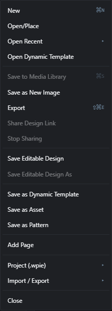
This menu is where a document begins and ends. Use it to start a New design, open or place existing images, and save your work to the WordPress Media Library or as an editable design.
Several items are grouped by destination: the top save block writes finished images, the middle block saves editable designs, and the lower blocks save reusable pieces (templates, assets, patterns) or handle project files and import/export.
Some items are only active in certain situations, and are greyed out otherwise rather than disappearing. For example, Save to Media Library is greyed out for a brand new blank document, and Share Design Link becomes active once the document has been saved as a design.
Edit menu Free 13 items #
The Edit menu holds undo and redo, the layer clipboard (cut, copy, paste, duplicate, delete), style copy and paste, transform and selection basics, and preferences.
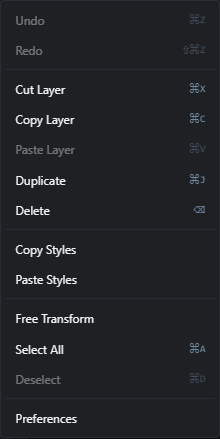
Use this menu for everyday editing actions. The top pair steps through your history, and the clipboard block moves whole layers around.
The style block copies just a layer's look (effects and appearance) from one layer to another. The lower block handles free transform, whole-document selection, and a link to the plugin's preferences.
Most clipboard and transform items need an active layer, and paste items need something already on the clipboard, so they grey out when they cannot run.
Image menu Free 16 items #
The Image menu changes the whole document: its pixel size, canvas size, colors, cropping, trimming, and rotation or flipping.
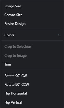
Everything here affects the entire document rather than a single layer. Use Image Size to change the pixel dimensions and Canvas Size to change the working area around the content.
The Colors submenu gathers background color, palette extraction, palette application and LUT loading. The lower items crop, trim and rotate or flip the whole canvas.
Layer menu Free 28 items #
The Layer menu creates new layers of every kind, duplicates and deletes them, combines and masks them, and moves them up or down the stack.
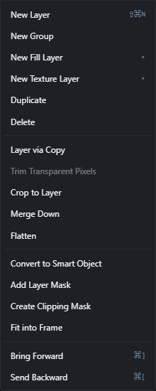
Use this menu to build and manage the layer stack. The top block adds new layers: empty layers, groups, fill layers (solid, gradient or pattern) and texture layers.
The middle blocks copy, trim, merge and flatten layers, then convert them to smart objects, add masks and create clipping masks. The bottom pair changes stacking order.
Most items need an active layer and grey out otherwise. Trim Transparent Pixels only works on a raster (pixel) layer.
Select menu 10 items #
Everything for making, changing, and reusing pixel selections.
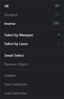
The Select menu holds the commands that create a selection, refine it, switch to a selection tool, or store one for later. Many items only light up when something is already selected.
A selection limits where edits, fills, and filters apply. Deselect returns you to editing the whole layer.
Filter menu 50 items #
Preset looks plus grouped image effects for blur, color, duotone, and stylize.
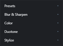
The Filter menu is organised into submenus. Presets apply a non-destructive whole-layer look. The other groups (Blur & Sharpen, Color, Duotone, Stylize) run pixel effects on the active layer.
Effects that have settings open a small dialog first; effects with nothing to adjust (like Invert or the Auto fixes) apply immediately. Most items are disabled until you select a layer.
View menu 20 items #
Zoom, panels, rulers, guides, snapping, color proofing, and post preview.
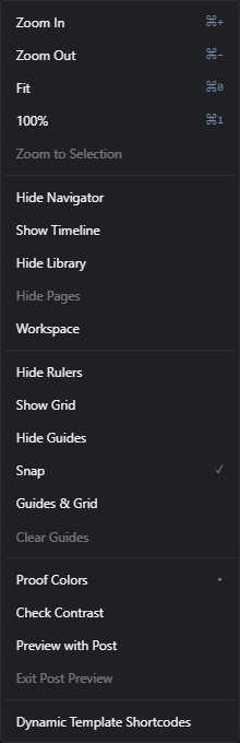
The View menu controls how the canvas is displayed without changing the image itself: zoom level, which panels are visible, on-screen aids like rulers and guides, and preview modes.
Show/Hide items change their label depending on the current state (for example Show Rulers becomes Hide Rulers). On Mac the shortcut key is Cmd; on Windows it is Ctrl.
Character (text properties) Free 7 items #
The character controls in the options bar that set the typeface, size and weight of the selected text.
These appear in the top options bar whenever the Text tool is active, or the Move tool is active over a text layer. During an open text edit they restyle the characters you have selected inside the box; with the layer only selected they restyle the whole layer. Changes also apply to every other selected text layer at once.
Font family
#Opens the font picker to choose the typeface for the text. During a text edit it restyles the selected characters, otherwise the whole layer. The picker has a search field on top: type to filter all font groups, Enter picks the first match.
Weight
#Dropdown that sets the stroke thickness of the letters, from light to black.
Font size
#Type a size for the text, or drag the px label beside it to scrub the value up and down.
Tip. Drag the px label to scrub the size without typing.
Bold
#Toggles the text between normal (weight 400) and bold (weight 700). Highlighted when the text is 700 or heavier.
Italic
#Slants the text on or off for emphasis.
Underline
#Draws a line under the text on or off.
Color
#Sets the text fill color from a swatch. With no text layer active it sets the shared foreground color instead.
Paragraph and layout (text) Free 10 items #
Alignment, curve and layout controls that act on the whole text layer.
These options sit next to the character controls in the options bar and apply to the entire text layer rather than a character selection. They cover horizontal and vertical alignment inside the text box, curving the line, and the layout and annotation helpers.
Align left
#Aligns each line of text to the left edge of the text box. The tooltip reads left.
Align center
#Centers each line of text horizontally in the text box. The tooltip reads center.
Align right
#Aligns each line of text to the right edge of the text box. The tooltip reads right.
Align top
#Positions the text at the top of its box vertically. The default for fixed-width text boxes.
Align middle
#Centers the text vertically within its box. The default for auto-width text.
Align bottom
#Sits the text at the bottom of its box vertically.
Curve
#Bends the whole line of text along an arc. At 0 the text is straight; move toward the ends for a stronger curve up or down.
Layout
#Opens a popover with six rendered previews (two classic layouts plus four seeded variations) that restyle the text block into a designed arrangement.
Remove layout
#The × button next to Layout clears an applied text layout and returns to plain text. Only shown once a layout is in place.
Annotate
#The last group in the text options bar. Its Presets button opens a popover of hand-drawn annotation presets (markers, circles, boxes, underlines, strikes and combos), each previewed with your own text. Only appears for an existing text layer.
Annotate presets Free 40 items #
The hand-drawn annotation presets behind the Annotate button in the text options bar: markers, circles, boxes, underlines, strikes and combos.
Select a text layer and the options bar shows an Annotate group with a Presets button. It opens a popover of live mini previews grouped into five categories: Marker, Circles & Boxes, Underlines, Strikes and Combos. Every tile is rendered from your own layer, using the first word of its text (up to six characters, falling back to Style when the layer is empty) in its real font, so the tile is the result.
The presets are deliberately hand-drawn only. Material looks such as gold, chrome or neon live in the Effects panel, and shadows and outlines live in Blending Options, so nothing overlaps. Each preset first clears the layer's outline, shadow, per-character styles and text effects, then applies its own combination, which means switching presets never leaves half of the previous look behind.
Clicking a tile applies it and closes the popover, recorded as Text style preset in history. The popover also closes on a click outside it or on Escape.
Presets
#The button in the Annotate group of the text options bar. It opens the preset popover and only appears while a text layer is selected.
Color
#The ink swatch at the top of the popover. Picking a color recolors an annotation already on the layer straight away (recorded as Annotation color) and tints every preset you apply afterwards, so a whole set of doodles shares one ink. Until you touch it, the swatch shows red.
Preset colors
#Resets the ink swatch so presets apply in their own built-in colors again. Only shown once you have picked an ink color. It clears the ink for future clicks and does not change an annotation already on the layer.
Remove annotation
#Applies the bare reset preset: clears the layer's text effects, outline, shadow and per-character styles and returns it to plain text.
Marker
#A yellow highlighter band swiped behind the text, lightly roughened.
Pink Swipe
#A single pink marker swipe, tapered like a pen stroke rather than a full band.
Double Swipe
#Two overlapping teal marker swipes, as if you went over the words twice.
Scribble Fill
#An orange scribble filled back and forth behind the text instead of a clean band.
Sky Swipe
#A light blue marker swipe with extra roughness, for a looser hand.
Weathered Marker
#A lilac highlighter band at maximum roughness, so the edges look dried out and worn.
Sun Swipe
#A warm yellow marker swipe with clean edges.
Mint Band
#A mint green highlighter band behind the text.
Circled
#A red hand-drawn oval looped around the text.
Sketchy Circle
#A blue oval drawn with a very shaky line, for a rough sketched note.
Double Loop
#A red circle looped around the text twice, as if you went round again for emphasis.
Sketchy Box
#A near-black hand-drawn rectangle around the text.
Blue Box
#A blue hand-drawn rectangle around the text, drawn with a looser line.
Ink Loop
#A near-black double loop around the text, like a pen circling a word on paper.
Green Oval
#A green hand-drawn oval around the text, roughened for a marked-correct feel.
Red Box
#A red hand-drawn rectangle around the text, for a flagged or corrected word.
Scribble Under
#A blue hand-drawn wavy line scribbled under the text.
Double Under
#Two red hand-drawn strokes under the text, for a stronger emphasis than a single line.
Hand Zigzag
#A green hand-drawn zigzag under the text.
Cursive Loops
#A purple looping cursive line under the text, like a run of handwritten e's.
Wave Under
#A blue sine wave underline drawn as a clean, even ruled line rather than a shaky one.
Rough Under
#An orange scribbled wave under the text at high roughness, for a scrappier hand.
Clean Under
#A single straight, near-black ruled underline with no hand-drawn wobble.
Dashed Under
#A red ruled underline drawn as two parallel straight lines under the text.
Red Strike
#A single rough red line struck through the middle of the text, overshooting slightly at both ends.
Double Strike
#Two near-black lines struck through the text, one just above and one just below the middle.
Crossed Out
#A big red X drawn across the whole text box, corner to corner.
Blue Pencil
#A single blue line struck through the text at high roughness, like an editor's pencil mark.
Teacher's Red
#Combines a red oval around the text with a red line struck through it, like a marked-up exam paper.
Important!
#Combines a yellow highlighter band with a red zigzag underline.
Checked Off
#Combines a pale green marker swipe with a green line struck through the text, for a finished to-do item.
Noted
#Combines a yellow highlighter band with a red oval around the text.
Proofread
#Combines a blue hand-drawn box around the text with a blue double scribble under it.
Sold Out
#Combines a yellow highlighter band with a big red X across the text.
Action Item
#Combines a near-black hand-drawn box around the text with a red zigzag under it.
Annotated
#Combines a purple double loop around the text with purple cursive loops under it.
Automation menu 13 items #
Bulk and generative jobs grouped into Content, Images, Design, and Actions.
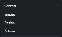
The Automation menu gathers everything that runs across many posts or images or generates work for you, organised into four submenus.
Some items are Pro features, and they carry a Pro chip here. In the editor itself they are not greyed out: without the Pro add-on the entry is simply absent from the menu, so if you are looking for one of them and cannot find it, that is why. Items without a chip are part of the free plugin.
Automation, then Actions (saved macros) Free 2 items #
Below Manage Actions, the Actions submenu lists your recorded actions for one-click replay.
Any action (macro) you record is listed here under the Manage Actions entry. Selecting one replays its recorded steps on the current document. When you have not recorded anything yet, a disabled placeholder is shown instead.
Saved action
#Each recorded action appears as its own item labelled with its name. Click it to replay all of its steps on the current document.
Tip. Record and edit actions from Manage Actions in the same submenu.
No saved actions
#A disabled placeholder shown when you have not recorded any actions yet. Record one in Manage Actions to make it appear here.
Tools menu 6 items #
Single-purpose creative tools that live inside the editor.
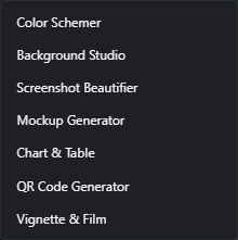
The Tools menu holds standalone creative tools that are neither bulk automation nor extensions. Each item opens its own dialog or studio.
Extensions menu 1 item #
A launcher that lists the generators of every installed extension.
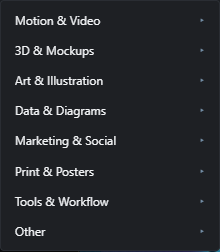
The Extensions menu is a launcher, and its first level is a fixed set of nine categories rather than a list of extensions. Inside a category an extension with a single generator appears as a direct item; one with several becomes a submenu named after the extension. Generators that belong to the editor itself do not appear here.
This menu only appears when at least one extension generator or extension menu item is installed. Managing and installing extensions is done from Help, then Manage Extensions, not here.
Help menu 7 items #
Documentation, shortcuts, tour, Easy Mode, status, and about.
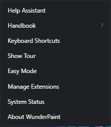
The Help menu links to learning resources, the keyboard-shortcut list, a guided tour, and system information. Extension management also lives here for administrators.
Assets menu Free 6 items #
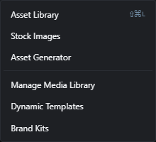
Everything that brings content into the document: the asset library, stock photos, AI asset generation, the media library manager, dynamic templates and brand kits.