Settings, chrome and shortcuts
Title bar, status bar, Easy Mode, System Status, the Settings page and every keyboard shortcut.
Title bar 19 items #
The top row of the editor: the document name, undo/redo, quick export, compare, theme, the way back, post preview and the save buttons.
The title bar sits across the very top of the editor. On the left it names the file you are working on; on the right it holds the actions you reach for most, ending in the primary save button.
Which buttons appear depends on context: a brand-new document, a document opened from a dynamic template, a nested Smart Object edit, or an edit launched from a page builder or the media library each show a slightly different set.
WunderPaint (brand logo)
#The plugin logo at the far left. It is a label only and marks the editor, hovering shows the tooltip WunderPaint.
Editing: / Creating:
#A small word before the file name that reads Creating: for a brand-new document or Editing: for an existing one, so you always know whether you are making a fresh image or changing an existing one.
Document name
#The bold name of the open document. It updates when you rename or save under a new name.
A small badge shown only when the open document is a dynamic template. It reminds you that saving updates the template itself rather than creating a normal image.
Tip. Hover it to read: saving updates the template.
· W×H
#The pixel size of the canvas, shown faintly after the name (for example · 1080×1080). A quick reminder of the document dimensions.
Unsaved changes dot
#A small dot that appears next to the size when the document has changes you have not saved yet. It disappears once you save.
Undo (⌘Z)
#Steps one change backwards. Greyed out when there is nothing left to undo.
Redo (⇧⌘Z)
#Re-applies the last change you undid. Greyed out when there is nothing to redo.
Quick export
#Exports and downloads the image immediately using the settings from your last export (format, quality and scale), so you do not have to reopen the export dialog. Formats that need extra choices (GIF, APNG, WebM, PDF and extension formats) reopen the export dialog instead.
Tip. PSD exports run through the real layer writer, not a flattened PNG.
Compare
#Press and hold to temporarily show the saved original underneath your edits, so you can see the before and after. Release to return to your edits. Only appears when the document was opened from an existing image.
Toggle theme
#Switches the editor between dark and light appearance. Your choice is remembered for next time.
Back to Media Library / Back to Post / Cancel
#Leaves the editor. The label reads Back to Post when you arrived from a post, Back to Media Library otherwise, and Cancel inside a nested Smart Object edit. If you have unsaved changes it first asks whether to discard them.
Shows your design inside a real post so you can judge it in context, and fills any dynamic fields with that post's content. Click again to leave the preview.
Save as New Image
#Saves your work as a fresh attachment in the media library without touching the original. Hidden in element-bound embeds (where Apply already saves a copy).
The primary button for a document opened as a dynamic template. It saves your changes back into the template where it lives, so every use of that template picks up the new design.
Close
#In an edit launched from a host (a page builder or the media library) this cancels back to the host without saving. It sits right next to the primary save action.
Apply / Apply to (host)
#The primary button when a page builder or insert flow opened the editor. It saves a bound copy back to that element (so shared originals are never silently changed) and names the host, for example Apply to Elementor.
Save to Media Library
#The main save button. It writes the image to the media library and, with versioning on, keeps the previous file as a restorable version. From the media library grid this is the primary action.
Apply to Smart Object
#The primary button when you are editing the contents of a Smart Object in a nested editor. It bakes your edit back into the Smart Object in the parent document.
Document tabs 3 items #
Tabs that let you keep several documents open at once, docked above the right panel.
When more than one document is open, a row of tabs appears at the right end of the menu row, directly above the right panel. A single open document shows no tabs at all.
New tabs open through File then New, through templates, the Asset Library and the Screenshot Beautifier, and through the + button at the end of the row. The count is capped at ten; beyond that the editor says the tab row is full.
Document tab
#One open document. Click it to switch to that document. The tab shows the document name, and its tooltip adds the size. The active tab connects seamlessly into the panel below.
Unsaved changes dot
#A small dot on a tab that marks a document with unsaved changes.
Close tab
#Closes the document. If the tab has unsaved changes the first click arms it and the tooltip changes to Click again to discard and close; a second click confirms. Moving focus away disarms it.
Pages bar 6 items #
A strip for multi-page designs, where each page is its own canvas saved together with the design.
The pages bar turns a single design into a multi-page document, Canva style. Each page is a full snapshot of the canvas and its layers with its own undo history, and all pages are saved together as part of the design.
Switching pages swaps the whole document. The strip can be hidden and shown again from the View menu without losing any pages.
Page X/Y
#Shows which page you are on and how many pages the design has in total.
Page thumbnail (Go to page)
#A small preview of each page. Click one to switch to it; the current page shows its number instead of a thumbnail.
Delete page (×)
#Removes a page from the design. It asks to confirm first, and is only available when more than one page exists.
+ Page
#Adds a new empty page right after the current one, keeping the same canvas size, and switches to it.
Duplicate page
#Copies the current page (canvas and all its layers) into a new page right after it, and switches to the copy.
Hide pages strip (×)
#Hides the pages strip. The pages stay saved with the design, and you can show the strip again from the View menu.
Animation timeline 11 items #
A frame strip that turns each visible top-level layer into an animation frame, with onion skin, play preview and per-frame delay.
The timeline treats every visible top-level layer as one animation frame. Reorder frames, set how long each one shows, preview with onion skin, and play the sequence, then export it as GIF, APNG or WebM.
You need at least two visible top-level layers before the timeline can play or export.
Timeline (heading and frame count)
#The title of the bar, followed by a note that reads how many frames there are and reminds you that every visible top-level layer is one frame.
Onion skin
#When ticked, faint versions of the neighbouring frames show through the current one, so you can line up motion between frames.
Play / Stop
#Plays the frames in order at their set delays, showing the result over the canvas. The button becomes Stop while playing. Disabled until there are two or more frames.
Export
#Opens the export dialog to save the animation as a GIF, APNG or WebM. Disabled until there are two or more frames.
Close timeline (×)
#Hides the timeline bar. Your layers and frame delays are unaffected.
Frame thumbnail
#A preview of one frame. Click it to select that frame's layer on the canvas; the active frame is highlighted.
Frame number
#The position of the frame in the sequence, starting at 1.
Frame delay (ms)
#How long this frame stays on screen, in milliseconds, before the next one. Type a value or use the stepper.
Move frame left
#Moves this frame one place earlier in the sequence. Disabled for the first frame.
Move frame right
#Moves this frame one place later in the sequence. Disabled for the last frame.
Empty timeline note
#A hint shown when there are fewer than two frames: add at least two visible top-level layers to animate.
Easy Mode top bar 5 items #
The simplified top row shown in Easy Mode, with undo, redo, a mode badge and the way back to the full editor.
Easy Mode is a beginner-friendly shell. It replaces the full menu row with a short bar: undo, redo, a friendly badge and one button back to the pro editor. Open, save and export still live in the normal title bar, which Easy Mode keeps.
A badge that shows you are in the simplified Easy Mode shell.
Undo
#Steps one change backwards, the same undo as the full editor. Greyed out when there is nothing to undo.
Redo
#Re-applies the last undone change. Greyed out when there is nothing to redo.
Editing hint
#A one-line reminder: click an element to edit it, and everything important appears on the right.
Switch to full editor
#Leaves Easy Mode and returns to the full pro editor with all tools and panels. Documents are fully compatible either way.
Easy Mode toolbar 8 items #
The short tool rail in Easy Mode covering the handful of things a beginner actually does.
The Easy Mode tool rail shows big, labelled buttons for the common tasks. Several of them deep-link into the bottom asset tray, which is the surface most people use to add shapes, photos, text lockups and emoji.
Select
#The default arrow. Use it to move and arrange the elements on your canvas.
Text
#Adds a text box in the middle of the canvas. Double-click it to type your words.
Tip. New text is centered and uses your foreground color.
Shape
#Opens the shapes in the bottom tray. Tip: drop a photo onto a shape and the photo fills the shape.
Photos
#Opens free stock photos in the bottom tray. Drag one onto the canvas, or onto a shape to fill it.
Templates
#Opens ready-styled text combinations in the tray. One click inserts a beautifully styled headline set.
Emoji
#Opens emoji you can drop in as design elements.
Draw
#Lets you paint freehand with the brush. You can then turn your sketch into a real picture with the AI tools.
Crop
#Trims your design down to a new size.
Easy Mode panel 22 items #
The single guided panel on the right in Easy Mode, whose cards follow whatever you have selected.
Easy Mode replaces the pro panel stack with one guided panel. When nothing is selected it shows design basics; select a text, shape or image and the matching card appears. Below that sit one-click filters and effects (reused from the pro Effects panel), AI actions, extension tools and a mini element list.
Everything here routes through the same operations as the full editor, so documents stay fully compatible.
Background (Design card)
#A swatch that sets the canvas background color. Shown when nothing is selected.
Size (Design card)
#A dropdown of common canvas sizes (the first six presets). Pick one to resize the canvas.
My designs & templates
#Opens the library at your saved designs and templates.
Font (Text card)
#Picks the font family for the selected text from the curated template font list. Fonts load on demand.
Size (Text card)
#Sets the font size of the selected text in pixels.
Color (Text card)
#A swatch that sets the text color.
Bold
#Toggles bold on the selected text (weight 700 when on, 400 when off).
Italic
#Toggles italic on the selected text.
Color (Shape card)
#A swatch that sets the fill color of the selected shape.
Corners (Shape card)
#A slider that rounds the corners of a rectangle shape. Only shown for plain rectangles.
Cuts the background out of the selected image using the local AI model, leaving the subject on transparency.
Reposition-in-shape tip
#A note shown when an image is clipped into a shape: double-click the image to reposition it inside its shape.
Opacity (Look card)
#A slider that sets how see-through the selected element is.
A style picker that adds a look to your description, for example a photo or illustration style, so the generated image matches the mood you want.
A text box where you describe the image you want, for example a cozy autumn coffee flatlay.
Generates a new image from your description using the first configured AI provider.
Takes a rough drawing made with the Draw tool plus your description and turns it into a finished picture.
Chips that launch installed extension generators (studios) right from Easy Mode. Only shown when extensions are installed.
Elements (layer list)
#A simple list of the elements on the canvas, front to back. Click one to select it, and drag to change what lies in front. Groups can be unfolded one level.
Lock / Unlock layer
#Locks an element so it cannot be moved or deleted, or unlocks it again.
Delete
#Removes the selected element. Only shown for the active, unlocked element.
Filters, Effects and Text styles (reused cards)
#The real preview cards from the pro Effects panel appear here for the selected element: one-click filters, quick effects, and for text also styles, effects and warp. Click a rendered thumbnail to apply it.
Title bar, tabs and timeline (more) 2 items #
Extra title-bar prompts and tab behaviours not covered elsewhere.
These are small but real affordances in the top chrome: the confirmation you get when you try to leave with unsaved work, and the two-step confirmation when closing a tab that still has changes.
Discard
#When you click Back to Media Library, Back to Post or Cancel while the document still has unsaved changes, a prompt titled Unsaved changes asks Discard unsaved changes?. Click Discard to leave and lose the changes, or dismiss it to keep editing.
Tip. Shown only while the unsaved-changes dot is lit.
Click again to discard and close
#Closing a document tab that has unsaved changes needs two clicks on its close button. The first click arms the button (its tooltip changes to Click again to discard and close); the second click discards the changes and closes the tab. Clicking elsewhere disarms it.
Tip. Clean tabs close on a single click.
Easy Mode panel (more) 2 items #
Two Elements-list affordances in the Easy Mode side panel.
The Easy Mode Elements list is a simplified layer list. These two controls handle groups and reordering.
Show group contents
#A small chevron on a group row in the Easy Mode Elements list. Click it to unfold the group and show its child elements indented one level below; click again to fold them away. Only whole groups reorder as a unit.
Tip. Easy Mode shows only one level of nesting to keep the list short.
Drag to change what lies in front.
#A hint under the Easy Mode Elements list. Drag a top-level element up or down to change its stacking order; an element higher in the list sits in front of the ones below it.
Workspaces Free 10 items #
Hide what you do not use, and keep it that way.
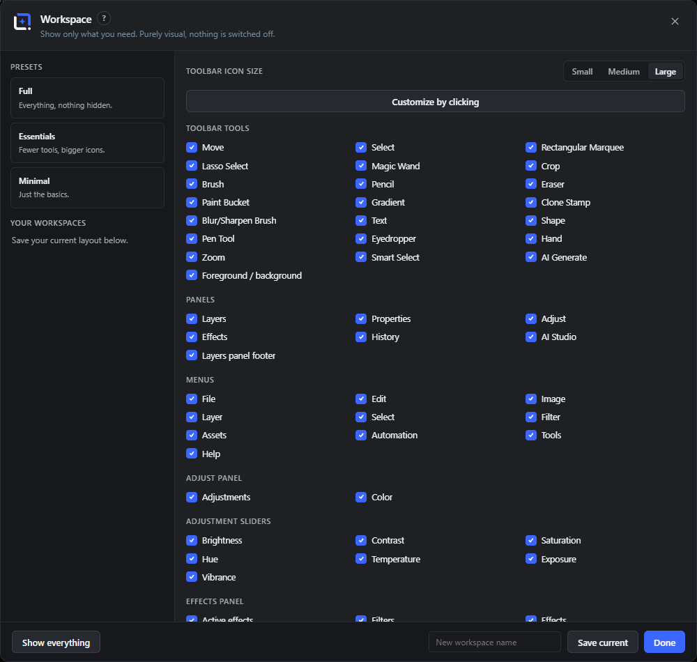
A workspace is the set of panels, sections and tools that stay visible, plus the size of the toolbar icons. Three presets are built in and you can save your own arrangement under a name.
The customise mode is the quick way in: turn it on and click anything in the editor to hide it, rather than hunting for it in a list.
Full
#Everything, nothing hidden. The default.
Essentials
#Fewer tools, bigger icons: the everyday set at a comfortable size.
Minimal
#Just the basics, for a screen with little room or a job with few steps.
Customize by clicking
#Turns on the picker overlay. Click any panel, section or tool in the editor to hide it; click Done when finished.
Hide:
#The label the overlay shows on whatever is under the pointer, so you can see what a click would remove.
New workspace name
#Saves the current arrangement under a name of your own.
Overwrite with the current layout
#Updates a saved workspace to match what is on screen right now.
Apply this workspace
#Switches to a saved arrangement.
Delete this workspace
#Removes a saved arrangement. The built-in presets cannot be deleted.
Toolbar icon size
#Large, Medium or Small, independent of which tools are visible.
Status bar 10 items #
The thin bar under the canvas showing document size, color mode, memory, the active tool and the zoom controls.
The status bar runs along the bottom of the editor. The left side reports facts about the document, the right side names the active tool and lets you set the zoom level exactly.
Proof: (mode)
#Appears only when a view-only color proof is turned on (View, then Proof Colors). It names the proof so you remember the canvas is showing a simulated output, not your real colors.
Dimensions / unit toggle
#Shows the canvas size and, when clicked, cycles the unit between pixels, centimetres and inches. Print sizes use the document DPI (72 by default).
Tip. Hover it to see the current DPI.
Color mode
#Reports the document color mode and bit depth, one of RGB · 8-bit, RGB · 16-bit or CMYK · 8-bit.
Memory estimate (~ MB)
#A rough estimate of how much memory the raw canvas uses, calculated from width times height times four bytes. A quick sense of how heavy the document is.
Tool:
#Names the tool you currently have active, so you can confirm what a click will do.
Zoom out (−)
#Zooms the view out one step (divides the current zoom by 1.25).
Zoom level (input)
#Shows the current zoom as a percentage and lets you type an exact value. Press Enter or click away to apply; an invalid entry snaps back to the current value.
Zoom in (+)
#Zooms the view in one step (multiplies the current zoom by 1.25).
Fit
#Scales the view so the whole canvas fits inside the visible area.
Reveal Off-Canvas
#The eye button next to the zoom control (also View, Reveal Off-Canvas) makes everything outside the document frame visible: layers parked on the pasteboard show up around the canvas instead of hiding behind the dark surround. A handy scratch space - park variants and material next to the frame, drag them in when needed. Export always crops to the frame, so nothing parked ever ships.
First-run tour 12 items #
A short spotlight tour over the real editor, shown once on first run and restartable from Help.
The first time you open the editor a guided tour spotlights the main areas one step at a time. It runs once (remembered in your browser) and can be restarted later from Help, then Show Tour.
The same spotlight component powers the guided how-tos in the Handbook.
Tools (step)
#Highlights the tool rail: many tools with single-key shortcuts (V, B, T and so on), and the options bar above the canvas that adapts to the active tool.
Canvas (step)
#Highlights the canvas: hold Space to pan, use Cmd/Ctrl with plus or minus to zoom, and note that everything lands on layers so your original is untouched until you save.
Panels (step)
#Highlights the right-hand panels: layers, properties, adjustments with filters and effects, history, AI actions and recordable Actions.
Assets (step)
#Highlights the Assets menu: the Asset Library, the Insert menu, your Brand Kits (colors, fonts, logo, company profile) and design sharing.
Asset Library tray (step)
#Highlights the tray under the canvas: text lockups, shapes, icons, photos, brand-kit logos, dynamic and starter templates, all click or drag onto the canvas.
Automation (step)
#Highlights the Automation menu: Generate Content writes draft posts with images, Featured Images fills posts with branded thumbnails, and the Image Processor batch-edits the media library.
Saving (step)
#Highlights the primary save button: Save to Media Library keeps restorable versions, Save as New Image creates a fresh attachment, and editable work lives in Designs.
Step counter
#Shows your place in the tour, for example 3 / 8.
Skip
#Ends the tour immediately. It will not show again automatically.
Next
#Advances to the next tour step.
Start editing
#The final button; closes the tour and marks it done so it does not reappear.
Tip. Restart the tour any time from Help, then Show Tour.
System Status 18 items #
A single visual overview of everything installed, indexed and loaded, plus a debug log you can export for support.
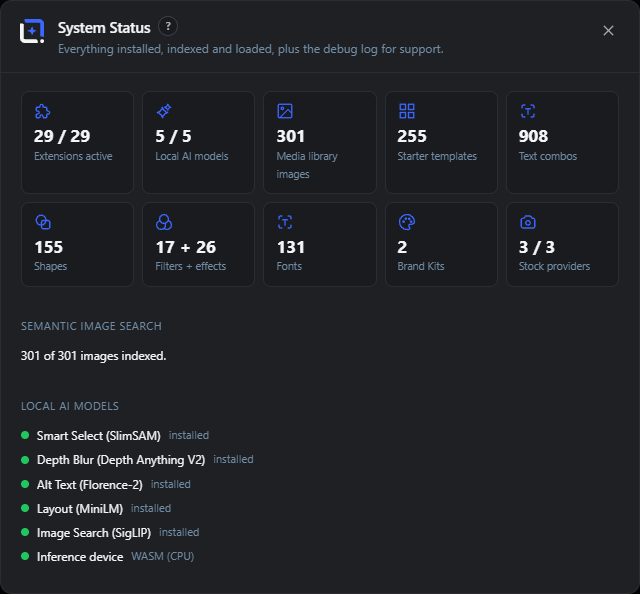
Opened from the Help menu, System Status collects everything that makes up your installation: extensions, local AI models, the semantic search index, content counts, system facts, storage, and a session debug log.
The one-click export bundles the status counts and log into a single JSON file so a support case is one attachment, not twenty questions. It contains no document content, no images and no API keys.
Extensions active
#A tile showing how many installed extensions are enabled out of the total.
A tile showing how many optional local AI models are installed out of the total.
Media library images
#A tile showing how many media library images are known to the search index.
Starter templates
#A tile counting the starter templates available.
Text combos
#A tile counting the ready-made text combinations.
Shapes
#A tile counting the shape and element library items.
Filters + effects
#A tile counting the filters plus the effects, including any added by extensions.
Fonts
#A tile counting the font families the editor knows about: the bundled ones, your custom uploads, and the whole Google catalogue when that option is on. It counts the catalogue, not what is downloaded and ready to draw with.
Brand Kits
#A tile counting your configured Brand Kits.
Stock providers
#A tile showing how many stock image providers are configured out of the total.
A section that reports the image search index: whether the model is installed, live indexing progress, and how many images are indexed. An Index now button appears when images are still pending.
Lists each local model with an installed or not-installed dot: Smart Select, Depth Blur, Alt Text, Alt Text Translation, Layout and Image Search. A final row names the inference device and whether it is GPU-accelerated.
System facts
#Shows the running plugin version (and warns if a newer version is installed on the server or if REST is unreachable), which AI providers are configured, and a count of any extension issues.
An admin-only stacked bar over the whole disk with every number listed below it: Versions & project files, Local AI models, Extensions, Fonts & editor runtime, Media library (other files), Other server data, and Free disk space. Color only aids scanning.
Debug log
#A list of events recorded during this editor session, colored by level (errors and warnings stand out). Shows the time, source and message of each entry.
Export log
#Downloads one JSON file to attach to a support request: status counts, device and graphics facts (browser, OS, display, WebGL hardware/software) and the debug log - never document content, images or API keys.
Clear
#Empties the session debug log.
Device & graphics
#The client machine at a glance: browser, operating system, display size and pixel ratio, CPU cores and memory, plus the graphics stack - WebGL version, hardware vs software rendering and WebGPU availability. Software rendering explains slow or frozen 3D studios in one look.
Guides & Grid 11 items #
A dialog for adding numeric guide lines and configuring the on-canvas grid.
Guides & Grid lets you place precise guide lines by number (as pixels or a percentage), apply common layout presets, and turn on a configurable grid. Dragging guides from the rulers still works as usual; this dialog adds exact control.
Orientation
#Chooses whether a new guide is vertical or horizontal.
Position
#The distance of the new guide from the top-left, entered as a number. Press Enter to add it.
Unit
#Whether the position is read as pixels or a percentage of the canvas.
Add
#Adds the guide at the entered orientation and position, clamped within the canvas.
Thirds
#Adds guides at the rule-of-thirds positions for balanced composition.
Golden ratio
#Adds guides at the golden-ratio positions.
Margins 5%
#Adds a margin frame 5% in from each edge.
Clear all
#Removes every guide. Only shown when guides exist.
Guide list (edit / delete)
#Lists each existing guide with its orientation and pixel position. Edit the number to move a guide, or use the close icon to delete it.
Show grid
#Turns the on-canvas grid overlay on or off.
Spacing
#Sets the grid cell size in pixels.
Handbook (Help) 9 items #
An in-editor handbook: categorized, searchable articles with step-by-step walkthroughs, tips, open buttons and interactive guided how-tos.
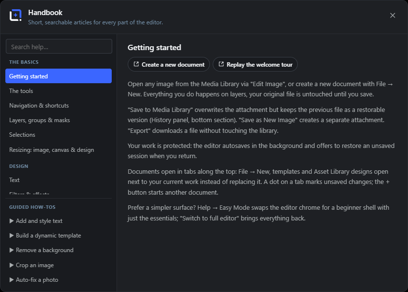
The Handbook opens over the editor. The left side groups its articles into five categories - The basics, Design, AI, Automation, Library & system - with a search box that flattens the list as you type. Below the search sit guided how-tos that walk you through a task step by step using the spotlight tour.
Articles are more than text: many start with buttons that open the described dialog directly, continue with a numbered Step by step walkthrough and end with Good to know tips and linked guided how-tos.
A ? button in the header of every dialog - including the Pro dialogs - opens the Handbook straight to the matching article, stacked above the dialog it was opened from.
Search help
#A search box that filters the article list as you type. It is focused automatically when the Handbook opens.
Categories
#Five article groups in the sidebar: The basics, Design, AI, Automation and Library & system. Every article belongs to exactly one.
Article list
#The list of articles, grouped by category while the search is empty; typing filters to a flat result list. No matches. shows when the search finds nothing.
Guided how-tos
#Interactive walkthroughs that run the spotlight tour over the real editor to teach a task. Click one to start it.
Article body
#The selected article on the right: intro paragraphs, an optional numbered Step by step walkthrough, Good to know tip callouts and buttons that open the dialogs or guides the article describes.
Help for this dialog (?)
#A small question-mark button in the header of every dialog that opens the Handbook to the article for that dialog. The Handbook always stacks above the dialog it was opened from.
Open buttons
#Pill buttons at the top of an article that close the Handbook and open the described dialog directly - for example Open Design Generator in the Design Generator article.
Step by step
#A numbered walkthrough inside an article: badge-numbered steps connected by a line, describing the task in order.
Good to know
#Highlighted tip callouts at the end of an article for non-obvious extras, like saving a generated design as a dynamic template.
Manage Extensions 11 items #
Install, enable, disable and remove in-editor extension packages.
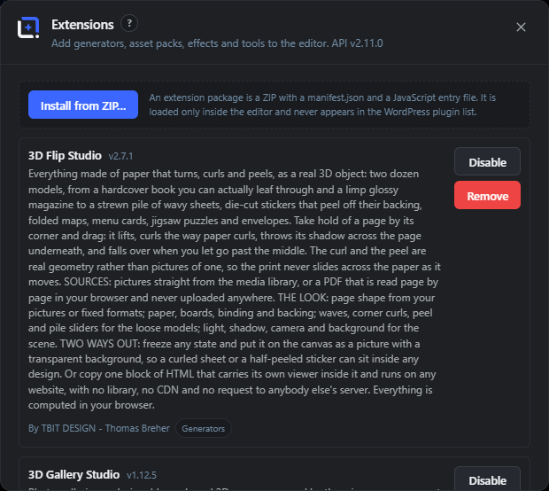
Extensions add generators, asset packs, effects, tools and more to the editor. Each is a ZIP containing a manifest.json and a JavaScript entry file; it loads only inside the editor and never appears in the WordPress plugin list.
Fresh installs are injected live with no reload. Disabling an already loaded package, or loading an updated version, takes effect on the next reload because scripts cannot be unloaded once run.
Uploads and installs an extension package from a ZIP file. Only shown to users allowed to manage extensions.
Install consent prompt
#Before the upload, a dialog explains that an extension runs with your permissions inside the editor (it can read and change your documents and act on your behalf, like a WordPress plugin) and asks you to confirm you trust the source.
Enable / Disable
#Turns an extension on or off. Enabling can take effect live; disabling an already loaded extension takes effect after the next reload.
Remove
#Deletes the extension and its files after a confirm prompt.
Disabled chip
#A small tag on an extension row that is currently turned off.
Takes effect after reload
#A tag marking an extension whose on-disk state differs from the running session, so a reload is needed to apply it.
Provided extension points
#Chips listing what an extension adds, such as Effects, Filter presets, Menu items, Panels, Panel sections, Tools, Export formats, Generators, Library sections, Template packs or AI tools.
Website
#A link to the extension's homepage, shown when the package declares one.
Extension errors
#Any load or runtime issues an extension has reported appear in red on its row.
API version note
#The dialog subtitle names the extension API version the editor supports, for compatibility.
System requirements (3D and motion studios)
#The 3D studios (Text, Mockup, Effects, Animation, Gallery, Objects) and Living Photos render through WebGL2 and need hardware graphics. Every current desktop browser provides that; virtual machines, remote desktops and browsers older than Safari 16.4 often do not - the studio then explains itself instead of opening, and System Status → Device & graphics shows the exact graphics stack.
System Status (more) Local AI 11 items #
Rows, actions and storage segments in the System Status dialog that were not listed yet.
System Status (Help menu) is one visual overview of the installation. Beyond the stat cards it has an index action, an inference-device readout, plugin and provider facts, and an admin-only storage breakdown.
Index now
#Appears in the Semantic image search row when some media library images are not yet indexed. Click it to embed the pending images so they become searchable by description. Until the search model is installed, the row instead tells you to download it under Settings, then Local AI Models.
Tip. Progress shows as Indexing… X / Y while it runs.
Inference device
#A row under Local AI models showing which engine runs the local models: WebGPU (GPU) when your browser supports GPU acceleration, otherwise WASM (CPU). A device is always available, so local features work either way, just faster on WebGPU.
Plugin version
#A row under System showing the version of the editor currently loaded in your browser. If a newer version is installed on the server it shows X installed, reload the editor; if the server cannot be reached it shows REST unreachable!.
AI providers configured
#A row under System listing which cloud AI providers currently have a key configured (for example gemini, openai), or none when no keys are set.
Versions & project files
#A segment of the admin-only Storage bar. It measures disk used by saved image versions and the editable project sidecar files the editor keeps. The exact size is listed beside the colored swatch.
Local AI models
#A Storage bar segment measuring the disk used by downloaded local AI model files (stored under wp-content/uploads/wpie-models).
Extensions
#A Storage bar segment measuring the disk used by installed editor extension packages.
Fonts & editor runtime
#A Storage bar segment measuring the disk used by uploaded custom fonts and the editor's own runtime files.
Media library (other files)
#A Storage bar segment (neutral gray) measuring the rest of your WordPress media library, the files that are not editor buckets.
Other server data
#A Storage bar segment (neutral gray) measuring everything else on the disk outside the uploads folder. Shown only when total and free disk figures are available.
Free disk space
#The empty part of the Storage bar, listed as free of total (for example 40 GB of 100 GB). Shown only when the server reports disk totals.
Local AI models (what each one does) Local AI 6 items #
The named local models that power in-browser AI features, each shown in System Status and downloadable under Settings.
Each local feature is backed by one downloadable model that runs in your browser (WebGPU or WASM) and is served from your own server. System Status lists each with an installed or not-installed dot.
Smart Select (SlimSAM)
#The model behind the Smart Select tool. It finds and cuts out the object you click on, so you can select a subject without tracing it by hand.
Depth Blur (Depth Anything V2)
#A depth-estimation model. It builds a depth map of a photo so features like background blur and depth-aware effects can tell foreground from background.
Alt Text (Florence-2)
#A captioning model that reads the rendered image and writes an alt-text description locally, no cloud key needed. Powers the Generate alt text action.
Alt Text Translation (Opus-MT)
#A translation model that renders the locally generated alt text into another language, so captions match your site's language.
Layout (MiniLM)
#A small text-embedding model used for layout and salience decisions, helping the editor place and rank elements sensibly.
Image Search (SigLIP)
#The embedding model behind semantic image search. It turns your media library images into vectors so you can find them by describing what they show.
Guides & Grid options 4 items #
The orientation and unit choices inside the Guides & Grid dialog's New guide row.
The New guide row lets you type an exact guide position. Two dropdowns control the guide's direction and how its number is read.
Vertical
#An Orientation option for a new guide. A vertical guide is a top-to-bottom line placed at an X position, useful for aligning columns and margins.
Horizontal
#An Orientation option for a new guide. A horizontal guide is a left-to-right line placed at a Y position, useful for aligning rows and baselines.
px
#A Unit option in the New guide row. The number you type is taken as an exact pixel position on the canvas.
%
#A Unit option in the New guide row. The number is read as a percentage of the canvas width (vertical guide) or height (horizontal guide) and converted to a pixel position, so 50% centers the guide.
Manage Extensions (more) Extension 5 items #
Per-row details and prompts in the Extensions manager beyond the main actions.
Each installed package is shown as a row with its name, version, author, capability chips and actions. These entries cover the pieces not listed yet.
Version
#The version badge next to each extension's name (for example v1.2.0). It shows which release of that package is installed, handy when checking whether a reload is loading a newer build.
By (author)
#A byline in an extension row's meta line showing who made the package, for example By TBIT Design. Only shown when the manifest names an author.
Capability chips
#Small chips in an extension row that name what the package adds to the editor, drawn from a fixed vocabulary. They tell you at a glance whether a package brings tools, effects, generators and so on.
Remove extension
#The confirmation that appears when you click Remove on an extension. It asks Remove "name" and delete its files?; confirming deletes the package from disk. This is a destructive action.
Tip. Removal deletes the files; already-loaded code stays until you reload.
No extensions installed yet.
#The empty-state message shown in the Extensions dialog when nothing is installed. Use Install from ZIP… to add your first package.
Help Assistant FreeCloud AI 5 items #
Ask the editor a question and get an answer out of its own handbook.
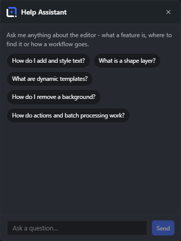
The assistant answers from a knowledge base that ships inside the plugin (includes/data/help-kb.json), built from the same glossary source as this site. That is deliberate: it cannot answer with something the editor does not do. The wording of the answer, though, is written by the AI provider you configured: your question and the matching handbook sections are sent there from your server, so the assistant needs a text provider and its key.
When a question matches one of the guided tours that ship with the editor, it offers that tour instead of describing the controls.
Ask a question…
#The input. Ask in your own words; the assistant looks up the matching sections and answers from them.
Send
#Sends the question.
Show me (tour)
#Turns the answer into a guided tour: the editor spotlights each control in turn instead of naming it.
New conversation
#Starts over with an empty thread. The previous exchange is not kept.
Suggested questions
#The starting prompts on an empty thread, covering the things people ask first: adding and styling text, removing a background, dynamic templates, shape layers, actions and batch processing.
Keyboard shortcuts: view & selection 14 items #
Shortcuts for zooming, fitting, selecting and opening the main surfaces.
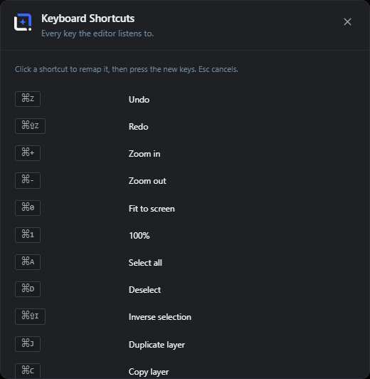
These commands control the view and selection and open key surfaces. Most are remappable in the shortcuts dialog; the ones marked not remappable are hardwired. Cmd/Ctrl means Command on Mac and Ctrl elsewhere.
In Easy Mode only everyday combos fire, so beginners cannot stumble into pro-only actions.
Zoom in
#Zooms the view in one step.
Zoom out
#Zooms the view out one step.
Fit to screen
#Scales the view so the whole canvas fits the visible area.
100%
#Sets the zoom to actual size, one screen pixel per image pixel.
Select all
#Selects the whole canvas.
Deselect
#Clears the current selection.
Inverse selection
#Swaps the selected and unselected areas.
Asset Library
#Opens the Asset Library.
Command palette
#Opens the command palette to search and run any command.
AI panel
#Opens the AI panel on the right. The plain letter A is free because select all uses Cmd/Ctrl + A.
Handbook
#Opens the in-editor Handbook.
Escape (cancel)
#Cancels the current draft, or cancels a crop, or clears the selection, in that order.
Enter (commit)
#Commits the current draft, such as confirming a crop or a shape.
Hold Space to pan
#Holding Space temporarily switches to the Hand tool so you can drag the canvas; releasing returns to your previous tool.
Keyboard shortcuts: editing 16 items #
Shortcuts for undo, save, layers, nudging, opacity and the quick-insert palette.
These commands edit the document and its layers. Undo, redo, duplicate, copy, cut and paste are remappable; the layer-order, save, nudge, brush-size, opacity, quick-insert and swap-color shortcuts are hardwired.
Shortcuts do not fire while you are typing in a text field.
Undo
#Steps one change backwards.
Redo
#Re-applies the last undone change (Cmd/Ctrl + Y also works).
Save
#Saves. A document bound to a design saves the design, one bound to a template updates the template, otherwise the export dialog opens to save to the library.
Duplicate layer
#Duplicates the selected layer.
Copy layer
#Copies the selected layer to the clipboard.
Cut layer
#Cuts the selected layer to the clipboard.
Paste layer
#Pastes the layer from the clipboard.
Bring forward
#Moves the selected layer one step towards the front.
Send backward
#Moves the selected layer one step towards the back.
Delete
#Deletes the selected layer, or clears the pixels inside an active selection.
Nudge layer
#Moves the selected layers by one pixel with the arrow keys, or ten pixels with Shift held. Groups move with all their children; a locked member freezes its whole unit.
Layer opacity (digits)
#Sets the active layer's opacity from the number keys: 1 to 9 give 10% to 90%, and 0 gives 100%.
Brush smaller
#Shrinks the current paint tool's brush size (by 5 above size 10, otherwise by 1). Works with Brush, Pencil and Eraser.
Brush larger
#Grows the current paint tool's brush size (by 5 from size 10 up, otherwise by 1). Works with Brush, Pencil and Eraser.
Quick insert
#Opens the quick-insert palette to drop in an element fast.
Swap colors
#Swaps the foreground and background colors.
Keyboard shortcuts: tools 20 items #
The single-letter shortcut for each tool in the tool rail.
Each tool has a one-letter shortcut. These are matched last so they never shadow the command shortcuts, and every one is remappable in the shortcuts dialog. They do not fire while you type in a field, and in Easy Mode single-key tool switches are suppressed.
Move
#Selects the Move tool for moving and arranging layers.
Select
#Selects the Select (object) tool.
Rectangular Marquee
#Selects the rectangular marquee selection tool.
Lasso Select
#Selects the freehand lasso selection tool.
Magic Wand
#Selects the Magic Wand, which selects areas of similar color.
Crop
#Selects the Crop tool.
Brush
#Selects the Brush for soft painting.
Pencil
#Selects the Pencil for hard-edged painting.
Eraser
#Selects the Eraser.
Paint Bucket
#Selects the Paint Bucket to fill areas with a color.
Gradient
#Selects the Gradient tool.
Clone Stamp
#Selects the Clone Stamp to paint copied pixels from another spot.
Blur/Sharpen Brush
#Selects the Blur/Sharpen brush.
Text
#Selects the Text tool.
Shape
#Selects the Shape tool.
Pen Tool
#Selects the Pen tool for drawing paths.
Eyedropper
#Selects the Eyedropper to sample a color.
Hand
#Selects the Hand tool to pan the canvas.
Zoom
#Selects the Zoom tool.
Selects the AI Smart Select tool that finds objects for you.
Settings page overview 10 items #
The admin settings page for WunderPaint, organized into tabs.
The plugin settings live under Settings, then WunderPaint in wp-admin and require the manage_options capability. The whole form is always present so a save never drops fields; the tabs only switch which panel is visible.
The tabs are: General, AI Providers, Costs & Budget, Local AI Models, Fonts, Integrations, Versioning, Permissions, Advanced, Backup and About. About always sits last, behind any tabs an add-on contributes.
General
#Editor defaults: the default canvas size and the starting theme.
API keys, the default image and text providers, and per-model overrides and prices.
Costs & Budget
#A monthly spend limit plus usage statistics and charts.
Download optional models that run locally in the browser.
Fonts
#Built-in fonts, optional Google Fonts and custom font uploads.
Stock Images
#The Integrations tab: keys for the stock providers Pexels, Pixabay and Unsplash, and the Meshy key that the 3D Objects studio uses to build models from a prompt.
Versioning
#Whether and how many previous file versions to keep.
Permissions
#The minimum capability required to use the editor.
Advanced
#The uninstall data-removal option.
Backup
#Export, restore and scheduled remote backups.
Settings: General 2 items #
Editor defaults for new documents and the starting theme.
Settings: AI Providers 10 items #
API keys, default providers and per-model overrides and prices for the cloud AI features.
API keys enable text-to-image, prompt editing and inpainting. Background removal and upscaling always run locally, in your browser, without a key: upscaling is a local Lanczos pass at 2x, and no provider is involved even when one is configured. Keys are stored obfuscated (reversible, not true encryption); for real secrecy define them as constants in wp-config.php.
Configuring AI keys always requires the manage_options capability.
The key for Google Gemini, used for text-to-image and prompt-based image editing. Get one at aistudio.google.com.
The key for OpenAI, used for generation, true mask inpainting (gpt-image-1) and variations (dall-e-2). Get one at platform.openai.com.
The key for Anthropic Claude. Not for image generation; it powers Generate alt text, captions and descriptions from the rendered image. Falls back to the first configured text provider.
Show or hide key
#The eye button next to a key field that reveals or masks the stored key. Keys defined in wp-config.php show as read-only.
Test connection
#Sends a test request to the provider and reports OK or the error inline, so you can confirm a key works.
Connected / Not configured badge
#A status badge on each provider card showing whether a working key is stored.
Default image provider
#Which provider handles image generation and editing unless a dialog picks another model.
Default text provider
#Which provider powers the Design Generator, generated library items and illustrations, text layouts, alt text and captions, and SEO texts. Falls back to the first configured text-capable provider.
Model overrides
#Text fields to override which model each provider uses for each task. Empty fields use the built-in defaults shown as placeholders. Slots include Image model, Fast text model, Design model and (OpenAI) Variations model.
Model prices
#Per-model price fields that feed the Costs & Budget statistics. Image models take a price per image; text models take prices per 1M input and per 1M output tokens. Keep them in sync with your providers' current pricing.
Settings: Costs & Budget 8 items #
A monthly spend cap plus usage statistics and charts for your AI calls.
This tab caps and tracks AI spending. Costs are estimates: real token and image counts multiplied by the prices you maintain under AI Providers, then Models.
Monthly spend limit ($)
#A dollar cap for AI usage each month. AI calls are blocked once the month reaches this amount.
Budget bar
#A progress bar under the limit showing how much of the monthly budget is used. Only shown when a limit above zero is set.
This month
#A stat card with the total estimated AI cost so far this month.
Today
#A stat card with today's estimated AI cost.
Requests this month
#A stat card counting AI requests made this month.
Budget left
#A stat card with the remaining monthly budget, or an infinity symbol when no limit is set.
Daily costs, last 30 days
#A stacked bar chart of daily AI cost over the last 30 days, colored by provider (Gemini, OpenAI, Anthropic).
This month by model
#A table breaking down this month's usage per model: task, requests, images, tokens in and out, and cost. Shows a note when there is no usage yet.
Settings: Local AI Models 3 items #
Download optional models that power local, in-browser features on your own server.
These optional models power local features such as Smart Select, background blur and local alt text. Downloading stores each model once on your own server (in wp-content/uploads/wpie-models); after that it is served from your domain, so nothing is fetched from a third-party CDN at run time and the features work offline.
The runtime itself ships inside the plugin (assets/ort/), so only the models are fetched, server to server from Hugging Face. That can take a while; if one times out, click Download again and it resumes where it left off.
A table of available models with columns for Model (and its source repo), Size, Status and an action button. It loads the list from the server when the tab opens.
Status (Installed / Not installed)
#Shows whether each model is already downloaded to your server.
Download / Re-download
#Downloads the model to your server, or re-downloads it if already installed. The button shows Downloading while it works and reports how many files were fetched or skipped.
Settings: Fonts 5 items #
Built-in self-hosted fonts, optional Google Fonts, and your own uploaded fonts.
Built-in fonts
#The editor ships ten font families in the plugin itself, served from your own site. The Font library card downloads the rest of the catalogue to your server on request, after which those families are self-hosted too. Either way no visitor data leaves your server, and this source is always active.
Google Fonts (CDN)
#When enabled, adds Google Fonts to the font picker. Privacy note: this loads fonts from fonts.googleapis.com while people work, which sends their IP to Google. Exported images are unaffected because text is rendered to pixels. Leave it off for a strictly self-hosted setup.
Custom fonts (upload)
#Upload your house fonts to serve from your site and offer in the font picker like any other family. A family name is optional and taken from the filename if left blank.
Add font / Upload
#The family field, file chooser and Upload button used to add a custom font. A status line reports progress or errors.
Delete (custom font)
#Removes an uploaded custom font from the list and your server.
Settings: Stock Images 5 items #
Free API keys that let you search Pexels, Pixabay and Unsplash from inside the editor.
With these free keys you can search stock providers directly in the editor (File, then Stock Images). The search itself and the final download run through your server, so your API key never reaches a browser. The preview thumbnails in the result grid are loaded by your browser straight from the provider, which is the one point at which it talks to them.
Pexels key
#Enables searching Pexels free stock photos. Get a key at pexels.com/api.
Pixabay key
#Enables searching Pixabay free stock photos and illustrations. Get a key at pixabay.com/api/docs.
Unsplash key
#Enables searching Unsplash high-quality free photos. Get an Access Key at unsplash.com/developers.
Test connection
#Runs a tiny live search with the stored key and reports success or the provider's error.
Remove
#Clears the stored key when you save; the masked field alone cannot distinguish removal from leaving it untouched.
Settings: Versioning 2 items #
Whether saving over an image keeps the previous file as a restorable version, and how many to keep.
Settings: Permissions 1 item #
The minimum WordPress capability a user needs to open the editor.
Minimum capability to use the editor
#Sets who may use the editor by required capability. Opening a specific attachment also requires permission to edit that attachment, and configuring AI keys always requires manage_options.
Settings: Advanced 1 item #
Advanced options, including whether to remove all plugin data on uninstall.
Remove all plugin data on uninstall
#When ticked, deleting the plugin also removes all its data: settings, saved versions and project sidecars. Leave it off to keep your data if you reinstall later.
Settings: Backup 7 items #
Export a portable ZIP of your editor data, restore one, and set up scheduled remote backups.
The Backup tab exports and restores your editor data as one portable ZIP: brand kits (with logo and watermark files), dynamic templates, designs, library assets, content templates, uploaded custom fonts, installed editor extensions and settings. It works for reinstalls and for moving to another site.
Include installed editor extensions
#When ticked, the export bundles your installed editor extensions.
Include API keys
#When ticked, the export includes your API keys in plain text. Keep the file safe.
Tip. Remote backups never contain API keys.
Include image version history
#When ticked, the export includes stored image versions. This can be large and is mainly useful for same-site restores.
Download backup
#Builds and downloads the backup ZIP with the chosen options.
Restore backup (file)
#Uploads a backup ZIP to restore. Restoring replaces your dynamic templates, designs, library assets, custom fonts and any extensions in the archive; settings are merged and kit logos and watermarks are re-imported. Stored API keys stay untouched unless the backup contains keys.
Restore confirmation
#A required checkbox acknowledging that restoring replaces existing templates, designs and library assets, before the Restore button will submit.
Scheduled off-site backups to any S3-compatible storage (AWS S3, Hetzner, DigitalOcean Spaces, Backblaze B2, Wasabi, MinIO). Needs the PHP extensions curl and SimpleXML on your server, which most hosts have. Remote archives never contain API keys. This is part of WunderPaint Pro; the local export and restore above stay free.
AI provider cards & key storage Cloud AI 5 items #
What each provider card powers, plus how keys are stored on the AI Providers tab.
The AI Providers tab shows one card per cloud provider with a short capability blurb, a key field, and a Test connection button. Keys are stored obfuscated, or can be defined as constants in wp-config.php.
Google Gemini
#A provider card. Google Gemini does text-to-image and prompt-based image editing (model gemini-2.5-flash-image). Get a key at aistudio.google.com. The card shows a Connected or Not configured badge.
OpenAI
#A provider card. OpenAI handles generation and true mask inpainting (gpt-image-1) and image variations (dall-e-2). Get a key at platform.openai.com.
Anthropic Claude
#A provider card. Anthropic Claude is not an image generator; it powers Generate alt text, captions and descriptions written from the rendered image.
API key storage
#A note on the AI Providers tab: keys are stored obfuscated (reversible, not true encryption) in the database. Background removal and 2x/4x upscaling always work locally with no key. For real secrecy, define keys as constants in wp-config.php.
Defined in wp-config.php
#When a provider key is set as a PHP constant in wp-config.php, its field on the settings page becomes a disabled, masked box labelled Defined in wp-config.php. The constant takes priority and cannot be edited from the admin screen.
AI model overrides & prices Cloud AI 7 items #
The per-role model id fields and per-model price inputs under AI Providers, then Models.
Under Models on the AI Providers tab, each provider has one or more model-id fields plus price inputs. Leave a field empty to use the built-in default shown as the placeholder. Prices feed the Costs & Budget statistics, so keep them in sync with each provider's pricing.
Image model
#The model id used for image generation and editing (Gemini and OpenAI). Type a different id to override the default, or leave it blank to use the placeholder default.
Fast text model
#The quick text model each provider uses for alt text, captions and SEO text. Available for Gemini, OpenAI and Anthropic.
Design model
#The stronger text model that powers the Design Generator, generated library items, illustrations and text layouts. Available for Gemini, OpenAI and Anthropic.
Variations model
#OpenAI only: the model used to make variations of an existing image (default dall-e-2).
$ per image
#The price input for an image model, in dollars per generated image. Used to estimate costs in the Costs & Budget tab. Empty uses the seeded default shown as the placeholder.
$ / 1M input tokens
#The price input for a text model's input, in dollars per one million input tokens. Feeds the cost estimates.
$ / 1M output tokens
#The price input for a text model's output, in dollars per one million output tokens. Feeds the cost estimates.
This month by model (table columns) 7 items #
The read-only columns of the per-model usage table on the Costs & Budget tab.
The This month by model table breaks down AI usage for the current month. Costs are estimates: real token and image counts multiplied by the prices you maintain under AI Providers, then Models. When there is no usage it reads No AI usage recorded yet this month.
Model
#The table column showing the model id used (with its provider named underneath).
Task
#The table column showing what the calls were for (the action, such as generate or caption).
Requests
#The table column counting how many API calls were made to that model this month.
Images
#The table column counting how many images that model produced this month (a dash when none).
Tokens in
#The table column totaling input tokens sent to that model this month (a dash when none).
Tokens out
#The table column totaling output tokens received from that model this month (a dash when none).
Cost
#The table column showing the estimated dollar cost for that model this month.
Local AI Models tab (more) Local AI 4 items #
Extra columns and notes in the Local AI Models download table.
The Local AI Models tab lists optional in-browser models with a download button each. These items cover the parts of that table not listed yet.
Size
#A column in the model download table giving the approximate download size for each model (for example ~150 MB), so you can judge the download before starting it.
Model source (repo)
#Under each model's name the table shows its source repository (the Hugging Face repo id). Downloads run server-to-server: the runtime comes from jsDelivr and the models from Hugging Face.
Stored on your server (offline)
#A note on the tab: downloading stores each model once on your own server (wp-content/uploads/wpie-models). After that it is served from your own domain, so nothing is fetched from a third-party CDN at run time and the features work offline.
Resume on timeout
#A note on the tab: the server-to-server downloads can take a while. If one times out, click Download again and it resumes where it left off rather than starting over.
Fonts tab (more) 3 items #
The Google Fonts toggle and custom-font upload details on the Fonts tab.
The Fonts tab has four cards: built-in fonts, the font library, Google Fonts and custom fonts. The Font library (recommended) card downloads the full catalogue once, server to server, into uploads/wpie-fonts/library; from then on the fonts are served from your own domain and no visitor browser ever contacts Google. It shows how many families are installed and lets you cancel a running download or remove the library again. These entries cover the toggle wording and the custom-upload specifics.
Offer additional Google Fonts in the font picker
#The checkbox under Google Fonts (CDN). When on, the font picker offers extra Google Fonts loaded from fonts.googleapis.com while people work, which sends their IP to Google. Exported images are unaffected because text is rendered to pixels. Leave it off for a strictly self-hosted setup.
Custom font formats
#The custom-fonts uploader accepts woff2, woff, ttf or otf files. Uploaded fonts are served from your own site and appear in the font picker like any built-in family.
Family name (optional, taken from the filename)
#The optional text field next to the custom-font file picker. Type a family name to control how the font appears in the picker; leave it blank and the name is taken from the filename.
Settings page basics 3 items #
The save button and the specific option values for the General tab dropdowns.
Shared controls of the settings page: the save action, plus the exact choices in the General tab's canvas and theme dropdowns.
Save Changes
#The standard WordPress submit button at the foot of the settings form. It writes every tab's fields at once. It is hidden on the Backup tab, whose export and restore forms submit on their own.
Default canvas size (presets)
#The Default canvas size dropdown on the General tab offers 1080 x 1080, 1920 x 1080 and 1200 x 630. If a custom size was stored, it appears as an extra option marked (custom). This sets the starting size for new documents.
Theme (options)
#The Theme dropdown on the General tab seeds the editor's initial look: Dark, Light or System (follow the operating system). Users can still toggle the theme inside the editor afterwards.
Shortcut behaviours (more) 6 items #
Alternate key bindings, context-sensitive behaviours and remapping not listed yet.
Several commands accept more than one key combination, and a few keys change what they do based on context. Shortcuts can also be reassigned, and Easy Mode deliberately limits which ones fire.
Redo (Ctrl/Cmd+Y)
#Besides Shift+Cmd+Z, plain Cmd+Y (or Ctrl+Y) also redoes the last undone step, matching the common Windows convention.
Zoom in (Cmd/Ctrl with + or =)
#Zoom in accepts either the + or the = key while holding Cmd or Ctrl, so you do not need to press Shift to reach + on most keyboards.
Delete inside a selection
#Delete or Backspace normally removes the active layer. But when an area selection is active, the same keys instead clear the pixels inside that selection and leave the layer in place.
Nudge by 10 px (Shift+Arrow)
#Arrow keys move the selected layer or group by 1 pixel. Hold Shift while pressing an arrow to move by 10 pixels instead. A locked member freezes its whole unit.
Reassign a shortcut
#Shortcuts are remappable. Each command has a default combination; assigning a new one stores an override, and the remapped command stops firing on its old key. The editor detects when a combination is already taken by another command so you can resolve the clash.
Easy Mode shortcut limits
#In Easy Mode only everyday keys work: Delete, Backspace, Escape, Enter, the arrow keys, and a small set of Cmd/Ctrl combinations. Single-key tool switches and pro-only shortcuts stay quiet so beginners cannot stumble into hidden tools.
Settings: 3D Model Generation (Meshy) Free 4 items #
Connect a Meshy account so the 3D studios can generate textured 3D models from images and text.
Lives on the Integrations tab below Stock Images. Requests are proxied through your server with the stored key; finished models are saved to the 3D model library.
Meshy API key
#Stored obfuscated like every provider key; the eye toggles visibility, Remove clears it. Sign up at meshy.ai - trial credits are free, then pay-as-you-go.
Test connection
#Verifies the stored key against Meshy and shows your remaining credit balance.
AI model
#Which Meshy generation model to use: Latest (recommended) always tracks the newest, or pin Meshy 7 / Meshy 6 / Meshy 5. Meshy 7 exists for image-to-3D only, so text-to-3D quietly falls back to the newest model that endpoint offers.
Detail quality
#One friendly quality level for every generation: Standard (recommended), High (4K textures on Meshy 6 and newer, larger files), Ultra (High plus the extra refinement pass Meshy 7 runs on images - sharper geometry, slower, 5 credits more) or Low (a compact 10,000-polygon remesh, fast and small). From Meshy 6 on the mesh is left as generated except at Low, because remeshing grinds down the very geometry the newer models are better at. PBR material maps are always included.