Panels
Layers, Adjust, Effects, AI, History, Actions and the Properties panel, control by control.
Blend and Opacity (panel header) 2 items #
The two controls at the top of the Layers panel set how the active layer mixes with the layers beneath it and how see-through it is.
These controls always act on the active layer (the one selected in the list). Both are disabled when no layer is selected.
Blend picks the mixing formula (see the full list of blend modes). Opacity sets overall transparency from 0 to 100 percent.
Blend
#Opens a dropdown of the 16 blend modes and applies the chosen one to the active layer. As you hover each option the canvas live-previews the result; clicking commits it, while clicking away or pressing Escape reverts to the mode you started with.
Tip. Hover a mode to preview it before you click.
Opacity
#A slider that sets how transparent the whole active layer is, from 0 (invisible) to 100 percent (solid). The live number to the right shows the current value; releasing the slider records one undo step.
Blend modes (all 16) 16 items #
Every blend mode offered by the Blend dropdown, and what each one does to the layer below it.
A blend mode decides the math used to combine the active layer with everything painted beneath it. Normal just stacks; the others darken, lighten, add contrast, or transfer color.
The list is the same everywhere the editor shows a blend menu.
Normal
#Shows the layer exactly as it is, with no interaction with the layers below (only its opacity affects the mix). This is the default for every new layer.
Multiply
#Multiplies the layer colors with the ones below, so the result is always darker. Pure white disappears and black stays black, which makes it ideal for shadows, ink, or darkening a photo.
Screen
#The opposite of Multiply: it always lightens. Pure black disappears while white stays white, so it is the go-to mode for glows, light leaks, and highlights.
Overlay
#Multiplies the dark areas and screens the light areas, boosting overall contrast while keeping midtones. Good for punchy contrast passes and texture overlays.
Darken
#Compares the layer and the layers below channel by channel and keeps whichever pixel is darker. Lighter areas of the top layer drop out.
Lighten
#The opposite of Darken: it keeps whichever pixel is lighter, per channel. Darker areas of the top layer drop out, useful for combining highlights.
Color Dodge
#Brightens the layers below based on the brightness of the top layer, producing intense, blown-out highlights. Great for glints and bright light effects.
Color Burn
#Darkens the layers below based on the darkness of the top layer, producing deep, saturated shadows. The counterpart to Color Dodge.
Hard Light
#Like Overlay but driven by the top layer instead of the base: dark areas multiply and light areas screen, giving a strong, harsh contrast.
Soft Light
#A gentle version of Hard Light that softly dodges light areas and burns dark ones, like shining a diffuse light through the layer. Good for subtle contrast and tinting.
Difference
#Subtracts the darker color from the lighter one per channel, so identical areas turn black and differences show as inverted color. Handy for comparing or aligning layers.
Exclusion
#Similar to Difference but with lower contrast and softer, greyer midtones. A gentler inversion effect.
Hue
#Takes only the hue of the top layer while keeping the saturation and brightness of the layers below. Shifts colors without changing their intensity or shading.
Saturation
#Takes only the saturation of the top layer, keeping the hue and brightness below. Boosts or mutes color richness without changing the actual colors.
Color
#Takes the hue and saturation of the top layer while keeping the brightness below. This is the standard way to tint or colorize a black-and-white photo.
Luminosity
#Takes only the brightness of the top layer while keeping the hue and saturation below. The exact opposite of the Color mode.
Filter layers box 1 item #
A search box that narrows the layer list to layers whose name matches your text.
Filter layers…
#Type here to show only the layers whose name contains your text (case-insensitive). It searches the rows that are currently on screen, so layers inside a collapsed group are not found until you expand it. Clear the box to show every layer again.
Layer Comps Free 5 items #
Named snapshots of which layers are shown, where they sit and how transparent they are, saved and reapplied with one click.
A layer comp remembers four things per layer under a name: whether it is visible, its x and y position, and its opacity. Size, rotation, blend mode, styles and the stacking order are not part of a comp. Switching between comps lets you compare arrangements or present variations without duplicating the file.
The section is collapsed by default and expands automatically once at least one comp exists. The count of saved comps is shown next to the heading.
Layer Comps (header)
#Click the heading to expand or collapse the list of saved comps. The triangle (▸ or ▾) shows the open state and a number in parentheses shows how many comps you have.
+ (Save current state as layer comp)
#Saves the current layer arrangement as a new comp. You are prompted for a name (it suggests Layer Comp 1, Layer Comp 2, and so on).
Tip. Use it to bookmark a version before trying a different layout.
Comp name (Apply)
#Clicking a saved comp's name restores your layers to that snapshot. It adds one undo step so you can go back.
↻ (Update layer comp)
#Overwrites the saved comp with the document's current state, keeping the same name. Use it after you tweak a layout you want the comp to remember.
× (Delete layer comp)
#Removes the saved comp. Your current layers are not changed, only the stored snapshot is deleted.
Layer list and per-row controls 14 items #
The scrolling stack of layers, and every icon-button and behaviour on a single layer row.
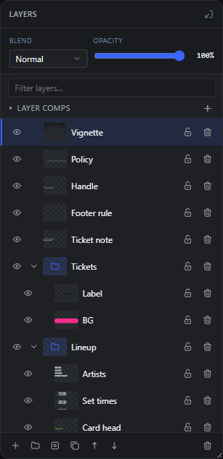
Layers are listed top-first: the layer at the top of the list sits in front of the ones below it. Groups can be expanded to show their indented children.
Each row carries a visibility toggle, an optional group caret, a thumbnail, the name, an optional mask chip, a lock toggle, and a delete button. Clicking a row selects it; right-clicking opens the context menu.
Select layer (click)
#Clicking a row makes that layer the active layer, so the header, tools, and properties all act on it. Press Enter on a focused row to do the same.
Add to selection (Shift / Cmd / Ctrl click)
#Hold Shift, Cmd, or Ctrl while clicking to add or remove a layer from a multi-selection. Selecting several layers lets Group, Convert to Smart Object, and other actions work on all of them at once.
Show / Hide layer (eye)
#The eye icon toggles the layer's visibility on the canvas. A hidden layer is dimmed in the list and is not exported. Each toggle is a separate undo step.
Expand / Collapse group (caret)
#Only groups show this triangle. Click it to open the group (revealing its indented children) or close it. Non-group rows show an empty gutter so thumbnails stay aligned.
Layer thumbnail
#A small preview of the layer's content (groups show a folder icon instead). Double-click a thumbnail to zoom the canvas to that layer's area.
Tip. Double-click: zoom to layer.
A small badge on the thumbnail marks a layer as a Smart Object, meaning its original content is preserved and can be edited non-destructively. Hovering shows the label Smart Object.
Data binding badge (link)
#A link badge on the thumbnail shows the layer is bound to dynamic content (such as {{post.title}}). Hovering reveals which field it is linked to.
Clipping indicator (arrow)
#A small down-arrow to the left of a clipped layer shows it is being masked by the layer directly beneath it. Set or remove it with Create/Release Clipping Mask.
Color label stripe
#A colored bar on the left edge of a row shows the color label assigned to that layer, for visually sorting or grouping related layers. Set the color from the right-click menu's Label row.
Layer name
#Shows the layer's name. Double-click the row to turn it into an edit box; type a new name and press Enter (or click away) to save, or Escape to cancel.
Tip. Double-click a layer to rename it.
Mask chip
#Appears only when the layer has a layer mask. Click it to enter mask-edit mode (the tool switches to a brush): paint white to reveal, black to hide, with a red overlay marking hidden areas. Alt-click the chip to disable or re-enable the mask; a disabled mask is shown dimmed.
Tip. Entering a mask hands you a brush automatically.
Lock / Unlock layer
#Toggles a lock that protects the layer from edits and moves on the canvas. It is not a write protection for everything: the Transform fields in the Properties panel and Delete still act on a locked layer. The icon shows a closed padlock when locked and an open one when unlocked.
Delete layer (row trash)
#Removes just this layer immediately. This is the per-row trash button; the toolbar and context menu also offer a Delete that respects the current multi-selection.
Drag to reorder
#Drag a row up or down to restack it. A line above or below the target shows where it will land; dragging onto the middle of a group (a dashed outline appears) drops the layer inside that group. Remember the top of the list is the front of the image.
Bottom toolbar 7 items #
The row of buttons at the foot of the panel for creating, duplicating, restacking, masking, and deleting layers.
Every button except Add layer and New group is disabled until a layer is active.
These are quick equivalents of the most common right-click actions.
Add layer
#Creates a new, empty raster layer the size of the document and places it just above the active layer. New layers are named Layer 1, Layer 2, and so on.
New group
#Creates a new group folder. If layers are selected, they are moved into the new group so you can organize related layers together.
Add mask
#Adds a layer mask to the active layer. With no selection it adds a white (reveal-all) mask; with an active selection the selected area becomes visible and the rest is hidden. Disabled when no layer is active.
Duplicate
#Makes a copy of the active layer (or the whole selection, groups included) directly above the original. Disabled when no layer is active.
Move up
#Brings the active layer one step forward in the stack (up the list, toward the front of the image). Disabled when no layer is active or it is already on top.
Move down
#Sends the active layer one step backward in the stack (down the list, toward the back of the image). Disabled when no layer is active or it is already at the bottom.
Delete
#Removes the active layer or the whole current selection. Disabled when no layer is active.
Copy Styles and Paste Styles Free 2 items #
Transfer a layer's whole appearance (opacity, blend mode, filters, adjustments, and effects) onto other layers, even in another tab.
These two actions are reached by right-clicking a layer on the canvas or from the Edit menu, and they pair with the Layers panel to reuse a look across layers.
Copy Styles remembers the active layer's appearance. Paste Styles applies it to every selected layer: the universal fields (opacity, blend mode, filter, adjustments, and effects) always transfer, while type-specific paint (text character styling, shape fill and stroke, and their gradients or patterns) only transfers when the target is the same kind of layer. The layer's actual content, position, and size are never changed.
Copy Styles
#Remembers the active layer's whole appearance: its opacity, blend mode, photo filter, adjustments, and layer effects, plus type-specific styling. The copied look is shared across tabs, so you can paste it onto a layer in another open document.
Paste Styles
#Applies the last copied look to every selected layer. Universal fields (opacity, blend, filter, adjustments, effects) always land; text or shape paint (fonts, colors, strokes, gradients, patterns, text effects) transfers only when the target matches the source layer's type.
Save Layer Comp dialog Free 1 item #
The small dialog that names a new layer comp before it is saved.
When you click the + in the Layer Comps header, this dialog opens so you can name the snapshot you are about to save. A layer comp records the current visibility, position, and layout of every layer, so you can save several arrangements of the same document and switch between them later.
This dialog is the only step between clicking + and the comp appearing in the list.
Name
#The text field for naming the layer comp you are about to save. It is pre-filled with a running name like Layer Comp 1 that counts up with each new comp, and you can type over it with anything you like. Confirming with an empty name cancels the save.
Tip. The name shows on the comp's Apply button in the list.
Layer color labels Free 2 items #
The color chips in the right-click menu that tint a layer row for visual grouping.
The Label row at the top of a layer's right-click menu holds six preset colors plus a clear option. Picking one paints a thin colored stripe down the left edge of that layer's row.
Labels are purely visual. They help you flag or group layers by meaning (for example all text layers or all backgrounds) without renaming anything.
Label color swatches
#Six preset colors you can assign to a layer as a visual tag. Click a swatch to stripe that layer's row in the chosen color. From left to right the colors are red, orange, yellow, green, blue, and purple.
Tip. The stripe appears as an inset bar on the left edge of the layer row.
No label (∅)
#The empty swatch marked with ∅ at the end of the Label row. Click it to remove any color label and return the row to its normal, unstriped look.
Layer row extras and shortcuts Free 7 items #
Double-click, right-click, and modifier-click gestures on a layer row that are not shown as buttons.
Beyond the visible eye, lock, mask, and trash buttons, each layer row responds to a few hidden gestures. These follow common Photoshop habits, so they are easy to miss unless someone points them out.
All of these act on the row you interact with, and the ones that change the document are recorded in history so you can undo them.
Rename layer
#Double-click a layer's name to turn it into an editable field, then type a new name. Press Enter or click away to keep the change; press Escape to cancel. Renaming is saved in history so it can be undone.
Tip. While you are renaming, the row cannot be dragged.
Double-click: zoom to layer
#Double-click a layer's thumbnail to zoom the canvas so that layer fills the view. The editor frames it with roughly 15% padding on each side. This is a quick way to jump to a small element without scrolling and zooming by hand.
Tip. Only image and content layers have a zoomable thumbnail; groups show a folder icon instead.
Open layer menu
#Right-click any layer row to open its context menu, which holds actions like Duplicate, Merge Down, masks, grouping, and Delete. If you right-click a layer that is part of a multi-selection, the whole selection is kept so the action applies to all selected layers; right-clicking a layer that is not selected picks just that one first.
Alt-click mask chip
#Hold Alt and click a layer's mask chip to disable or re-enable its mask without deleting it. A disabled mask dims to about 40% and stops hiding pixels. A plain click instead enters mask paint mode and hands you the Brush, where white reveals and black hides, with hidden areas shown under a red overlay.
Tip. The same enable/disable also lives in the right-click menu.
Drop into group
#While dragging a layer, hover over the middle of a group row until it shows a dashed outline, then release to move the layer inside that group. Dropping near the top or bottom edge of a row instead places the layer above or below that row.
Select with keyboard
#A layer row can take keyboard focus; press Enter while it is focused to make that layer the active layer. This lets you move through the list and pick a layer without using the mouse.
Group folder icon
#Groups do not show a picture thumbnail. Instead they show a folder icon in the thumbnail slot, so you can tell groups apart from image and content layers at a glance.
Tip. Use the caret next to it to expand or collapse the group's contents.
Adjustments (tonal sliders) Free 12 items #
The Adjust panel's tonal controls: three one-click auto corrections and seven live sliders that color-grade the selected layer without altering its pixels.
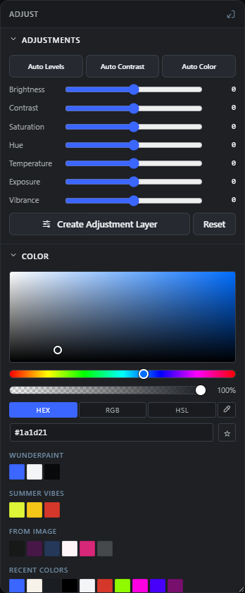
The Adjustments block lives in the Adjust tab. Every slider here is non-destructive: the values are stored on the layer's adjust object and re-render live, so you can drag them back to zero at any time with no quality loss.
All controls need an active layer. With nothing selected the sliders and auto buttons are disabled. A slider's read-out shows a + in front of positive values (for example +30).
Auto Levels
#One-click tonal fix that stretches each color channel (red, green, blue) to use the full black-to-white range. Use it to instantly brighten a flat, dull or slightly washed-out photo.
Tip. On a Smart Object this lands as a re-editable Smart Filter; on other layers it is applied to the pixels.
Auto Contrast
#Stretches overall brightness to the full range using a single luminance curve, so color relationships stay intact. Choose this over Auto Levels when Auto Levels introduces an unwanted color cast.
Auto Color
#Automatic white balance using a gray-world estimate, damped so it never overshoots. Use it to neutralise a color cast (for example an overly orange indoor shot or a blue snow scene).
Brightness
#Lightens or darkens the whole layer evenly. Move right to brighten, left to darken.
Contrast
#Increases or decreases the difference between light and dark tones. Higher values make shadows deeper and highlights brighter; lower values flatten the image.
Saturation
#Controls how intense every color is, uniformly. Drag right for richer color, drag all the way left for grayscale.
Hue
#Rotates every color around the color wheel by the chosen number of degrees. Use it to shift the whole palette (for example turn reds toward orange or blue toward teal).
Temperature
#Warms or cools the image. Positive values push toward warm orange tones, negative values toward cool blue tones.
Exposure
#Simulates giving the shot more or less light, biased toward the highlights. Use it to rescue an under- or over-exposed image.
Vibrance
#A gentler saturation that boosts muted colors more than already-saturated ones, protecting skin tones from going neon. Reach for this before Saturation when you want a natural lift.
Create Adjustment Layer
#Bakes the current slider settings into a new full-canvas Adjustment Layer placed above the active layer, then clears the layer's own adjustments. Use it to grade everything below it and keep the grade editable and re-orderable in the Layers panel.
Reset
#Clears all seven sliders on the active layer back to zero in one step, removing the whole adjustment. Disabled when no layer is selected.
Color (fill / foreground picker) Free 2 items #
The Adjust panel's color block: a full embedded color picker plus a one-click gradient-fill gallery for shape and text layers.
The Color section carries a full embedded color picker. What it edits depends on selection: with a shape layer selected it sets that shape's fill; with a text layer selected it sets the text color; with anything else (or nothing) selected it sets the toolbar foreground color.
Picking a solid color on a layer that currently has a gradient or pattern fill switches that fill back to solid so the color actually shows.
Color picker
#The embedded picker with an HSV field, hex / RGB / HSL inputs, an alpha (transparency) control and every swatch group. Drag in the field or type a value to choose a color; it applies immediately to the selected shape fill, text color, or the foreground color.
Gradient fill
#A grid of ready-made gradient swatches that appears only when a shape or text layer is selected. Click one to fill the layer with that gradient in a single step; shapes receive a linear gradient by default.
Filters (preset looks) Free 18 items #
A grid of one-click preset filters that layer a live, non-destructive CSS look over the active layer, previewed on a thumbnail of that layer's own content.
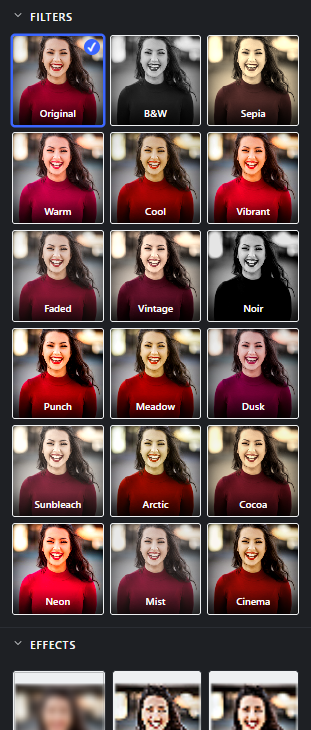
Filters live on the Effects tab. Each chip shows a small preview of your actual layer with the look applied. Clicking a chip stores the choice on the layer (as its filter), so it is fully non-destructive and re-editable, and only one preset filter is active at a time (a new choice replaces the old).
Filters are CSS looks (they combine grayscale, sepia, saturate, contrast, brightness and hue-rotate). The same chips also appear in Easy Mode.
Original
#The unfiltered layer. Click it to remove any preset filter and return to the untouched look.
B&W
#Full black-and-white by removing all color. Use it for a clean monochrome look.
Sepia
#A warm brown antique tone with slightly boosted contrast, for an aged photo feel.
Warm
#Pushes colors warmer and richer with a small brightness lift. Good for cosy, sunlit scenes.
Cool
#Shifts colors toward cooler blue-green and dims very slightly. Suits crisp, modern or wintry looks.
Vibrant
#Strongly boosts saturation and contrast for a punchy, colorful result.
Faded
#Lowers saturation and contrast and lifts brightness for a soft, washed-out matte look.
Vintage
#A retro film treatment: mild sepia, reduced saturation, added contrast and a slight warm hue shift.
Noir
#High-contrast black-and-white with a slightly darker exposure, for a dramatic cinematic mood.
Punch
#Adds contrast and saturation with a tiny brightness lift for a crisp, energetic image.
Meadow
#A fresh green-leaning look with a warm hue shift and gentle contrast and brightness lift. Suits nature and outdoor shots.
Dusk
#A cooler, moodier evening grade: reduced saturation, warm-to-cool hue shift, higher contrast and lower brightness.
Sunbleach
#A bright, over-exposed summer look: low saturation and contrast, strong brightness lift and a touch of sepia.
Arctic
#A cold, airy blue grade with a hue shift, extra brightness and slight contrast. Good for snow and icy scenes.
Cocoa
#A rich warm-brown tone with boosted saturation and contrast and a slightly darker exposure.
Neon
#An extreme saturation and contrast boost with a warm hue shift for a bold, electric look.
Mist
#A soft, hazy look: low saturation and contrast with lifted brightness, as if seen through fog.
Cinema
#A movie-style teal-and-warm grade with added contrast, gentle saturation, slightly darker exposure and a hint of sepia.
Effects (pixel effects) Free 27 items #
A grid of pixel-level effects, each shown as a rendered thumbnail of your layer; effects with settings open a parameter popover, effects without settings apply on click.
Effects live on the Effects tab, below Filters. Each chip renders a preview of the active layer with the effect at its default settings. Effects with adjustable parameters open a settings popover when clicked; effects with no parameters (Invert, Auto Levels, Auto Contrast, Auto Color) apply immediately.
On a Smart Object these are applied as non-destructive Smart Filters that stay re-editable. On any other layer they are applied destructively, and vector layers (shape / text) rasterize first. Installed extensions can add their own effects to this grid.
Gaussian Blur
#Smoothly blurs the layer using a high-quality Gaussian (three box-blur passes). Use it to soften detail, create depth, or build a backdrop.
Sharpen
#Increases edge crispness with a Laplacian sharpen. Use a light amount to recover detail; high amounts add bite but can look harsh.
Unsharp Mask
#Professional sharpening that boosts only edges above a threshold, using a blurred copy as the mask. Gives cleaner, more controllable sharpening than plain Sharpen.
Box Blur
#A fast, uniform box blur. Cheaper than Gaussian and gives a slightly boxier softening; handy for quick backgrounds.
Noise / Grain
#Adds random grain. Keep size at 1 for fine digital noise, or raise it for chunkier film grain. Turn on Monochrome so the grain has no color speckle.
Pixelate
#Averages the image into square blocks for a blocky, low-resolution mosaic. Larger cells give bigger pixels; often used to censor a region.
Posterize
#Reduces each channel to a small number of tone levels, flattening smooth gradients into bands for a poster or screen-print look.
Threshold
#Converts the layer to pure black and white by cutting at a brightness level: pixels brighter than the level go white, the rest go black.
Invert
#Inverts every color to its opposite, creating a photo-negative. Applies instantly with no settings.
Gamma
#Brightens or darkens the midtones without moving pure black or white. Values above 1 lift midtones; below 1 deepen them.
Duotone
#Maps the layer's brightness between two chosen colors: shadows take the shadow color, highlights the highlight color. Great for two-tone poster art.
Levels
#The classic Levels control: remap the input black/white points and midtone gamma, and clamp the output range. Use it for precise contrast and tonal placement.
Curves
#The Curves tool: bend a smooth tone curve through your own control points for fine, arbitrary tonal and contrast control. Starts as a straight identity line.
Vignette
#Darkens (or lightens) the edges toward the corners to draw the eye to the centre. A positive amount darkens; a negative amount brightens the edges.
Tilt-Shift
#Keeps a horizontal band in sharp focus and blurs above and below it, faking a shallow-depth miniature look. Position the band and set how wide and how strong the blur is.
Color Splash
#Keeps only colors near a chosen hue and turns everything else grayscale. Pick the hue to preserve and how wide a range around it survives.
Halftone
#Recreates a printed halftone: brightness becomes a grid of black dots that grow in dark areas. Set the dot spacing and the screen angle.
Glitch
#A digital-corruption look: shifts the red and blue channels, slices rows sideways in random blocks, and can darken alternate lines. Change the seed for a different random variant.
Glow
#Adds a soft luminous bloom by screening a blurred copy back over the image, making bright areas glow. Set the spread (radius) and how strong the glow is.
Emboss
#Turns the image into a gray relief where edges look raised or carved, lit from a corner. Strength controls how pronounced the relief is.
Edge Detect
#Finds and highlights outlines with a Sobel filter, drawing edges bright on black. Use it for line-art or sketch bases.
Shadows / Highlights
#Independently lifts or deepens the darkest areas and recovers or boosts the brightest, weighted by how dark or light each pixel is. Ideal for opening up shadow detail while taming blown highlights.
Denoise
#Removes speckle and noise with a median filter, smoothing flat areas while keeping edges. Raise strength for more passes on very noisy images.
Auto Levels
#The same per-channel auto tone stretch as the Adjust panel's button, offered here as an effect chip. Applies instantly with no settings.
Auto Contrast
#The same luminance contrast stretch as the Adjust panel's button, as an effect chip. Applies instantly with no settings.
Auto Color
#The same gray-world white balance as the Adjust panel's button, as an effect chip. Applies instantly with no settings.
Color LUT
#Applies a 3D color lookup table (a .cube LUT) for a one-shot cinematic grade. This effect is hidden from the grid and is added through the Load LUT (.cube) import rather than clicked here; its intensity mixes the graded result back with the original.
Tip. The LUT table itself comes from the imported .cube file, not from a slider.
Text Styles (one-click looks) Free 87 items #
A gallery of ready-made text looks that appears only for text layers; each tile is previewed with your own text and applies a complete fill, outline and effect combination in one click.
Text Styles show at the top of the Effects panel when a text layer is selected. Every tile renders using your layer's own text and font, so the preview is the result. Clicking a tile replaces the layer's current effects with that style's fresh combination of fill, outline and text effects.
Everything stays non-destructive: after applying a style you can fine-tune it in Character, Text Effects and Warp.
Plain
#Strips every text effect, outline, shadow and gradient back to a clean solid fill. Use it to start over.
Sticker
#A red fill wrapped in a white-then-dark double outline, like a cut-out sticker.
Comic
#Bold yellow letters with a dark outline, a double ring and a halftone dot shadow, for a comic-book caption.
Gold
#A polished gold gradient fill with a dark-gold outline and a soft bevel for a metallic sheen.
Chrome
#A cool silver chrome gradient with a dark outline and bevel, for a shiny metal finish.
Neon
#White letters with a hot-pink neon glow, mimicking a glowing sign or tube light.
Fire
#A yellow-to-red flame gradient with an orange glow, for a hot, burning headline.
Ice
#A cool blue gradient with a white outline and a pale blue glow, for a frozen, icy look.
Retro 3D
#Cream letters extruded into a teal 3D block shadow and slightly skewed, for a retro poster feel.
Flat shadow
#A blue fill with a long, flat 45-degree drop shadow, the classic flat-design long-shadow look.
Print offset
#A dark fill with a cyan mis-registered offset and a small echo, imitating a risograph print.
Letterpress
#Soft gray letters pressed inward with a debossed highlight and shadow, like ink stamped into paper.
Playful
#Rainbow-cycling colors with bouncy per-letter jitter, for a fun, kid-friendly title.
Reflection
#White letters with a mirrored reflection below and a soft shadow, for a glossy glass look.
Wave
#Blue outlined letters warped into a wave with a small drop shadow, for a flowing banner.
Glitch
#Pale letters with chromatic RGB fringing and sliced glitch distortion, for a broken-signal look.
VHS
#Cyan-tinted letters with chromatic offset, scanlines and a soft glow, imitating an old VHS tape.
Rubber stamp
#Red letters with a rough grunge texture and a slight skew, like an inked rubber stamp.
Standing
#Warm gradient letters with a bevel, a diagonal shine and a slanted ground shadow, so the text appears to stand upright on a surface.
Neon sign
#Hollow tube letters with a glowing pink neon-tube stroke and no solid fill, like a wired sign.
8-bit arcade
#Pixelated yellow letters extruded into a short 3D block, for a retro arcade game title.
Slime
#Green letters with dripping blobs and an inner glow, for a gooey slime effect.
Speed
#Red outlined letters with a horizontal motion blur and forward skew, so the text looks like it is rushing past.
Highlight
#Dark letters over a rough yellow marker highlight, as if swiped with a highlighter pen.
Paper cut
#Dark letters sitting on a soft rounded paper card with a subtle drop shadow, for a layered paper-craft look.
Party
#Rainbow letters with jitter and scattered confetti, for a celebratory, festive title.
Candy
#Pink letters with diagonal candy stripes and a double ring outline, for a sweet, playful look.
Vegas marquee
#Dark red letters studded with glowing golden bulbs, straight off a casino front.
Scoreboard
#Red LED pixels on a dark chip, the stadium display look.
Blueprint
#Pale hollow glyphs with a technical grid inside, like a construction drawing.
Varsity
#Blue letters with a white inline and a red outer outline, the college-jersey classic.
Knockout
#The text punched as holes out of a dark rounded panel.
Origami
#Sky-blue paper facets with a teal block shadow, like folded paper.
Off air
#TV static inside the letters with color-fringed ghosting and scanlines.
Comic shade
#Bright comic lettering with a dark halftone shade, outline and block depth.
Checkerboard
#A black-and-white checker fill with a clean outline.
Topography
#Deep green letters ringed by contour lines, like a trail map.
Sparkle gold
#Gold foil with white star glints on top.
Rose gold
#A soft rose metal ramp with a gentle gloss streak.
Silver
#A cool chrome ramp with subtle sparkles.
Vaporwave
#A pink-to-cyan gradient with color fringing and scanlines, the retro-web aesthetic.
Cyberpunk
#Acid yellow with glitch slices and a cyan offset ghost.
Graffiti
#Spray-grain orange with a heavy outline, drips and a tag-style slant.
Western
#Saddle-brown letters with a cream inline and block depth, the saloon-poster look.
Neon blue
#A glowing blue neon tube on hollow glyphs.
Neon mint
#A glowing mint-green neon tube on hollow glyphs.
Bubble pop
#Glossy pink candy letters with inner glow and a dotted offset shadow.
Honey
#An amber gradient with dripping edges and a syrupy shine.
Lava
#A fire gradient with a hot glow and molten red drips.
Newsprint
#A black-and-red misprint: the ink plate shifted off its outline plate.
Stamped
#Weathered red ink with a stitched outline, like a rubber stamp.
Kawaii
#Pastel pink with white-and-blue rings, sparkles and a soft inner glow.
Disco
#A lilac chrome ramp with purple speed rays and sparkles.
Racing
#A checkered-flag fill with a slant and a motion blur trail.
Midnight
#A deep blue gradient under tiny white stars with a soft blue glow.
Frost
#Icy pale blue with a white inner glow, cold outer glow and frost sparkles.
Sunset stack
#A warm sunset gradient over stacked retro offset shadows.
Ocean
#Wavy blue water bands inside the letters with a reflection below.
Mermaid
#Teal-to-violet wave bands with sparkling glints.
Soda
#An orange fizz gradient full of rising bubbles.
Champagne
#Warm gold foil with fine rising bubbles.
Stone
#A gray rock ramp with cracks and a chiselled bevel.
Iceberg
#Pale ice with blue fracture lines and a cold glow.
Sale seal
#White text on a red starburst badge, ready for price tags.
Price star
#Dark text on a yellow starburst, the supermarket price flash.
Editorial
#Plain dark text whose shadow is drawn as diagonal hatching.
Love note
#Pink letters filled with tiny white hearts.
Starry
#Navy letters filled with little golden stars.
Circuit
#Green circuit traces on a dark board with a phosphor glow.
Terminal
#Green LED pixels on black, the retro terminal screen.
Army
#A camouflage fill with a weathered stencil edge.
Highland
#A red-and-navy tartan weave fill.
Gingham
#A light red-and-white picnic check.
Poolside
#An aqua gradient warped by a gentle water ripple.
Mirage
#A desert-heat gradient that shimmers and fades upward.
Gold ring
#Dark letters wrapped in a golden gradient outline.
Neon ring
#Dark letters wrapped in a cyan-to-magenta gradient ring with a violet glow.
Retro diner
#Cream letters with a maroon inline and a teal offset shadow, 50s diner style.
Bumblebee
#Bold yellow-and-black horizontal stripes.
Hazard
#Diagonal yellow-and-black warning stripes with block depth.
Peppermint
#Red-and-white candy stripes with a green dotted shadow.
Galaxy
#A violet nebula gradient with star glints and a purple glow.
Denim
#A fine indigo twill fill with orange stitch dashes.
Chalk
#Rough white strokes with a dusty, hand-drawn edge.
Horror
#Blood-red letters dripping over a dark aura.
Golden ticket
#Dark text on a golden starburst with sparkles.
Boom
#Comic-yellow letters on red speed rays with a tilted block shadow.
Text Effects Free 72 items #
A large gallery of individual, stackable text decorations for text layers; clicking a tile switches the effect on with sensible defaults and opens its settings card over the canvas.
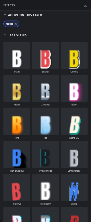
Text Effects appear for text layers, below Text Styles. Each tile is previewed on a single large glyph so the effect is clearly visible. Clicking a tile turns that effect on and opens a floating settings card on the canvas with its sliders and color rows; an active tile re-opens its card. Effects are removed from inside their card, not by re-clicking the tile.
Effects are non-destructive and stack, and the text stays fully editable. The ranges below come from each effect's settings card.
Long shadow
#Casts a long, solid drop shadow at an angle behind the text, the flat-design long-shadow look.
Block shadow
#Extrudes the letters into a solid 3D block projected at an angle, for depth and weight.
Glow
#Adds a soft colored glow (outer halo) around the letters.
Echo
#Repeats fading copies of the text stepped in one direction, for a trailing echo effect.
Skew
#Slants the whole text horizontally and/or vertically for an italic or leaning look.
Outline
#Draws a single colored stroke around the letters.
Neon
#A bright glowing neon halo in a chosen color, stronger than the plain Glow.
Splice
#Offsets a colored copy of the letters and knocks it out where they overlap, for a sliced two-part look.
Halftone
#Casts a shadow made of halftone dots offset behind the text, for a printed comic feel.
Reflection
#Mirrors a fading copy of the text beneath it, like a reflection on glass.
Multi outline
#Wraps the text in two to five concentric colored outlines (rings). The first three carry their own color; further rings continue the outermost one.
Bevel
#Adds a beveled highlight-and-shadow edge so the letters look raised.
Letterpress
#Presses the letters inward with a subtle top shadow and bottom highlight, like ink debossed into paper.
Image fill
#Fills the letters with an image or texture of your choice instead of a flat color. Pick the image in the settings card.
Letter dance
#Randomly rotates and offsets each letter for a lively hand-placed look. Change the variant for a different arrangement.
Color cycle
#Colors the letters across a rainbow gradient. No settings; it just switches on.
Chromatic
#Splits the red and blue channels apart for a chromatic-aberration RGB fringe.
Glitch
#Slices the letters into shifted horizontal bands for a digital glitch. Change the variant for a new random cut.
Shine
#Sweeps a bright diagonal shine band across the letters, like a glint on metal or glass.
Scanlines
#Overlays evenly spaced horizontal lines across the text for a CRT screen or retro look.
Grunge
#Eats away at the letters with a rough noise texture for a distressed, worn look.
Stitch outline
#Draws a dashed outline around the letters, like a sewn stitch or cut line.
Inner glow
#Adds a colored glow inside the edges of the letters rather than outside.
Neon tube
#Turns the letters into hollow glowing tubes, like bent neon-sign glass.
Motion blur
#Smears the letters in one direction to suggest speed or movement.
Marker
#Draws a rough hand-drawn highlighter swipe behind the text. Change the variant for a different rough stroke.
Circle mark
#Draws a rough hand-drawn circle or ellipse around the text, as if circled by pen.
Scribble line
#Adds a rough hand-drawn scribbled underline beneath the text.
Paper cut
#Places the text on a rounded card with a soft shadow, for a layered paper-cut look.
8-bit
#Pixelates the letters into blocky low-resolution squares for a retro game look.
Sketch
#Redraws the letter outlines as loose hand-sketched pen strokes with multiple passes.
Confetti
#Scatters small colorful confetti pieces around the text for a festive feel.
Stripes
#Fills the letters with repeating diagonal stripes in up to three colors.
Drip
#Drops liquid drips down from the bottom of the letters, like paint or slime.
Ground shadow
#Lays a squashed, slanted, blurred shadow on the ground under the text so it appears to stand up.
Gradient
#Fills the letters with a two-color gradient at any angle.
Chrome
#Gives the letters a shiny reflective chrome finish with adjustable shine, contrast and tint.
Comic dots
#Fills the letters with halftone comic dots over a solid background color.
Spray
#Sprays a grainy stippled texture over the letters, like airbrush or spray paint.
Highlight
#Places a clean rounded highlight block behind the text, like a highlighted label.
Underline
#Adds an underline beneath the text with a choice of styles, thickness and offset.
Sticker
#Wraps the text in a thick colored sticker border with a drop shadow, like a cut-out sticker.
Speed lines
#Radiates comic-style burst lines outward from the text for energy and impact.
Two tone
#Splits the letter fill into two colors across an adjustable dividing line.
Gold foil
#Adds a metallic gold-foil tint with small sparkle highlights. Change the variant for different sparkle placement.
Retro stack
#Stacks up to three offset color copies behind the text for a layered retro poster shadow.
Misprint
#Offsets a thin colored outline copy off-register, imitating a misaligned print run.
Fade
#Fades the text to transparent across a chosen direction for a soft dissolve.
Soft blur
#Applies a gentle blur to the whole text, for a soft or out-of-focus look.
3D
#Renders the letters as a full 3D extrusion with separate top and bottom face colors, a depth (side) color and a shine border.
Sparkles
#Scatters seeded four-point star glints across the letter faces, like catchlights on something shiny.
Inline
#Draws a thin contour line inset inside the glyph edges, the classic varsity-jersey lettering look.
Contour lines
#Rings the letters with up to four concentric hollow outlines marching outward, like elevation lines on a map.
Marquee lights
#Places glowing light bulbs along the glyph edges, the fairground and casino marquee look.
Knockout
#Punches the letters as holes out of a rounded panel, so whatever lies beneath shows through the text.
Checker fill
#Fills the letters with a two-color checkerboard pattern.
Halftone shade
#Shades the letters with a comic dot screen that grows denser toward one side.
TV static
#Fills the letters with seeded monochrome noise, like an analog TV with no signal.
LED board
#Rebuilds the fill as glowing round pixels on a dark chip, like a stadium scoreboard.
Origami fold
#Lays alternating light and dark facets across the letters, like folded paper catching the light.
Blueprint
#Replaces the fill with hollow outlined glyphs and a fine technical grid inside, the construction-drawing look.
Waves fill
#Fills the letters with alternating wavy horizontal bands, a stylized water look.
Motif fill
#Fills the letters with a repeating little shape of your choice: hearts, stars, plus signs or rings.
Camo fill
#Fills the letters with seeded organic camouflage blobs in four earthy tones.
Circuit board
#Fills the letters with repeating circuit traces and solder pads on a dark board.
Plaid fill
#Fills the letters with a woven tartan of crossing translucent bands and thin accent lines.
Bubbles
#Scatters fizzy little bubbles with highlights inside the letters, like a fresh soda.
Cracked
#Runs seeded branching fracture lines across the letters, for stone, ice or shattered looks.
Ripple
#Displaces the finished text in a sine wave, like its reflection in moving water or heat haze.
Star seal
#Puts a starburst badge panel behind the text, the classic price-sticker and quality-seal shape.
Hatch shadow
#Casts the drop shadow as diagonal line shading instead of a solid shape, an editorial-illustration touch.
Gradient outline
#Wraps the letters in an outline filled with a two-color gradient ramp.
Warp (text) Free 18 items #
A gallery of preset shape warps for text layers that bend the whole word along a curve while keeping the text fully editable.
The Warp section shows for text layers. Each tile previews a warp shape on your text. Clicking a shape bends the text along it (a render-time mesh distortion, so the text stays editable) and opens a floating settings card with a Bend control. Choose None to remove the warp.
Bend sets how strongly the shape is applied (it defaults to 50, and tiles preview at a fixed bend).
None
#Removes any warp and returns the text to a straight baseline.
Arc
#Bends the whole line of text along a circular arc, curving it up or down as one piece.
Arch
#Arches the text like a rainbow, raising the middle while the ends stay lower.
Arc Lower
#Curves only the bottom edge of the text into an arc while the top stays flat.
Bulge
#Swells the middle of the text outward so it looks fatter in the centre.
Squeeze
#Pinches the middle of the text inward, narrowing it toward the centre.
Flag
#Ripples the text in an S-shaped wave, like a flag waving in the wind.
Wave
#Sends the text along a smooth up-and-down wave.
Rise
#Tilts the text upward so it rises from left to right in a slanted ramp.
Fisheye
#Bulges the text as if seen through a fisheye lens, enlarging the centre.
Twist
#Rotates the text progressively along its length for a twisting ribbon effect.
Cone
#Flares the text wider at one end and narrower at the other, like a cone or funnel.
Fish
#Distorts the text into a fish or eye shape, pointed at the ends and full in the middle.
Bounce
#Pushes the bottom of the text into a bouncing curve while the top stays put.
Ripple
#Adds repeating small ripples across the text for a rippled-water look.
Melt
#Stretches the bottom of the letters downward as though the text is melting.
Perspective
#Tilts the text into a perspective plane so one end looks farther away.
Pinch
#Pulls the text inward toward a central point for a pinched, sucked-in distortion.
Adjust panel (color and slider behaviour) Free 5 items #
How the Adjust panel's color block and tonal sliders bind to whatever layer you have selected.
The Adjust panel holds the tonal sliders and the color block. A few of its behaviours are easy to miss because they depend on which layer is selected.
Color picker target
#The color block in the Adjust panel changes the fill of the selected shape, or the color of the selected text layer. With no shape or text layer selected, it sets the foreground color instead.
Tip. Pick a shape or text layer first if you want the color to land on that layer.
Solid color resets a gradient or pattern fill
#If the selected layer currently uses a gradient or pattern fill, choosing a solid color switches its fill type back to solid so the color actually shows.
Tip. Use Gradient fill again afterwards to return to a gradient.
Gradient fill swatches
#When a shape or text layer is selected, a grid of gradient preset swatches appears under the color block. Click one to fill the layer with that gradient. Shapes also receive a linear gradient direction.
Tip. Only shows when a shape or text layer is selected and gradient presets exist.
Live per-layer adjustments
#The Brightness, Contrast, Saturation, Hue, Temperature, Exposure and Vibrance sliders apply live to the selected layer and stay non-destructive. Create Adjustment Layer moves them onto a separate full-canvas layer, and Reset clears them.
Tip. Positive slider values show with a leading plus sign in the value readout on the right.
Sliders and Auto buttons need a selected layer
#The seven adjustment sliders and the Auto Levels, Auto Contrast and Auto Color buttons are disabled until you select a layer, because they act on the active layer.
Effects panel (how looks apply) Free 6 items #
The rules behind the Filters, Effects and text look tiles: previews, parameter dialogs, and destructive versus non-destructive application.
Every tile in the Effects panel previews the real result and clicking one applies it. Whether the result is baked into pixels or kept editable depends on the layer type.
Live preview thumbnails
#Every filter, effect, text style and warp tile shows a small thumbnail rendered from your actual selected layer, so the tile previews the real result before you click.
Tip. Previews are cached per layer, so re-selecting a layer shows them instantly.
Effect settings dialog
#Clicking an effect that has adjustable parameters opens a settings dialog so you can tune it before applying. On a plain raster layer an effect without parameters applies immediately; on text, shape, group, generator and QR layers it first asks whether to convert the layer to a Smart Object, keeping it editable, or to bake it to pixels.
Applied as non-destructive Smart Filters
#When the selected layer is a Smart Object, effects are added as Smart Filters that stay non-destructive. This note appears under the Effects grid so you know the effects can be re-edited or removed later.
Tip. Convert a layer to a Smart Object first to keep its effects editable.
Applied destructively (vector layers rasterize first)
#On a normal (non-smart) layer, effects are baked into the pixels. For a vector layer such as text or a shape you are asked first: convert it to a Smart Object and the effect stays editable along with the text, or choose Apply to pixels and the layer is rasterized, which fixes its content. This note appears under the Effects grid for non-smart layers.
Text Styles, Text Effects and Warp appear for text layers
#The Text Styles, Text Effects and Warp sections only appear when a text layer is selected. The Filters and Effects sections are always shown for any renderable layer.
Tip. Text Styles are one-click looks that you can fine-tune afterwards in Character, Text Effects and Warp.
Select a layer to apply filters and effects
#With nothing selected, the Effects panel shows this prompt instead of the tiles. Select a layer to enable the filters, effects and text looks.
Warp settings (Bend) Free 2 items #
The strength control for text warps, which lives in a floating card over the canvas rather than inline in the panel.
Picking a warp shape tile bends the text along that shape. The amount of bend is set in a small settings card that floats over the canvas.
Bend
#Bend sets how strongly the chosen warp shape distorts the text. Higher values curve, arch or wave the text more. The text stays fully editable because the warp is a render-time mesh distortion.
Tip. Pick a warp shape tile first, then the settings card with the Bend control opens over the canvas.
Warp settings card
#Choosing any warp shape opens a small settings card floating over the canvas that holds the Bend control. Re-picking the active shape re-opens the card, and choosing None removes the warp entirely.
Transform Free 9 items #
Move, resize, rotate, scale, flip and reset the selected layer or group.
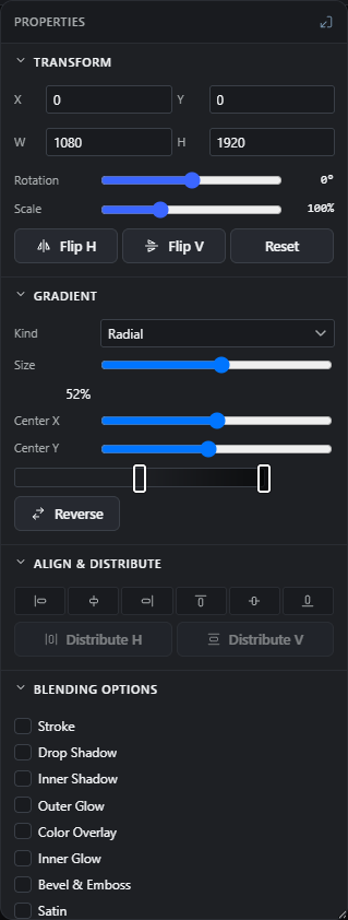
The Transform section sits at the top of the Properties panel for every layer type. For a single layer the boxes show that layer's own position and size. For a group they show the combined bounding box of all its members, so editing X/Y moves everything together and flips mirror the whole unit about its shared centre.
Numeric fields accept typed values, and their labels (X, Y, W, H) are drag-to-scrub: press on the label and drag left or right to change the value smoothly.
X
#Horizontal position of the layer's top-left corner, in canvas pixels. Type a number or drag the X label to scrub. For a group it shifts every member by the same amount so their spacing stays intact.
Tip. Drag the X label left or right to nudge the value without opening a slider.
Y
#Vertical position of the top-left corner, in canvas pixels. Type or scrub the Y label. Moving a group shifts all its members together.
W
#Width of the layer in pixels. Type a value or scrub the W label. Disabled for groups, because a group has no real box of its own; resize a group with the Scale slider instead.
H
#Height of the layer in pixels. Type or edit directly. Disabled for groups.
Rotation
#Rotates the layer around its own centre. 0° is upright, negative values turn it counter-clockwise. For a group the slider is a relative nudge that spins every member around the group's shared centre and snaps back to 0° when you release it.
Tip. On a group there is no single stored angle, so the slider always returns to 0° after each turn.
Scale
#Grows or shrinks the layer about its centre as a live percentage, then snaps back to 100% on release so it reads as a relative nudge rather than a fixed size. Text scales its font size along with the box, and a group scales all members about their shared centre so the whole group grows uniformly.
Tip. This is the way to resize a group, since W and H are disabled for groups.
Flip H
#Mirrors the layer left to right. On a group it mirrors every member about the group's centre. Click again to flip back.
Flip V
#Mirrors the layer top to bottom. On a group it mirrors all members about the group centre. Click again to undo.
Reset
#Clears rotation and both flips in one click, returning the layer to upright and unmirrored. Its tooltip reads Reset rotation and flips.
Tip. Also clears any stored 90-degree quadrant rotation on the layer.
Fill & Stroke (shapes) Free 14 items #
Set how a shape layer is filled and outlined, plus corner rounding and polygon or star point counts.
The Appearance section appears for shape layers (rectangle, ellipse, polygon, star and custom paths). It controls the fill (a flat color, a gradient, or a repeating pattern), the stroke color and thickness, and shape-specific geometry like corner radius and the number of sides or points.
The gradient and pattern sub-controls here are the same ones used by the text Fill toggle in the Character section.
Fill
#Chooses how the shape is filled. Solid is one flat color, Gradient blends between color stops, and Pattern tiles a repeating motif. Switching to Gradient or Pattern the first time seeds sensible defaults (a two-stop gradient, or the dots pattern).
Color
#The solid fill color, shown when Fill is set to Solid. Click the swatch to pick a color, or type a CSS color value (for example a hex code) in the text box next to it.
Type
#The gradient style, shown when Fill is set to Gradient. Linear runs in a straight line, Radial spreads out from the centre, and Angle (conic) sweeps around like a color wheel.
Gradient
#The gradient bar with draggable color stops. Drag a stop to move it, click the bar to add a stop, and click a stop to recolor it. This defines the colors the fill blends between.
Angle
#Direction of a linear or angle gradient, in degrees. Hidden for radial gradients (which have no direction). Slide from 0° to 360° to rotate the color flow.
Pattern
#Picks the repeating motif used to fill the shape, shown when Fill is set to Pattern. Choosing None falls back to the dots pattern.
Pattern scale
#Zooms the pattern tile in or out as a percentage of its natural size. Higher values make the motif larger and more spaced out.
Stroke
#The outline color drawn around the shape. Click the swatch to pick a color or type a value; leave it empty (placeholder none) for no outline.
Stroke Size
#Thickness of the outline in pixels. Scrub the label or type a number; 0 means no visible stroke. Values are clamped to whole pixels and never go below 0.
Radius
#Rounds the corners of a rectangle shape. Only shown for rectangles. Larger values give softer, more pill-like corners.
Points / Sides
#How many points a star has, or how many sides a polygon has. The label reads Points for a star and Sides for a polygon. Only shown for those two shapes.
Stroke style
#Solid, Dashed or Dotted outline for the shape, with Dash and Gap fields appearing for the dashed styles. Text outlines offer the same choice next to the outline width.
Line ends
#For line shapes (v1.300): two dropdowns pick a decoration for the start and the end of the line - Arrow, Triangle, Dot or Bar. Heads render in canvas output and SVG exports alike; dashes stop at the shaft, the heads stay solid.
Line endpoint handles
#A selected line shows two round grips on its ends instead of the eight resize handles (v1.299): drag either end to re-aim the line directly while the other end stays anchored; Shift snaps to 45° steps.
Character (text properties) Free 29 items #
Everything about how a text layer looks: font, size, weight, color, spacing, alignment, curve, outline, marker, shadow and background pill.
The Character section appears when a text layer is selected. It edits the whole layer by default. While you are inside a live rich-text edit on the canvas, the font, size, weight, color, tracking, bold, italic and underline controls instead apply to just the selected words, so you can style parts of a paragraph differently.
Some controls only appear in certain states: Justify shows only for a fixed-width text box, the Curve slider hides once text is attached to a path (replaced by path controls), and the PSD rasterized-look toggle appears only on text imported from a PSD.
Text
#A two-row text box holding the layer's words. Edit here to change the copy without double-clicking on the canvas. You can also type dynamic tokens like {{post.title}} for templates.
Font
#The typeface picker. Opens the font library so you can choose a font family for the text (or the selected words while editing).
Size
#Font size in pixels. Type a number or scrub the Size label. While editing, it sizes only the selected characters.
Wt
#Font weight (thickness), from Light to Black. Pick a numeric weight from the dropdown. Wt is short for weight.
Tip. 400 is regular, 700 is bold.
Fill
#How the letters are filled: Solid color, Gradient, or Pattern. Choosing Gradient or Pattern reveals the same Type, gradient bar, Angle, Pattern and Pattern scale controls used for shapes.
Tip. See Fill & Stroke (shapes) for the gradient and pattern sub-controls.
Color
#The text color. Click the swatch to pick a color or type a CSS/hex value. While editing, it recolors only the selected words.
Tracking
#Letter spacing: extra space added between characters. Negative values tighten the letters, positive values spread them apart.
Tip. Also called letter-spacing.
Line height
#Vertical spacing between lines, as a multiple of the font size. Lower values pack lines tighter, higher values open them up.
Curve
#Bends the whole text into an arc. 0 is a straight line; positive values curve it one way, negative values the other. Hidden once text is attached to a path.
Path start
#Where along a path the text begins, when the text is attached to a path. Slide to shift the text forward or backward along the curve.
Reverse direction
#Flips text-on-a-path to run along the other side of the curve (for example from inside to outside a circle). Only shown when text is attached to a path.
Detach from path
#Removes the text from its path so it becomes normal straight text again. Only shown when text is on a path.
Outline
#Draws a colored stroke around the letters. Pick an outline color with the swatch and set its thickness in the number box. Picking a color auto-sets a sensible width if none is set yet.
Marker
#A hand-drawn highlighter behind the words. Pick a marker color with the swatch; the Remove button next to it clears the marker. It marks whole lines by default, or just the selected words while editing.
Tip. Select words during a live text edit to mark only them.
Shadow
#Drop shadow behind the text. Tick the checkbox to switch it on, then pick a shadow color with the swatch. Choosing a color also turns the shadow on.
Background
#A colored pill or box behind the text. Pick a background color with the swatch, set the corner radius in the number box, or press None to remove it.
Tip. Use a high radius for a rounded label or badge look.
Show original rasterized look (PSD import)
#For text imported from a PSD, this checkbox shows the original flattened pixel version instead of the live editable text. Only appears when a rasterized fallback exists.
Bold
#Toggles bold on the text. Turning it on sets the weight to 700; turning it off returns to 400.
Italic
#Slants the text into an italic style. Click again to turn it off.
Underline
#Draws a line under the text. Click again to remove it.
Uppercase
#Non-destructive all-caps toggle (v1.300): layout, canvas and exports render the text in capitals while the stored text keeps its original case - switch it off and the original casing returns.
Align left
#Aligns each line of text to the left edge of the text box. This is the horizontal alignment for the lines within the layer.
Align center
#Centres each line of text horizontally within the text box, so line starts and ends are balanced around the middle.
Align right
#Aligns each line of text to the right edge of the text box.
Justify
#Stretches lines so they fill the full width of the box, adding space between words to make flush left and right edges. Only shown for fixed-width text boxes, since point text has no fixed width to stretch to.
Align top
#Vertical alignment: pins the text block to the top of its box. Use this when text should sit at the top and grow downward.
Align middle
#Vertical alignment: centres the text block between the top and bottom of its box. This is the default for auto-height (point) text.
Align bottom
#Vertical alignment: pins the text block to the bottom of its box, so it grows upward from the baseline area.
List (bullets / numbering)
#Non-destructive paragraph lists (v1.301): every non-empty line gets a bullet or its running number in canvas renders, exports and SVG, while the stored text keeps its raw form. Toggle between none, bullets and numbering.
Align & Distribute Free 8 items #
Line up and evenly space the selected layers or groups.
The Align & Distribute section shows a row of six icon buttons for alignment and two buttons for distribution. Alignment lines objects up to a shared edge or centre. Distribution spreads three or more objects out with equal gaps.
These are unit-aware: they keep grouped layers together and align the group as a single object rather than pulling its members apart.
Align left
#Lines up the selected objects so their left edges match. With two or more selected the reference is the selection's own bounding box; with a single object it is the canvas, so the object moves to the canvas edge.
Align horizontal centers
#Lines up the objects so their horizontal centres share the same vertical line. With two or more selected they centre on each other; with a single object it centres on the canvas.
Align right
#Lines up the selected objects so their right edges match, snapping to the rightmost edge.
Align top
#Lines up the objects so their top edges match, snapping to the highest edge in the selection.
Align vertical centers
#Lines up the objects so their vertical centres share the same horizontal line. Objects shift up or down until centred on each other.
Align bottom
#Lines up the selected objects so their bottom edges match, snapping to the lowest edge.
Distribute H
#Spreads the selected objects out horizontally so the gaps between them are equal. Disabled until enough objects are selected to space apart.
Tip. Needs several objects; the button is greyed out otherwise.
Distribute V
#Spreads the selected objects out vertically so the gaps between them are equal. Disabled until enough objects are selected.
Fill and gradient type options 5 items #
The individual choices inside the Fill toggle and the gradient Type/Kind selectors that shape and text fills use.
Shape and text layers share a Fill toggle with three choices: Solid, Gradient, and Pattern. When you pick Gradient, a Type toggle lets you choose the gradient shape. A standalone gradient layer offers the same choices under a Kind dropdown.
These are the option values inside those lists. Each one changes what extra controls appear below.
Solid
#The first choice in the Fill toggle. Fills the shape or text with one flat color. Pick it when you want a single solid color instead of a gradient or a repeating pattern. Choosing it shows the Color swatch below.
Linear
#A gradient whose colors blend along a straight line from one side to the other. Use it for simple top-to-bottom or side-to-side color blends. When Linear is selected an Angle slider appears so you can set the direction.
Tip. The Angle slider is shown for Linear and Angle types.
Radial
#A gradient whose colors radiate outward in rings from the center. Use it for a spotlight or soft glow look. It has no single direction, so the Angle slider is hidden for this type.
Angle
#The conic (angular) gradient type: colors sweep around the center like a color wheel. This is the Angle choice inside the gradient Type toggle, not the Angle direction slider. An Angle slider still appears to set where the sweep begins.
Tip. Do not confuse this with the Angle slider that sets gradient direction.
Kind
#The gradient type dropdown shown for a dedicated gradient layer (as opposed to a gradient fill inside a shape or text). Switches the whole layer between Linear, Radial, and Angle.
Transform: hidden affordances 2 items #
Two behaviours in the Transform section that are not obvious from the visible controls.
Scrub labels (drag to change a value)
#Many number fields have a draggable label. Press on the label text and drag left or right to scrub the value down or up without typing, then release to save the change. This works for X, Y, W, H, font Size, Stroke Size, Radius, and the Min size / Max size fit fields.
Tip. Drag right to increase, drag left to decrease.
Use the Scale slider to resize a group
#Tooltip shown on the W and H boxes when a group is selected. A group has no box of its own, so its width and height fields are greyed out. Resize a whole group with the Scale slider instead, which grows every member together.
Character: extra buttons and inputs 4 items #
Smaller controls inside the Character section that sit alongside the main text-style rows.
Text path
#Label for the row of buttons that appears once text has been attached to a path. It groups the Reverse direction and Detach from path buttons. Shown only while the text layer is following a path.
None (background pill)
#Clears the color of the text background pill so the text sits on no fill. It sits next to the Background swatch and is greyed out when there is no background color set.
Corner radius (background pill)
#Sets how rounded the corners of the text background pill are. Higher values give a more pill-shaped highlight behind the text; zero gives square corners. It is the small number box in the Background row.
Remove (marker)
#Removes the highlighter marker from the text. While editing, if you have words selected it clears the marker on just those words; otherwise it clears the marker for the whole layer. The button appears only when a marker is present.
Dynamic content 11 items #
Binds a text or image layer to a post or site source so a template fills it with real content per post.
This section turns a normal layer into a dynamic one. A text layer can pull a post title, excerpt, custom field, or any variable; an image layer can pull the generated background, the featured image, or a brand logo. When the template runs against a post, the value is dropped in for you.
Bound text gets an auto-fit range (Min size and Max size) so long text shrinks to fit its box. If every variable in a text layer resolves empty, that layer is hidden for that post.
Brand Kit
#Chooses which Brand Kit supplies the custom variables listed in this panel and which kit the post preview resolves with. The choice is stored on the document, so it travels inside saved templates. A run of the template can still override it.
Tip. Only shows when your site has more than one Brand Kit.
Variable
#Binds the layer to a source such as a post title, excerpt, featured image, or the generated background. The list is grouped by source and only shows variables that match the layer type (text sources for text layers, image sources for image layers). Pick a variable to make the layer dynamic.
None
#The first entry in the Variable list. Leaves the layer unbound so it keeps the exact text or image you placed. Selecting it also clears an existing binding.
Custom field…
#A Variable entry, available for text layers only, that binds the layer to a WordPress custom field (post meta) by its key. Selecting it reveals the Meta key box below. Works on image layers too: a meta key holding an image attachment ID or URL swaps the image per post.
Meta key
#The custom-field key to read, for example my_field_key. Each post shows that field's value where the layer sits. This box appears only after you choose Custom field….
Min size
#The smallest font size the auto-fit may shrink bound text down to when it is too long for its box. Text that still overflows at this size is shortened instead. Shown for bound text or text that contains variable tokens.
Tip. Drag the label to scrub, or type a value.
Max size
#The largest font size the auto-fit will grow bound text to when it is short. Together with Min size it sets the range the text is allowed to move between. Shown for bound text or text that contains variable tokens.
In text
#Opens a variable picker so you can drop a token (like {{post.title}}) into the middle of the layer's own text. Use it to mix fixed words with dynamic values, for example Read more: {{post.title}}. Available for text layers that are not fully bound to a single Variable.
Tip. Mix variables into the text.
Empty value hides the layer
#When the template runs, if every variable in a text layer resolves to empty, the whole layer is hidden for that post. This keeps designs tidy when a field is missing. It is a behaviour, not a control, and applies to text made of {{tokens}}.
Tip. Word-level styling resets on resolved text.
Auto crop for dynamic images
#When you bind an image layer, it defaults to a centered Cover crop so an arbitrary source photo is not squashed into the box. You can change this afterwards in the Image Fit section. It is the default behaviour on first binding, not a button.
When a layer is bound to the generated background, the panel notes it will be replaced by that image at run time and suggests keeping a placeholder photo in it while you design. This is a helper message shown for the ai.background binding.
Image Fit 5 items #
Controls how a placed or dynamic source image maps into the layer's box.
Three modes decide how an image sits inside its frame: Stretch distorts to fill, Cover crops to fill, and Fit shows the whole picture with empty space. Cover and Fit keep a focal point (the anchor) that defaults to the center.
On a raster layer that already has baked pixels, these settings do not touch the current pixels; they only govern how the dynamic replacement image is placed when a template runs.
Stretch
#Stretches the image to fill the box exactly, ignoring its aspect ratio. It is fast but can squash or distort the picture. This is the legacy default for image layers.
Cover
#Scales the image to fill the whole box and crops whatever overflows, while keeping the aspect ratio. Use it for photo backgrounds where the frame must be completely filled with no gaps.
Fit
#Scales the image so the entire picture is visible inside the box, keeping the aspect ratio and leaving empty (letterbox) space on the short side. Use it when nothing may be cropped, for example a full logo.
Anchor (reposition on canvas)
#With Cover or Fit, the image keeps a focal point that decides which part survives the crop, or where the letterboxed image sits. It defaults to the center. There is no grid here; double-click the layer on the canvas to drag the image and set that point freely.
Tip. Double-click the layer on the canvas to reposition the image freely.
Raster replacement note
#On a raster layer that has baked pixels, a helper message reminds you the fit does not change the current pixels. It only controls how the layer's dynamic replacement image is placed when the template runs.
Appearance (shape) 11 items #
Fill, stroke, and geometry controls for a vector shape layer.
This section appears for shape layers. Choose a Solid, Gradient, or Pattern fill, add a stroke, and adjust the shape geometry (corner radius for rectangles, or the number of sides or points for polygons and stars).
Fill
#Segmented toggle that chooses how the shape is filled: Solid color, Gradient, or Pattern. Switching to Gradient seeds two stops if none exist; switching to Pattern seeds the dots pattern.
Color
#The solid fill color of the shape, shown when Fill is set to Solid. Pick from the swatch popover or type any CSS color into the text box next to it.
Type (gradient)
#When Fill is Gradient, chooses the gradient shape: Linear (straight band), Radial (from a center point outward), or Angle (a conic sweep). The Angle slider below is hidden for Radial.
Gradient (stops)
#The color-stop bar for the gradient fill. Drag the handles to move stops, and click a stop to change its color and position. Extra room is left below the bar for the draggable handles.
Angle (gradient)
#Rotates a Linear or Angle gradient around the shape. Shown only when Type is not Radial. Zero degrees runs left to right.
Pattern
#When Fill is Pattern, picks the repeating pattern used to fill the shape (dots, stripes, and others). Choosing None falls back to the dots pattern.
Pattern scale
#Resizes the pattern tile inside the shape. Lower values make a denser, smaller pattern; higher values make a larger, sparser one.
Stroke
#The outline color drawn around the shape. Pick a color from the swatch, or type none (leave blank) to remove the outline.
Stroke Size
#The thickness of the shape's outline in pixels. Set it to 0 for no outline. Drag the label to scrub or type a value.
Radius
#Rounds the corners of a rectangle shape. Higher values give softer, more rounded corners; 0 keeps sharp corners. Shown only for rectangle shapes.
Sides / Points
#Sets the number of sides for a polygon, or the number of points for a star. The label reads Points for stars and Sides for polygons. Shown only for polygon and star shapes.
Gradient (gradient layer) 7 items #
Properties for a standalone gradient fill layer.
This section appears when the selected layer is a dedicated gradient layer (a full gradient fill rather than a shape or text). Choose the gradient kind, set the direction or the reach and center, edit the color stops, and reverse them.
Which control shows depends on Kind: Linear gets an Angle slider, Radial gets Size, Center X and Center Y. A gradient layer stores its geometry as a from point and a to point; the sliders read those points back and write them, so what you see always matches the layer.
Kind
#Chooses the gradient shape for the layer: Linear (straight band), Radial (center outward), or Angle (conic sweep). The Angle slider below appears only for Linear; Size, Center X and Center Y appear only for Radial.
Size
#Sets how far a radial gradient reaches from its center out to its last stop. Drag it right to widen the fade, left to tighten it into a small spot. The readout at the right shows the reach as a percentage of the layer's diagonal, and the center stays where it is while you drag.
Tip. This is the control for template vignettes: shrink Size to pull the darkening in tighter around the subject.
Center X
#Moves the center of a radial gradient sideways inside the layer. 0 puts it on the left edge, 50 in the middle, 100 on the right edge. The reach you set with Size is kept.
Center Y
#Moves the center of a radial gradient up and down inside the layer. 0 puts it on the top edge, 50 in the middle, 100 on the bottom edge. The reach you set with Size is kept.
Angle
#Rotates a Linear gradient by moving its start and end points. Shown only when Kind is Linear. The value is read back from the stored from and to points.
Gradient bar (stops)
#The color-stop bar for the layer. Drag handles to move stops and click a stop to recolor it or change its position.
Reverse
#Flips the order of the color stops so the gradient runs the opposite way. Each stop's position is mirrored (position becomes 1 minus position) and the stops are re-sorted.
Smart Object and Smart Filters 8 items #
Non-destructive filter stack and content controls for a Smart Object layer.
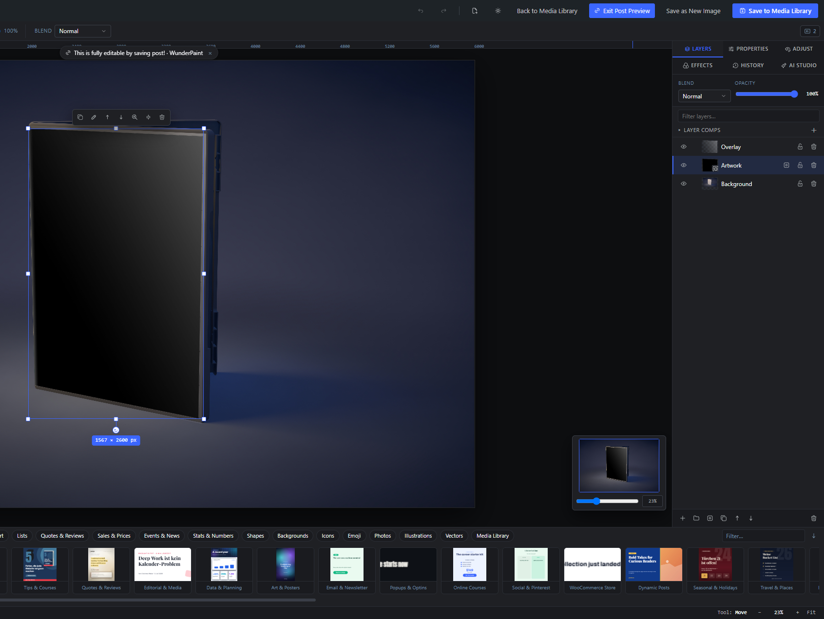
A Smart Object holds its original image (or PSD) untouched and applies a live stack of filters on top. Filters can be reordered, switched off, or removed without ever damaging the source pixels.
From here you can also open the Smart Object's contents for editing, replace the source with a new file, or flatten it back to a normal pixel layer.
Source info
#A read-only line at the top showing the Smart Object's source size, its kind (PSD or Image), and whether the original file is embedded. It helps you confirm what the Smart Object contains.
Toggle filter
#The checkbox beside each filter in the list turns that Smart Filter on or off without removing it. A disabled filter dims in the list and stops affecting the image. Use it to compare with and without an effect.
Move up
#Moves the filter one place higher in the stack, changing the order effects are applied in. Disabled for the top filter. Order matters because each filter runs on the result of the one before it.
Remove
#The X button deletes that Smart Filter from the stack. The source image is unaffected because filters are non-destructive.
A dropdown that appends a new Smart Filter to the stack. It lists all built-in effects plus any effects added by extensions (hidden ones are excluded). New filters start enabled with their default parameters.
Edit Contents
#Opens the Smart Object's inner document so you can edit its layers or image, then return and see the filters re-applied. This is the re-entry point for editing what is inside the Smart Object.
Replace…
#Swaps the Smart Object's source for a different image or file while keeping the layer's position, size, and filter stack. Use it to reuse a placement with new artwork.
Rasterize
#Flattens the Smart Object and its live filters into a plain pixel (raster) layer. This bakes the current look permanently and removes the ability to edit contents or filters. Use it only when you no longer need the non-destructive stack.
Blending Options (layer styles) 10 items #
Photoshop-style, non-destructive layer effects; tick a box to add each one.
Blending Options add live effects around and over a layer's shape, such as a stroke, shadows, glows, and overlays. Tick a style to enable it and reveal its parameters below; untick to remove it. Effects stack and update live.
These styles apply to almost every layer type, including groups, where they wrap the group's combined silhouette. Adjustment layers do not get Blending Options.
Stroke
#Draws a colored outline around the layer's edge. Choose its thickness, color, and whether it sits outside, centered on, or inside the edge. Good for making text or shapes pop against a busy background.
Drop Shadow
#Casts a soft shadow behind the layer to lift it off the background. Control its color, opacity, angle, distance, blur, and spread. The most common depth effect.
Inner Shadow
#Casts a shadow inside the layer's edges, making it look recessed or cut into the surface. Control color, opacity, angle, distance, and blur.
Outer Glow
#Adds a soft glow radiating outward from the layer's edges. Set its color, opacity, blur, and spread. Use it for a halo or light-bloom look.
Color Overlay
#Fills the layer with a flat color on top of its content at the chosen opacity. Handy for tinting or recoloring a shape or image without editing it.
Inner Glow
#Adds a soft glow that spreads inward from the layer's edges toward the middle. Control its color, opacity, and blur. Good for a subtle inner light.
Bevel & Emboss
#Adds highlight and shadow along the edges to fake a raised or carved 3D surface. Set the size, strength, and whether it looks raised (Up) or recessed (Down).
Satin
#Overlays a soft, folded sheen inside the layer for a satin or cloth-like finish. Control color, opacity, angle, distance, and blur.
Pattern Overlay
#Lays a repeating pattern over the layer at a chosen opacity and scale. Pick the pattern and how large the tile is. Useful for texture or halftone looks.
Gradient Overlay
#Lays a gradient over the layer at a chosen angle and opacity. Edit the color stops on the bar and rotate with the angle. Good for tinted, directional color washes.
Layer style parameters 13 items #
The shared controls that appear beneath each enabled layer style.
When you enable a Blending Options style, its own set of parameters unfolds below it. The same controls are reused across styles, so only the ones a given effect supports appear. This section describes each of those shared controls.
Color
#The color of the effect, chosen from a swatch popover. Appears for styles that use a single color, such as Stroke, Drop Shadow, Color Overlay, and glows.
Gradient stops
#The color-stop bar for Gradient Overlay. Drag and edit stops to build the gradient that is laid over the layer.
Opacity
#How strong or see-through the effect is. Lower values let more of the layer show through. Shown for most styles.
Size
#The overall thickness or reach of the effect, for example the width of a Stroke or the depth of a Bevel. Larger values make the effect bigger.
Position
#For the Stroke style, where the outline sits relative to the layer edge: Outside the shape, Centered on the edge, or Inside the shape. Inside keeps the outer silhouette crisp; Outside grows the visible size.
Angle
#The direction the effect comes from, for shadows, satin, and gradient overlays. Rotate it to move a shadow around the layer or aim the gradient.
Distance
#How far a shadow or satin is offset from the layer. Higher values push the shadow further away, making the layer feel more lifted.
Blur
#How soft the effect's edge is. Zero is a hard edge; higher values give a softer, more feathered look. Shown for shadows, glows, and satin.
Spread
#Grows the solid core of a shadow or glow before the blur is applied, making it thicker and more intense. Shown for Drop Shadow and Outer Glow.
Strength
#How pronounced the Bevel & Emboss relief is. Higher values deepen the highlight and shadow for a stronger 3D feel.
Direction
#For Bevel & Emboss, whether the surface looks raised or carved: Up (raised) pushes it toward you, Down (recessed) sinks it in.
Pattern
#For Pattern Overlay, the repeating pattern laid over the layer. Choosing None falls back to the dots pattern. Extensions can add more patterns.
Scale
#For Pattern Overlay, how large the pattern tile is. Higher values enlarge the tile so the motif repeats less often.
Extension property sections Extension 1 item #
Extra property sections that installed extensions add for certain layers.
Installed extensions can register their own sections in the Properties panel. Each one renders below the built-in sections and can be shown only for layer types it cares about. This is how add-ons (for example generators and studios) provide their own editing controls right where you edit a layer.
Because the section is re-mounted per layer rather than per edit, sliders inside it stay smooth while you drag. The exact controls depend on the extension you installed.
Extension section
#A property section provided by an installed extension, appearing under the built-in sections when its condition matches the selected layer. Its title and controls come from the extension itself, so what you see varies by add-on. Extensions read live layer values so their controls stay in sync as you work.
Tip. If an extension section fails to load, it is skipped and the rest of the panel still works.
Shape fill modes Free 3 items #
The three fill modes offered by the Fill toggle at the top of a shape layer's Appearance panel.
The Fill toggle switches a shape's body between a flat color, a color gradient, or a repeating pattern. Picking a mode reveals that mode's own controls just below it.
These are the individual options inside the Fill toggle; the toggle itself is documented separately.
Solid
#Fills the shape body with a single flat color, taken from the Color swatch below. This is the starting fill mode unless the layer already carries a pattern.
Tip. The exact color is edited with the Color swatch and hex field under the toggle.
Gradient
#Fills the body with a multi-stop color blend. Choosing it reveals the gradient Type, gradient bar, and Angle controls, and if the layer has no stops yet it seeds a two-stop blend from the current fill color to orange.
Pattern
#Fills the body with a repeating tile pattern. Choosing it reveals the Pattern picker and Pattern scale slider; if no pattern is set it starts on the dots pattern.
Gradient direction types Free 3 items #
The three gradient shapes shared by the shape/text gradient Type toggle and by the Gradient layer's Kind menu.
When a fill is set to Gradient (on shapes and on text) the Type toggle offers these three shapes. A dedicated Gradient layer offers the same set through its Kind menu.
Linear and Angle also show an Angle slider; Radial hides it because it spreads from the center outward.
Linear
#Blends the colors along a straight line across the layer. Use it for simple top-to-bottom or side-to-side fades. The Angle slider sets the line's direction.
Radial
#Blends the colors outward in rings from the center to the edges, good for spotlights and soft glows. The angle control is hidden for this type because a radial blend has no single direction.
Angle
#Sweeps the colors around a center point like a clock hand (a conic gradient). Use it for cone or pie-slice color effects.
Layer style option menus Free 5 items #
The named dropdown choices inside the Stroke and Bevel & Emboss layer effects in Blending Options.
Most layer effects expose only sliders, but two of them add a menu of named choices: where a Stroke sits relative to the edge, and which way a Bevel & Emboss is lit.
These are the individual options; the Position and Direction menus themselves are documented with their parent effects.
Outside
#Draws the stroke fully outside the shape's edge, so the fill stays untouched and the layer grows slightly. This is the default stroke position.
Center
#Straddles the stroke on the edge so half of its width sits inside the shape and half outside.
Inside
#Draws the stroke fully inside the edge, so the layer keeps its size and the stroke eats into the fill.
Up (raised)
#Lights the top of the bevel so the layer looks raised toward you. This is the default direction for Bevel & Emboss.
Down (recessed)
#Lights the bottom of the bevel so the layer looks pressed into the surface.
Dynamic content help notes Free 2 items #
The inline explanatory notes shown under a bound layer in the Dynamic content panel.
When a text or image layer is bound to a variable, a small help note appears explaining what happens when the template runs against a real post. The note text changes with the layer type and the chosen binding.
Text auto-fit note
#Shown under a bound text layer. It explains that text which does not fit first shrinks toward the Min size, then gets shortened, and points you to View, Preview with Post to test against real content.
Tip. Pair this with the Min size and Max size fields to control how far text is allowed to shrink.
Dynamic image note
#Shown under a bound image layer. It explains that the image source is swapped in per post when the template runs and is placed into the box using the Image Fit settings.
Smart Object filter list Free 3 items #
The heading and per-row labels of the Smart Filters stack on a Smart Object layer.
A Smart Object keeps its filters as a live, re-orderable stack that never touches the embedded original. The list sits under a small heading; each row shows the filter name with controls to toggle, reorder, or remove it.
Smart Filters
#The heading over the stacked list of non-destructive filters applied to this Smart Object. Filters render from top to bottom and can be reordered at any time without changing the embedded source.
Tip. Reordering with Move up changes the order filters are applied in, which can change the result.
Filter name
#Each row shows the applied filter's label between its on/off checkbox and the reorder and remove buttons. The label dims when the filter is switched off but stays in the stack.
Filter
#The default placeholder text in the Add menu, shown before you pick an effect to append to the filter stack. Selecting any effect from the list adds it, enabled, to the bottom of the stack.
Right panel tabs 8 items #
The tab strip at the top of the right dock that switches the panel between Layers, Properties, Adjust, Effects, History and AI Studio.
The right side of the editor is a single panel that shows one tab at a time. Click a tab to switch what the panel shows. Installed extensions can add their own tabs after these six.
The panel width is adjustable and remembered between sessions, and it grows automatically if a tab's content is too wide to fit.
Layers
#Switches the panel to the Layers list, where you stack, reorder, show or hide, group and blend the layers of your document. This is the default working view for building a design.
Properties
#Opens the Properties panel, which shows the settings of the selected layer: position, size, text options, image fit and so on. Tool settings are not here, they live in the options bar above the canvas.
Adjust
#Opens the Adjust panel for color and tone corrections on the active layer: brightness, contrast, saturation, hue, temperature, exposure and vibrance. Curves and Levels are not here, they live under the Filter menu.
Effects
#Opens the Effects panel for filters and visual effects applied to the active layer.
History
#Opens the History panel: the list of every step you have taken, named snapshots you have saved, and the saved file versions of an existing image. Use it to jump back and forth in time.
Opens the AI panel (labelled AI Studio on the tab), with the prompt box plus all local and cloud AI tools. Use it to generate images, edit layers and run one-click AI helpers.
Installed extensions can add extra tabs to the right of the six built-in ones. Each extension renders its own controls into the panel body. If you have no extensions installed, no extra tabs appear.
Tip. Extension tabs use the sliders icon and are keyed by the extension id.
Drag to resize the panel
#A thin handle on the left edge of the panel. Drag it left or right to make the whole right dock wider or narrower. The width you set is saved and reused next time.
Tip. The panel also widens on its own if a tab's content would otherwise scroll sideways.
AI Studio panel (top controls) AI 14 items #
The header, provider selector, prompt box and main generate/edit buttons at the top of the AI panel.
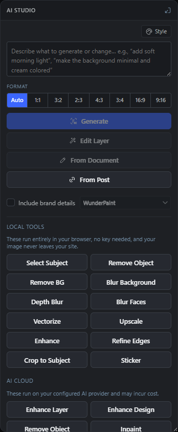
The AI panel is split into two parts. The top (documented here) holds the prompt box and the main buttons that create or transform a whole image. Below that sit the quick-action grids for Local tools and AI cloud tools.
Local tools run entirely in your browser and need no key. Cloud tools send your image to a configured AI provider and may cost money. If you have not configured any provider, the panel shows only the local tools and a note pointing you to Settings.
AI Assist
#The heading at the top of the AI panel. It marks the start of the AI tools and has a small status dot next to it.
Tip. The tab itself is labelled AI Studio; the panel heading reads AI Assist.
Provider pills
#One pill per AI provider you have configured in Settings. Click a pill to choose which provider runs the cloud actions (Generate, Edit Layer, and the AI cloud grid). Only providers you have set up appear here.
Tip. The active provider is highlighted; the first configured provider is used if your saved choice is unavailable.
The message shown in place of the provider pills when you have not configured any AI provider. It tells you that only the key-free local tools will work until you add a provider in Settings.
Prompt box
#The large text field where you describe what to generate or change, for example add soft morning light or make the background minimal and cream colored. The prompt feeds Generate, Edit Layer, From Sketch, From Post and the cloud actions that need instructions (Inpaint, Replace BG).
Prompt style button
#A small style picker above the prompt box that appends a look or art direction to your prompt text (for example a photographic or illustration style). Use it to steer the visual style without typing it out.
Tip. It edits the same prompt text, so you can still tweak the wording afterwards.
Format
#The small label above the aspect ratio row. It marks the set of buttons that choose the shape of the generated image.
Auto
#The default aspect ratio choice. It matches the document's own aspect ratio, so the generated image comes out shaped like your current canvas.
Aspect ratio chips
#Fixed shape choices for generation, next to Auto. Pick one to force the generated image into that ratio instead of matching the document. Providers work on fixed grids, so these cover the common ratios.
The primary button that creates a brand-new image from your prompt and adds it as a new layer. Needs a configured provider and some prompt text. Respects the chosen Format (aspect) and, if enabled, the brand details.
Sends the active layer to the AI and rewrites it according to your prompt, keeping it as the same layer. Use it to change an existing image (recolor, restyle, add or remove elements) rather than start from scratch. Needs a provider and prompt.
Turns your whole canvas (a rough, multi-layer sketch) into a finished image, using the flattened canvas as a reference and your prompt for direction. Use it to render a quick layout mock-up into a polished picture. Needs a provider and prompt.
Opens a post picker; the chosen post's title, excerpt and content ride along with your prompt so the AI can, for example, make a quick article infographic. If you leave the prompt empty it falls back to a generic illustrative prompt. Needs a provider.
Tip. Leave the prompt blank to let the article alone drive the image.
A checkbox (shown only when you have at least one Brand Kit) that appends the selected kit's colors and fonts to the prompt, and attaches its logo as a reference image, for Generate, Edit Layer, From Sketch and From Post. Turn it on to keep AI results on-brand.
Brand Kit selector
#A dropdown next to Include brand details that appears only when you have more than one Brand Kit. Pick which kit's colors, fonts and logo the AI should follow. It is disabled until Include brand details is checked.
AI Local tools Local AI 19 items #
The key-free AI helpers that run entirely in your browser; your image never leaves your site.
These tools work with no AI provider and no API key. They run in the browser, so there is no per-use cost and nothing is uploaded. Each button acts on the active image layer (or the current selection where noted).
Extension AI tools, if you have any installed, also appear in this grid and run in the same progress and error handling.
Detects the main subject of the active image and turns it into a selection. Use it as a fast way to get a selection before cutting out, removing an object, or applying an edit to just the subject.
Erases the selected area and fills it from the surrounding pixels. First make a selection (Smart Select K, or Select Subject), then click this. For tricky fills the cloud version is stronger.
Tip. This is the local, key-free eraser; there is also a cloud Remove Object.
Cuts out the subject of the active image layer and makes the background transparent. Use it to isolate a product or person for compositing.
Keeps the subject sharp and blurs everything behind it for a portrait look. It asks you for the blur strength in pixels before running.
Opens a graduated background blur built from a depth map, with a focus and strength slider for a true depth-of-field effect. Use it when a single flat blur is not enough and you want the blur to increase with distance.
Finds every human face on the active layer with the local Florence-2 model and pixelates it beyond recognition, in one step and without a key. Use it before publishing photos of people.
Traces the active image into editable vector shapes (SVG paths) and places them as new shape layers. Use it to turn a logo or flat graphic into clean, scalable vectors.
Doubles the source resolution of the active image layer. The layer keeps its size on the canvas, but zooming in and exporting come out sharper.
Tip. It is not a no-op even though the on-canvas size does not change; the underlying pixels get finer.
A one-click automatic boost of color, contrast and sharpness on the active image layer. Use it for a quick overall improvement with no settings.
Smooths and slightly tightens the cutout edge of the active image layer. Use it to clean up fringes left behind by Remove BG.
Crops the canvas down to the detected subject, leaving a small margin. Use it to auto-trim empty space around the main object.
Cuts out the subject and adds a white sticker outline with a soft shadow. Use it to make a die-cut sticker style graphic in one click.
Text Behind Subject
#Builds the magazine look in one click: duplicates the active image layer, cuts out its subject locally and slides an editable headline between background and cutout. The headline is selected afterwards, ready to type.
Color Pop
#Keeps the subject in color and turns everything else black and white. The same local subject mask as Remove BG drives it, with soft edges that blend instead of cutting, so hair and fur survive the border.
Product Shot
#Cuts out the subject and centers it on clean white with a soft contact shadow, sized with comfortable margins. Every product photo looks like a catalog page; the original layer is replaced, undo brings it back.
Neon Rim
#Dims the background and wraps the subject in a glowing colored rim. The glow borrows the first vivid color of your Brand Kit when one is set, and falls back to neon cyan.
Speed Blur
#Zoom-blurs the background outward around the subject while the subject itself stays sharp - instant motion for cars, sports and action shots.
Depth Fog
#Adds atmospheric haze staged by a real depth estimate: clear up front, misty in the distance. Runs the same local depth model as Depth Blur.
Any AI tools added by installed extensions appear alongside the built-in local tools and run in the same progress and error handling. What you see depends on which extensions you have installed.
AI Cloud tools Cloud AI 13 items #
The AI helpers that run on your configured provider and may cost money.
These tools send your image (and, where relevant, your prompt and selection) to the AI provider chosen in the provider pills. They need a configured provider key and may incur cost.
If no provider is configured this whole grid is inactive and a note links you to Settings to add one.
Sends the active layer to the AI and recreates it at much higher quality: sharper, cleaner and more detailed, while keeping the same subject, colors and composition. Use it when the local Enhance is not strong enough.
Flattens the whole canvas as a reference and redesigns it to a professional standard, keeping the layout, text and composition but making it noticeably more polished. The result is added as a new layer on top.
Erases the selected area and lets the AI reconstruct what was behind it. First make a selection (Smart Select K, or Select Subject), then click this. Stronger than the local version for tricky fills.
Repaints only the selected area from your prompt; everything outside the selection stays untouched. Steps: select an area, type what should go there in the prompt box, then click this.
Extends the picture outward, inventing more scenery. It fills empty canvas around your image, or enlarges the canvas by 25% per side if it is already full. An optional prompt steers what appears.
Adds natural, realistic color to a black-and-white photo on the active image layer. Use it to bring old monochrome photos to life.
Redraws the active image layer as a clean, vibrant cartoon illustration. Use it to stylize a photo into a drawn look.
Repairs an old or damaged photo on the active layer, removing scratches, dust and noise and improving clarity. Use it on scanned or aged photographs.
Cuts out the subject locally, then generates a brand-new background from your prompt behind it. Type the background you want in the prompt box first, then click this.
Generates alternative takes on the active layer and shows them in a chooser so you can keep the one you like. This tool appears only when an OpenAI provider is configured.
Design Review
#A vision model looks at the flattened document like an art director: one overall verdict plus three to six concrete findings (area, issue, suggested fix). The answer comes in the editor language from Settings, Help - independent of the WordPress locale.
Improve Text
#Five stronger alternatives for the selected text layer, in the same language and about the same length as the original. Picking one replaces the layer text; undo restores the original.
Editable vector (paths)
#A checkbox under the Format row: the image model draws the prompt as flat artwork and the local tracer converts it into editable shape layers - real paths, not pixels. Distinct from the Asset Generator, whose text model writes simple SVG directly.
AI progress and choices AI 3 items #
The working status card, cancel control and the variation chooser that appear while and after AI runs.
While any AI action runs, a status card shows what is happening and lets you cancel. Some actions (like Variations) end by asking you to pick from several results.
Working status card
#A small card that floats over the top right of the canvas while an AI action runs. It names the current step (for example Generating image… or Editing layer…) and reminds you it can take a few seconds.
Tip. It floats over the canvas so it stays visible even if the AI panel scrolls.
Stops waiting on the current AI action and hides the status card. If a result still arrives after you cancel, it is discarded rather than applied.
Choose a variation
#The dialog that opens after Variations finishes. It shows the alternative results in a grid; click (or press Enter on) one to keep it as a new layer. The rest are discarded when you pick or close.
History panel 10 items #
The step-by-step undo stack with time travel, named snapshots, and the saved file versions of an existing image.
Every action you take is recorded as a step, and the last hundred are kept - on very large images fewer, because the stack is also capped by how much memory it holds. Click any step to jump the whole document to that point in time. Hovering a step shows a thumbnail preview of how the canvas looked then.
When you are editing an image that already exists in the Media Library, a Saved versions footer lists the file versions saved on the server, and lets you restore an earlier one.
History · N steps
#The header of the History panel. It shows how many steps are currently recorded in the session's undo stack.
Tip. N updates live as you work.
Snapshot
#Saves a named marker of the current state so you can find and return to it easily later. It asks for a name (default Snapshot) and adds a pinned entry to the step list.
Tip. Snapshot entries are marked with a pin so they stand out in the list.
History step
#One entry in the step list, labelled with the action it represents (for example a text, shape, brush or crop operation) and a matching icon. Click it, or press Enter, to time-travel the document to that exact point.
Current step
#The step you are currently sitting on is highlighted as the current one. It marks where in history the document is right now.
Tip. Steps after the current one are shown as future steps you can jump forward to.
Future steps
#Steps that come after the current one (because you traveled back in time). They are dimmed. Clicking one moves forward to it; doing new work from an earlier point may replace them.
Step preview thumbnail
#A small floating image that appears when you hover over a history step, showing how the canvas looked at that step. It helps you find the right point before clicking. Previews are cached so re-hovering is instant.
Saved versions
#A footer that appears only when you are editing an image already in the Media Library. It lists the file versions saved on the server, newest first, so you can roll the file back to an earlier save.
Tip. This is separate from the in-session history; it survives closing the editor.
Version item
#One saved server version, showing its version number, the date and time it was saved, and its file size in kilobytes. Each has a Restore button.
Restore
#Rolls the file back to that saved version. It asks you to confirm; the current file becomes a new version first (so nothing is lost) and then the editor reloads on the restored version.
Tip. Restoring reloads the editor page.
CURRENT
#A badge on the last row of the Saved versions list marking the version the file is currently on. It has no Restore button because it is already active.
Actions panel 13 items #
Record sequences of edits, replay them, save reusable looks, share them as JSON, and batch-apply them across many images.
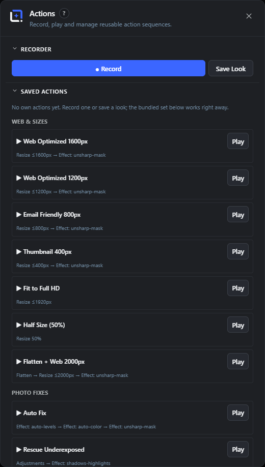
The Actions panel lets you record the operations you perform (filters, effects, adjustments, resize, rotate, flip, flatten) into a reusable action, then replay it on any image with one click.
You can also save just the active layer's filter and adjustments as a Look, export and import actions as JSON files to share them, and run an action across many Media Library images at once with Batch Process.
Recorder
#The top section of the panel, holding the record controls and the Save Look button. This is where you capture a new action.
Record
#Starts recording your edits into a new action. While recording, apply the filters, effects, adjustments and image operations you want to capture; they are listed live below the button.
Tip. Only recordable steps (filters, effects, adjustments, resize, rotate, flip, flatten) are captured.
Stop & Save
#Stops recording and asks for a name to save the action under (default My action). The button also shows the number of steps captured so far. If nothing was recorded it tells you and saves nothing.
Save Look
#Saves the active layer's current filter and adjustments as a reusable look (a single-step action). It suggests the filter's name as the default. Disabled when no layer is active, or if the layer has no filter or adjustments to save.
Recording step list
#The live list shown while recording, with one bullet per captured step. Before you do anything it shows a hint reminding you to apply filters, effects, adjustments, resize, rotate, flip or flatten.
Tip. Watch this to confirm each edit was captured.
Saved Actions
#The middle section listing every action and look you have saved yourself. When it is empty it points at the bundled set below, which works right away: fifty-six ready-made actions in six groups (Web & Sizes, Photo Fixes, Looks & Styles, Artistic, Privacy & AI, Social Formats). Each item you saved can be played, deleted, and is included in Export; the bundled ones can only be played.
Action item
#One saved action in the list. It shows a marker (a palette for a look, a play arrow for a recorded action), the name, and the chain of steps it will run. Has its own Play and Delete buttons.
Tip. Looks are marked differently from full recorded actions.
Play
#Runs the action's steps on the current document, in order. A spinner shows while it runs, and a success message names the applied action when it finishes. Only one action can play at a time.
Delete (action)
#Removes one of your own saved actions or looks from the list. It deletes immediately with no confirmation, so use it deliberately. The bundled actions have no delete button; they are part of the plugin.
Export
#Downloads the actions you saved yourself as a single JSON file (wpie-actions.json). Use it to back up your actions or share them with someone else. The bundled actions are not exported, since every installation already has them. Disabled when you have saved none of your own.
Import
#Loads actions from a JSON file (such as one exported earlier) and adds them to your list. It opens a file picker and reports how many actions were imported.
Batch
#The bottom section, explaining that you can apply an action to many library images at once.
Batch Process…
#Opens the batch dialog, where you pick an action and run it across many Media Library images in one go. Use it to apply the same edit or look to a whole set of photos.
AI tool groups (Local vs Cloud) AI 3 items #
The AI Studio quick actions are split into two labelled groups by where the work runs.
Below the Generate and Edit Layer buttons, the quick actions are sorted into two grids under their own headings. The split tells you at a glance which tools are free and private and which ones call a paid provider.
Local tools
#Heading over the first grid of quick actions. Everything under it runs entirely in your browser with no API key. The note under the heading reads These run entirely in your browser, no key needed, and your image never leaves your site. Use these for fast, private edits at no cost.
Tip. Extension AI tools also appear inside this Local tools grid.
AI cloud
#Heading over the second grid of quick actions. These call your configured AI provider and may cost money; the note reads These run on your configured AI provider and may incur cost. If no provider is set up yet, the note instead says the tools need a provider key and shows an add one in Settings link.
Tip. The add one in Settings link opens the plugin settings in a new tab.
Blur radius (px)
#A small dialog that opens when you click Blur Background. Type how strongly to blur the background behind the subject, in pixels. Higher numbers give a stronger, softer out-of-focus look.
Tip. Confirm with your typed value; an empty or invalid entry falls back to 18 px.
Variation picker dialog AICloud AI 3 items #
The chooser that opens after Variations, where you keep one of four AI takes.
Running Variations opens a Choose a variation dialog with a grid of alternatives generated from the active layer. You keep exactly one.
Variation
#Each image tile in the Choose a variation dialog is one AI alternative of the active layer. Click a tile to keep that one as a new layer; the other tiles are discarded.
Tip. Focus a tile with the keyboard and press Enter to pick it.
Pick the variation to keep; the rest are discarded.
#The subtitle under the dialog title. It reminds you that choosing one tile throws the other options away, so there is no way to keep several at once.
Close
#The X button in the top corner of the Choose a variation dialog. It closes the dialog without keeping any variation. Clicking the dark area outside the dialog does the same thing.
Tip. Closing here keeps your original layer unchanged.
History panel dialogs and version details Free 3 items #
The naming and confirmation dialogs behind the Snapshot and Restore buttons, plus the saved-version metadata.
Two buttons in the History panel open extra dialogs, and each saved version carries a small metadata line.
Take Snapshot
#The dialog that opens from the Snapshot button. Type a name in the Snapshot name field and confirm to pin a named restore point into the history list. The name is saved with a 📌 pin marker so snapshots stand out among ordinary steps.
Tip. Cancelling, or confirming with an empty name, adds nothing.
Restore Version
#A confirmation box shown when you click Restore on a saved version. It warns Restore version vN? The current file becomes a new version and the editor reloads. Confirm with the Restore button to load that version; the whole editor reloads afterward.
Tip. Your current work is not lost; it is saved as a new version before the older one loads.
Version date and size
#Under each saved version's vN name is a second line showing when it was saved (your local date and time) and its file size in kilobytes. Use it to tell versions apart before restoring.
Actions panel dialogs and status text Free 5 items #
The naming dialogs behind Stop & Save and Save Look, plus the list markers and helper text.
Saving a recording or a look opens a naming dialog, and the Saved Actions list uses small icons and placeholder text to keep things clear.
Save Action
#The naming dialog shown after you press Stop & Save. Type a name in the Name for this action field and confirm to store the recorded steps as a reusable action. Cancel to discard the whole recording.
Tip. An empty name is saved as Action.
Name for this look
#The field in the Save Look dialog that appears when you save the active layer's filter and adjustments as a reusable look. It is prefilled with the layer's current filter name, or Look if there is none. Confirm to save the look; cancel to abort.
Tip. An empty name is saved as Look.
Look vs action marker
#Each item in the Saved Actions list is prefixed with an icon showing its type: a 🎨 palette for a saved look (a filter plus adjustments) and a ▶ triangle for a recorded action (a sequence of steps). It is a read-only hint, not a button.
No actions yet. Record one or save a look.
#The placeholder text shown in the Saved Actions section when you have not stored any actions or looks yet. It names the two ways to create one.
Recording… apply filters, effects, adjustments, resize/rotate/flip/flatten.
#While the recorder is running but nothing has been captured yet, this hint tells you which operations get recorded. As you apply steps they replace the hint and appear as a bullet list. Pressing Stop & Save with nothing recorded shows a reminder to apply operations while recording.
Right panel width behavior Free 1 item #
The panel remembers its width and widens itself when content would otherwise overflow.
Panel auto-width
#Beyond the manual drag handle, the right panel remembers its width and can widen itself automatically. If a tab's content (for example a long translated label) would otherwise need a horizontal scrollbar, the panel grows just enough to fit. Your chosen width is saved and restored on your next visit.
Tip. Drag the left edge of the panel to set a width by hand; the value persists.