Studios and dialogs
Create, export, QR, charts, brand kits, the Media Library manager and every design tool.
Create New Image dialog Free 35 items #
The New Image dialog picks a size preset or custom dimensions, then starts a blank canvas, an AI generation, or a template.
Reached through File, then New (and shown as the welcome start screen when the editor opens with no image). A preset list runs down the left side; the main area has three tabs: Blank Canvas, Generate with AI, and Templates.
The footer shows a live memory estimate for the chosen size and warns as the canvas gets very large. Browsers cannot draw canvases beyond about 16000 px per side, so the Create button is blocked past that limit.
Blank Canvas
#Starts an empty document at the chosen size, name, resolution, color mode, and background. This is the default tab.
Generates a full image straight onto a new canvas from a text prompt, using a configured AI image provider. The result lands as an AI Generation layer sized to the canvas.
Tip. Needs at least one image provider configured in Settings.
Templates
#Opens a starter template, an extension template pack, or one of your saved dynamic templates as a new document.
Instagram Square
#Size preset for a square Instagram post. Selecting it also suggests its name for the document. This is the preset selected when the dialog opens.
Instagram Story
#Size preset for a vertical Instagram or reels story.
OG / Social Share
#Size preset for an Open Graph social share image (the thumbnail shown when a link is posted).
Full HD
#Size preset for a 1080p full HD landscape canvas.
Header / Banner
#Size preset for a wide header or banner strip.
Standard
#Size preset for a general purpose 4:3 web image.
Custom Size
#Starting point for a free size. Typing your own width or height also switches the selection to Custom.
Name
#The document name. Picking a preset fills in the preset label until you type your own name. On the Blank tab the Create button stays disabled until a name is present.
Width
#Canvas width in the current unit. If the aspect link is on, height follows to keep the ratio.
Height
#Canvas height in the current unit. If the aspect link is on, width follows to keep the ratio.
Link aspect ratio
#Chain toggle between the width and height fields. When on, changing one dimension scales the other to preserve the current proportion. Off by default.
Unit
#Switches the width and height fields between pixels, inches, and centimetres. Inches and centimetres are converted to pixels using the chosen resolution.
Resolution
#Pixels per inch used for print and for converting inch or centimetre dimensions to pixels. Higher values give sharper prints at the same physical size.
Color Mode
#The document's color model and bit depth. RGB suits screen work; CMYK is for print pipelines.
Transparent
#Starts the canvas with no background fill, shown as a checkerboard. Use this when the image needs to sit on top of something else. This is the default background.
White
#Fills the canvas background with solid white.
Black
#Fills the canvas background with solid black.
Custom
#Picks any background color from a swatch. Selecting Custom reveals a color button next to the choices.
Preview card
#A scaled thumbnail of the blank canvas at the chosen aspect and background, with the exact pixel dimensions shown beneath it. Updates live as you change size or background.
On the AI tab, chooses which configured image provider generates the picture. Shows one pill per available provider; if none are set up, a link to Settings appears instead.
The text description of the image to generate. Generation is blocked with a toast if this is left empty.
One-tap chips that append a style word to the prompt. Each chip adds its lowercased name to whatever text is already there.
Starter templates
#On the Templates tab, a grid of built-in ready-made designs. Clicking one opens it as a new document.
Tip. Opens in a new tab unless this is the welcome start screen.
Extra template grids contributed by installed extensions, each under its own pack heading. They open the same way as starter templates.
Your templates
#Your own saved dynamic templates. Opening one restores its layers and keeps its template link so you can later update it in place.
Tip. Add one from the editor with File, then Save as Dynamic Template.
Delete template
#Removes one of your saved templates. Only appears on your own saved templates, not starter or pack templates.
Cancel
#Closes the dialog without creating anything. Hidden on the welcome start screen, where you must pick a size first.
Create & Edit
#Creates the document and opens it for editing. On the AI tab the button reads Generate & Edit and runs the image generation first. Disabled while busy, past the size limit, on the AI tab with no provider, or on the Blank tab with no name.
Search templates… (Templates tab)
#The search box above the starter templates in the Templates tab. Same matcher as the Asset Library: it searches the template name, the copy on its text layers, its category and the names of its dominant colors, and every word you type must match.
Category chips (Templates tab)
#An All chip plus one chip per template category. Picking a category filters both the bundled starters and the installed template packs at once.
Color dots (Templates tab)
#The twelve color swatches next to the chips. Click one to keep only templates whose dominant palette contains that color, click it again to clear it.
Export / Save dialog Free 37 items #
One dialog for downloading a file, saving over the media library image, or saving a copy as a new attachment, with format, quality, scale, metadata, and batch options.
This dialog runs in three modes and its title and primary button change to match. Save to Media Library overwrites the current attachment (keeping a version). Save as New Attachment (called Apply when opened from a page builder) writes a copy. Export downloads a file without touching the library.
A live flattened preview sits at the top. Below it are the format picker and the quality, scale, and (where needed) flatten controls, followed by batch export, presets, watermark, and metadata sections. When a post preview is active, export renders the resolved dynamic content while the saved project keeps its placeholders.
Dialog modes
#The dialog opens as Save (overwrite the library image), Save as / Apply (write a copy or hand it back to a page builder), or Export (download only). Metadata and project options show only outside Export mode.
Preview
#A flattened PNG thumbnail of the final composite at up to 220 px, so you see exactly what will be written. Updates live as layers or bindings change.
PNG
#Lossless format that keeps transparency. Best for graphics, logos, and anything with sharp edges or alpha. This is the default format.
JPEG
#Compressed photo format with no transparency. Smaller files for photos; a Quality slider and a flatten background appear when it is chosen on a transparent document.
WebP
#Modern format with good compression and transparency support. A Quality slider appears when it is chosen.
Animated GIF built from the visible top-level layers, one layer per frame. Only offered in Export mode when there are at least two frame layers.
APNG
#Animated PNG built the same way as the GIF option but with full color and alpha. Export mode only, needs at least two frame layers.
WebM
#Animated WebM video from the frame layers. Only offered in Export mode when the browser supports MediaRecorder and there are at least two frame layers.
PSD
#Layered Photoshop file, download only. Offered in Export mode when there are layers; the media library cannot display PSDs, so re-editing is covered by the project sidecar instead. It has no quality or scale controls.
Single-page PDF built from a JPEG render of the canvas. Export mode only; it has a Quality slider and, on a transparent document, a flatten background.
Extra export formats added by installed extensions appear at the end of the format row in Export mode, each with its own label and file extension.
Quality
#Compression quality for lossy formats. Higher keeps more detail and makes a bigger file. Shown for JPEG, WebP and PDF only.
Background (flatten)
#The color that fills transparent areas when a format cannot store transparency (JPEG, PDF). Without it, transparent pixels would turn black in the encoder. Only shown on a transparent document with such a format.
Frame delay
#Time each frame is held in an animated GIF, APNG, or WebM. The value is shown in seconds. Only appears for those animated formats.
Frames note
#An informational line for animated formats that states how many frames will be produced (each visible top-level layer becomes one frame).
Scale
#Multiplier on the output pixel size, so you can render at half size up to double size. The Output line and estimated file size update with it. Hidden for PSD.
Output / Est. size
#A read-only line showing the final pixel dimensions (document size times scale) and a rough estimate of the encoded file size in megabytes.
Batch sizes (ZIP)
#Checkboxes for the built-in size presets. Tick any you want and export renders the design at each one, packed into a single ZIP. Export mode, non-PSD only.
Download ZIP
#Builds and downloads the ZIP of the ticked batch sizes. Disabled until at least one size is checked; the button shows how many are selected.
Presets (export)
#Saved combinations of format, quality, and scale shown as chips. Click a chip to apply it; Alt-click removes it. Export mode only.
Tip. Alt-click a preset chip to delete it.
Add preset
#The plus chip saves the current format, quality, and scale as a named export preset for reuse.
Favicon set (ZIP)
#Renders the canvas into a favicon bundle: a favicon.ico, a set of PNG sizes from 16 to 512 px, and an HTML snippet, all zipped. Export mode only.
Watermark
#Applies a watermark image over the output. The dropdown lists your Brand Kit watermarks plus a legacy Settings watermark; position, size, opacity, and margin follow the last used batch watermark placement. Hidden for PSD.
Filename
#The name used for the saved or downloaded file. Prefilled from the document name. Shown outside Export mode as a metadata field, and used as the download name in Export mode.
Alt Text
#Alternative text stored on the attachment for accessibility and SEO. Prefilled from the existing attachment when editing one. Save and Save as modes only.
Title
#The attachment title saved with the image. Prefilled from the document or existing attachment. Save and Save as modes only.
Caption
#The attachment caption saved with the image. Save and Save as modes only.
Description
#A longer optional description saved on the attachment. Multi-line text field, Save and Save as modes only.
Uses an AI text provider to look at the rendered image and fill in the Alt Text, Caption, and Description. Disabled with a hint when no text provider key is configured.
Version note
#An optional note describing what changed, stored with the new version and shown in the Versions panel. Save mode only.
Overwrites original notice
#A caution box shown in Save mode reminding you that saving replaces the original file, while the previous version stays available in the Versions panel.
Keep editable project file
#Stores a sidecar project file alongside the image so the layered design can be reopened and edited later. On by default; shown outside Export mode. The sidecar always keeps the raw binding placeholders even when the pixels ship a resolved preview.
Copies the rendered image as a PNG to the system clipboard instead of saving a file. Export mode only, hidden for PSD and where the browser lacks clipboard image write.
Cancel
#Closes the dialog without saving or downloading.
Primary action
#Runs the save or export. The label is Save to Media Library in Save mode, Create Attachment in Save as mode, and Download in Export mode. Shows a spinner while working.
Overwriting and image optimizers
#Saving over the library image keeps the same URL, and that is what makes this worth knowing. Optimization plugins that deliver WebP or AVIF (Imagify, ShortPixel, EWWW, Smush, Optimole and others work this way) serve a converted copy from that same URL, and that copy was made from the previous version of the picture. Until the optimizer converts the image again, the editor and the media library show your edit while the public page can still show the old one. Two ways around it: re-optimize that single image in whichever optimizer you use, or choose Save as New Attachment, which writes a copy with its own URL that no stale conversion can point at. WunderPaint reports every overwrite to WordPress through wp_update_attachment_metadata(), the signal optimization plugins are meant to listen for; what they do with it is theirs to decide.
EU AI label
#Places one of the European Commission's official emblems for AI disclosure into the picture, and can record the matching IPTC entry in the file. Starts on None and does nothing unless you pick a motif. See the next section.
EU AI labels Free 5 items #
The European Commission's official emblems for disclosing AI involvement, applied when saving or exporting, and only when you ask for one.
Three motifs, each in black, white and half-opacity versions, shipped with the plugin as the Commission publishes them. They are free to use and need no attribution.
Nothing is ever applied on its own. The editor does not inspect your design, does not guess and never suggests a label, because the disclosure rules are about content that could be taken for something real, not about every illustration, and only the person who made it knows which one it is.
EU AI label
#Places one of the European Commission's official emblems for AI disclosure into the exported picture. Three motifs: a basic emblem, Fully AI-generated, and Partially AI-modified. The list starts on None and nothing is applied unless you pick a motif yourself. The editor never inspects a design or suggests one, because only you know whether what you made could be taken for a real photograph.
Emblem color
#Black, white, or either of those at half opacity, matching the four variants the Commission publishes. Pick the one that stays readable on your picture.
Emblem position
#Which corner the emblem is stamped into, or the center. It is drawn onto the finished export the same way a watermark is.
Emblem size
#Size as a percent of the export width. The basic emblem is square and the other two are wide bars, so each motif starts at its own value, chosen so all three end up about the same height.
Also record it in the file metadata
#A second box, empty unless you tick it, that writes the matching IPTC digital source type into the file as well. That is the vocabulary picture agencies and image search read, so an image can declare its origin even where the emblem is cropped away. The metadata entry itself can only be written into PNG and JPEG, so the box appears for those two; the emblem on the picture is not limited that way. Nothing is written to the file unless this is on.
Image Size / Canvas Size dialog Free 12 items #
A Photoshop-style dialog to change pixel dimensions, either resampling the whole image or resizing just the canvas around an anchor.
The same dialog runs in two modes. Image Size resamples the whole document, scaling every layer to the new dimensions. Canvas Size changes the canvas area only, keeping layers at their pixel size and adding or trimming space around an anchor point.
Width and height can be entered in pixels or as a percentage. Both dimensions are clamped between 1 and 12000 px, and Image Size additionally caps the total at 24 megapixels.
Image Size (mode)
#Resamples the whole document to new dimensions, scaling all layers uniformly. Use it to make the finished image larger or smaller. Offers the aspect-ratio link.
Canvas Size (mode)
#Changes the canvas dimensions without scaling layers, adding or cropping space around an anchor. Use it to give a design more room or to trim it. Adds the Relative option and the anchor grid.
Current size
#A read-only line showing the document's present width and height in pixels, for reference before you change it.
Width
#The target width in the current unit. In Image Size with the link on, height follows to keep the aspect ratio. Press Enter to apply.
Height
#The target height in the current unit. In Image Size with the link on, width follows to keep the aspect ratio. Press Enter to apply.
Link aspect ratio
#Chain toggle that keeps width and height proportional in Image Size mode. On by default; shown only in Image Size (Canvas Size resizes each side freely).
Unit (px / %)
#Switches the width and height fields between absolute pixels and a percentage of the current size. Switching converts the current values so the target stays the same.
Relative
#In Canvas Size, treats the width and height values as an amount to add or remove rather than an absolute size. Positive numbers grow the canvas, negative numbers trim it. Zeroes the fields when toggled.
Anchor
#A 3 by 3 grid choosing where the existing content sits as the canvas grows or shrinks. Centre keeps content centred; a corner or edge pins content there and adds space on the opposite sides. Canvas Size only.
New size
#A read-only line showing the resulting width and height. It turns red and blocks Apply if the size is outside 1 to 12000 px.
Cancel
#Closes the dialog without changing the document.
Apply
#Commits the resize. Disabled while the new size is invalid; Image Size also shows an error and stops if the result would exceed 24 megapixels.
Resize Design dialog Free 13 items #
Retargets the whole design to a different format, scaling every layer uniformly and recentering so nothing gets distorted.
Unlike Image Size, this dialog is built for changing the shape of a design (for example from a square post to a vertical story). It rescales all layers together and recenters the composition, so proportions are preserved rather than stretched.
Pick one of the social and web presets for a one-click retarget, or type a custom width and height. Undo restores the previous format.
Current size note
#A read-only line showing the present dimensions and a reminder that layers scale uniformly with no distortion.
Instagram Post
#One-click retarget to a square Instagram post.
Instagram Story
#One-click retarget to a vertical Instagram story.
Facebook Post
#One-click retarget to a Facebook landscape post.
YouTube Thumbnail
#One-click retarget to a YouTube video thumbnail.
X Header
#One-click retarget to an X (Twitter) profile header.
Pinterest Pin
#One-click retarget to a tall Pinterest pin.
LinkedIn Banner
#One-click retarget to a LinkedIn profile banner.
Full HD
#One-click retarget to a 1080p landscape canvas.
Width
#Custom target width for a size not in the preset list. Combined with Height and the Resize button.
Height
#Custom target height for a size not in the preset list. Combined with Width and the Resize button.
Resize
#Applies the custom width and height, retargeting the design. Disabled until both values are within 16 to 12000 px. A toast confirms the new size and notes that undo restores the old format.
Cancel / Close
#Closes the dialog without changing the design (the corner close button or Escape).
Export Carousel dialog Free 8 items #
Slices a wide document into a numbered sequence of equal vertical tiles, for a swipeable social carousel, as a ZIP or straight into the media library.
Point this at a wide design and it cuts it into N side-by-side tiles of equal width and full height, numbered in order. A preview shows the design with dashed guide lines where the cuts fall.
Tiles can be downloaded as a single ZIP or written directly as new media library images. The filenames use the document name plus a number.
Preview with slice guides
#A scaled preview of the document with dashed vertical lines marking where each tile boundary falls, so you can see the split before exporting.
Tiles
#How many equal vertical slices to cut the design into. Each tile is the full height and one Nth of the width.
Format
#The image format for the exported tiles. JPEG is smaller for photos; PNG keeps sharp edges and transparency.
Quality
#Compression quality for JPEG tiles. Higher keeps more detail at a larger file size. Only shown when Format is JPEG.
Save as
#Where the tiles go: a single ZIP download, or added straight to the media library as new images. Defaults to the ZIP download.
Tiles note
#A read-only line showing the resulting tile count and each tile's exact pixel size (document width divided by tiles, full document height).
Cancel
#Closes the dialog without exporting. Disabled while an export is running.
Export
#Renders the master canvas, slices it into the chosen number of tiles, and either downloads the ZIP or creates the new library images. A toast reports how many tiles were exported.
Tip. Filenames are the document name plus a tile number.
Collage & Photo Grid Free 8 items #
Arranges a handful of media-library photos into a collage and inserts it as an editable layer group.
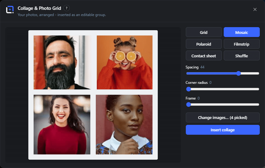
Tools, Collage & Photo Grid opens a dialog with a live preview: pick images from your library, choose a layout and tune the look with a few sliders. Five layouts ship: a clean grid, a justified mosaic that keeps each photo close to its own aspect ratio, scattered polaroids with tilt and captions, a filmstrip with sprocket holes, and a contact sheet that labels every photo with its cleaned-up file name.
Inserting builds real layers: every photo is a normal image layer with a cover crop, cards and strips are shape layers, captions are text layers, all collected in one group. You can swap single pictures, nudge frames, restyle captions and apply layer styles afterwards.
Layouts
#Grid, Mosaic, Polaroid, Filmstrip and Contact sheet. Mosaic justifies rows to the full width; Polaroid scatters tilted instant-photo cards; Contact sheet adds a file-name caption under every cell.
Spacing
#The gap between photos and to the canvas edge, in pixels.
Corner radius
#Rounds the photo corners. Polaroid photos stay square, the instant-photo look owns its corners.
Frame and Frame color
#A matte card behind each photo, in any color. Polaroid always has its white card; the color swatch recolors it.
Columns
#Fixes the column count for grid, contact sheet and polaroid layouts; 0 picks a count that keeps cells roughly square.
Shuffle
#Deals a new seeded arrangement: the image order is reshuffled in every layout, and the polaroid scatter also re-rolls its tilt and offsets. The same document and settings always reproduce the same collage.
Captions from file names
#For polaroid and contact sheet: labels every photo with its file name, extension stripped and dashes and underscores turned into spaces.
Insert collage
#Builds the layers and selects the new group. Nothing is flattened; every part stays editable.
360° Panorama Free 7 items #
Walk through any equirectangular image, repair the AI wrap seam, place linked hotspots and copy a fully self-contained HTML embed.
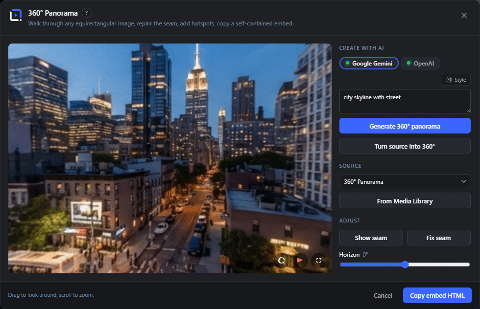
Tools, 360° Panorama opens a WebGL sphere viewer for equirectangular (2:1) images: drag to look around with a little inertia, scroll to change the field of view. The source can be any image layer of the document or a picture straight from the media library; a warning appears when the image is not close to 2:1.
The embed it copies is one self-contained HTML block: inline viewer, inline styles, hotspots included, the image URL as its only outside reference. It works in any Custom HTML block, with or without WunderPaint on the page, and keeps working if the plugin is ever removed.
Create with AI
#Panorama creation lives right in the tool: describe a scene and generate a fresh 360° sphere, or click Turn source into 360° to rebuild the current source photo as a full panorama of the same place, light and mood. The result lands as a layer and opens in the viewer.
Source
#Every image layer of the document appears in the picker; From library opens the media picker for any other panorama. Layers close to 2:1 are preselected.
Fix seam
#AI panoramas typically drift in color across the width, so the left and right edges no longer match at the wrap. Per row the difference is measured and blended so the edges meet, plus a narrow blur band over the residual line. Apply to layer writes the repaired image back (undo restores it).
Add hotspot
#Click in the view to place a marker: a text pill or an icon (pin, info, arrow, play) whose label appears on hover. Every hotspot has its own color and size, an optional URL, an optional info text that opens as a small card in the view, and Move re-places it with another click. All of it carries into the embed.
Copy embed HTML
#Puts the self-contained viewer snippet on the clipboard, using the current view direction as the start view. The embed opens as a light blurred poster with a 360° badge and boots WebGL only when it scrolls into view or is clicked, so pages with several panoramas stay fast. Start with auto-rotate makes it turn slowly on its own; Embed height sets the block's CSS height.
360° generate format
#In the AI panel's Format row, the 360° chip generates a seamless equirectangular sphere (prompt wrapper plus exact 2:1 resample) and inserts it as a layer, ready for this tool.
Viewer controls
#Bottom right in both viewers: auto-rotate (slow turntable that pauses while you interact and resumes after a moment), a compass needle that shows the view direction and flies back to the start view when clicked, and fullscreen. Zoom by scroll, pinch or double-tap; camera moves are eased. On phones the embed adds a gyro button - move the device to look around.
Blur Faces FreeLocal AI 3 items #
Find every face on the active layer and pixelate it beyond recognition, in your browser, with no key.
Blur Faces runs on the local Florence-2 model. The model is asked to ground the phrase "human face" in the image, each box it returns is padded a little, and those regions are pixelated straight into the layer. The picture never leaves your site.
The result replaces the content of the active layer as a single undo step, so one Undo takes it back if a false positive lands somewhere you did not want it.
Blur Faces
#Runs the detection and pixelates every face it finds on the active layer. A toast reports how many faces were made unrecognizable.
Needs the local caption model
#Blur Faces uses the Florence-2 caption model for detection. Until it is installed under Settings, Local AI Models, the action says so instead of running.
No faces found on the active layer
#The model grounded nothing for "human face". The layer is left untouched. Check that an image layer is active rather than a text or shape layer.
Recrop thumbnails Free 4 items #
Per-image, per-size control over the crop window of WordPress' hard-crop sizes, with a local subject-aware auto-suggest.
WordPress crops sizes like the thumbnail dead center, which happily beheads portraits in theme grids. In the Media Library Manager, open an image's detail editor and choose Recrop thumbnails: every cropped size this image has appears on the left, and the crop window sits on the full image, ratio-locked, ready to drag and resize.
Saving rewrites only the generated size files and updates their metadata. File names never change, so published pages simply show the better crop, and the original upload is never touched. Browsers cache thumbnails, so a published page may show the old crop until its cache expires.
Size list
#Every registered hard-crop size this attachment actually has, with its current file as preview. Soft sizes only scale, so they never appear here.
Crop window
#Drag to move, pull the corner handle to resize; the ratio is locked to the selected size, and the window never leaves the image.
Auto-frame subject
#Detects the subject with the local model (no key, nothing leaves your browser) and places the window around it with a little padding. Auto for all sizes does the same for every size at once.
Save crops
#Rewrites the changed size files in place and remembers each window, so reopening the dialog shows the crop you chose.
Design Generator (styles, image modes, fields) AI 25 items #
The style presets, image strategy, brand context fields and dynamic bindings in the Design Generator.
The Design Generator turns a brief into a full layout that lands as editable layers: background, image, shapes and text. Layout comes from a cloud text model, the image from your chosen source.
Bold Promo
#Style start: a big headline and a punchy call to action, high-contrast modern sans-serif.
Minimal Quote
#Style start: an elegant layout with lots of whitespace around a large serif quote and a small attribution.
Energetic Sale
#Style start: strong warm colors built around a huge discount number, urgent and loud.
Editorial Hero
#Style start: a calm full-bleed photographic backdrop with a refined serif headline and a thin kicker.
Event Invite
#Style start: the event name as the hero, with date, time and venue as clean supporting details.
Retro Poster
#Style start: warm vintage colors, chunky condensed display type and a centred, print-like composition.
Tech Launch
#Style start: a sleek dark layout with a crisp headline, a one-line benefit and a soft glowing accent.
Soft Pastel
#Style start: gentle pastel tones with a rounded, friendly, uncluttered feel.
Fills the image slot with a real stock photo. Needs a configured stock provider, and is the default when one is set up.
Placeholder image
#Uses a neutral placeholder so you can swap in your own image later. The free default when no stock provider is set.
Generate with AI
#Generates the image with a configured image provider (OpenAI or Gemini). A second picker chooses the provider when more than one is available.
No image
#Builds the design without any image at all.
Brand or product name
#Optional brand or product name fed into the brief as context.
Headline
#Optional exact headline to use in the layout.
Subheadline or tagline
#Optional supporting line under the headline.
Call to action
#Optional call-to-action text, for example the button label.
Website or URL
#Optional website or URL to include in the design.
Brand colors, e.g. #ff5500
#Optional brand colors to steer the palette, given as hex or plain names.
Post title
#Dynamic field: binds the headline role to post.title so it updates per post.
Tip. On by default when Make it a dynamic template is enabled.
Post excerpt
#Dynamic field: binds the subhead role to post.excerpt.
Featured image
#Dynamic field: binds the image role to post.featured.
Category
#Dynamic field: binds the kicker role to post.category. Off by default.
Publish date
#Dynamic field: binds the meta line to post.date. Off by default.
Edit Brand Kits
#The pencil next to the kit picker opens the Brand Kits manager without leaving the dialog.
No Brand Kit
#Runs the design with no brand kit applied.
Template gallery: categories, color dots and search Free 29 items #
The shared filter bar above every starter-template gallery: an All chip, one chip per category, and a row of color dots.
The same filter bar sits above the starter templates in the Asset Library dialog and in the Templates tab of the Create New Image dialog. Whatever you pick there filters the bundled templates and the templates of installed extension packs in one go, so a pack heading disappears when none of its templates match.
Categories are occasion-first: a template is filed under what it is FOR (a sale, a menu, a gig), not by how it looks. The preview already shows the look.
The search box next to the bar needs no AI model. Every template carries its own words and colors as plain data, so the gallery indexes the template name, the copy on each of its text layers, its category and the names of its dominant colors. Each whitespace-separated word you type must match, so typing more words narrows the result instead of widening it. That means "red menu" and "neon sale" both work, and typing a color name alone ("blue") filters just like clicking the blue dot.
Chips, dots and search combine: category AND color AND every search word must match for a template to stay in the grid. Clicking an active chip or an active dot again clears that filter.
All
#The first chip, active by default. Clears the category filter so every category is shown at once. Clicking an active category chip returns you here as well.
Sales & Specials
#Templates for discounts, offers and special deals. Click the chip to show only these; click it again to go back to All.
Products & Launches
#Templates built around a product shot or a launch announcement.
Events & Invites
#Templates for events and invitations: date, venue and headline layouts.
Music & Nightlife
#Templates for gigs, club nights, DJ sets and releases.
Food & Drink
#Templates for menus, dishes, drinks and hospitality posts.
Sports & Fitness
#Templates for match days, training, gyms and fitness offers.
Business & Jobs
#Templates for company posts, services, hiring and job ads.
Tips & Courses
#Templates for how-tos, tips, lessons and course promotion.
Quotes & Reviews
#Templates for quotes, testimonials and customer reviews.
Editorial & Media
#Templates with an editorial or magazine feel: articles, covers, media posts.
Data & Planning
#Templates for numbers, schedules, plans and comparisons.
Art & Posters
#Templates for posters and decorative artwork where the design is the message.
Extension pack categories
#An installed template pack can declare its own categories; they appear as extra chips after the twelve built-in ones. The first declaration of a category id wins and built-ins always win, so a pack can reuse a built-in id (its templates then join that chip) but cannot relabel it.
Filter by color (dot row)
#The twelve round swatches at the right of the filter bar. Each one keeps only the templates whose dominant palette contains that color; clicking the active dot clears the color filter. The buckets are the same ones the Media Library Manager uses, so "red" means the same thing in both searches.
How a template's colors are decided
#Nothing is rendered or sampled. The gallery reads the template description: the document background, every visible shape fill and stroke, every text color and text background, and every gradient stop. Each color counts by the area it covers, near-transparent colors (under 35% alpha) are ignored, and colorful buckets are weighted higher than black, gray, white and brown, so a bright accent on a big dark background still counts. Up to four buckets that each hold at least a tenth of the weight are kept, strongest first.
red
#Shows templates whose palette is dominated by red tones. The dot's tooltip is the bucket name itself.
orange
#Shows templates with orange as a dominant color.
yellow
#Shows templates with yellow as a dominant color.
green
#Shows templates with green as a dominant color.
teal
#Shows templates with teal as a dominant color.
blue
#Shows templates with blue as a dominant color.
purple
#Shows templates with purple as a dominant color.
pink
#Shows templates with pink as a dominant color.
brown
#Shows templates with brown as a dominant color. Brown counts as a neutral, so it is not weighted up the way the colorful buckets are.
black
#Shows templates dominated by black and very dark tones. A neutral bucket, not weighted up.
gray
#Shows templates dominated by gray tones. A neutral bucket, not weighted up.
white
#Shows templates dominated by white and very light tones. A neutral bucket, not weighted up.
Growth Pack categories
#Since v1.300 the free plugin bundles the Growth Pack: 500 marketing starter templates in five extra gallery categories - Email & Newsletter, Popups & Optins, Online Courses, Social & Pinterest and WooCommerce Store. They load lazily (pre-compressed) the first time the gallery opens and behave exactly like the built-in categories.
Vignette & Film studio Free 82 items #
One dialog that paints a vignette plus light leaks, film grain, dust, scratches, a frame and a retro date stamp onto a single re-editable overlay layer.
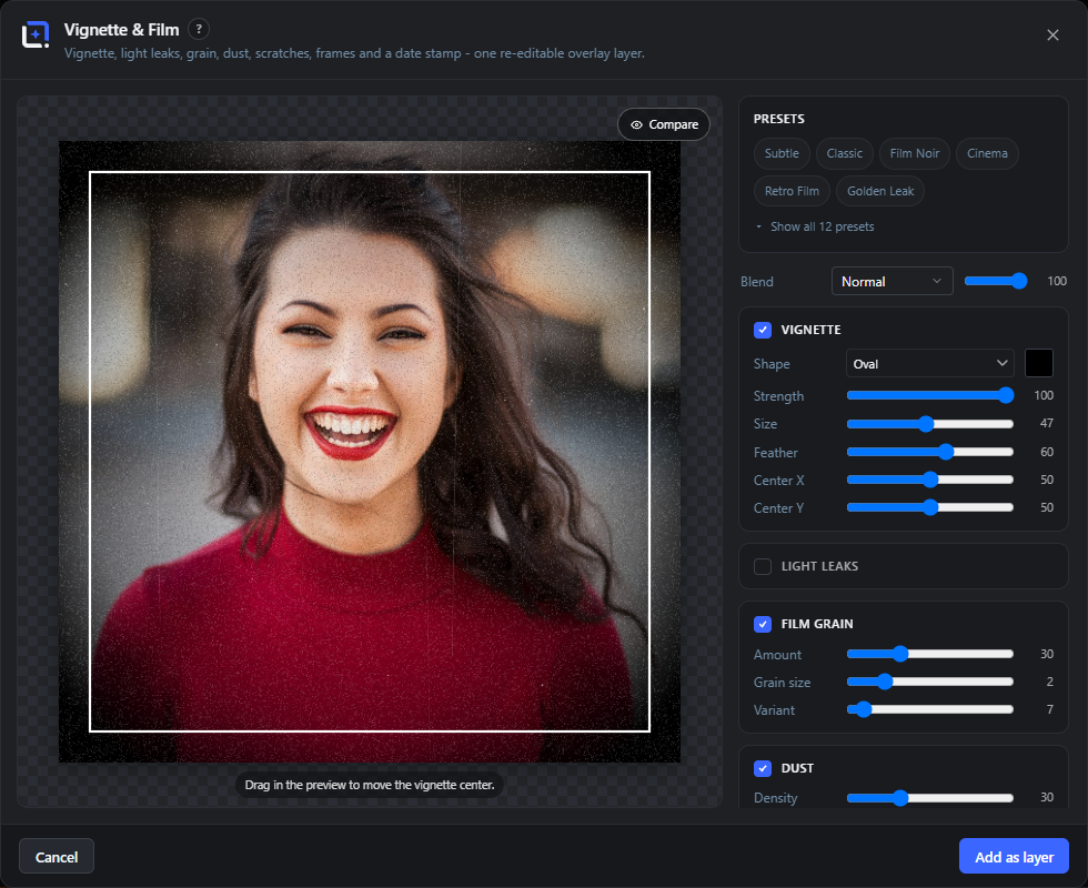
Opened from Tools, then Vignette & Film. The left half shows a live preview of your document with the overlay on top, the right half holds a preset row, a Blend row and one collapsible card per effect: Vignette, Light leaks, Film grain, Dust, Scratches, Frame and Date stamp. Every card has a checkbox in its header: unchecked, the effect is off and its sliders stay hidden. The overlay always renders at the full document size and is scaled into the preview, so grain and dust look exactly like the final pixels.
What you insert is a generator layer, not a flat pasted image. The layer keeps its settings under the id wpie-core/vignette, so Edit in the layer's context menu reopens this studio with every slider where you left it. Because all values are stored as relative percentages, the layer also re-renders itself at the target size whenever the document changes shape: dynamic templates, Magic Resize and format automation call the generator's resolve hook and repaint the overlay to the new box instead of stretching it.
If a plain radial gradient layer is selected when you open the studio (the way the starter templates ship their vignettes), the studio reads that gradient's look into its sliders and the primary button changes to Replace layer, converting the gradient into a studio layer at the same stack position.
Presets
#A row of pills at the top of the control column. Clicking one replaces all settings at once with a curated look (and its suggested blend mode). Six pills show by default.
Show all 12 presets
#Expands the preset row from the first six pills to all twelve, and reads Show fewer presets once open.
Subtle
#Preset: a soft oval vignette only, low strength with a wide, heavily feathered falloff. The lightest of the looks.
Classic
#Preset: the standard oval vignette, medium strength and a tighter size than Subtle. No film effects.
Film Noir
#Preset: a strong, tight oval vignette plus film grain, and it switches the layer blend mode to Multiply.
Cinema
#Preset: a Top edge vignette (shading from the top down) with light grain, for a graded movie-still feel.
Retro Film
#Preset: oval vignette, heavier grain, light scratches and one warm light leak. The full analog look.
Golden Leak
#Preset: a gentle wide vignette with two strong golden light leaks.
Old Photo
#Preset: a dark brown vignette instead of black, strong grain and dark dust, like a print that aged in a box.
Instant Photo
#Preset: light vignette and grain inside an off-white instant photo frame with the heavy bottom chin.
Filmstrip
#Preset: vignette, grain and scratches inside a near-black filmstrip frame with punched perforation holes.
90s Snapshot
#Preset: light vignette, grain, one warm leak and the orange date stamp in the bottom right corner. The stamp is filled with today's date if you have not typed your own text.
Rounded Matte
#Preset: a very soft vignette behind a dark matte with rounded corners.
Dusty Print
#Preset: an Edges vignette with dense light dust and a few scratches, like a dusty scan.
Blend
#Picks the blend mode the finished overlay layer uses against the artwork below. Normal simply lays the overlay on top; Multiply deepens a dark vignette into the image. The preview honours your choice live.
Opacity (Blend row)
#The slider next to the Blend dropdown. Sets the layer's opacity, so you can dial a whole look back without touching its sliders.
Compare
#Hold this button under the preview to hide the overlay and see the untouched document. Releasing brings the effect back.
Vignette
#The header checkbox of the Vignette card. On by default, it paints the darkening (or lightening) falloff. Off, the whole card and its sliders disappear.
Shape
#The dropdown that decides where the vignette falls off. Ten shapes are available, from a classic oval to single edges, letterbox bars and pillars.
Oval
#Shape: a radial falloff around an adjustable center. Its radius comes from the image diagonal, so the look survives any format. Unlocks Feather, Center X and Center Y, and lets you drag the center in the preview.
Circle
#Shape: like Oval, but the radius keys to the short side instead of the diagonal, giving a true round spotlight whatever the format. Also unlocks Feather and the Center sliders.
Edges
#Shape: four straight ramps from the top, bottom, left and right edges inwards. The corners overlap and darken naturally, so the frame stays rectangular instead of round.
Corners
#Shape: only the four corners fall off, the way an old lens loses light, while the edges stay clear.
Top
#Shape: a single ramp shading down from the top edge. Good for headline text that needs contrast.
Bottom
#Shape: a single ramp shading up from the bottom edge, the classic bed for a caption.
Left
#Shape: a single ramp shading in from the left edge.
Right
#Shape: a single ramp shading in from the right edge.
Letterbox
#Shape: two ramps, one from the top and one from the bottom, for a cinematic band top and bottom. Their reach is a little shorter than a single edge ramp at the same Size.
Pillars
#Shape: the same idea turned sideways, one ramp from the left and one from the right edge.
Color (Vignette)
#The swatch next to the Shape dropdown. The vignette does not have to be black: a dark brown ages a photo, a bright color can lift the edges instead of sinking them.
Strength (Vignette)
#How opaque the vignette gets at its darkest point. 0 makes it invisible, 100 paints the color at full opacity at the edges.
Size (Vignette)
#How far the falloff reaches. On the oval and circle shapes a larger value pushes the dark ring outwards and leaves more of the image clear; on the edge, letterbox and pillar shapes it sets how deep the ramp travels from the edge.
Feather
#How soft the transition is between the clear center and the shaded edge. Low values give a hard ring, high values a long gentle fade. Shown for the Oval and Circle shapes only.
Center X
#Moves the bright center of the vignette horizontally, in percent of the image width. 50 is the middle. Shown for the Oval and Circle shapes only.
Center Y
#Moves the bright center vertically, in percent of the image height. Use it to put the clear spot on a face that sits off-center. Shown for the Oval and Circle shapes only.
Drag in the preview
#With the Oval or Circle shape active, the pointer turns into a crosshair over the preview and dragging sets Center X and Center Y directly. A hint under the preview says so.
Tip. Only available for Oval and Circle, the other shapes have no movable center.
Light leaks
#Card checkbox. Paints one to three soft colored glows anchored on an edge, biased to the top half like leaks in a real camera back. Overlapping leaks add up like light does.
Color (Light leaks)
#The base color of the leaks. Each blob drifts a little around this hue, so several leaks never look identical.
Strength (Light leaks)
#How bright the leaks burn into the image.
Size (Light leaks)
#How far a leak reaches into the frame, from a small edge flare to a glow across half the image.
Count (Light leaks)
#How many leaks are painted.
Variant (Light leaks)
#Reshuffles the leaks: their edge, angle, stretch and hue drift all follow this number. Same number, same leaks, every time the layer re-renders.
Film grain
#Card checkbox. Sprinkles bright and dark speckles across the frame. It is sparse by design, only the outliers become visible grains rather than a full mosaic.
Amount
#How strongly the grain shows. Higher values make the speckles more opaque, not more numerous.
Grain size
#The pixel size of one grain. 1 gives a fine digital noise, 6 a coarse pushed-film texture. The grain is drawn without smoothing, so the cells stay crisp.
Variant (Film grain)
#Redraws the whole grain pattern with a different random seed. Nothing else changes.
Dust
#Card checkbox. Scatters specks and the occasional curled fiber over the image, the way dust sits on a scanner or a negative.
Density
#How many specks are placed. The count scales with the document area, so a large canvas gets the same dust per square inch as a small one.
Size (Dust)
#Scales every speck and fiber. Small values give sharp pinpricks, large values chunky lint.
Tone (Dust)
#Chooses whether the dust is painted white or black. Light reads as dust on a dark scan, Dark as dirt on a light print.
Variant (Dust)
#Reshuffles where the specks and fibers land.
Scratches
#Card checkbox. Draws thin vertical lines that wander slightly as they run down the frame, like the scratches a projector leaves on film.
Count (Scratches)
#How many scratches are drawn. Each one gets its own position, length and drift.
Strength (Scratches)
#How visible the lines are. It scales their opacity, so low values leave them as a barely there hint.
Tone (Scratches)
#Paints the scratches white or black. Light suits dark footage, Dark suits a bright print.
Variant (Scratches)
#Redraws the set of scratches with different positions and wobble.
Frame
#Card checkbox. Paints a border on top of everything else in the overlay, so grain and dust stay behind it.
Style
#The frame dropdown. Ten styles, from a plain border to instant photo, filmstrip and photo corners.
Instant photo
#Frame style: an even border on three sides with a much heavier chin at the bottom, the classic instant film look.
Solid border
#Frame style: an even band of the frame color on all four sides.
Thin line
#Frame style: a single hairline keyline, inset from the edge by the Size slider.
Double line
#Frame style: two concentric keylines, a heavier outer and a finer inner one, for an editorial look.
Filmstrip
#Frame style: bars across the top and bottom with perforation holes punched through them, so the image shows in the holes.
Slide mount
#Frame style: a thick 35mm slide mount with a rounded window cut into it.
Rounded matte
#Frame style: a matte that fills everything outside a rounded window. This is the only style that reveals the Radius slider.
Painted edge
#Frame style: four bands whose inner side wobbles like a loaded brush, for a hand-painted border. Reveals the Variant slider.
Corner tape
#Frame style: four semi-transparent tape strips lying across the corners at an angle, like a photo taped into an album. Reveals the Variant slider.
Photo corners
#Frame style: a triangular mounting pocket in each corner, the classic photo album corners.
Color (Frame)
#The color of the border, bars, tape or corners. White by default, but a near-black reads as a filmstrip or a dark matte.
Size (Frame)
#How thick the frame is, measured against the short side of the image, so it scales with the document. Each style interprets it in its own proportion (the slide mount and filmstrip run visibly wider than a solid border at the same value).
Radius
#How round the window corners are. Shown for the Rounded matte style only.
Variant (Frame)
#Reshuffles the random part of the frame: the brush wobble of Painted edge, the tilt of the tape strips. Shown for the Painted edge and Corner tape styles only.
Date stamp
#Card checkbox. Burns in a glowing seven-segment date, the way a point and shoot camera did. Ticking it fills the text with today's date in the classic format (for example '26 07 16) if the field is still empty. It is drawn as strokes, not as a font, so it renders identically everywhere.
Text
#What the stamp reads. Digits get real seven-segment shapes; a space, an apostrophe and a period have their own forms, and any other character is drawn as a dash.
Color (Date stamp)
#The color of the stamp. It is also used for the glow around the digits.
Size (Date stamp)
#The height of the digits, in percent of the image's short side, so the stamp keeps its proportion at any document size.
Corner
#Which corner the stamp sits in, with a margin that scales with the image.
Add as layer
#The primary button in the normal case. Renders the overlay at full document size and adds it as a new layer named Vignette & Film on top of your stack, carrying the Blend mode and Opacity you chose.
Replace layer
#The primary button reads this instead when the studio opened with a plain radial gradient vignette selected (as the starter templates ship them). It removes that gradient and drops the studio layer in at the same stack position and inside the same group, keeping the old layer's name.
Update layer
#The primary button reads this when you reopened the studio through Edit on an existing Vignette & Film layer. It repaints the same layer in place instead of adding a second one.
Cancel
#Closes the studio and throws away the settings. The X in the header and the Escape key do the same.
Edit (reopening the layer)
#The layer is a generator layer, so Edit in its context menu brings this studio back with every card, slider and color exactly as you left them. Nothing is baked in permanently.
Tip. The same lifecycle also lets Actions replay the studio and lets dynamic templates and Magic Resize repaint the overlay at the new document size, because all values are stored as percentages rather than pixels.
QR Code Free 28 items #
Build a scannable QR code for links, Wi-Fi, contacts and more, styled to match your brand and inserted as an editable image layer.
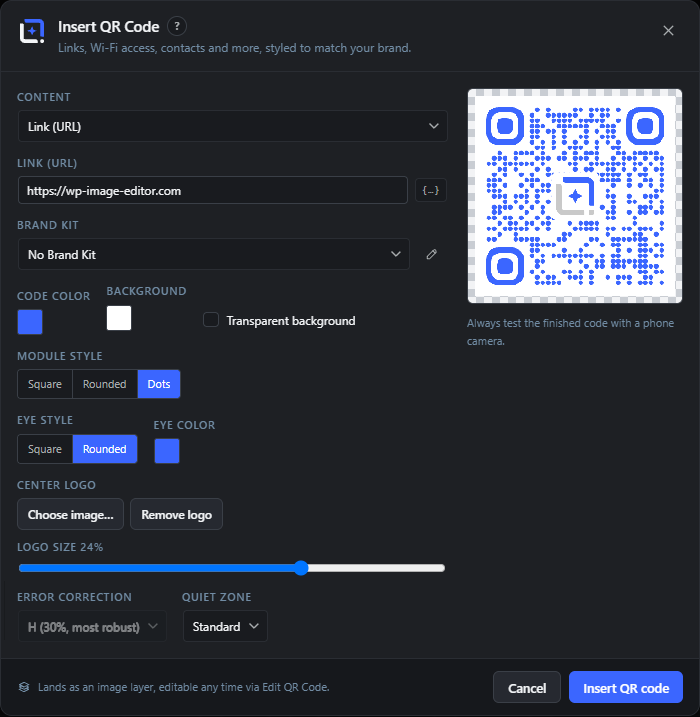
The QR Code dialog turns a piece of content (a link, some text, an email, a phone number, an SMS, Wi-Fi login details or a contact card) into a QR code image. A live preview on the right updates as you type and shows warnings if a choice might hurt scannability.
The code lands as an ordinary image layer. All settings are stored on that layer, so you can reopen the dialog later with Edit QR Code from the context menu and change anything without starting over. Every content field also accepts dynamic variables like {{post.url}} that resolve per post when the design runs as a template.
Content
#Chooses what the QR code encodes. Picking a type swaps the input fields below to match (for example a Wi-Fi network shows SSID and password fields).
Link (URL)
#The web address the code opens when scanned. Shown when Content is set to Link (URL).
Tip. Use the variable button to insert {{post.url}} so the code points at each post.
Text
#Plain text to encode when Content is set to Text. Scanners simply show this text, they do not open a link.
Email address
#The recipient address for an Email code. Scanning it opens a new message to this address.
Subject (optional)
#Pre-fills the subject line of the email that opens when the code is scanned. Leave empty for none.
Message (optional)
#Pre-fills the body of the email (or the SMS text) that opens when the code is scanned. Optional.
Phone number
#The number to call (Phone call code) or text (SMS code) when the code is scanned.
Network name (SSID)
#The Wi-Fi network name for a Wi-Fi access code. Scanning it lets a phone join the network without typing.
Password
#The Wi-Fi password stored in the code. Leave blank if the network is open.
Security
#The Wi-Fi encryption type so the phone connects correctly.
First name / Last name
#The contact's name for a Contact (vCard) code. Scanning it offers to save a new contact.
Company (optional)
#The organisation stored on the vCard contact. Optional.
Website (optional)
#A website address saved with the vCard contact. Optional (the vCard also has its own phone and email fields).
Insert variable
#The small button next to each content field inserts a dynamic token such as {{post.title}}. The token resolves per post when the design runs as a dynamic template; the preview keeps the placeholder text.
Tip. A hint appears once a field contains a variable, reminding you the preview stays as placeholder text.
Brand Kit
#Applies a saved Brand Kit to the code: the darkest kit color becomes the code color, a second dark color becomes the eye accent, and the kit logo (if any) is offered as the center logo. Only shown when Brand Kits exist.
Code color
#The color of the code's dark modules (the pattern itself). Keep it clearly darker than the background so cameras can read it.
Background
#The color behind the code. Greyed out when Transparent background is on.
Transparent background
#Drops the background fill so the code sits directly on whatever is beneath it. Make sure that surface stays light enough to scan.
Module style
#The shape of the small squares (modules) that make up the code. Rounded and Dots look softer; Square is the most reliable to scan.
Eye style
#The shape of the three large corner markers (the 'eyes') that scanners use to orient the code.
Eye color
#An optional separate color for the three corner eyes. Use the Match code color button to clear it and fall back to the code color.
Center logo
#Places an image in the middle of the code. Use the kit logo, choose an image file, or remove the current one. Adding a logo locks error correction to H so the code still scans.
Logo size
#How much of the code the center logo covers. Larger logos look bolder but risk scannability, so the range is deliberately narrow.
Error correction
#How much of the code can be damaged or covered and still read. Higher levels are more robust but make the pattern denser. Locked to H whenever a center logo is used.
Quiet zone
#The blank margin around the code. Some scanners need this clear border, so keep at least Standard when placing the code on a busy background.
Preview and warnings
#Shows the live code on a checkerboard (so transparency is visible) and lists scannability warnings, for example if the content is too long or colors are too close. Fill in the content to see it.
Tip. Always test the finished code with a phone camera before publishing.
Insert QR code
#Renders the code at high resolution and adds it as an image layer centered in the document (about 30% of the shorter side). When editing an existing code the button reads Update QR code.
Chart & Table Studio Free 21 items #
A three-zone studio that turns data into one of 35 chart and table types, inserted as a group of fully editable vector and text layers.
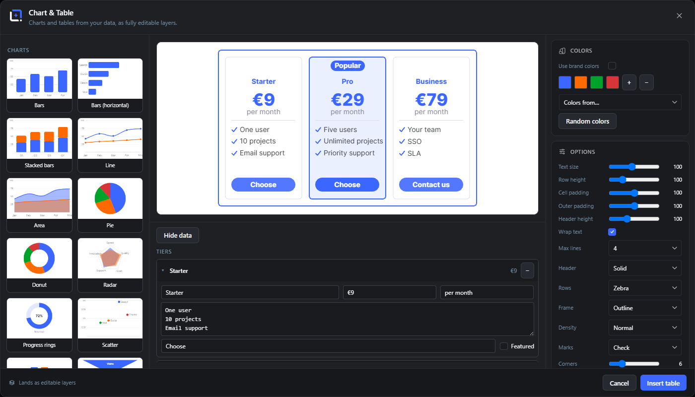
The left rail is a type gallery with rendered previews: 24 chart types and 11 table types. The center shows a live preview above a spreadsheet-style data grid, and the right rail holds design, color, series, options and text cards.
Everything the studio builds stays real layers, and the full data and settings are stored on the group: Edit in the context menu reopens the studio with everything intact. Cells and titles accept {{variable}} tokens, and a table imported from WordPress refreshes itself inside dynamic templates on export, batch runs and Preview with Post.
Type gallery
#Rendered preview cards for every type, split into Charts and Tables. Switching the type swaps the sample data unless you have entered your own.
Data grid
#A spreadsheet-style editor: the first row is the header, cells are edited in place and may hold several lines. Pasting from Excel or Google Sheets works, tabs are understood.
Column widths (drag)
#Drag the grip between two header cells to give a column more or less room in the finished table; double-click a grip to return it to automatic. The set widths travel with the design.
Add / remove rows and columns
#Toolbar buttons extend or trim the grid; rows and columns can also be reordered.
Variables in cells
#The { } button inserts a {{variable}} token at the focused cell: post fields, brand-kit values, site and date sources. Tokens resolve when the design is exported, batch-processed or previewed with a post.
Import (CSV file)
#Reads a .csv, .tsv or .txt file into the grid. With your own data already present the import asks before replacing it.
Import from WordPress
#Builds the table from your content: pick a post type, the fields as columns, plus filters (search, category or any taxonomy, author, date range, custom field with compare, offset) and sorting. The field list is reorderable.
Tip. The saved query stays on the group, so the table can refresh later.
Refresh
#Re-runs the saved WordPress query and replaces the rows. Inside dynamic templates this happens automatically on export, batch runs and Preview with Post; when a refresh fails the previous rows are kept.
Design cards
#Ready-made looks rendered with the current type, plus random variations. A click applies the design; with a locked palette (brand colors on, or a picked kit or swatch set) a design changes geometry and typography only and never your colors.
Shuffle designs
#Regenerates the random design tiles for a fresh set of looks.
Use brand colors
#Locks the palette to your brand kit: the document's active kit first, then the site kit. While it is on, designs and shuffle never override the colors.
Colors / swatches
#The working palette as editable swatches; + and − change the palette size (2 to 8 colors).
Colors from…
#Fills the palette from a saved Brand Kit or Swatch set. The picked source is remembered on the chart and locks the palette, so designs and shuffle keep your colors; editing a swatch by hand releases the lock.
Random colors
#Rolls a fresh harmonic scheme from the editor's color engine.
Series
#One row per data series with its name and an optional fixed color that overrides the palette for that series.
Font
#The editor's full font selector (brand, custom, system, editor and Google fonts, each previewed in its own face); the family applies to every text in the chart or table.
Title / Subtitle
#Optional heading lines above the chart or table. Both accept {{variable}} tokens via the { } button.
Chart options
#Type-dependent styling: card background, corner rounding, bar gap, grid lines, axes, outline, gradient fills, label and value weights, smooth curves, and number formatting (thousands separator, decimals).
Table geometry
#Sliders for the table body: text wrapping with a maximum line count per cell, row height, cell padding, outer padding and header size. Long cells wrap instead of clipping.
Tiers (Pricing table)
#The pricing editor: name, price, period, feature list and call-to-action per tier, with one tier markable as Featured.
Insert / Update
#Inserts the chart or table as an editable group; when editing an existing one the group is rebuilt in place with the stored size.
Color Schemer Free 15 items #
Build a five-color scheme with color theory, from an image, or by chance, then save it site-wide and optionally push it into a Brand Kit.
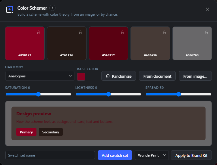
The Color Schemer has five swatch slots driven by classic color-theory harmonies. Pick a base color and a harmony, then nudge spread, saturation and lightness to fine-tune. You can lock individual slots so they survive randomizing and slider changes.
Colors can also be extracted from the current document or any media-library image. A live design preview shows how the scheme feels as background, card, text and buttons. Saved schemes become Swatch sets that appear in every color picker and in backups.
Swatch slot
#One of five color slots that make up the scheme. Each shows its hex value; click a slot to open a color picker and edit it. A manual edit automatically locks that slot.
Lock / Unlock slot
#The small padlock on each slot keeps that color fixed while you randomize or move the sliders. Unlock it to let the harmony rebuild that slot again.
Harmony
#The color-theory relationship used to derive the scheme from the base color. Each harmony spaces the hues differently around the color wheel.
Base color
#The anchor color the whole scheme is built from. Starts from the current foreground color.
Randomize
#Generates a fresh, tasteful scheme by randomizing the base color and settings. Locked slots are kept.
From document
#Extracts the five most important colors from the current design and fills the unlocked slots. Disabled when the document is empty.
From image…
#Opens a media-library picker; choose an image and its main colors fill the unlocked slots. Loads more thumbnails on demand.
Saturation
#Shifts the whole scheme more colorful or more muted. Rebuilds the unlocked slots.
Lightness
#Shifts the whole scheme lighter or darker. Rebuilds the unlocked slots.
Spread
#How far apart the harmony pushes the hues. Low keeps colors close together, high spreads them out.
Design preview
#A live mock card showing the scheme in use as background, surface, text, and Primary and Secondary buttons, so you can judge how it works together.
Swatch set name
#Names the scheme before saving. Leave blank to get an auto name like Palette 3.
Add / Update swatch set
#Saves the five colors as a named Swatch set stored site-wide, so it shows up in every color picker and in backups. Saving with an existing name updates that set in place.
Tip. The button label flips to Update swatch set when the name matches an existing set.
Overwrites the colors of the chosen Brand Kit with this scheme. Asks for confirmation first. Only shown if you can manage kits and at least one kit exists.
Saved swatch sets (Load / Delete)
#Lists your saved sets with color previews. Load pulls a set back into the slots to keep editing; Delete removes it (with a confirm step).
Background Studio Free 19 items #
Generate a full-document background from four generative styles with sliders and a seed, all rendered locally with no cloud involved.
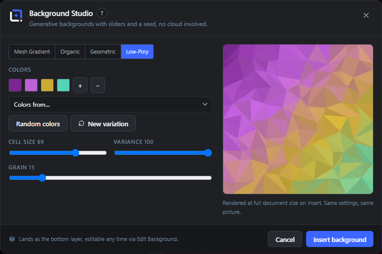
Background Studio makes deterministic, seed-based backgrounds in four styles: mesh gradient, organic, geometric and low-poly. Feed the color strip from a Brand Kit, a saved Swatch set, the current document, or chance, and shape the look with per-style sliders plus a grain overlay.
The result is inserted as a full-size raster layer at the bottom of the stack. All settings live on that layer, so Edit Background reopens the studio exactly as you left it. Tileable looks can also be saved as a seamless pattern.
Style
#The generative background family. Each style shows its own set of sliders below.
Colors
#The color strip the background is built from. Click a swatch to change it; use + and − to add or drop colors.
Colors from…
#Fills the color strip from the current document's content colors, a Brand Kit, or a saved Swatch set. Only shows sources that exist.
Random colors
#Replaces the strip with a fresh harmonious set from the color-scheme engine.
New variation
#Rolls a new random seed, giving a different picture with the exact same style and settings.
Color points
#How many color blobs the mesh gradient blends together. More points means a busier gradient. Shown for Mesh Gradient.
Softness
#How smoothly the mesh colors bleed into each other. Higher is softer and more diffuse. Shown for Mesh Gradient.
Organic variant
#Switches the Organic style between rounded Blobs and flowing Waves. This also changes the labels of the two sliders below.
Count / Bands
#How many blobs (Blobs) or wave bands (Waves) are drawn. Labeled Count for Blobs and Bands for Waves.
Roundness / Amplitude
#Shapes the organic forms: blob roundness in Blobs, or wave height in Waves. Labeled Roundness for Blobs and Amplitude for Waves.
Geometric variant
#The repeating geometric motif for the Geometric style.
Size (Geometric)
#The size of each geometric element (dot, cell, stripe). Shown for the Geometric style.
Spacing (Geometric)
#The gap between geometric elements. Shown for the Geometric style.
Angle (Geometric)
#Rotates the geometric pattern. Shown for the Geometric style.
Cell size
#The size of the triangular facets in the Low-Poly style. Larger cells mean fewer, bigger triangles. Shown for Low-Poly.
Variance
#How irregular the low-poly triangles are. Higher is more jagged and random. Shown for Low-Poly.
Grain
#Adds a subtle noise texture over the whole background to reduce banding and give a printed feel. Applies to every style.
Save as pattern
#Saves the current look as a seamless, repeatable tile in the Asset Library under Patterns. Only offered for looks that tile cleanly (mesh, organic blobs, and the straight geometric lattices).
Tip. Waves, rays and low-poly cannot tile, so the button is hidden for them.
Insert background
#Renders the background at full document size and adds it as the bottom layer. When editing an existing background the button reads Update background and re-renders in place.
Screenshot Beautifier Free 17 items #
Wrap a screenshot in a rounded card with shadow, optional browser, window or phone chrome, and a generated backdrop, all as editable layers in a new tab.
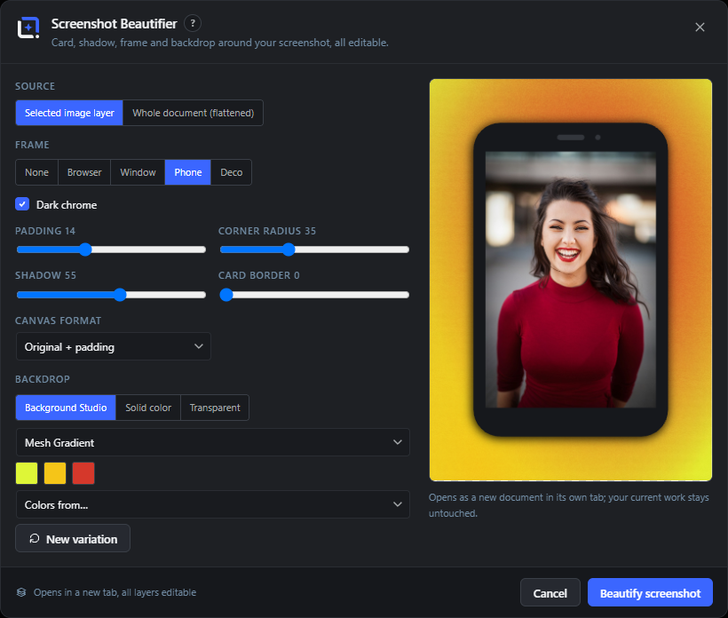
The Screenshot Beautifier frames the selected image layer or the whole flattened document in a rounded card with a shadow, adds optional device chrome or a decorative frame, grows the canvas with padding and aspect presets, and drops a backdrop behind it.
Everything opens as a fresh document in its own tab, grouped as editable layers, so your current work stays untouched. The backdrop keeps its Background Studio parameters, so Edit Background still works on it later.
Source
#What to frame: the selected image layer, or the whole document flattened into one image. Options only appear when they are available.
Frame
#The chrome drawn around the screenshot. Browser adds an address bar, Window a title bar, Phone a device body, Deco draws generative decorative shapes, None just uses the card.
Dark chrome
#Switches the browser, window or phone chrome to a dark theme. Shown for those three frames.
Address bar text
#The text shown in the browser frame's address bar. Shown only for the Browser frame.
Deco variant
#The style of decorative frame when Frame is set to Deco. Offset panes stacks tilted panes behind the card, Ring draws an outline halo, Corners adds corner accents.
Strength (Deco)
#How pronounced the decorative frame is. Shown for the Deco frame.
Angle (Deco)
#The tilt of the offset panes. Shown only for the Offset panes deco variant.
Deco colors / Randomize
#Two color swatches for the decorative frame, with Colors from… (Brand Kit or Swatch set) and a Randomize button that also reseeds the deco pattern.
Padding
#The breathing room between the screenshot card and the canvas edge, as a percentage of the card size.
Corner radius
#How rounded the corners of the screenshot card are.
Shadow
#The strength of the drop shadow under the card, giving it lift off the backdrop.
Card border
#A subtle outline around the card. Zero means no border.
Canvas format
#The shape of the output canvas. Original keeps the screenshot's aspect plus padding; the presets crop the canvas to common ratios.
Backdrop
#What sits behind the card: a generated Background Studio scene, a single solid color, or transparent.
Backdrop style (Studio)
#The Background Studio style used for the backdrop, with color swatches, Colors from… and a New variation button. Shown when Backdrop is Background Studio.
Solid color (Backdrop)
#The single background color when Backdrop is set to Solid color.
Beautify screenshot
#Builds the framed composition and opens it as a new document in its own tab, grouped as editable layers. Your current document is left untouched.
Mockup Generator Free 11 items #
Place your artwork or the whole document onto a studio product mockup (ebook, box, DVD, CD, report or monitor), rendered locally as a transparent-background image layer.
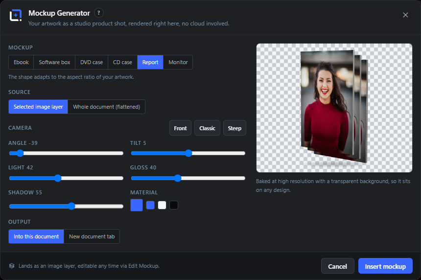
The Mockup Generator wraps the selected layer or the flattened document around a small 3D product shape, lit and shaded in the browser with no cloud involved. Six product types are available and the shape adapts to your artwork's aspect ratio.
The baked result is a normal image layer with a transparent background, so it drops onto any design. Parameters and the artwork are stored on the layer, so Edit Mockup reopens this dialog and re-renders in place.
Mockup
#The product shape your artwork is placed on. The shape adapts to the aspect ratio of your artwork.
Source
#Which image to wrap onto the mockup: the artwork stored on the layer (when editing), the selected image layer, or the whole document flattened. Only available options are shown.
Camera presets
#One-click camera angles that set the Angle and Tilt together. Front is nearly straight-on, Classic is a gentle three-quarter view, Steep is a dramatic angle.
Angle
#Rotates the product left or right (yaw). Positive values turn the spine or side into view.
Tilt
#Tips the product forward or back (pitch). Positive values look slightly down onto the object.
Light
#Moves the key light from left to right, changing which side is brightest.
Gloss
#The sheen on plastic and glass fronts. Higher values add a stronger highlight.
Shadow
#The strength of the ground shadow under the product.
Material
#The color of the product's spine, sides or bezel. Pick any color, or click one of the Brand Kit chips shown beside the swatch.
Output
#Where the finished mockup goes: added into the current document, or opened as a new document tab. Only shown when inserting a new mockup (not when editing).
Insert mockup
#Bakes the mockup at high resolution with a transparent background and adds it (or opens it in a new tab). When editing, the button reads Update mockup and re-renders in place, keeping the box width and following the new aspect ratio.
Contrast Check Free 4 items #
Rate every visible text layer against the pixels actually behind it and flag any that fall below the WCAG contrast recommendation.
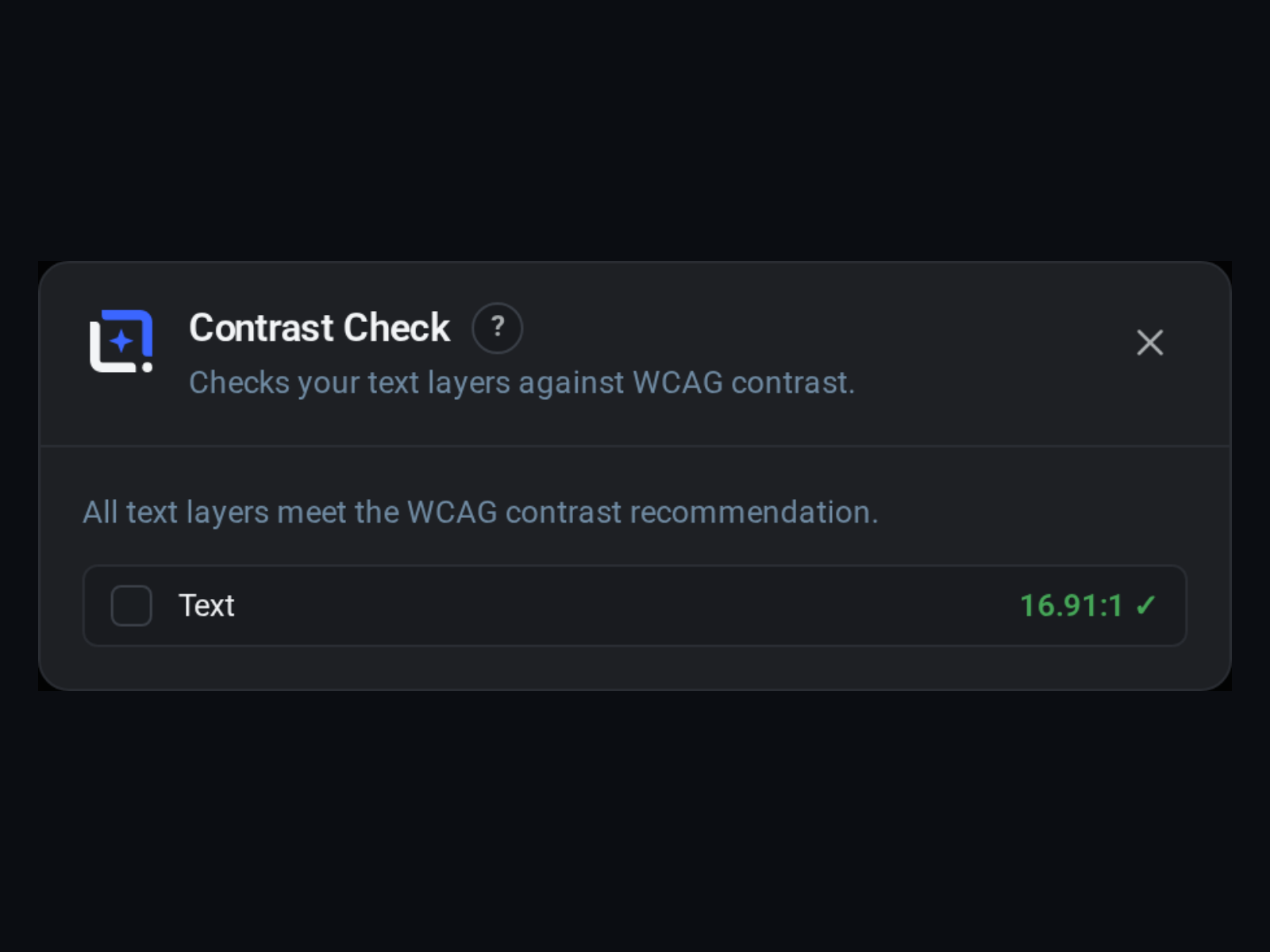
The Contrast Check dialog scans all visible text layers, measures each one's color against whatever lies underneath it in the design, and reports a WCAG contrast ratio. It runs automatically when opened.
A summary tells you how many layers fall short, and each result row can be clicked to jump straight to that text layer so you can fix it.
Checking text layers
#The automatic scan that runs when the dialog opens. It composites what is beneath each text layer and computes the real contrast ratio. Shows a spinner while working.
Summary line
#A one-line verdict: either how many text layers fall below the WCAG contrast recommendation, or that all layers meet it. Reads 'No visible text layers to check' when there is no text.
Contrast result row
#One row per text layer showing its text-color swatch, the layer name, and the measured contrast ratio. Click a row to select that layer and close the dialog so you can adjust it.
Ratio and pass / fail
#The measured contrast shown as a ratio (for example 4.7:1). A passing layer shows a check mark; a failing one shows the ratio it still needs to reach, for example '(needs 4.5:1)'.
Depth Blur (background) FreeLocal AI 5 items #
Estimate a depth map for the active layer and add a graduated depth-of-field blur that keeps the focus sharp while melting the background away.
Depth Blur estimates how far each part of the image is from the camera, then blurs by distance so the subject stays crisp and the background softens like a wide-aperture lens. The depth estimation runs locally with a self-hosted Depth Anything model.
A live preview updates as you move the Focus depth and Strength sliders. Apply bakes the blur into the layer. If the depth model is not installed yet, the dialog links to Settings to download it.
Focus depth
#Chooses which depth stays sharp: lower keeps near objects in focus, higher keeps far ones sharp. It starts at an automatically detected focus point.
Strength
#How strong the background blur gets. Higher values give a more dramatic, shallow-depth-of-field look.
Preview
#A live canvas showing the blurred result as you move the sliders, so you can dial in the effect before committing.
Apply
#Bakes the current blur into the active layer, replacing its content. The button reads Applying… while it works.
Model not installed notice
#Shown when the local Depth model has not been downloaded yet. It explains where to get it (Settings, then WunderPaint, then Local AI Models) and links straight to Settings.
Tip. Reopen this dialog after installing the model.
QR code content types and Wi-Fi security Free 8 items #
The Content dropdown chooses what the finished QR code holds, and each type reveals its own fields.
Link (URL) and Text are the two simplest types (documented with their fields). The remaining choices below build special payloads so a phone scan does the right thing (start an email, dial, connect to Wi-Fi, save a contact).
Content type that builds a mailto: code. Reveals the Email address, Subject (optional) and Message (optional) fields, so a scan opens a pre-filled email.
Phone call
#Builds a tel: code so a scan offers to dial the number. Reveals the Phone number field.
SMS
#Builds an SMS code. A scan opens a new text message to the number, optionally pre-filled with the Message.
Wi-Fi access
#Encodes network join details so a scan connects to Wi-Fi without typing. Reveals Network name (SSID), Password, Security and Hidden network.
Contact (vCard)
#Encodes a contact card. A scan offers to save the person. Reveals first and last name, Company, Phone, Email and Website fields.
WPA/WPA2/WPA3
#Default Wi-Fi security for the code. Use this for almost every modern router.
WEP
#Legacy Wi-Fi security. Only pick this for very old networks that still use it.
Open (no password)
#For networks that have no password. The Password field is ignored when this is chosen.
QR code module, eye and logo options Free 9 items #
The exact choices inside the Module style and Eye style controls, plus the buttons that manage the center logo.
Square
#Module style that draws sharp square pixels. The classic and most compatible QR look.
Rounded
#Module style that softens every pixel into a rounded square for a friendlier feel.
Dots
#Module style that renders each pixel as a small dot. The most decorative option, so test it with a phone after export.
Square
#Eye style that keeps the three finder eyes (the big corner markers) as plain squares.
Rounded
#Eye style that rounds the corners of the three finder eyes.
Match code color
#Clears a separate Eye color so the finder eyes reuse the main Code color. This button appears only after you have set a custom eye color.
Use kit logo
#Drops the current Brand Kit logo into the center of the code. Shown only when the selected kit has a logo.
Choose image…
#Uploads any image from your computer to sit in the middle of the code.
Remove logo
#Removes the center logo. Shown only when a logo is set.
QR error correction and quiet zone options Free 8 items #
The individual levels in the Error correction dropdown and the sizes in the Quiet zone dropdown.
L (7%, smallest code)
#Error correction level L. Least redundancy, so the smallest and densest code. Best for short data and clean printing.
M (15%, default)
#Error correction level M, the default. A balanced amount of redundancy for everyday use.
Q (25%)
#Error correction level Q. More redundancy, so the code survives more damage or dirt at the cost of density.
H (30%, most robust)
#Error correction level H, the most robust. Survives the most damage and is required when a logo covers part of the code.
Tip. Adding a center logo locks the level to H automatically and disables this dropdown.
None
#Quiet zone option with no blank margin around the code. Risky, because many scanners need the border to lock on.
Narrow
#A thin blank margin around the code.
Standard
#The standard blank margin, on by default. The safe choice for reliable scanning.
Wide
#A generous blank margin around the code.
QR Brand Kit picker, variables and Update Free 4 items #
The small controls around the QR dialog: the Brand Kit dropdown items, the variables notice and the edit-mode button label.
No Brand Kit
#Top item of the Brand Kit dropdown. Leaves the code colors and logo as they are instead of pulling from a kit.
Edit Brand Kits
#Pencil button next to the Brand Kit dropdown. Opens the Brand Kits manager so you can change kit colors and logo without leaving the QR dialog.
Variables resolve per post
#Notice that appears when any field contains a {{token}}. The live preview keeps the placeholder text. In the free plugin the token resolves against a real post on export and under View, then Preview with Post. Running the design over many posts, or embedding it as a dynamic image block or shortcode, is part of Pro.
Update QR code
#Edit-mode label of the primary button. When you reopen a code through Edit QR Code, it rebuilds the existing layer in place instead of inserting a new one.
Chart types Free 9 items #
Every chart choice in the Type dropdown's Charts group.
The Type dropdown is split into two groups, Charts and Tables. These are the nine Charts entries. Data is entered as Label, value, value rows (pasting from Excel or Sheets works).
Bars
#Vertical bar chart, one bar per row. Extra numeric columns become grouped bars side by side.
Bars (horizontal)
#Bars drawn sideways. Good when your category names are long.
Stacked bars
#Stacks each series on top of the previous one, so a bar shows a total split into parts.
Line
#Line chart with one line per series. Good for trends over time.
Area
#Line chart with the area under each line filled in.
Pie
#Pie chart of a single series, one slice per row.
Donut
#Pie with a hollow center. The Thickness slider sets the ring width.
Radar
#Spider chart that compares several series across the same set of axes.
Progress rings
#One ring per row, each showing a percentage toward a goal. Thickness sets the ring width.
Table types Free 3 items #
The Tables group of the Type dropdown holds eleven choices. The three below are the ones whose editor changes shape; the rest (Ranking, Schedule, Checklist, Menu / price list, Spec sheet, Scorecard, Timeline and Matrix) are data grids with their own styling.
Data table
#A plain data grid. The first row becomes the column headers, and each following row is a record.
Comparison table
#A feature comparison grid with yes and no style cells and an optional highlighted column.
Pricing table
#Pricing tiers shown as cards. Choosing this switches the editor from a data box to the tier builder.
Chart and table option lists Free 21 items #
Every choice inside the Value labels, Header, Rows, Frame, Density and Marks dropdowns.
Off
#Value labels option that shows no numbers on the chart.
Values
#Value labels option that prints the raw number on each bar, point or slice.
Percent
#Value labels option that prints each figure as a percentage of the total.
Solid
#Header style with a solid color band behind the column titles.
Gradient
#Header style with a color gradient band. Choosing it also switches the gradient fill on.
Underline
#Header style with just an underline beneath the titles, no fill.
None
#Header style with no special header treatment.
Zebra
#Row style that alternates a faint background every other row for easier reading.
Lines
#Row style that separates rows with thin divider lines.
Plain
#Row style with no zebra shading and no dividers.
Cards
#Row style that renders each row as a separate card.
None
#Frame option with no border or container around the table.
Outline
#Frame option with a thin outline around the whole table.
Soft
#Frame option with a soft, subtle container.
Dark
#Frame option with a dark container behind the table.
Compact
#Density option with tight row height, fitting more rows in less space.
Normal
#Default row height.
Roomy
#Density option with generous row height and more breathing room.
Check
#Marks style that shows a check for yes cells in a comparison table.
Badge
#Marks style that shows a filled badge for yes cells.
Dot
#Marks style that shows a small dot for yes cells.
Pricing tier editor fields Free 6 items #
The per-tier fields that appear when a tier is expanded in the Pricing table editor.
Each tier is a collapsible row. Click a row to open its fields. The tier list is capped at 5 tiers, and you cannot remove the last one.
Name
#The tier's title, for example Starter or Pro. Also shown on the collapsed row.
Price
#The headline price text for the tier, for example €29. Free text, so any currency works.
Period
#The billing period shown under the price, for example per month.
One feature per line
#Multi-line box listing the tier's features. Put one feature on each line and it becomes one bullet.
Button (optional)
#Call-to-action button label for the tier, for example Choose or Contact us. Leave empty for no button.
Remove tier
#The minus button on a tier row deletes that tier. Disabled when only one tier is left.
Color Schemer harmonies Free 7 items #
Every rule in the Harmony dropdown that decides how the swatches relate to the base color.
Analogous
#Colors that sit next to each other on the wheel. Calm and cohesive.
Complementary
#The base color plus its opposite on the wheel. High contrast and punchy.
Split complementary
#The base color plus the two colors either side of its opposite. Contrast with less tension.
Triadic
#Three colors spaced evenly around the wheel. Balanced and vivid.
Tetradic
#Four colors in two complementary pairs. Rich but harder to balance.
Monochromatic
#One hue in several saturations and lightnesses. Very unified.
Shades & tints
#The base hue stepped from dark shades to light tints.
Color Schemer picker and confirm states Free 4 items #
Smaller Color Schemer controls: the media picker, the kit target selector and the two-step confirm buttons.
More…
#Loads the next page of media library images inside the From image… picker. Reads Loading… while fetching.
Brand Kit selector
#Dropdown next to Apply to Brand Kit choosing which kit receives the scheme. Only visible when you can manage kits and at least one kit exists.
Really overwrite the kit colors?
#The confirm state of Apply to Brand Kit. The button turns into this warning first, so you click twice to actually overwrite the kit's colors.
Really delete?
#The confirm state of a saved swatch set's Delete button. Click again to remove the set for good.
Background Studio styles Free 4 items #
The four top-level looks in the Background Studio style switch.
Mesh Gradient
#Smooth multi-color gradient blended between color points. The softest, most modern background. Tiles seamlessly.
Organic
#Flowing blob or wave shapes. Choose the Blobs or Waves variant below.
Geometric
#Repeating dots, grid, stripes or rays. Choose the variant and set size, spacing and angle.
Low-Poly
#A faceted, triangulated surface. Set cell size and how much the facets vary.
Background Studio variants Free 6 items #
The variant choices inside the Organic and Geometric styles.
Blobs
#Organic variant of soft rounded blobs. Count sets how many, Roundness sets how smooth. Tiles seamlessly.
Waves
#Organic variant of layered wave bands. Bands sets how many, Amplitude sets the height.
Dots
#Geometric variant of a dot grid.
Grid
#Geometric variant of a line grid.
Stripes
#Geometric variant of parallel stripes, angled by the Angle slider.
Rays
#Geometric variant of rays fanning from a point.
Tip. Rays is the one geometric variant that cannot be exported as a seamless pattern tile.
Beautifier source, frame and deco options Free 10 items #
The choices inside the Screenshot Beautifier's Source, Frame and Deco switches.
Selected image layer
#Source option that wraps the currently selected image layer (or the bottom-most one).
Tip. If there is no image layer and no document, the beautifier shows a note asking you to add one first.
Whole document (flattened)
#Source option that flattens the entire document to one picture and frames that.
None
#Frame option with no browser or window chrome, just the card and shadow.
Browser
#Frame option that adds a browser chrome with an address bar. Reveals the Dark chrome toggle and Address bar text.
Window
#Frame option that adds a plain app window chrome with a title bar. Reveals the Dark chrome toggle.
Phone
#Frame option that wraps the shot in a phone body. Reveals the Dark chrome toggle.
Deco
#Frame option that adds a generative decorative frame instead of chrome. Reveals the deco variant, Strength, Angle and deco colors.
Offset panes
#Deco variant with offset color panes behind the card. The Angle slider skews them.
Ring
#Deco variant that draws a colored ring around the card.
Corners
#Deco variant that adds decorative accents to the card corners.
Beautifier canvas format and backdrop options Free 8 items #
The Canvas format choices and the three Backdrop modes.
Original + padding
#Canvas format that keeps the shot's own aspect ratio and just adds the padding you set.
16:9
#Canvas format that fits the framed shot into a 16:9 canvas, good for slides and video thumbnails.
4:3
#Canvas format that fits the shot into a 4:3 canvas.
1:1
#Canvas format that fits the shot into a square canvas, good for social posts.
OG / social card (1.91:1)
#Canvas format sized 1.91:1, the Open Graph link-preview ratio for social shares.
Background Studio
#Backdrop mode that puts a generative Background Studio fill behind the card. Reveals a style dropdown, color swatches and New variation.
Transparent
#Backdrop mode with no fill behind the card, so it sits on a transparent canvas.
New variation
#Reseeds the Background Studio backdrop for a fresh look while keeping the same style and colors. Only shown for the Background Studio backdrop.
Mockup product types Free 6 items #
The six product shapes in the Mockup switch.
The shape adapts to the aspect ratio of your artwork, so a tall image and a wide image produce differently proportioned products.
Ebook
#Renders the artwork as a standing ebook or book cover.
Software box
#Renders the artwork on a boxed software package.
DVD case
#Renders the artwork on a DVD case.
CD case
#Renders the artwork on a CD jewel case.
Report
#Renders the artwork as a printed report or document stack.
Monitor
#Renders the artwork on a computer monitor screen.
Mockup source, camera and output options Free 9 items #
The Source choices, the camera presets, the Material kit swatches and the two Output modes.
Stored artwork
#Source option that reuses the exact artwork saved on the mockup layer. Only offered in edit mode.
Selected image layer
#Source option that puts the currently selected image layer onto the product.
Whole document (flattened)
#Source option that flattens the whole document and uses that as the artwork.
Front
#Camera preset for a nearly straight-on view.
Classic
#Camera preset for the standard three-quarter product angle.
Steep
#Camera preset for a dramatic, strongly turned angle.
Material kit swatches
#Small color chips from the active Brand Kit shown next to the Material color. Click one to recolor the product body to that kit color.
Into this document
#Output option that drops the finished mockup as an image layer into the current document.
New document tab
#Output option that opens the mockup as its own new document in a separate tab, leaving your current work untouched.
Contrast Check and Depth Blur extras FreeLocal AI 4 items #
The remaining states and links in the Contrast Check and Depth Blur dialogs.
No visible text layers to check
#Message shown by Contrast Check when there are no visible text layers, so there is nothing to rate.
Contrast swatch
#The small color square at the start of each Contrast Check row, showing that layer's text color.
Open Settings
#Link in the Depth Blur model-missing notice. Opens Settings so you can download the Depth model, then reopen the dialog.
Applying…
#Label the Depth Blur Apply button shows while it bakes the blur into the layer.
Backgrounds tab (gradients, patterns, solids) Free 4 items #
The Backgrounds tab inserts a full-canvas background layer at the bottom of the stack, split into gradients, patterns and solid colors.
My backgrounds (Alt-click to remove)
#Your own saved background fills (solid or gradient). A click inserts one as the background; Alt-click removes it from the list.
Gradients
#Preset gradient swatches. Clicking one drops it in as a full-canvas gradient background layer.
Patterns
#Geometric pattern fills drawn in the current foreground color across the whole canvas.
Tip. These are drawn vector patterns, different from the uploaded seamless tiles in the Patterns tab.
Solid colors
#Flat color backgrounds. The row mixes your brand colors, the current foreground and background colors and a few neutrals.
Asset Library tray Free 33 items #
The collapsible dock under the canvas for fast, one-click inserting of assets.

The tray is the fast path to the Asset Library. It sits under the canvas, stays open so you can drop several assets in a row, and remembers whether it was open and which section you last used.
Every tile can be clicked to insert, or dragged straight onto the canvas. Where a section shows your own saved items, hold Alt and click a tile to remove it.
Asset Library
#The label at the left of the tray head, naming the dock. It does not do anything on its own; the chips next to it choose what the tray shows.
Recent
#Lists the assets you inserted most recently, newest first, across every source. Use it to reinsert something you just placed without searching for it again.
Tip. Empty until you insert your first asset; everything you add lands here.
My Assets
#Your own saved layer snapshots, made with File, then Save as Asset. Click to insert; Alt-click removes an item.
Dynamic Templates
#Your saved dynamic templates. Clicking one opens it as a new document (next to your current work when tabs are on).
Starter Templates
#The fully editable starting points that ship with the plugin, plus any templates added by installed extension packs. Clicking one opens it as a new document.
Brand Kits
#One tile per Brand Kit that has a logo. Clicking a tile inserts that kit's logo as a layer.
Buttons & Badges
#Styled text-and-shape button and badge combinations. Clicking one inserts the group so you can edit each line. This is the tray's default section on first open.
Headlines
#Ready-made headline text combinations. Insert one, then edit each line on the canvas.
Lists
#Pre-styled list layouts as text groups. Insert, then replace the placeholder lines.
Quotes & Reviews
#Quote and review text combinations with attribution lines. Insert and edit in place.
Sales & Prices
#Sale, price and offer text groups built around a number or discount. Insert and edit.
Events & News
#Event and news text combinations (name, date, venue and similar). Insert and edit.
Stats & Numbers
#KPI callouts, comparisons and mini bar-chart text groups. Insert and edit the figures.
Shapes
#Vector shape elements (arrows, blobs, badges and more) plus any shapes you saved. Click to insert centered; Alt-click removes a saved one.
Backgrounds
#Full-canvas fills: gradient presets, solid colors (including your Brand Kit colors) and any backgrounds you saved. Inserts as the bottom layer.
Icons
#The Tabler icon set as line icons. Scroll or filter, then click to insert; the strip loads more as you reach its end.
Emoji
#The full emoji set as text glyphs. Filter by name, then click to insert. Loads more as you scroll.
Free stock photos from your configured provider. Browse the category cards or type in the tray search; results stream in with infinite scroll and insert as layers.
Tip. Needs a stock provider under Settings, then Integrations.
Illustrations
#Free illustrations from Pixabay. Only appears when a Pixabay API key is configured.
Vectors
#Free vector graphics from Pixabay. Only appears when a Pixabay API key is configured.
Media Library
#Images already in your WordPress media library. Click to insert; from three characters the search also ranks by meaning when the image search model is installed.
Filter search field
#The search box in the tray head. It filters the current section; in Photos, Illustrations and Vectors it drives the provider search instead, and its placeholder changes to match.
Opens the AI Generate dialog seeded to a type that matches the current section: text for a text category, shape for Shapes, otherwise gradient.
Open Asset Library
#Opens the full Asset Library dialog on the current section. Photo, illustration, vector and recent sections open on the dialog's Media Library section.
Collapse / Expand
#The chevron at the far right opens or closes the tray body. Clicking the active chip again also collapses the tray.
Drag onto canvas
#Every tile is draggable. Drag it from the tray and drop it on the canvas to insert at that spot instead of centered.
Alt-click to remove
#In the sections that show your own saved items (My Assets, Shapes, Backgrounds, Text), hold Alt and click a tile to delete that saved item.
Tip. Only affects items you saved, never the built-in library.
Category cards (Starter Templates)
#With the tray search empty, the Starter Templates strip shows one card per template category instead of hundreds of tiles. Each card is previewed with the first template of that category and its tooltip names the category and how many templates it holds. Categories with no templates are skipped, and categories added by installed template packs get a card too.
Drill into a category
#Click a category card and the strip switches to the templates of that category, bundled ones and pack ones together. Click a template to open it as a new document.
All categories (back tile)
#The leading grid tile shown while you are inside a category. Click it to leave the drill-in and return to the category cards.
Tray search in Starter Templates
#Typing in the tray search leaves the category cards and lists matching templates directly. It uses the same matcher as the library dialog, so it hits the template name, the copy on its text layers, its category and its dominant color names: "red menu" works. With no category picked, a search word that matches a pack's own name also brings in that pack's templates.
No matches.
#The hint shown in the strip when the current search or category leaves no templates. Clear the search or use the All categories tile to get back.
WordArt
#Hand-crafted multi-layer word-art lockups; inserting one adds a fully editable group of text layers.
Asset Library (full dialog) Free 20 items #
The full-screen library modal with a left sidebar of sources and a search across everything you have saved.
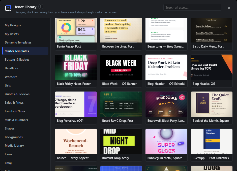
The dialog opens from Assets, then Library (or the tray's Open Asset Library button). The left sidebar lists every source; the header search runs a live hero search across all asset titles at once.
Each sidebar section shows a card grid you can click to insert or, for templates and designs, to open as a new document.
The header search box. Typing runs a live search across designs, media, starters, your assets, text, shapes, backgrounds, icons, emoji and extension packs at once, grouped by source. When the image search model is installed it also ranks your media library by meaning.
Designs
#Your layered working files, saved via File, then Save Design. Open one as a new document; each card also has Duplicate, Move to folder, Rename and Delete buttons, and a Folder dropdown filters the list when designs have folders.
My Assets
#Your saved layer snapshots, organised into your own categories. Tabs across the top switch category (All, each category, Unsorted); each category has rename and delete tools, and there is a New category button.
Tip. Deleting a category keeps its assets and moves them to Unsorted.
Dynamic Templates
#Your saved dynamic templates, grouped per Brand Kit with a "Without Brand Kit" group for the rest. Click to open as a new document; each card has a Delete button.
Starter Templates
#The bundled, fully editable starter templates plus installed extension template packs (each pack under its own heading). Click to open as a new document.
Text (styled combinations)
#The seven text-combination categories are each a sidebar section: Buttons & Badges, Headlines, Lists, Quotes & Reviews, Sales & Prices, Events & News, Stats & Numbers. Insert a group, then edit each line. Your own saved text appears first with Alt-click to remove.
Shapes
#Vector shape elements grouped into sets, sized to about 30% of the canvas and filled with the foreground color on insert. Your saved shapes show first with Alt-click to remove.
Backgrounds
#Full-canvas fills inserted as the bottom layer. Sub-groups are Gradients, Patterns (dots, stripes, checker, grid, diagonal, crosshatch, zigzag, waves, bricks, plus, triangles, scales), Solid colors (Brand Kit colors plus neutrals) and your saved backgrounds.
Media Library
#A paged grid of images from your WordPress media library. Click to insert centered and fitted; Load more pages in as you scroll. The search index hint shows if semantic indexing is available.
Icons
#The Tabler icon set. Search by name; the count shows how many match. Icons insert as stroked shape layers in the foreground color. "Show more" (or scrolling) reveals additional pages.
Emoji
#The emoji set with a name search and a category dropdown (All categories plus each group). The count shows matches. Emoji insert as a centered text layer.
Patterns
#Small seamless tile images that fill shapes and the Pattern Overlay layer style. This section is dialog-only. Upload a pattern (named, downscaled to 256 px max) or delete existing ones; patterns embed into saved documents.
Tip. The Upload button is disabled once you reach the pattern cap.
Brand Kits
#One logo tile per Brand Kit that has a logo; clicking inserts that logo as a layer. If no kit has a logo, a Manage Brand Kits button opens the kit editor.
Sidebar section list
#The left rail listing every source. Clicking a section clears the header search and shows that section's grid. Installed extension packs add their own sections here, matching the tray chips.
Close
#Closes the dialog. Pressing Escape does the same.
Search templates…
#The search box above the starter templates. It matches the template name, the copy written on its text layers, its category and the names of its dominant colors, so "summer" finds a template whose headline says Summer even when its name does not. Every word you type must match, so adding words narrows the grid.
%d templates (count)
#The readout next to the template search. It counts what is currently visible: the matching bundled starters plus the matching templates of every installed pack.
Category chips (starter templates)
#An All chip plus one chip per template category above the grid. Click a chip to show only that category, click it again for All. Built-in categories come first, categories declared by installed template packs follow.
Color dots (starter templates)
#Twelve round swatches at the right of the chip row, labelled with the raw bucket name. Click one to keep only templates whose dominant palette contains that color, click the active one again to clear it. The buckets match the Media Library Manager's color swatches.
Pack headings follow the filters
#Extension template packs are filtered by the same chips, dots and search. A pack heading and its grid only appear while at least one of its templates still matches.
Media Library Manager: folders, tags & smart folders Free 17 items #
The left rail of the Media Library Manager for organising media into folders, tags and saved smart folders.
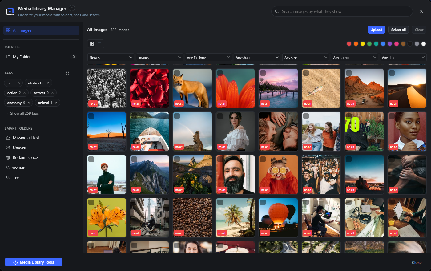
The Media Library Manager is a full-screen, free manager for your WordPress media library. Its left rail holds real hierarchical folders, tags, smart folders and the tools menu.
Drag image tiles from the grid onto a folder (or onto All images to remove them from folders) to move them.
All images
#The top rail entry showing every image, unfiltered. Dropping selected tiles here removes them from any folder.
Tip. Drop here to remove images from folders.
Folders
#A hierarchical taxonomy of real folders shown as an indented tree, each with its image count. Click a folder to view it; drag tiles onto it to move them in.
New folder
#The plus button in the Folders header creates a top-level folder after you name it.
New subfolder
#The plus button on a folder row creates a child folder under it.
Rename folder
#The pencil button on a folder row renames that folder.
Delete folder
#The trash button on a folder row deletes the folder after a confirm. The images stay in your library.
Tip. Deleting a folder never deletes its images.
Tags
#Flat tag terms with counts. Click a tag to filter to it. A preview of the first six is shown, with a toggle to reveal the rest.
Tag list / cloud view
#The grid/list button in the Tags header switches between a chip list (with counts and delete buttons) and a size-weighted tag cloud where bigger tags have more images.
New tag
#The plus button in the Tags header creates a new tag term after you name it.
Delete tag
#The small x on a tag chip deletes that tag after a confirm. The images stay in your library.
Show all tags
#Expands the tag list from the six-item preview to all tags, and back with Show fewer.
Missing alt text
#A built-in smart folder listing every image with no alt text. A "Fill with Metadata Assistant" button appears in its toolbar to fix them in bulk.
Unused
#A built-in smart folder listing images that are not attached to or used by any content.
Reclaim space
#A built-in smart folder that sorts by biggest file first and shows a running total of the space on screen, so you can find and trash the heaviest files.
Saved smart folders
#Your own saved filters and saved semantic searches. Each has a delete button; semantic ones re-run their query when opened.
A footer readout of how many images are not yet searchable, with an Index now button to build the semantic index. Shows live progress while indexing.
Media Library Tools
#The button at the bottom of the rail that opens the tools menu (suggest folders, find duplicates, regenerate thumbnails, rename by pattern, find broken, generate metadata).
Media Library Manager: search, filters, sort & grid Free 17 items #
The main pane of the Media Library Manager: a semantic search, structured filters, sorting and a multi-select image grid.
The main pane combines a meaning-based search with structured filters (type, file type, orientation, size and color) and sorting. Filters compose with a search, so you can rank by meaning and still narrow by color or shape.
Click tiles to select (Shift-click for a range), hover to read title and alt, and use the pencil on a tile to open the per-image editor.
The header search. It ranks your indexed library by meaning (for example "dog on the beach"), so file names do not matter. Debounces while typing and runs on Enter; a clear button resets to All images.
Save as smart folder
#Appears in the toolbar during a semantic search. Saves the current query as a reusable smart folder in the left rail.
Sort
#Orders the grid. Options are Newest, Oldest, Title A-Z, Largest, Smallest and Biggest file.
Media type
#Filters by what kind of media to show: Images, Videos, Audio, Documents or All media.
File type
#Restricts to one file format: JPEG, PNG, WebP, GIF, SVG or PDF.
Orientation
#Filters by image shape.
Size
#Filters by pixel dimensions bucket.
Color swatches
#A row of color buttons that filters the grid to images whose dominant color falls in that bucket. Click the active swatch again to clear it. Colors are precomputed in the background.
Reset
#Clears all active filters and the sort back to defaults. Only shown when a filter or non-default sort is active.
Upload
#Opens a file picker to add images or PDFs. Dropping files onto the main pane starts the same import flow.
Select all
#Selects every image currently loaded in the grid.
Clear
#Deselects everything.
Image tile
#One image in the grid. Click to select, Shift-click to select a range. Shows a checkmark when selected, a "no alt" badge when it lacks alt text, and its title and alt on hover.
Edit metadata (tile)
#The pencil button on a tile opens the per-image metadata editor for that image.
Load more
#Loads the next page of results. The grid also loads more automatically as you scroll near the end (except in ranked search results).
View name and count
#The toolbar readout showing the current view's name and how many images or results it holds. In Reclaim space it also totals the file size shown.
Fill with Metadata Assistant
#Appears in the Missing alt text smart folder. Opens the Metadata Assistant pre-filtered to images without alt text.
Large preview Free 7 items #
The full-screen view behind the eye icon on a tile, with arrows to step through the current results.
Opens over the Media Library Manager and shows the file at full size. Images, video and audio play in place, PDFs open in a frame, and any other document offers a link to open it.
Opening it
#The eye icon on a tile, or the same action from the tile menu.
Insert into design
#Places the image into the open document as a new layer and closes the preview. Shown for images.
Copy file URL
#Copies the address of the original file to the clipboard.
Download
#Saves the original file to your computer under its own file name. This is the untouched original, not a size generated from it.
Edit metadata
#Closes the preview and opens the detail editor for this image, where title, alt text, tags, usage, origin and file data live.
Close
#Closes the preview. Clicking the backdrop or pressing Escape does the same.
Media Library Manager: selection & bulk actions Free 10 items #
The bulk bar that appears when images are selected, for moving, tagging, featuring, inserting, downloading or deleting them.
Selecting one or more tiles reveals the bulk bar at the bottom of the main pane. It acts on the whole selection at once.
N selected
#A live readout of how many images are in the current selection.
Move to folder
#Moves the selected images into a folder from the dropdown. Includes a No folder option to remove them from folders.
Add tag
#Adds the chosen tag to every selected image.
Remove tag
#Removes the chosen tag from every selected image.
Uses your cloud provider to generate tags, mood and text for each selected image, creating any missing tags and filling empty alt, caption and description. Shows live progress.
With exactly one image selected, ranks the library by visual similarity to it. Needs the image search model.
Featured image
#With exactly one image selected, opens the post picker to set that image as a post's or page's featured image.
Insert into design
#Adds the selected images as layers in the current document, each offset slightly, then closes the manager.
Download
#Downloads each selected image to your computer using its title as the file name.
Delete
#Moves the selected images to the trash after a confirm. Their files stay on disk for a grace period, and you can bring them back under "Clean up the library".
Tip. This does not need MEDIA_TRASH. The images go to the same holding room the clean-up scan uses, so nothing is deleted outright.
Media Library Tools Free 12 items #
The tools menu and its sub-dialogs for tidying the library: suggest folders, find duplicates, regenerate thumbnails, rename by pattern, find broken and generate metadata.
Opened from the Media Library Tools button in the rail. Some tools need the image search model (suggest folders, find duplicates) and are disabled with a hint until it is installed.
Groups visually similar images into clusters you can turn into folders. Name a group to create it; the panel offers Auto-name (captions the representative image with your cloud provider) and Create all.
Finds near-identical images and groups them. It pre-marks all but the first of each group for trashing; click any image to flip keep or trash, then trash the marked ones per group.
Regenerate thumbnails
#Rebuilds the intermediate image sizes for the selected images. Select images first, then run it.
Rename by pattern
#Sets the title of the selected images from a text pattern. Use ### for a zero-padded counter and the { } button to insert variables (brand, site, image dimensions and more); a live preview shows the first few results.
Find broken files
#Scans for media whose underlying file is missing or unreadable and lists the results as a ranked view. Reports when none are found.
Generate Metadata
#Opens the Metadata Assistant to write titles, alt text, captions, descriptions and tags across your media.
In the Suggested folders panel, names each unnamed cluster from a quick caption of its representative image using your cloud provider.
Create all (clusters)
#Creates a folder for every named cluster at once and moves its images in.
Create (single cluster)
#Creates one folder from a single named cluster and moves its images into it.
Trash group (duplicates)
#Moves the images marked for trash in one duplicate group to the WordPress trash after a confirm.
Optimize images
#Opens the Pro Image Processor in Optimize mode with the current selection preloaded: smallest files with no visible difference, as new attachments or versioned overwrites. Without WunderPaint Pro the entry shows the Pro teaser.
Clean up the library
#Opens the cleanup panel: images nothing references, files with no library entry, and originals larger than the site delivers. Deleting moves things to a holding area with a retention period rather than removing them, and re-checks before anything is finally gone. Read the Clean up the library section before using it in bulk.
Where an image is used Free 6 items #
The Usage tab in an image's detail view: every place on the site that references this file, with a link to each one.
Open an image in the Media Library Manager (the Edit metadata button on a tile) and the left column has three tabs: Details, Usage and Origin. Usage answers the question that stops most people from ever tidying their library: is anything still pointing at this?
The answer is worked out live every time you open it, not read from a stored result, because the honest answer changes the moment somebody edits a page. It is also the same check that runs again at the moment you move an image to the holding area, so a stale list can never cause a deletion.
Post content
#Images inserted into any post, page or custom post type. Reads block markup including blocks that carry no wp-image class (cover, media-text, gallery, site logo), gallery shortcodes, plain URLs in src and srcset, and background images in inline CSS. A resized copy in the markup resolves back to its original.
Custom fields and builder data
#Featured images, Elementor layouts, ACF fields including repeaters and flexible content, WooCommerce product galleries, and SEO social images. Page builders store their layouts as JSON with escaped slashes; that is read properly rather than skipped.
Site settings and widgets
#The site icon, the custom logo, header and background images from your theme settings, and any media widget. Transients are skipped, because a reference that exists only in a cache is not a reason to keep a file.
Categories and user profiles
#Category and product-category images from term meta, including WooCommerce category thumbnails, plus local avatars in user meta.
Saved designs and templates
#WunderPaint's own data: saved designs, templates, the asset library and brand kits. Without this a design you saved months ago could be broken by deleting an image that looked unused, and you would only find out on opening it.
A plugin that keeps image IDs in a table of its own, or a filename hard-coded into a theme template. The panel says so in plain words when it finds nothing, rather than implying the file is definitely safe. Developers can register additional sources with the wpie_media_usage_sources filter.
Clean up the library Free 8 items #
Finds images nothing points at, files no library entry claims, and originals larger than your site delivers. Nothing is deleted on the day you ask for it.
Opened from Media Library Tools. Read this before using it in bulk: the panel removes files, and while it is built to be careful, no automatic check can know everything about a site it did not build.
The scan works through your content in slices and can be stopped at any point. Its result is sorted into four groups, and only one of them can be cleaned up. Deleting moves images to the WordPress trash with their files left in place, so addresses on your site keep resolving; a scheduled job re-checks each entry when its retention period is up and restores anything that turned out to be in use.
Take a backup before your first bulk cleanup. Not because the tool expects to be wrong, but because that is the right habit for anything that removes files in bulk.
In use
#At least one exact reference was found, by attachment ID or by address. Never offered for cleanup.
Unused
#No reference found anywhere, AND the last scan completed cleanly across every source, AND the image is older than the grace period. The only group that can be cleaned up.
Younger than the grace period of 14 days. Held back deliberately: an image uploaded on Tuesday has probably just not been placed yet. On a site built last month this is most of the library, which is normal and not a fault.
Not checked
#Never scanned, uploaded after the last scan, or a source failed to read. If any source errored the run offers nothing for cleanup at all, because a failed query looks exactly like a source with no references in it.
Move to the holding area
#Re-checks every selected image live, then moves the ones still unreferenced to the WordPress trash. The file stays on disk, so the site keeps working even if a verdict was wrong. Anything the re-check finds in use is kept and reported back to you.
Everything currently held, with the date it went in and when its period ends. Put anything back with one click. When the period is over a daily job checks each entry once more; still unreferenced means it is finally removed, back in use means it restores itself.
Files sitting in the uploads folder that no library entry points at, usually left behind by imports or removed plugins. The mirror image of Find broken files. Shows a preview and the size of each. WunderPaint's own folders and known plugin cache and backup directories are always skipped.
Originals stored considerably wider than the largest size your site actually generates, so those extra pixels never reach a visitor. Each row says whether the full size file is linked directly somewhere, which is the one good reason to keep every pixel. Hands the selection to the Image Processor with the target width already set.
Replace an image Free 5 items #
Swaps the file behind a library entry so every reference keeps working, with a ratio-locked crop when the new file is a different shape.
The Replace image button sits under the preview in an image's detail view. The library entry and its ID survive, which is what lets everything already pointing at the image keep working without being touched.
Keep the current filename
#Every address stays valid, so nothing on the site has to change. Caches and CDNs may still serve the old picture for a while. If the new file is a different format it is converted to the original format first, because keeping only part of a filename would change the address and break every reference.
Use the new filename
#The file gets its own name and the places the usage check found are rewritten one at a time. Deliberately not a global search and replace, which fixes the database and leaves JSON and CSS files under uploads pointing at a file that no longer exists.
Crop to the original shape
#Offered when the new file has a different aspect ratio, with both ratios named. The mask is locked to the original proportions, can be dragged and resized from any corner, and nudged with the arrow keys. A square slot stays square.
Scale to the original size
#Renders the result at exactly the dimensions of the image it replaces. Leave it off to keep the higher resolution; WordPress generates the smaller sizes either way.
Transparency warning
#Converting into a format without an alpha channel fills transparency with white. The dialog says so and points at the new-filename option as the way to keep it.
Origin and licence Free 2 items #
Where an image came from, who made it, under what licence and until when, prefilled from the file's own IPTC data.
The Origin tab in an image's detail view. Agencies and shops have to answer this question years after the download folder was cleared, which is usually when the answer is gone.
Source, Creator, Licence
#Three free-text fields per image. On upload, creator and copyright are prefilled from the file's IPTC block where stock photos and most cameras already put them, using PHP's own reader so nothing has to be installed.
Licence expires
#A date. The detail view warns when a licence has run out, and again while it is within a month of doing so.
What is inside the file Free 8 items #
The File data tab reads the camera, software and location a file carries, and can take the private parts back out.
The Details tab describes the image; this one describes the FILE. A photo from a phone records the camera and lens, the exposure, the software that has touched it since, and usually the exact spot it was taken at. WordPress shows none of that, and the original file stays reachable under its own address.
Everything is read with PHP's own functions, so no extra software has to be installed on the server. Coordinates are resolved against the place index that ships with the plugin, which means finding out where a photo was taken never contacts an outside service.
What the file carries
#A line naming the blocks found in the file: camera data (EXIF), captions and rights (IPTC), XMP, text notes, and location. A file with nothing embedded says so plainly.
Location
#Shown as a place name and a rough distance rather than a pair of numbers, worked out on your own server. The exact coordinates and the altitude are printed underneath.
Capture
#When the picture was taken, the camera make and model, the lens, and the exposure values the camera recorded.
Device identity
#Serial numbers of the camera body and lens, and the owner name some cameras write. Listed on its own because this is the group people are most surprised to find in a published file.
Software and rights
#The software that wrote or edited the file, the artist and copyright fields, and the digital source type when one is set, which is how a file declares that AI was involved.
Remove location
#Clears the coordinates and leaves everything else in place, so a photo keeps its camera details without saying where you live. The values are overwritten rather than merely unlinked, so they cannot be recovered from the raw file.
Remove all metadata
#Clears every embedded block. Useful before publishing images you did not take yourself, or where the file history is nobody else's business.
What happens to the file
#Both buttons work on the original and on every size generated from it, and neither re-saves the picture: the blocks are cut out of the file and the image data is left untouched, so quality is exactly as before. The previous files are kept as a version you can restore from the History panel.
Media Library Manager: import (smarter upload) Free 7 items #
The import panel that reviews files before adding them, with optimize and describe options and duplicate detection.
Triggered by the Upload button or by dropping image files onto the main pane. Files queue up for review; when the image search model is installed each is checked against your library for likely duplicates before import.
Folder (import)
#Chooses which folder the imported images go into. Defaults to the folder you are currently viewing, or No folder.
Optimize (max 2048px, WebP)
#Downscales each image to at most 2048 px and converts it to WebP on import to save space.
Writes alt text, a caption and tags for each image as it is imported, using a caption model or your provider. Disabled until an engine is available; a note warns when it uses a paid cloud provider.
When the image search model is installed, each queued file is checked and flagged if it looks like an existing attachment, so you can skip it.
Skip / Include
#Toggles whether a queued file is imported. Skipped rows are dimmed and excluded from the count.
Import
#Imports every non-skipped file with the chosen options and shows progress. The button label shows how many will be imported.
Cancel (import)
#Closes the import panel without importing. Disabled while an import is running.
Stock Images dialog Free 9 items #
Search free stock photos, illustrations and vectors and insert them as image layers.
Opens from the Stock Images command. Results insert as image layers (as a data URL) and nothing touches your media library until you save. If no provider key is set, it links to Settings.
Providers are whichever of Pexels, Pixabay and Unsplash you have configured. Pixabay adds Photos, Illustrations and Vectors type tabs.
Category cards
#Before you search, the dialog shows curated photo categories with live thumbnails; clicking one runs that search immediately.
Provider tabs
#Switches between your configured stock providers (Pexels, Pixabay, Unsplash). Changing provider clears the current results.
Type tabs (Pixabay)
#Only for Pixabay. Chooses Photos, Illustrations or Vectors. Changing type clears the results.
Search field
#The query box. Type a term and press Enter or the Search button to run it. Focused when the dialog opens.
Search
#Runs the search for the current query. Disabled while busy or when the query is empty; shows "Searching…" during a request.
Result tile
#One stock result. Click it to fetch the full image and insert it as a layer, fitted and centered on the canvas. The caption links to the author's page.
Author credit
#The link under each result crediting and linking to the photographer or contributor. Opens in a new tab.
Load more
#Fetches the next page of results. The grid also auto-loads more as you scroll near the end, and pre-fills tall screens.
Open Settings
#Shown when no provider is configured (and you can manage settings). Opens the plugin settings to add a free Pexels or Pixabay API key.
Quick Insert palette Free 16 items #
A slash menu to filter and insert or open any insert source by typing.
Opens with the / key. Type to filter the list, use the arrow keys to move, and press Enter to run the highlighted command. Escape closes it.
Filter input
#The text box at the top. Typing filters commands by label and hint; Arrow keys move the selection and Enter runs it.
Text
#Inserts a centered text layer in the foreground color.
Rectangle
#Inserts a centered rectangle filled with the foreground color.
Ellipse
#Inserts a centered ellipse filled with the foreground color.
Frame: Circle
#Inserts a circular photo frame you can drop an image into.
Icon…
#Opens the icon library.
Emoji…
#Opens the emoji library.
Text combination…
#Opens the Asset Library on the styled text-combination groups.
Elements…
#Opens the Asset Library on shapes (arrows, blobs, badges).
Background…
#Opens the Asset Library on backgrounds (gradients, patterns, colors).
Image…
#Opens the Asset Library on your media library images.
Stock photo…
#Opens the Stock Images dialog (Pexels / Pixabay).
Chart…
#Opens the chart tool (bar, line, pie, donut).
QR code…
#Inserts a QR code (link, Wi-Fi, vCard and more).
Opens the AI panel to generate an image from text.
Opens the Design Generator to build a whole design from a brief.
Command palette Free 10 items #
A searchable palette of every editor command: menu actions, dialogs, tools and effects.
Opens with Cmd/Ctrl+K. Type to filter by command label or group; Arrow keys move and Enter runs the highlighted command. Each row shows its group and, for tools, the keyboard shortcut.
Command input
#The search box. Filters all commands by label and group as you type; Arrow keys navigate and Enter runs the selection.
Edit commands
#Undo and Redo, in the Edit group.
File commands
#Export, Library, Design Generator and Stock Images.
Image commands
#Image Size, Canvas Size, Resize Design, Trim and Rotate 90 CW.
View commands
#Check Contrast and Guides & Grid.
Layer commands
#New Layer, Group Layers, Duplicate Layer, Add Layer Mask, Convert to Smart Object and Flatten.
Select commands
#Select All and Deselect.
Help commands
#Keyboard Shortcuts and Handbook.
Tools
#Every editor tool, listed as "Tool: name" with its keyboard shortcut, selecting the tool when run.
Effects
#The whole effects registry (non-hidden effects), each opening that effect when run.
Asset Generator (AI) dialog AICloud AI 10 items #
Describe an asset and the AI proposes editable gradients, text lockups, shapes or one full illustration.
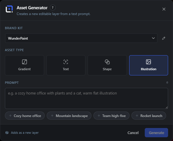
A cloud feature that works with any text-capable provider (Anthropic, OpenAI or Gemini). It creates a new editable layer from a text prompt; if no key is set it links to Settings.
For gradient, text and shape it returns four options to preview and insert; for illustration it draws one SVG through the real render pipeline.
Brand Kit
#Chooses which Brand Kit steers the generation (its palette, fonts and profile). Includes a No Brand Kit option and a pencil to edit kits. Only shown when kits exist.
Asset Type
#The type of asset to generate: Gradient, Text, Shape or Illustration. Each has its own prompt hints and suggestion chips.
Prompt
#Describes what you want, with a live character count and a type-specific placeholder. The suggestion chips below append their text to it.
Suggestion chips
#One-tap prompt starters that change per type (for example Warm sunset, Bold sale banner, Lightning bolt, Cozy home office). Clicking one adds it to the prompt.
Exact text (Text type)
#Only for the Text type. An optional box for the exact wording, one line per headline, bullet or subline.
Generate / Regenerate
#Runs the generation. It asks the AI for four options (or draws one illustration) and shows "Generating…"; after the first run the button becomes Regenerate.
Insert (per option)
#Adds that single generated option to the canvas as a new editable layer.
Insert all
#Adds every generated option to the canvas at once and closes the dialog. Not shown for illustrations.
Cancel
#Closes the dialog. Disabled while a generation is running.
Open Settings (no key)
#Shown in the error message when no provider key is configured; opens the plugin settings.
Designs tab (saved working files) Free 6 items #
The Designs tab of the Asset Library lists your saved layered working files with per-card actions.
Designs are editable, layered project files saved with File, then Save Design. Opening one restores every layer, not a flattened image.
Folder
#Filters the saved designs by the folder you filed them under. All designs shows everything; the extra options only appear once at least one design has a folder.
Open design
#Opens the saved design. With document tabs it opens in a new tab next to your current work; otherwise it replaces the current document after a discard prompt when there are unsaved changes.
Tip. Click the card preview to open it.
Duplicate design
#Makes a copy of the design in the library so you can branch a variation without touching the original.
Move to folder
#Prompts for a folder name to file the design under. An empty value removes it from its folder.
Tip. Folders are just labels; they group designs in the Folder filter above.
Rename design
#Prompts for a new name for the saved design.
Delete design
#Permanently deletes the saved design after a confirmation prompt.
My Assets categories Free 7 items #
The My Assets tab groups everything you saved with File, then Save as Asset into your own categories.
All
#Shows every saved asset regardless of category.
Unsorted
#Shows saved assets that have no category yet. Appears only when some assets are uncategorised.
+ New category
#Creates a new category by name to organise your saved assets.
Rename category
#Renames the category (the small pencil next to the category name).
Tip. Shown as a small pencil icon on the category chip.
Delete category
#Deletes the category. Its assets are kept and move to Unsorted.
Tip. Shown as a small x on the category chip.
Insert
#Inserts the saved asset's layers onto the canvas (click the asset tile).
Delete
#Removes the saved asset from your library (the x on the tile). Alt-clicking the tile also removes it.
Template tab controls Free 4 items #
Extra controls on the Dynamic Templates and Starter Templates tabs.
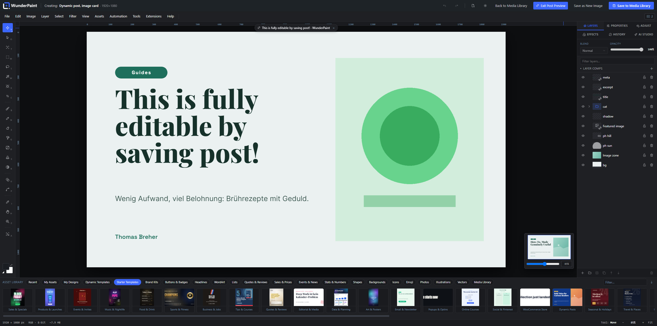
Open as new document
#Opens the template as a fresh document, in a new tab when tabs are available, without changing your current work.
Delete template
#Deletes a saved dynamic template after confirmation (the x on the card).
Without Brand Kit
#Dynamic templates are grouped under a heading per brand kit they were saved with; templates with no kit (or a kit that was deleted) collect under Without Brand Kit.
Extension template packs
#Installed extensions can add their own starter templates, grouped under a subheading with the pack's name.
Icons and Emoji tab controls Free 8 items #
Search, filtering, paging and credit controls inside the Icons and Emoji tabs.
Search icons…
#Filters the icon set by name as you type.
Icon count
#Shows how many icons match the current search (rendered as "N icons").
Show more
#Loads the next batch of icons into the grid.
Icons: Tabler Icons (MIT license)
#Credit line at the bottom of the tab. The icon set is the open-source Tabler Icons library.
Search emoji…
#Filters the emoji list by name.
Category
#Narrows the emoji grid to one group (for example Smileys or Animals).
Emoji count
#Shows how many emoji match (rendered as "N emoji").
Show more
#Loads the next batch of emoji into the grid.
Patterns tab (seamless tiles) Free 2 items #
The Patterns tab manages your uploaded seamless tile images.
Uploaded patterns tile as fills for shapes and for the Pattern Overlay layer style, and they embed into saved documents so they travel with the file.
Brand Kits tab (logos) Free 3 items #
The Brand Kits tab inserts a kit's logo as a layer.
Insert logo
#Inserts a brand kit's logo as an image layer. There is one tile per kit that has a logo set.
Manage Brand Kits
#Shown when no kit has a logo yet; opens the Brand Kits manager so you can add one.
EU AI labels
#The same twelve emblems also sit on this shelf as ordinary tiles. Clicking one inserts it as an image layer you can move, scale and place yourself, which is the way to go when the emblem has to sit somewhere specific in a design rather than in a corner.
Search all assets (semantic media) FreeLocal AI 2 items #
The library-wide search box also matches your media library by meaning when the image search model is installed.
Semantic media results
#When the image search model is installed, your typed query is matched against your indexed media library by meaning, and matching photos appear under a Media Library heading in the results.
Tip. So a search like dog on the beach can surface a file named IMG_2847.jpg.
Index now
#Indexes images that are not yet searchable so they can be found by meaning. A progress line reads Indexing for semantic search… while it runs.
Tip. The search results show how many images are still unindexed.
Library tray photo categories Free 3 items #
Quick-browse category cards shown in the tray's Photos, Illustrations and Vectors strips before you search.
Photo categories
#Before you type a search, the stock strips show category cards; clicking one runs that stock search. Each card shows a representative thumbnail.
Search
#The first card focuses the tray search box so you can type your own photo query instead of picking a category.
Stock provider
#A small dropdown next to the search that switches the photo strip between your configured stock providers instead of mixing them.
Media Library Manager (extra affordances) Free 6 items #
Drag-and-drop, range selection and pattern-rename details in the Media Library Manager.
Drag images onto a folder
#Drag one selected tile (or all selected tiles) onto a folder in the left rail to move them there. Dropping on All images removes them from every folder.
Tip. The drop target highlights while you drag over it.
Drop files to import
#Drag image or PDF files from your computer onto the grid to open the import dialog.
No folder
#In the Move-to-folder picker and the import folder picker, No folder files the images outside any folder.
Keep / mark for trash
#In the duplicate finder each image in a group is a toggle: click to keep it or mark it for the trash. By default the first is kept and the rest are marked.
Tip. A check means keep; a trash icon means marked for removal.
Shift-click range select
#Click one tile, then Shift-click another to select the whole run in between. The same range select works in the Metadata Assistant grid.
Rename tokens (### and { })
#In Rename by pattern, ### becomes a zero-padded counter and the { } button inserts variables like {{brand.company}}. A live preview shows the first few new titles before you apply.
Tip. Set the digit count with the number of #, for example ### pads to three digits.
Asset Generator (types and kit controls) AI 6 items #
The four asset types and the brand-kit controls in the Asset Generator dialog.
Asset Generator uses a cloud text model to propose new editable layers from a prompt. It needs any text-capable provider key; without one it links to Settings.
Gradient
#Generates gradient background presets from your prompt, previewed as swatches.
Text
#Generates styled text lockups (headline groups). An optional exact-text box lets you supply the wording, one line per headline, bullet or subline.
Shape
#Generates a single vector element (an SVG shape) from your prompt.
Illustration
#Draws one complete flat SVG illustration. One is produced per run because they are large, and the preview is the real render.
Edit Brand Kits
#The pencil next to the kit picker opens the Brand Kits manager without leaving the dialog.
Tip. Changes are picked up live when the kit dialog saves.
No Brand Kit
#Generates without any brand palette, fonts or profile steering the result.
Brand Kits dialog Free 13 items #
Manage brand kits: colors, fonts, logo, watermark, company profile and custom variables that feed pickers, templates and AI.
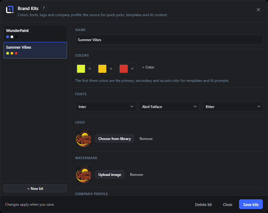
Opens from the Brand Kits command. The left column lists your kits; the right column edits the selected kit. Changes are local until you press Save kits, which updates the whole editor.
One kit is free; multiple kits are a Pro feature. The first three colors are treated as primary, secondary and accent.
Kit list
#The left column listing every kit with a swatch preview of its first colors. Click a kit to edit it.
Adds a new blank kit and selects it. Beyond one kit it requires Pro and shows a PRO badge.
Name
#The kit's display name, shown in pickers and template groupings.
Colors
#The kit palette as swatches you can recolor or remove, with a + Color button to add more. The first three are the primary, secondary and accent colors used by templates and AI prompts.
Fonts
#Up to three house fonts as dropdowns. The first is the primary font; the other two are optional. Empty selections are dropped.
Logo
#The kit logo, chosen from your media library. Shows a preview, a Choose from library button (opens an inline picker) and a Remove button when set.
Watermark
#An image watermark for this kit, uploaded directly (PNG, WebP, JPEG or SVG). Shows a preview and a Remove button. It appears as a one-click choice in Batch Watermark.
Company profile
#Structured company details used by templates and AI: Company, Contact person, Email, Website, Street, ZIP, City, Industry, plus a free-text Description.
Custom variables
#Your own key and value pairs. Keys are lowercased and stripped to letters, numbers and underscores; values are free text. They become {key} placeholders in content templates.
Tip. For example {tonalitaet} or {zielgruppe}.
+ Variable
#Adds an empty custom variable row. Hidden once you reach the maximum.
Delete kit
#Deletes the current kit. It asks once ("Really delete?") before removing; the last remaining kit is replaced by a fresh blank one.
Save kits
#Saves all kits at once and refreshes the editor so pickers, templates and open dialogs see the changes. Shows "Saving…" while working.
Tip. Changes only take effect when you save.
Close
#Closes the dialog without saving unsaved edits. Escape does the same.
Design Generator dialog AICloud AI 17 items #
Turn a written brief into a full, editable layout: background, image, shapes and text land as layers.
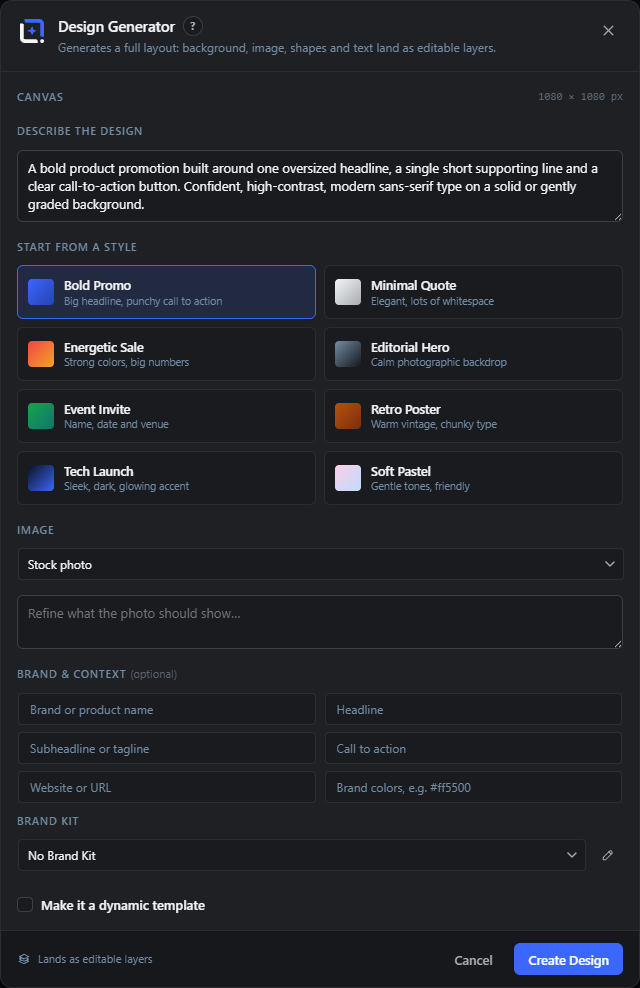
Describe a design (or start from a style preset) and the assistant plans a layout via the text model and sources an image. It proposes several variant previews; you pick one and it inserts as editable layers.
It can also produce a dynamic template whose chosen fields bind to a post, so the design updates per post while your typed copy stays as the preview.
Canvas readout
#Shows the current document's width and height in pixels, the size the design is built for.
Describe the Design
#The main brief box. Describe the design you want, for example an Instagram post announcing a summer sale.
Start from a Style
#Eight preset style cards that seed the brief with a starting description you can then edit: Bold Promo, Minimal Quote, Energetic Sale, Editorial Hero, Event Invite, Retro Poster, Tech Launch and Soft Pastel.
Image
#How the design gets its image: Stock photo (when a provider is set), Placeholder image, Generate with AI (when an image provider is set) or No image.
Image provider
#For Generate with AI, chooses the image model (OpenAI or Google Gemini) when more than one is configured.
Image description
#For AI or stock images, a box to describe or refine what the photo should show (subject, style, mood, colors).
Brand & Context
#Optional details that steer the copy: Brand or product name, Headline, Subheadline or tagline, Call to action, Website or URL, and Brand colors.
Brand Kit
#Applies a Brand Kit's palette, fonts and profile. Includes No Brand Kit and a pencil to edit kits. Only shown when kits with colors or fonts exist.
Use the active image layer as style reference
#When an image, raster or smart-object layer is selected, sends a snapshot of it as a style reference for the design.
Include the kit logo as a layer
#Adds the selected Brand Kit's logo as its own layer after the design. Only shown when the kit has a logo.
Make it a dynamic template
#Turns the result into a dynamic template. The fields you enable bind to the post; your typed copy stays as the preview placeholder.
Dynamic fields
#When dynamic is on, choose which post fields bind: Post title, Post excerpt, Featured image, Category and Publish date.
Create Design
#Sends the brief and settings, builds the layout and renders variant previews. The button shows the current status while working.
Pick a variant
#The result cards. Click one to insert it as editable layers (plus the logo if enabled). The copy says it proposes three fresh designs.
Regenerate designs
#Asks the model again for a fresh set of variants, with new copy and direction, not just a new composition.
Back to the brief
#Returns from the variant view to the brief so you can adjust it.
Cancel
#Closes the dialog. Disabled while the assistant is working.
Use Image dialog Free 5 items #
After saving a new image, decide where it should go: as a featured image or in a new draft.
Appears after Save As New. The freshly saved attachment can be set as a featured image on an existing post or dropped into a brand-new draft.
Preview and note
#Shows the saved image and a note that it is in the library, ready to use as a featured image or in a new draft.
Search posts
#A live title search over your posts to find one to attach the image to.
Set featured
#Sets the saved image as the featured image of that post, with a link to edit the post afterward.
Insert into new draft
#Creates a new draft post that contains the image, with a link to edit the draft.
Skip
#Closes the dialog without attaching the image anywhere. It stays in the library.
Post picker dialog Free 4 items #
Search and pick a post to preview a dynamic template with, or to receive an action like setting a featured image.
Used by View, then Preview with Post for dynamic templates, and reused by other flows (such as setting a featured image). Picking a post fetches its context so bindings resolve; in preview mode it turns on the non-destructive binding preview on the canvas without changing anything.
Post type
#A dropdown to choose which post type to search, shown only when more than one type is available.
Search posts by title
#A live title search over published posts, debounced as you type. It is focused on open, and Enter picks the first result.
Result row
#One post, showing its thumbnail, title and a meta line (date and first category). Clicking it picks the post.
Heading and subheading
#The dialog title and subtitle, which the calling feature can override (for example "Set as featured image"). By default it reads "Preview with Post".
Batch Watermark dialog Free 11 items #
Stamp a watermark onto many library images at once, with a live preview and saved settings.
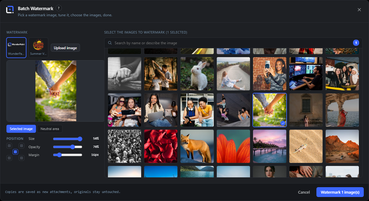
One modal with two columns. The left holds the watermark settings (a Brand Kit watermark or a direct upload, a position grid, sliders and a live preview); the right is a large media browser to select the target images.
Watermarked copies are saved as new attachments; originals are never touched. Your last settings are remembered.
Watermark source
#Choose the watermark image from your Brand Kits' watermarks (one-click tiles) or upload one directly. A tip suggests storing watermarks in Brand Kits.
Upload image
#Uploads a watermark image and selects it. The uploaded mark shows as an active tile labeled Upload.
Live preview
#A canvas that shows the watermark placed exactly as the batch run will, over the first selected image (or a neutral area), using the current position, size, opacity and margin.
Preview stage toggle
#Switches the preview background between Selected image (the first target) and Neutral area (a plain stage).
Position
#A 3x3 anchor grid to place the watermark: Top left, Top right, Center, Bottom left or Bottom right.
Size
#How large the watermark is relative to the image.
Opacity
#How transparent the watermark is.
Margin
#The gap between the watermark and the image edge, in output pixels. Has no effect when the position is Center.
Target image browser
#A media browser on the right to pick which images to watermark. Click images to select or deselect; the heading shows how many are selected.
Watermark N image(s)
#Runs the batch. Each target is redrawn with the watermark and saved as a new JPEG attachment (named with a -watermarked suffix), with progress shown. Disabled until a watermark and at least one image are chosen.
Tip. Originals stay untouched; copies are saved as new attachments.
Cancel
#Closes the dialog without running the batch.
Metadata Assistant (Alt Text) dialog AILocal AICloud AI 15 items #
Generate titles, alt text, captions, descriptions and tags for many media images in one pass, with review before saving.
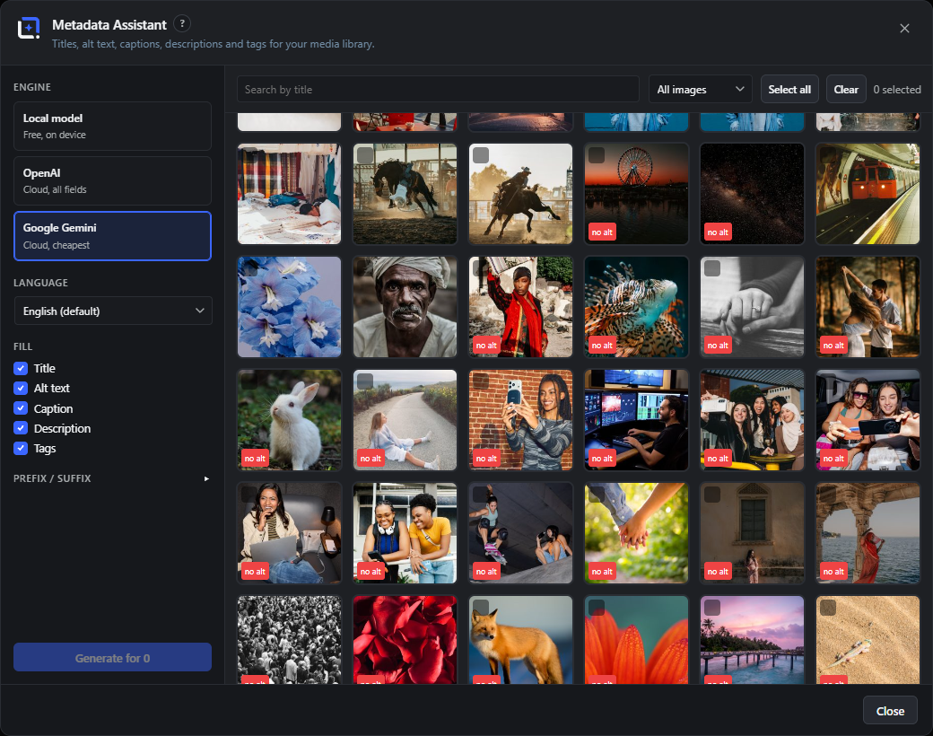
A two-column tool. The left column sets the engine, output language, which fields to fill, optional prefix/suffix affixes and a cost estimate; the right is a searchable, multi-select media grid.
A run makes one suggestion per selected image (including tags and mood on cloud engines), which you review and edit before writing. The local model only writes descriptive text, not titles or tags.
Engine
#The captioning engine: Local model (free, on device) or a cloud provider (Anthropic, OpenAI, Gemini). Only installed or configured engines appear. Local writes text only.
Language
#The output language for cloud captioning. English is the default plus German, French, Spanish, Italian, Dutch, Portuguese and Polish. Hidden for the local model.
Fill
#Which metadata fields to write: Title (cloud only), Alt text, Caption, Description and Tags (cloud only). Title and Tags are disabled and dimmed under the local model.
Prefix / suffix
#An expandable panel to wrap each of Title, Alt text, Caption and Description with a fixed prefix and suffix. The { } button inserts variables like site name, brand or date.
Affix presets
#Save the current prefix/suffix set as a named preset, load a saved one, or delete one. Presets are stored in your browser.
Cost estimate
#A rough dollar estimate for the current cloud selection, based on the engine and the number of selected images. Shown only for cloud engines with a selection.
Search by title
#Filters the media grid by title text.
Filter (All / Missing alt text)
#Limits the grid to All images or only those Missing alt text. Opens on Missing alt text when launched from that context.
Select all / Clear
#Selects every shown image or clears the selection. A counter shows how many are selected.
Media tile
#One image. Click to select, Shift-click for a range; a "no alt" badge marks images without alt text, and the pencil opens the per-image editor.
Generate for N
#Runs one suggestion per selected image and switches to the review view. Retries rate-limited cloud calls with backoff and paces requests gently. Disabled without a selection, fields or engine.
Review and edit
#The review list where each image's suggested Title, Alt text, Caption, Description and comma-separated Tags can be edited before saving. Empty fields are skipped.
Save N image(s)
#Writes the reviewed metadata: text via the media endpoint and tags via the manager (creating new tags as needed). Reports how many saved and failed.
Back
#Returns from review to the browse view.
Cancel (run)
#Stops an in-progress generate or save run.
Per-image metadata editor AILocal AICloud AI 16 items #
A per-image detail modal to view file facts and edit title, alt, caption, description and tags, by hand or with one AI suggestion.
Shared by the Metadata Assistant and the Media Library Manager (from a tile's pencil). The left column shows the preview and read-only file details; the right column edits the metadata. Text saves to the core media endpoint and tags via the manager, creating new tags on the fly.
Preview
#The image thumbnail at the top of the left column.
Dimensions
#The image's width and height in pixels. Read-only.
File size
#The file size in a human-readable form (B, KB or MB). Read-only.
Format
#The file format (for example JPEG, PNG, WebP, SVG), derived from the MIME type. Read-only.
Uploaded
#The localized upload date and time. Read-only.
File name
#The original file name. Read-only.
Colors
#The image's dominant color swatches, when they have been computed. Read-only.
URL and Copy
#The image's source URL in a read-only field with a Copy button that puts it on the clipboard.
Title
#Editable title of the image.
Alt text
#Editable alternative text used by screen readers and shown when the image cannot load.
Caption
#Editable caption shown with the image.
Description
#Editable long description of the image.
Tags
#The image's tags as removable chips, with a text box (backed by an autocomplete list of existing tags) to add more. New tag names are created when you save.
Engine (Generate metadata)
#Chooses which engine the Generate metadata button uses (Anthropic, OpenAI, Gemini or Local model). Shown when more than one is available.
Makes one AI suggestion for this image, filling empty text fields and adding suggested tags (and mood on cloud engines). The local model fills descriptive text only.
Save
#Writes the edited title, alt, caption and description, and applies tag additions and removals, then closes the editor.
Brand Kits (per-field controls) FreePro 13 items #
The individual add, remove and field controls inside the Brand Kits editor.
A brand kit stores colors, fonts, a logo, a watermark, a company profile and custom variables. Edits stay local until Save kits.
+ Color
#Adds a color swatch to the kit.
Tip. The first three colors are the primary, secondary and accent used by templates and AI prompts.
Color
#Click a swatch to open the color picker and set that color exactly.
Remove color
#Deletes that color from the kit (the small x on the swatch).
Primary font…
#Picks the kit's main font. There are three font slots; the second and third read Optional… and can be left empty.
Choose from library
#Picks the kit's logo image from the media library.
Remove
#Clears the kit's logo.
Upload image
#Uploads a watermark image for the kit.
Tip. Kit watermarks show up as one-click choices in Batch Watermark.
Remove
#Clears the kit's watermark image.
Company profile fields
#Free-text company details used by templates and AI as brand context, and available as brand.* bindings.
key
#The custom variable's name, forced to lowercase letters, digits and underscore. Used as a {key} placeholder in content templates.
Tip. For example {tonalitaet} or {zielgruppe}.
Value
#The text substituted wherever the matching {key} appears.
Really delete?
#The Delete kit button asks once more before it removes the kit. If it is the last kit, a fresh blank kit takes its place.
Multiple Brand Kits
#The free plan keeps a single brand kit. Pro allows several so you can switch palette, fonts and profile per client or campaign.
Batch Watermark (position and preview stage) Free 3 items #
The five position anchors and the two preview stage modes in Batch Watermark.
Position anchors
#The 3x3 grid places the watermark at one of five anchor points.
Selected image
#Preview stage mode: shows the watermark on the first selected target image, placed exactly like the batch run.
Neutral area
#Preview stage mode: shows the watermark on a plain gray striped stage instead of a real image.
Metadata Assistant and per-image editor (extra controls) AI 9 items #
Fill options, engine choices, affix presets, status marks and the tag input details.
Fill fields
#Checkboxes choosing what the run writes: Title, Alt text, Caption, Description and Tags.
Tip. The local model cannot write a Title or Tags, so those two are disabled and dimmed when the engine is Local model.
Engine options
#Choose the model that reads each image. Only installed or configured engines appear. Cloud providers write every field; the local model writes descriptive text only.
Save preset
#Saves the current prefix and suffix set under a name so you can reuse it later.
Load preset
#Applies a saved affix preset to the prefix and suffix fields.
Delete preset
#Deletes a saved affix preset.
Insert variable ({ })
#The { } button next to each prefix and suffix inserts tokens like the site name, brand or the date so the wrapper text is dynamic.
Per-image status
#In the review list each image shows a spinner while working, a green check when done or saved, and a red ! with the error on hover if it failed.
Rate-limit handling
#Cloud runs pace themselves between images and retry a rate-limited call a couple of times; if the provider keeps returning its limit the whole run stops with a notice.
Add a tag and press Enter
#In the per-image editor, type tags here; suggestions autocomplete from your existing tags and brand-new tags are created when you save. Remove a tag with the x on its chip.