Dynamic Showcases
Live WordPress data composed into one designed graphic: products, posts, reviews, your team or pasted spreadsheet rows become an editable card layout.
Dynamic Showcases dialog Extension 5 items #
Live WordPress data composed into one designed graphic: products, posts, reviews, your team or pasted spreadsheet rows become an editable card layout.
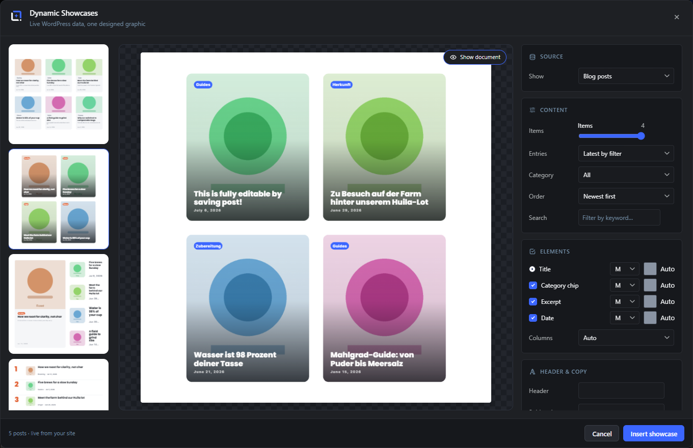
Turn live WordPress data into one designed graphic. Pick a source: WooCommerce products, blog posts, any public post type, real customer reviews, your team, an external RSS, Atom or JSON feed, or rows pasted straight from a spreadsheet. Filter it, click a layout in the live preview rail, and the real records compose into a single editable design.
Layout families cover products, posts, testimonials and people, from new-arrivals grids and spotlight heroes to review walls and team pages. A Custom Card mode repeats a card you design in the editor, a normal template with variables, as the tile, with per-record values filled in and empty elements hidden. Every element the source actually has, prices, sale badges, rating stars, chips, dates, gets its own row to toggle, resize and recolor, and long copy never clips: text auto-shrinks and shortens with an ellipsis.
Open it from the Extensions menu. Saved queries refresh in place, so the bestseller sheet you designed in spring re-composes itself with today's bestsellers.
Layout rail
#The left column lists one card per layout with a mini preview rendered from neutral example content - the rail is a layout catalog, deliberately independent of your live data (the big preview shows the real records). Click a card to switch; the active layout is outlined.
Preview stage
#The large center preview, rendered by the same engine that inserts the layers, over a checkerboard so transparent backgrounds are visible.
Show document
#Overlays the current document behind the preview (with the showcase background hidden), so you can judge the composition against what is already on the canvas.
Status line
#Bottom-left of the dialog: how many records were loaded and from where ("6 products, live from your site", "6 items, from pasted data"), plus loading and error states.
Insert / Update showcase
#Inserts the composition as a named group of editable layers, or replaces the group in place (keeping its stacking position) when you came in through Edit.
Source: products, posts, any post type, reviews, team, pasted data Extension 7 items #
Six data sources feed the same layout engine.
The Show dropdown decides where records come from. Query sources (products, posts, custom post types) re-run their filter against the live site every time the panel opens or refreshes; the pasted-data source parses rows you copied from a spreadsheet.
Products (WooCommerce)
#Live products with name, image, price, sale price and discount, rating from real reviews, category, short description, SKU and stock status.
Blog posts
#Published posts with title, featured image, excerpt, date and category.
Any public post type
#Every public post type of the site (pages, portfolios, events, listings...) appears in the dropdown and is treated like posts: title, featured image, excerpt, date, category.
Customer reviews
#Approved WooCommerce product reviews and/or post comments as testimonial records: author, star rating, quote text, date and the reviewed product. E-mail addresses never leave the server.
Team (site users)
#Site users as team records: display name, role, bio, avatar and published-post count. Logins and e-mail addresses are never exposed.
External feed / API (RSS, Podcast, YouTube, JSON)
#Paste any RSS or Atom URL and the studio analyses its structure server-side: podcast feeds deliver episode covers and durations (shown as chips), YouTube channel feeds their video thumbnails, blog feeds their images. Individual JSON APIs work too - a web-radio now-playing endpoint, a headless CMS, any custom API: the server finds the record set (or treats a single object as one record), flattens nested values to dot paths, and mapping rows appear under the URL so you assign Title, Image, Price, Description, Category and Date to your fields - auto-detected in English and German, correctable by hand. A price mapping makes the rows product-shaped. The URL and mapping are saved with the graphic, so Refresh and dynamic templates re-pull the source; feeds are cached briefly (JSON two minutes, feeds fifteen) and fetched through WordPress with unsafe-URL rejection.
Pasted data (CSV / Excel)
#Rows pasted straight from Excel, Google Sheets or a CSV file; see the Pasted data section below.
Pasted data: spreadsheet rows as records Extension 3 items #
Copy rows from Excel or Sheets, paste, done: delimiter detection, quoted fields and automatic column mapping.
The paste box accepts tab-separated rows (what Excel and Sheets put on the clipboard) as well as comma- or semicolon-separated CSV. Column names in the first row are auto-mapped to the record fields, in English and German (Produkt, Preis, Beschreibung, Kategorie all map correctly), and every mapping can be corrected by hand.
Rows WITH a mapped price column behave like products and feed the catalog layouts; rows without one behave like posts and feed the roundup layouts. The chosen layout re-validates automatically when the shape flips.
Paste box
#The text area for raw rows. Delimiter (tab, comma or semicolon) is detected from the first line; quoted fields survive embedded commas.
First row contains column names
#On by default. Off treats every row as data and names the columns Column 1, Column 2...
Column mapping (Title, Image URL, Price, Description, Category)
#Five dropdowns bind record fields to your columns. Auto-detected from the header names; adjust any of them and the preview re-renders.
The twenty layouts Extension 15 items #
Four layout families plus your own: catalog, roundup, testimonials, team, and the Custom Card that repeats a user template. Twenty built-in layouts in total.
Each layout is a recipe that adapts to the document format, and every card keeps its designed PROPORTIONS: fewer items or fewer columns make larger cards up to a sensible size, never stretched stripes with billboard text - remaining space stays calm whitespace and the grid centers itself.
New Arrivals Grid
#Product cards in a grid: image, name, rating stars, price with struck regular price, and a sale badge on discounted items.
Spotlight
#One hero product left at full height, compact rows with thumb, name and price stacked right.
Price List
#Menu-style rows: thumbnail, name and description left, price right, hairline separators.
Sale Sheet
#Discount-first cards: the percentage is the hero element, price below.
Bestseller List
#Ranked rows with a big accent number, thumb, name, description and price, ideal with the Best selling sort.
Compare Two
#Two tall cards side by side with category chip, rating and price, for A-versus-B graphics.
Latest Posts
#Post cards in a grid: featured image, category chip, title and date.
Hero + Stories
#One big story card left (image, chip, title, excerpt, date), compact story rows right.
Top List
#Numbered ranking rows with thumb, title and meta line, the "most read this month" classic.
Contents
#Magazine table-of-contents rows: ghost index number, title, excerpt.
Review Wall
#Testimonial cards: star rating, quote, author line with an initials disc (or their avatar), and the reviewed product.
Big Quotes
#Full-width quote rows: stars and quote left, author block right.
Team Grid
#Portrait cards: avatar (with a colored initials disc as fallback), name, role chip and bio.
Team List
#Compact people rows: avatar disc, name and role left, bio right.
Custom Card
#Repeat YOUR OWN design as the tile: build a card in the normal editor with variables like {{wc.name}}, {{wc.price}} or {{post.title}}, save it via File, then Save as Dynamic Template, and pick it in the Card section. The studio clones the card per record, scales it into the grid (the cell aspect follows your card), fills in each record’s values and hides elements whose value is empty - a discount label only appears on discounted products. A "Create starter card" button inserts a pre-wired example card to style. Editing the card template later updates every showcase that uses it on the next refresh. Available for EVERY source: products, posts, feeds and APIs use the standard variables, and reviews/team additionally offer semantic variables under the "Showcase records" picker group (review author, review text, rating, team role, bio and more) - the review author or team name also arrives as {{post.title}}, the avatar as {{post.featured}}. Coming from a page builder? This is the same idea as a loop template (Elementor) or a repeater (ACF): one card design that repeats per record, just rendered as a graphic.
Content filters Extension 10 items #
Count, category, order, keyword and per-source filters decide which records make it in.
The Content section adapts to the source: query sources get category, order and search; products add stock filters and shop-specific sorting; reviews get their own filter row set.
Items
#How many records to pull. The slider maximum always equals the ACTIVE layout’s capacity, so nothing is ever silently dropped - switching layouts adjusts the range.
Entries: Latest by filter / Hand-picked
#Two ways to choose content. Latest by filter describes a query (category, order, search, stock filters) that re-runs on every refresh. Hand-picked lets you search and click exactly the entries you want - they appear in pick order, numbered chips remove them again, and the selection is saved with the graphic.
Category
#The category-like taxonomy of the chosen post type: product categories for products, blog categories for posts, the first hierarchical taxonomy for other types.
Order
#Newest first, Oldest first, A to Z, Recently updated; products add Best rated, Best selling (all time), Best selling (7 days) (real sales from the last week via the WooCommerce analytics data) and price sorting in both directions.
Search
#A keyword filter over the records.
Only on sale
#Products only: restricts the query to items currently on sale.
Only in stock
#Products only: restricts the query to items in stock.
Include (reviews)
#Reviews only: product reviews, post comments, or both.
Minimum rating
#Reviews only: all ratings, 3 stars and up, 4 stars and up, or only 5 stars. Comments carry no rating and drop out once a minimum is set.
Sort (reviews)
#Reviews only: newest first or best rated first.
Elements: per-piece toggles and columns Extension 7 items #
Switch individual card elements off without touching the layout.
Every optional card element has its own checkbox; layouts simply skip what is off. The column override reflows grid layouts.
Prices
#Show or hide all price blocks, including struck regular prices.
Sale badges
#Show or hide the discount badges on product cards.
Rating stars
#Show or hide star rows on product and review cards.
Category chips
#Show or hide category chips and role chips.
Descriptions
#Show or hide short descriptions, excerpts and bios.
Dates
#Show or hide date lines on post and review cards.
Columns
#Auto, 1, 2, 3 or 4 columns for the grid layouts; Auto picks by item count.
Header and copy Extension 2 items #
Headline, subhead and footer around the card grid, with an AI assist.
All three lines are optional; leaving them empty gives the cards the full canvas.
Style: presets, brand, colors, geometry, fonts Extension 9 items #
Six presets plus full overrides, resolved through your brand kits.
The preset sets the world (background, card color, ink, accent, fonts); everything after it is an override. With Use my brand kit colors on, the accent comes from the document’s active brand kit, exactly like every other studio.
Preset
#Fourteen complete palette-and-font worlds: Clean, Editorial, Midnight, Bloom, Forest, Mono, Noir, Festive, Lux, Ocean, Sunset, Lavender, Slate and Terra.
Use my brand kit colors
#Resolves the accent from the active brand kit (document kit first, then the site kit).
Brand kit
#Pick which kit supplies the colors when the site has several; Site default follows the document.
Accent
#A custom accent color; the Auto button returns to the brand or preset accent.
Background
#A custom background color; Auto returns to the preset background.
Transparent background
#Drops the background layer entirely so the showcase sits on whatever is behind it.
Corners
#Corner-radius factor from 0 percent (square) to 200 percent of the preset rounding.
Spacing
#Gutter density from 60 to 160 percent: tighter or airier grids without changing the layout.
Heading font / Body font
#Full font pickers (brand, custom, system, editor and Google families) overriding the preset’s pairing.
Refresh and dynamic behavior Extension 3 items #
A showcase saves its QUERY, not a snapshot: it can re-pull records any time.
The inserted group carries the full panel state. Edit Dynamic Showcases restores the panel against live data; Refresh Dynamic Showcases in the right-click menu re-runs the query and swaps the cards in place with one click, keeping the group’s position and stacking order.
Inside dynamic templates and automations the showcase re-renders itself with fresh site data on every run, so a "newest products" graphic in a dynamic image or an automation stays current without reopening the editor. An empty result keeps the previous cards: stale beats blank in a batch run.
Refresh Dynamic Showcases (right-click)
#One click in the canvas or layers-panel context menu: the saved query runs again and the cards are replaced in place. New products, posts or reviews appear; the position you dragged the group to is kept.
Dynamic templates and automations
#During dynamic-content resolution (Preview with Post, automations, dynamic images) the showcase rebuilds from live data automatically, at the size it was designed at.
Stale beats blank
#If a refresh returns no records (source offline, filter too narrow), the existing cards stay; a batch run is never broken by an empty query.