3D Gallery Studio
Photo sets arranged as designable cards and real 3D walls, from tight grids to scattered polaroids.
Overview Extension #
Photo sets arranged as designable cards and real 3D walls, from tight grids to scattered polaroids.
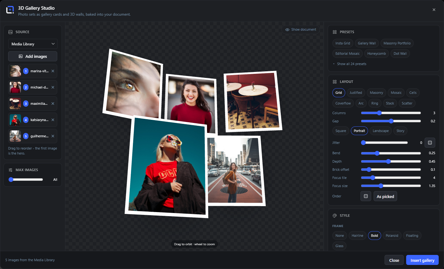
Photo galleries as designable cards and real 3D scenes: arrange any set of images as a grid, justified rows, masonry, mosaic, honeycomb, circles, hearts, stars, coverflow, a curved wall, a carousel ring, a card deck or scattered polaroids. Style gaps, corners, frames from hairline to polaroid and glass, captions and backgrounds, then tilt and orbit the whole wall in 3D.
Sources are static picks from the media library or dynamic: a post's featured image and all its images, a WooCommerce product with its gallery, or the newest posts, products or uploads. Dynamic galleries dropped into a dynamic template re-collect and re-layout their images per post or product in automation runs.
Open it from the Extensions menu. Export as a baked layer, a seamless video loop, an interactive drag-to-rotate HTML embed or a 360-degree spin, and reopen anytime via Edit 3D Gallery.
Requires a browser with WebGL2 and real graphics hardware. On software rendering the 3D scenes stays blank; Help, then System Status shows what your device reports.
Source: static or dynamic images Extension 9 items #
Choose the photos that fill the gallery: a fixed set you pick by hand, or a dynamic set that re-collects itself per post or product.
3D Gallery Studio arranges any set of images as a designable wall. The Source card at the top of the panel decides where those images come from. There are two modes: a static set you pick from the media library, and a dynamic set tied to a post or product.
Dynamic galleries are the point of the extension in automation: drop one into a dynamic template and each generated post or product re-collects and re-lays-out its own images, so one design produces a fitting gallery for every item. This needs Free 1.237.0 or newer (extension API 2.7.0), which exposes the resolved images to the generator.
Media library (static)
#The default mode. Pick a fixed set of images from the WordPress media library; that exact set is laid out and stays the same wherever the gallery is used.
Pick images / Add images
#Opens the media picker to choose images for a static gallery. Add more at any time; the chosen thumbnails appear as a strip you can reorder or remove from.
Tip. The layout adapts to however many images you pick, so a set of 3 and a set of 12 both fill the wall.
Post / Product (dynamic)
#Switches the source to a dynamic collection resolved from a post or WooCommerce product. Instead of fixed images, you choose what to collect (see the content-type rows below).
Content type
#For a dynamic gallery, what to gather from the item.
Search posts
#Type to find the specific post or product to preview a dynamic gallery against while you design. In automation the gallery follows the current item instead.
Max images
#Caps how many images a dynamic gallery collects, so a long post or a big "latest" feed still makes a tidy wall.
Follow the current post in automation runs
#When on, a dynamic gallery ignores the previewed item and re-collects images from whatever post or product the automation run is generating for. This is what makes one template produce a per-item gallery.
Shuffle order
#Reshuffles the image order with a seeded random, so the wall looks arranged rather than sequential. The seed is stable, so re-renders stay identical.
Order
#How the collected images are ordered before layout: as picked, or the shuffled arrangement.
Layout families Extension 12 items #
Ten ways to arrange the images, from tidy grids to honeycombs, coverflow and scattered polaroids. Each adapts to the image count.
The Layout card picks the family that arranges the tiles. Every family is pure geometry computed from the image count, so a wall always looks complete whether it holds three photos or twelve. "Flat" families (grid, justified, masonry, mosaic, cells) form a wall you can then jitter and bend; the others place tiles in real depth.
Grid
#Even rows and columns of same-size tiles, the classic Instagram-style block. Set the column count and aspect.
Justified rows
#Rows where each image keeps its own aspect ratio and the row is stretched to a flush edge, like a photo-gallery contact sheet.
Masonry
#Pinterest-style columns where tiles keep their aspect and stack with no row gaps, giving a portfolio wall.
Mosaic
#An editorial mosaic that mixes large and small tiles into a woven block. Set columns to 0 to let it size itself.
Cells (honeycomb)
#A tessellating wall of shaped cells: hexagons, circles or diamonds packed into a honeycomb. Choose the cell shape and density.
Coverflow
#A center image in focus with the rest angled away into depth on both sides, the iTunes-style flow. Set the angle and which tile is in focus.
Curved wall (arc)
#A wall bent into an arc that wraps toward the camera, set by the curve span in degrees.
Carousel ring
#Tiles placed evenly around a ring you look into, ideal for a rotating product carousel.
Card deck (stack)
#Images stacked like a deck of cards with a slight fan, the top card fully visible.
Polaroid scatter
#Photos tossed onto a surface at random angles and offsets, like a pile of polaroids. Seeded, so the scatter is repeatable.
Tile shape
#For the cells family, the mask geometry of each tile. Beyond the packing shapes, tiles can also be cut to decorative masks.
Density / Columns
#How many tiles across (or how tightly cells pack). More columns means smaller tiles and a denser wall.
Tiles, frames and captions Extension 14 items #
Style the tiles: spacing, rounded corners, a frame around each photo, drop shadows, and optional title captions on pills.
The Style and Captions cards control how each tile looks. Gaps and corner radius shape the tiles; a frame style wraps each photo; captions add a title pill you can color and place.
Gap
#The spacing between tiles, as a fraction of tile size. Zero butts photos edge to edge; larger values open the wall up.
Corner radius
#Rounds the corners of every tile, from square photos to pill-soft cards.
Frame
#The border treatment drawn around each photo.
Frame color
#The color of the frame, with a row of quick swatches (whites, creams, wood tones, charcoal, grey and gold) plus a full color picker.
Shadows
#A soft drop shadow under each tile that lifts the wall off the background. Set its strength.
Reflection
#A faint mirror of the wall on the ground plane, for a showroom feel. Strength runs roughly 0.08 to 0.6.
Size variance
#For scattered and stacked layouts, how much individual tiles differ in size, so the pile looks natural.
Jitter
#Randomly nudges tiles of a flat wall off their exact grid position for a hand-placed look. Seeded and repeatable.
Captions
#Turns on a title pill on (or below) each tile. When on, the caption cards below appear.
Caption text / Title
#The caption shown on each tile. For dynamic galleries this can bind to the image title or the item name.
Caption font
#The typeface for captions: pick from system fonts or the editor font library, in styles such as sans, serif, mono, condensed and handwriting.
Caption size
#Scales the caption text relative to the tile.
Caption placement
#Where the caption pill sits relative to the photo.
Pill background / color / opacity
#The caption sits on a rounded pill. Set the pill background color, the text color and how opaque the pill is.
3D, camera and background Extension 10 items #
Tilt and orbit the whole wall in real 3D, set the camera, bend flat walls into depth, and choose what sits behind the gallery.
One three.js engine drives everything; "flat" is simply the head-on orthographic view. The 3D / Camera card tilts and turns the wall and sets the lens, while Background decides what fills the scene behind it.
Rotate (turn)
#Turns the whole wall left or right around the vertical axis, showing its edge and depth.
Tilt
#Tips the wall forward or back around the horizontal axis, for a looking-up or looking-down angle.
Field of view
#The camera lens angle. A narrow field flattens perspective (telephoto); a wide field exaggerates depth.
Zoom / Distance
#Moves the camera closer or further, framing the wall tight or with breathing room.
Bend
#Curves a flat wall toward the camera at the edges, from perfectly flat to a gentle wrap.
Depth
#Pushes tiles apart along the view axis so the wall gains front-to-back layering instead of sitting on one plane.
Focus tile / Focus size
#For coverflow, which image is centered and in focus, and how much larger the focused tile is than its neighbours.
Orbit gesture
#In the preview you can drag to orbit the wall and use the wheel to zoom, to find an angle by hand. The hint reads "Drag to orbit, wheel to zoom".
Background
#What fills the scene behind the gallery.
Show document
#Renders your current editor design behind the gallery so you can compose the wall against the real layout before baking.
Presets Extension 7 items #
Twenty-four one-click starting points, from Insta Grid to Showcase Orbit, each setting a layout, styling and motion together.
The Presets row gives you a finished look in one click; every preset sets the layout family, tile styling, camera and animation together, and you can tune anything afterward. Use the category chips to filter, and "Show all" to expand the full set.
Preset cloud
#The collapsible row of preset chips. It starts compact; "Show all 24 presets" expands it and "Show fewer" collapses it again.
Categories
#The presets are grouped by kind in this reference (walls, cells, depth, scatter) to keep the list readable. The studio itself shows them in one row behind an expand button; there are no category chips to filter by.
Wall & grid presets
#Flat-wall looks: Insta Grid, Gallery Wall, Masonry Portfolio, Editorial Mosaic, Justified Rows, Captioned Wall, Dot Wall, Floating Wall, Pulse Wall.
Shaped & honeycomb presets
#Cell layouts: Honeycomb, Diamond Facets, and the circle-cell Team Circles.
Depth & motion presets
#Presets that use real depth: Coverflow, Product Carousel, Product Arc, Curved Wall, Showcase Orbit, Cinema Pan, Hero Spotlight, Film Strip.
Scatter & deck presets
#Casual piles: Polaroid Pile, Card Deck, Memory Board, Team Polaroids.
Preview on your current design
#Presets and every change render live against your document, so you judge the gallery in place before inserting.
Loop animation Extension 4 items #
Give the wall a gentle, seamless motion for the video and embed exports: orbit, spin, sway, float, pulse, drift or a cinema pan.
The Animation card adds motion that loops seamlessly, meaning the last frame matches the first, so a video or embed can repeat forever with no jump. Set the seconds per loop and the motion strength.
Animation (motion)
#The kind of looping movement applied to the whole wall.
Seconds
#The length of one loop. Shorter is livelier; longer is calmer. The exports use this as the loop duration.
Swing / Strength
#How far the motion travels, for example the swing angle of a sway. Swing runs about 4 to 30 degrees.
Seamless loop
#All motions are built to loop cleanly ("Loops seamlessly in video and embed exports"), so the video-loop and HTML-embed outputs never stutter at the wrap.
Export and insert Extension 9 items #
Turn the gallery into a baked layer, a seamless video loop, an interactive HTML embed or a 360-degree spin, and re-edit it any time.
The footer of the panel is where the gallery leaves the studio. Everything stays editable: an inserted gallery carries its settings, so "Edit 3D Gallery" reopens the studio on that exact wall.
Insert 3D Gallery
#Bakes the current wall into your design as an image layer. The layer remembers its generator settings, so you can reopen and change it later.
To media library
#Saves the baked gallery straight into the WordPress media library as a new image, without inserting it into the open document.
Video loop
#Records the animated wall as a seamless video loop for social or hero use. Exports MP4 with a WebM fallback; set the length with Seconds. A still scene is not a problem: the recording switches the animation to Sway for the take and puts it back afterwards.
HTML embed
#Exports an interactive, drag-to-rotate gallery as a self-contained HTML snippet driven by the bundled runtime.js (a [data-wpie-3dgallery] block). Visitors can orbit and zoom it live.
360 spin: sprite sheet
#Bakes a turntable spin as a single sprite sheet image plus a tiny viewer, so the gallery can be spun by the visitor with no 3D at runtime.
360 spin: viewer
#Inserts a standalone 360 viewer of the spinning wall.
360 spin: frames (ZIP)
#Downloads the individual spin frames as a ZIP, for use in your own slider or viewer.
Update 3D Gallery
#When you opened the studio from an existing gallery layer (Edit 3D Gallery), this replaces that layer in place with your changes instead of adding a new one.
Show document (preview)
#A preview toggle that composites your current design behind the gallery, so you export it framed exactly as it will sit in the layout.