3D Mockup Studio
A real-time three.js studio that wraps your design onto a 3D product model, then bakes it into the document as a transparent PNG layer.
3D Mockup Studio (overview) Extension 10 items #
A real-time three.js studio that wraps your design onto a 3D product model, then bakes it into the document as a transparent PNG layer.
Real-time 3D product mockups rendered in your browser: over a hundred models from smartphones, laptops and smart TVs to mugs, cans, bottles, bags, books, boxes, apparel, gift cards and podium staging, plus composed e-commerce hero scenes such as an unboxing, a skincare podium or a drink line-up with per-can artwork.
Fit and position your artwork per surface, or feed it from dynamic templates so a whole catalog can wear its own designs in automation runs. Orbit freely to the exact angle, tune shadow blur, length and direction, and add a ground reflection.
Open it from the Extensions menu. Insert the scene as a transparent PNG layer, bake a full 360-degree turntable as a sprite-sheet layer, download a self-contained drag-to-rotate HTML viewer, or export single frames for 360 player plugins. Everything stays editable via Edit Mockup.
Insert 3D Mockup
#Opens the studio to build a new mockup. Your currently active layer is loaded as the starting artwork, and the model defaults to the smartphone.
Tip. Nothing is added to your document until you press Insert Mockup.
Edit 3D Mockup
#Reopens the studio on an existing mockup layer with the exact model, artwork, camera, light and finish it was baked with. Adjust anything and the layer updates in place.
3D Models
#The mode that shows the parametric 3D model catalogue. This is the only mode available now; it fills the whole side panel with the model picker and its cards.
Tip. The Scenes tab only appeared when photographic scene packs were installed, which are retired.
Drag to orbit
#Click and drag inside the viewport to rotate the model. Horizontal drag spins it (Rotate/yaw), vertical drag tilts it (Tilt/pitch).
Wheel to zoom
#Scroll the mouse wheel over the viewport to zoom the camera in and out. Zoom is clamped so the model never disappears.
Drag to orbit · wheel to zoom
#The hint line shown at the bottom of the viewport, reminding you how to move the camera.
Tip. A small always-on caption, not a control.
Show document
#Toggles a flattened render of your open document behind the transparent mockup, so you judge the mockup over the real design instead of the checkerboard. When editing, the mockup's own layer is left out of that preview.
Tip. Only appears when the editor can render the current document.
Close (X)
#Closes the studio without changing your document. The X sits in the top-right of the dialog header.
Cancel
#Closes the studio and discards the mockup you were building. Nothing is inserted or updated.
Escape / click outside
#Pressing Escape, or clicking the dark backdrop outside the dialog, closes the studio the same way as Cancel.
Tip. A safe way out; your document is untouched.
Model picker Extension 2 items #
Choose which 3D object your artwork is wrapped onto, browsing 106 models across five categories.
The Model card holds a Category dropdown above a grid of thumbnail tiles. Pick a category to filter the grid, then click a tile to switch the model. The active tile is highlighted, and switching models rebuilds the 3D scene instantly.
Category
#Filters the model grid to one product family so the plain models never mix with the composed hero scenes. Changing it only hides and shows tiles; it does not change the current model until you pick a tile.
Model tile
#Each tile is one model, shown with a thumbnail and its name. Click it to load that model into the viewport; the tile you picked is marked active.
Tip. Hover a tile to see its full name as a tooltip.
Devices models Extension 8 items #
Screens and gadgets that show your artwork as a self-lit display or wrapped surface.
The Devices category holds eight electronic products. Screen models (phone, tablet, laptop, monitor, TV, watch) render your artwork unlit, exactly as designed, behind a glass sheen. The eReader instead prints it on a matte e-ink page.
Smartphone
#A modern smartphone with a metal rail, edge-to-edge screen carrying your artwork, punch-hole selfie camera and a triple-lens back in the chosen body color. This is the model the studio opens on.
Tablet
#An aluminium tablet with a uniform bezel; your artwork fills the screen. Good for app and web mockups on a larger display.
eReader
#A matte e-ink reader. Your artwork prints on the paper-gray page with no glass gloss, so it reads like electronic paper rather than a backlit screen.
Laptop
#An open laptop (lid tilted about 110 degrees) with a painted keyboard and trackpad; your artwork sits on the screen. Ideal for website and dashboard shots.
Monitor
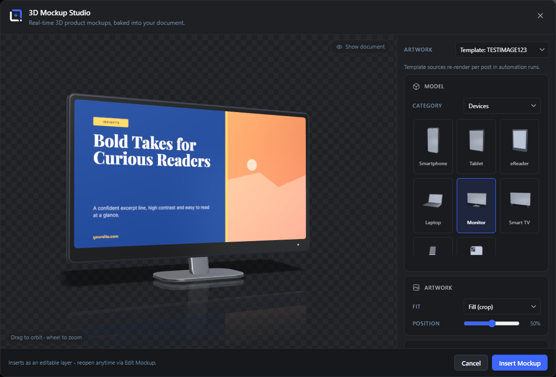
#A desktop monitor on a slanted arm and flat foot, with a slim bezel and a power LED in the chin; artwork fills the panel.
Smart TV
#A wide flat-panel television on two blade feet; your artwork fills the near bezel-less screen. Best for landscape designs.
Smartwatch
#A smartwatch showing your artwork on its rounded watch face. Suited to app icons and compact UI.
Phone Case
#A phone case with your artwork printed across the back. Use it for merchandise and accessory designs rather than screen content.
Print & Paper models Extension 18 items #
Flat printed pieces and signage, from postcards and posters to billboards and calendars.
The Print & Paper category holds eighteen printed products. Most take a single artwork on their printed face; a few are parametric (Canvas Print, Acrylic Sign, Clipboard, Desk Calendar) and the Poster Frames trio and Desk Calendar expose separate artwork surfaces.
Report (A4)
#A single A4 sheet or cover page lying with your artwork printed on it. Good for documents, letters and one-pagers.
Flyer
#A printed flyer sheet carrying your artwork. Use it for promo leaflets and handouts.
Postcard
#A postcard with your artwork on the face. Smaller and thicker than a flyer.
Sticker
#A die-cut sticker with your artwork and a thin border. Good for labels and merch stickers.
Business Cards
#A small stack of business cards with your artwork on the top card. Suits branding and identity designs.
Polaroid
#An instant photo with the classic thick white border; your artwork fills the photo window.
Poster Frame
#A framed poster hanging on a wall; your artwork sits inside the frame. Use it for wall-art and print mockups.
Roll-up Banner
#A pull-up exhibition banner standing on its base; your artwork runs the full height. For trade-show and event visuals.
Billboard
#A large outdoor billboard panel carrying your artwork. Best for wide advertising layouts.
Envelope
#A mailing envelope with your artwork on the front. Pairs well with the Report for stationery sets.
Wall Calendar
#A hanging wall calendar; your artwork prints on the top page. For calendar and seasonal designs.
Poster Frames (Trio)
#Three framed posters side by side, each of which can carry its own artwork via the Left, Center and Right surfaces. Good for a gallery-wall arrangement.
Poster (Clips)
#A poster held at the edges by metal clips; your artwork fills the sheet.
Poster (Pins)
#A poster pinned to a board; your artwork fills the sheet. A more casual poster presentation.
Canvas Print
#A gallery-wrap canvas with your artwork stretched over the front and edges. Width, Height and Depth are adjustable.
Clipboard
#A clipboard holding a stack of sheets with your artwork on top; the Sheets slider sets how thick the paper stack looks.
Acrylic Sign
#A standing acrylic sign block with your artwork; Width and Height are adjustable. For reception and desk signage.
Desk Calendar
#A wire-O desk calendar tent standing on the desk; the Angle slider opens or closes the tent, and Front and Back are separate artwork surfaces.
Books & Cases models Extension 12 items #
Bound and boxed products: books, media cases and binders, several with adjustable size and multiple surfaces.
The Books & Cases category holds twelve models. The hardcover Book, Software Box and the open books let you set dimensions and place different artwork on each surface (front, spine, back, page spreads). The disc cases and vinyl slide their disc out by a Slide out amount.
Book
#A hardcover book you can size with Height, Width and Thickness. By default only the Front carries artwork; the Spine and Back start plain but can each take their own design.
Softcover Book
#A softcover (paperback) book with your artwork on the cover. A thinner, more flexible-looking alternative to the hardcover.
Open Book (standing)
#An open hardcover standing upright with the spread facing you; your artwork is split across the two pages. The Opening slider sets the angle between the halves, and the Outside jacket and Inside spread are separate surfaces.
Open Book (lying)
#An open book lying flat with the pages facing up; artwork is split across the spread. Opening sets how flat it lies, and here the Inside spread is the main surface with the Outside jacket optional.
Software Box
#A retail software or product box; Width, Height and Depth are adjustable. The Front shows your artwork by default, with Spine, Top and Back available as extra surfaces.
DVD Case
#A closed DVD keep case with your artwork on the cover. Use the disc variant if you want the disc showing.
CD Jewel Case + Disc
#A CD jewel case with the disc sliding out; the Slide out slider sets how far. The Cover and the Disc are separate artwork surfaces.
DVD Case + Disc
#A DVD case with the disc sliding out by the Slide out amount; Cover and Disc take their own artwork.
CD Jewel Case
#A closed CD jewel case with your artwork on the cover insert.
Spiral Notebook
#A spiral-bound notebook with your artwork on the cover. For stationery and branding sets.
Ring Binder
#A lever-arch ring binder; the Spine slider sets its width. Your artwork prints on both the Front and the Spine label.
Vinyl Record
#An LP record sleeve with the disc sliding out by the Slide out amount; the sleeve Cover and the record Label are separate artwork surfaces.
Product & Packaging models Extension 16 items #
Physical goods and packaging where your artwork becomes a wrapped label, printed panel or fabric print.
The Product & Packaging category holds sixteen models: drinkware, bottles and jars, bags, apparel and shipping packaging. Cylindrical products wrap the artwork as a label band; boxes, pouches and totes print it on a flat face. Several are parametric or expose front/side surfaces.
Mug
#A ceramic mug with a cream interior and ear handle; your artwork wraps the front of the body as a printed band, kept clear of the handle.
Coffee Cup (to go)
#A takeaway paper coffee cup with a lid; your artwork wraps around the cup. For cafe and to-go branding.
Can
#An aluminium beverage can with a pull tab; your label wraps almost all the way around the straight wall.
Bottle
#A cosmetic or pump-style bottle with a metallic cap; your artwork sits on a label band around the body.
Cosmetic Jar
#A squat cosmetic jar with a screw lid; your artwork wraps the body as a label band. For skincare and beauty products.
Cosmetic Tube
#A squeezable cosmetic tube with your artwork printed on the body. Pairs with the jar and bottle for beauty ranges.
Shopping Bag
#A paper shopping bag with rope handles and an open top; your artwork prints on the front panel.
Tote Bag
#A fabric tote bag with your artwork printed on the front. For merch and eco-branding.
Pillow
#A soft cushion with a puffed cushion silhouette; the Front carries your artwork by default and the Back is an optional second surface.
Wine Bottle
#A wine bottle with a label band carrying your artwork. For beverage and gift branding.
Pouch (stand-up)
#A stand-up food pouch (doypack) with your artwork on the front. For snacks, coffee and pet food packaging.
Shipping Box
#A corrugated shipping box; Width, Depth and Height are adjustable and the Flaps slider opens the lid. Front carries artwork with the Side optional.
T-Shirt
#A t-shirt with your artwork printed on the chest; the Width slider adjusts the fit. For apparel and merch.
Candle
#A candle in a glass container with a wrapped label; Height and Width are adjustable. For home and spa products.
Pen
#A pen with your artwork on the barrel; Length and Width are adjustable. A small promotional item.
Beverage Carton
#A gable-top milk or juice carton; Width and Height are adjustable. Front carries artwork with the Side optional.
Hero scenes Extension 24 items #
Ready-made compositions that arrange several models into one shot, each object able to carry its own artwork.
Hero scenes combine multiple models into a single arranged scene (for example a laptop, tablet and phone together). Every object in the scene is exposed as its own artwork surface, so you can give each one a different design through the per-surface pickers. By default each object uses the main artwork.
Hero: Devices
#A laptop, tablet and phone arranged together, each screen taking its own artwork. For a product or app across screen sizes.
Hero: Desk
#A laptop with a phone and mug on the desk. A warm workspace shot.
Hero: Branding
#A shopping bag, box, mug and business cards together for a brand identity spread.
Hero: Café
#A takeaway coffee cup, mug and business cards for cafe branding.
Hero: Beauty
#A bottle, jar and tube together for a skincare or cosmetics range.
Hero: Print
#A framed poster, report and business cards for a print and stationery showcase.
Hero: Merch
#A tote bag, mug and sticker for a merchandise set.
Hero: On the go
#A phone, coffee cup and smartwatch for a mobile, out-and-about scene.
Hero: Reading
#A closed book, eReader and open book together for a publishing or reading theme.
Hero: App
#A phone, tablet and smartwatch for showing one app across devices.
Hero: Monitor Desk
#A monitor with a phone and mug on the desk for a workstation shot.
Hero: Stationery
#A report, envelope and business cards for a corporate stationery set.
Hero: Office
#A clipboard, pen and mug for an office desk scene.
Hero: Desk Set
#A ring binder, spiral notebook and pen for a study or back-to-school set.
Hero: Shipping
#A shipping box, pouch and sticker for a fulfilment or e-commerce scene.
Hero: Pantry
#A beverage carton, jar and can for a grocery or pantry-shelf shot.
Hero: Drinks
#A wine bottle, bottle and can together for a beverage line.
Hero: Spa
#A candle, jar and tube for a spa or wellness theme.
Hero: Fashion
#A t-shirt, tote bag and sticker for an apparel and merch scene.
Hero: Music
#A vinyl record, poster and mug for a music release or band-merch scene.
Hero: Wall Art
#A canvas print, framed poster and polaroid for a wall-art arrangement.
Hero: Event
#A roll-up banner, flyer and business cards for an event or trade-show set.
Hero: Calendars
#A wall calendar, desk calendar and postcard for a calendar product line.
Hero: Launch
#A laptop, phone and shipping box together for a product-launch or unboxing scene.
Model-specific options Extension 30 items #
Extra sliders that appear only for models that can change size, angle or how far a part opens.
When a model declares its own parameters, matching sliders appear under the Model card. Each model keeps its own values, so a Width you set on the box does not carry over to the box's or another model's Width. Size sliders use the model's own units (plain numbers); Opening and Angle are degrees; Slide out and Flaps are percentages.
Height
#Sets the hardcover Book's height. Larger values make a taller book.
Width
#Sets the hardcover Book's width (how wide the cover is).
Thickness
#Sets the hardcover Book's spine thickness (page count feel).
Opening
#Sets the angle between the two halves of the standing open book. Higher opens it flatter; 178 is nearly flat.
Opening
#Sets how flat the lying open book lies; 179 is almost fully flat on the surface.
Width
#Sets the Software Box's width.
Height
#Sets the Software Box's height.
Depth
#Sets the Software Box's depth (how thick front-to-back it looks).
Slide out
#Sets how far the CD slides out of the jewel case, from fully in to fully out.
Slide out
#Sets how far the disc slides out of the DVD case.
Spine
#Sets the width of the ring binder's spine (how fat the binder is).
Width
#Sets the Shipping Box's width.
Depth
#Sets the Shipping Box's depth (front-to-back).
Height
#Sets the Shipping Box's height.
Flaps
#Opens the box's top flaps, from closed to fully open. Use it to show an open or sealed carton.
Width
#Adjusts the t-shirt's fit (how wide the body of the shirt sits).
Width
#Sets the Canvas Print's width.
Height
#Sets the Canvas Print's height.
Depth
#Sets how deep the gallery-wrap canvas stands off the wall.
Slide out
#Sets how far the record slides out of its sleeve.
Height
#Sets the candle's height.
Width
#Sets the candle's width (jar radius).
Sheets
#Sets how many sheets are stacked on the clipboard, changing the paper thickness.
Length
#Sets the pen's length.
Width
#Sets the pen's barrel width (thickness).
Width
#Sets the Acrylic Sign's width.
Height
#Sets the Acrylic Sign's height.
Width
#Sets the Beverage Carton's width.
Height
#Sets the Beverage Carton's height.
Angle
#Sets how far the desk calendar tent is opened; lower stands it more upright, higher spreads the legs.
Artwork source Extension 8 items #
Choose which of your document's content becomes the design wrapped onto the model.
The Artwork dropdown at the top of the side panel picks where the main artwork comes from. It offers the active layer, the whole flattened document, any named layer, and any dynamic template. When you reopen an edited mockup it also offers the artwork it was baked with.
Artwork
#The main source dropdown. Whatever you pick here is rendered to a canvas and used as the design on the model (and as the fallback for every surface that is left on Main artwork).
Active layer
#Uses your currently selected layer as the artwork. Image layers load at full quality; other layer types are rendered and trimmed to their content.
Tip. This is the default when you open the studio fresh.
Whole document
#Uses a flattened render of the entire document (all layers combined) as the artwork. Good for wrapping a finished design onto a product.
Template: (name)
#Uses a dynamic template as the artwork, rendered with the current preview-post context. These sources re-render for each post during automation runs, so every post gets its own cover on the mockup.
Tip. Requires templates to exist in your library.
(layer name)
#Every named layer in the document is listed so you can wrap one specific layer onto the model. Nested layers are indented, and groups show a small triangle marker.
Tip. Handy when only one layer holds the design you want to show.
Saved artwork
#When you reopen an existing mockup, this option restores the exact pixels it was baked with, even if the original layer has since changed.
Tip. Only appears while editing an existing mockup.
Saved override
#A fallback label shown when a mockup was saved pointing at a source (a layer or template) that no longer exists, so the dropdown still has a valid selection.
Tip. Pick a live source to replace it.
Template sources re-render per post in automation runs.
#An on-screen note that appears when templates are available, reminding you that template-based artwork is regenerated for each post during batch or automation runs.
Artwork fit & position Extension 5 items #
Control how the artwork is scaled and cropped onto the model's surface.
The Artwork card sets how the design fills the model's face. Areas the artwork does not cover stay transparent, so the material below (screen glass, ceramic, paper) shows through on a contain fit.
Fit
#Chooses how the artwork is sized to the surface: crop-to-fill, fit fully inside, or stretch to the exact shape.
Fill (crop)
#Scales the artwork to cover the whole surface, cropping whatever overflows. Keeps the design edge-to-edge with no gaps; use the Position slider to choose which part is kept.
Tip. This is the default fit.
Fit inside
#Scales the artwork so all of it is visible inside the surface, which can leave the material showing around the edges. Use it when nothing may be cropped.
Stretch
#Stretches the artwork to the surface's exact aspect ratio, which may distort it. Use it only when the design already matches the shape.
Position
#With Fill (crop), slides the crop window across the artwork to choose which part stays visible. It is disabled for the Fit inside and Stretch modes.
Per-surface artwork Extension 7 items #
Give each face of a multi-surface model its own design, fit and crop.
Models that expose more than one surface (book front/spine/back, open-book spreads, disc cases, the poster trio, shipping box, carton and every hero scene) show a labeled picker per surface under the Model card. Each surface can use the main artwork, a plain unprinted face, or its own separate source, and can override the global fit and crop.
Surfaces default sensibly: the main face uses your artwork, while inner faces like spines and backs start plain. Hero scenes expose one surface per object so each product can carry a different design.
Surface pickers
#One dropdown per surface (labeled Front, Spine, Back, Cover, Disc, Left, Center, Right, and so on) that sets what design that face shows. Surfaces only appear for models that have more than one.
Tip. The label matches the physical part of the model.
Main artwork
#Uses the studio's main Artwork source on this surface. This is the default for a model's primary face.
None (plain)
#Leaves this surface blank so the bare material (cover board, paper, disc) shows with no print. Used by default for inner faces like spines and backs.
Tip. Pick this to keep a spine or back unbranded.
Per-surface sources
#Besides Main artwork and None, each surface offers the same sources as the main picker (Active layer, Whole document, a named layer, or a template), so different faces can carry different designs.
Default (artwork)
#The per-surface Fit option that inherits the global Artwork fit and position. Leave it here unless this face needs a different crop.
Per-surface Fit
#Overrides how the artwork sits on just this surface, using the same choices as the global fit: Fill (crop), Fit inside or Stretch.
Per-surface Position
#A small crop slider next to each surface's Fit that positions the crop window for that face; it is active only when that surface uses Fill (crop).
View (camera) Extension 2 items #
Set the exact camera angle with sliders, matching what you get by dragging in the viewport.
The View card holds two sliders that rotate and tilt the model. They mirror dragging in the viewport: horizontal drag changes Rotate, vertical drag changes Tilt. Zoom is set by the mouse wheel.
Light & Shadow Extension 5 items #
Tune the studio lighting and the ground shadow's strength, softness, length and direction.
The Light & Shadow card controls the overall brightness and the contact shadow the model casts on the ground. The shadow follows the camera, and its footprint is kept fully inside the baked layer so it is never clipped.
Light
#Sets the overall brightness of the studio (ambient plus key light plus environment). Higher makes a brighter, punchier scene.
Shadow
#Sets how dark and visible the ground shadow is. At 0 the shadow and its ground plane are turned off entirely.
Blur
#Sets the softness of the shadow edge (penumbra width). Low is a crisp hard shadow; high is a soft, diffuse one.
Length
#Sets how long the shadow stretches by lowering the key light. Higher throws a longer shadow, as if late in the day.
Direction
#Rotates the light around the model so the shadow falls to a different side, measured relative to the camera view.
Finish (reflection & body color) Extension 3 items #
Add a ground reflection and set the color of the model's non-artwork body.
The Finish card controls a mirror reflection on the ground and the body color of the model (the phone frame and back, mug ceramic, box card, and so on). The artwork surfaces are unaffected by the body color.
Reflection
#Fades a mirror of the model into the ground beneath it, dropping off with distance. Higher gives a glossier, showroom-floor look; 0 turns it off.
Body
#Sets the color of the model's material body: the parts that are not the artwork, such as a phone's frame and back, a mug's glaze or a box's board. Opens the editor's color picker when available.
Color swatches
#Eight one-click preset body colors below the picker for fast changes. Clicking one sets the Body color and marks it active.
Tip. Ranges from dark slate and near-black through off-white, gray, navy, forest, wine and tan.
360 Spin export Extension 7 items #
Bake a full turntable rotation as a sprite sheet layer, a drag-to-rotate HTML viewer, or single frames.
The 360 Spin card bakes a whole turn of the model into frames with identical framing on every frame (no wobble during the spin). You can insert those frames as one sprite-sheet layer in the document, or download them as a self-contained viewer or a ZIP for 360 player plugins.
Frames
#Sets how many still frames make up one full 360-degree turn. More frames give a smoother spin but a larger sprite sheet.
Size
#Sets the pixel size of each frame cell in the sprite sheet. Larger is sharper but heavier.
Bakes a full turn as one sprite sheet layer, identical framing on every frame.
#An on-screen note explaining that the spin is baked as a single sprite-sheet image with every frame framed the same way.
Tip. Informational text, not a control.
Insert sprite sheet
#Bakes the full turn and inserts it into your document as one image layer holding all the frames in a grid. The layer remembers its spin settings, so Edit Mockup re-bakes the whole sheet.
Tip. Feed the sheet to a 360 viewer, WooCommerce spin or animation tool.
Viewer (HTML)
#Downloads a ready-to-embed, self-contained HTML file that plays the spin and rotates as the visitor drags. Everything (the sheet image included) is inlined, so it works offline.
Frames (ZIP)
#Downloads the individual spin frames as PNGs in a ZIP, ready to feed 360 product-viewer plugins (WooCommerce spin viewers and similar).
Viewer = ready-to-embed HTML file, spins on drag. Frames feed 360 player plugins.
#An on-screen note describing the two download buttons: the HTML viewer spins on drag, and the frames ZIP feeds external 360 players.
Tip. Informational text, not a control.
Sprite sheets: what to do with a 360 spin Extension 5 items #
A sprite sheet is one image holding every frame of a turn. This is what you do with it after a studio has baked one.
Three studios bake a turntable spin the same way: 3D Mockup Studio, 3D Text Studio and 3D Gallery Studio. All three hand you the same three routes out, and which one you want depends on where the spin has to run.
A sprite sheet is a flip book in one file. The frames sit side by side in a grid, and a player shows one cell at a time and steps to the next as the visitor drags. Nothing inside the editor plays a sheet: the studio makes one, and a viewer, a plugin or a few lines of your own code play it. That is the part that surprises people, so it is worth saying plainly.
Every frame is rendered at the same camera distance. The studio measures the widest angle first and frames them all to that, so the object does not swell and shrink while it turns. Without that, a spin jitters.
Which of the three routes to take
#Take Insert sprite sheet when you still want to work on the picture: it arrives as one layer, so you can crop it, put your brand on it and export a single PNG. Take Viewer (HTML) when the spin simply has to work on a page and you would rather not add a plugin. Take Frames (ZIP) when a 360 player is already in place and wants numbered images.
Tip. For most people the viewer or the ZIP is the shorter road. The sheet is for when you have your own player, or your own code.
What the grid looks like
#The frames are laid out in a roughly square grid, not in one long strip. 24 frames become 5 columns by 5 rows and the last cell stays empty. At the default frame size that is one image of 1920 by 1920 pixels. Raising either dropdown multiplies that, which is the whole trade the two settings offer.
Playing a sheet yourself
#Give an element the size of one cell, set the sheet as its background and move the background position by one cell per frame. Because the frames sit in a grid rather than a single row, both axes have to move: frame i sits at -(i % cols) * cell across and -floor(i / cols) * cell down. A plain CSS steps() animation only walks one axis, so a grid needs a few lines of JavaScript, or a player that understands sheets.
Tip. If all you want is drag to rotate, take Viewer (HTML) instead. It already does exactly this, in one file.
What is inside Frames (ZIP)
#One PNG per frame, named frame-01.png upwards and zero padded to the number of frames, in turning order. A viewer that sorts by file name therefore gets the rotation right with no renaming. Each image is one cell of the sheet, at the frame size you picked.
What the HTML viewer actually is
#One self-contained file. The sheet is embedded inside it, so there is nothing else to upload and no request leaves the page. It spins by itself until the first drag, then follows the pointer. On a phone it turns on a horizontal drag and lets a vertical swipe scroll the page, so it does not trap the reader.
Insert & editable layers Extension 5 items #
Bake the mockup into your document as a transparent PNG layer that stays editable and can re-render per post.
The footer holds the primary action. The mockup is baked at high resolution, trimmed to hug the model and its shadow, and placed as a transparent PNG image layer. Because the layer stores the full scene, you can reopen it later with Edit Mockup, and template-based mockups re-render automatically in automation runs.
Insert Mockup
#Bakes the current view into a new transparent PNG layer and adds it to the document, centered and sized to about 85% of the shorter document side. The scene is stored on the layer so it stays editable.
Update Mockup
#Shown instead of Insert when you opened the studio via Edit Mockup. It re-bakes the mockup into the existing layer, refitting the new render into the layer's box around its center so nothing distorts.
Tip. The button label switches to this automatically while editing.
Editable layer (Edit Mockup)
#Every inserted mockup stores its model, artwork, camera, light and finish on the layer. Reopening it with Edit Mockup restores the exact scene so you can change anything and re-bake.
Automation re-render
#When a mockup's artwork (or any surface) comes from a dynamic template, the extension re-renders that template against each post and re-bakes the mockup during automation runs, so every post gets its own design on the product. Mockups with fixed artwork keep their baked pixels.
Tip. Only template-based sources re-render; static ones stay as baked.
Inserts as an editable layer - reopen anytime via Edit Mockup.
#The footer hint reminding you that the result is a normal, re-editable image layer.
Tip. Informational text next to the action buttons.
Model categories (picker filter) Extension 5 items #
The Category dropdown above the model tiles narrows the grid to one product family.
The model picker groups the parametric models into five families. Picking a category hides every tile that does not belong to it, so the plain products never mix with the staged Hero compositions.
This is a view filter only. It never changes your artwork or the selected model, it only decides which tiles are visible.
Devices
#Shows only the screen and gadget models: Smartphone, Tablet, eReader, Laptop, Monitor, Smart TV, Smartwatch and Phone Case. Pick this family when you are mocking up an app screen or a device photo.
Print & Paper
#Filters to flat printed pieces: Report (A4), Flyer, Postcard, Sticker, Business Cards, Polaroid, Poster Frame, Poster Frames (Trio), Poster (Clips), Poster (Pins), Roll-up Banner, Billboard, Envelope, Wall Calendar, Desk Calendar, Canvas Print, Clipboard and Acrylic Sign.
Books & Cases
#Filters to books and media cases: hardcover Book, Softcover Book, Open Book (standing) and (lying), Software Box, DVD Case and CD Jewel Case (with or without disc), Spiral Notebook, Ring Binder and Vinyl Record.
Product & Packaging
#Filters to physical products and packaging: Mug, Coffee Cup (to go), Can, Bottle, Wine Bottle, Cosmetic Jar, Cosmetic Tube, Shopping Bag, Tote Bag, Pillow, Pouch (stand-up), Shipping Box, T-Shirt, Candle, Pen and Beverage Carton.
Hero scenes
#Filters to the multi-object hero compositions (every tile whose name starts with Hero:). Each of these arranges several products in one staged shot instead of a single object.
Tip. Hero tiles expose one artwork picker per object they contain.
Per-surface artwork faces Extension 14 items #
Models with more than one printable side show a named artwork picker for each face, so every face can carry its own design.
When the selected model declares surfaces, the Model card lists one row per face below the model tiles. Each row is a source picker (Main artwork, None (plain), a layer, the whole document or a template) plus its own Fit and Position controls.
Faces default either to the Main artwork (they show your design straight away) or to None (plain) (they stay blank until you choose a source). The labels below are the face names as they appear in the code.
Front
#Artwork for the front face of a multi-surface model, such as the book cover, the box front, the pillow front or the calendar front. It starts filled with your Main artwork.
Spine
#Artwork for the narrow spine edge of a book, software box or ring binder. On the Book and Software Box it starts blank, on the Ring Binder it starts with the main artwork. This is the surface picker, not the ring binder's spine-width slider of the same name.
Tip. Use it for the printed title strip down the edge.
Back
#Artwork for the back face. It starts blank (None (plain)), so you only fill it when you actually have a back-cover design.
Top
#Artwork for the top face of the Software Box. It starts blank so the box top stays a plain body color until you add a design.
Outside
#Artwork for the outer cover of an open book. On Open Book (standing) it carries the main artwork, on Open Book (lying) it starts blank.
Inside
#Artwork for the inner spread (the open pages) of an open book. On Open Book (lying) it carries the main artwork, on Open Book (standing) it starts blank.
Cover
#Artwork for the sleeve or case cover of a disc product. It defaults to the main artwork.
Disc
#Artwork printed on the disc itself, for the case-with-disc models. Defaults to the main artwork so the disc face matches the cover.
Label
#Artwork for the round center label of the Vinyl Record. Defaults to the main artwork.
Side
#Artwork for the side panel of the Shipping Box or Beverage Carton. Starts blank so the sides stay a plain body color until you add a design.
Left
#Artwork for the left frame in the Poster Frames (Trio) model, so the three framed posters can each hold a different image.
Center
#Artwork for the center frame in the Poster Frames (Trio) model.
Right
#Artwork for the right frame in the Poster Frames (Trio) model.
Hero scene object surfaces
#Every Hero composition exposes one artwork picker per object it stages (for example Laptop, Tablet and Phone on Hero: Devices, or Bag, Box, Mug and Cards on Hero: Branding). Each object defaults to the Main artwork and can be pointed at its own layer, the whole document or a template.
Tip. This is how you put a different design on each product in a single staged shot.
Studio window Extension 1 item #
The full-screen modal that hosts the 3D preview and every mockup control.
Opening Insert 3D Mockup (or Edit 3D Mockup on an existing mockup layer) mounts this modal inside the editor. The 3D preview sits on the left, the settings cards on the right, and a Cancel plus primary action in the footer.
3D Mockup Studio
#The modal's title bar, badged with the editor brand mark. The line beneath the title changes with the mode: it explains what an insert does when you open a fresh mockup, and that edits update in place when you reopen one.