3D Text Studio
The 3D Text Studio dialog, its two modes, the live preview, and the buttons that bake the result into your document.
Studio overview and insert Extension 8 items #
The 3D Text Studio dialog, its two modes, the live preview, and the buttons that bake the result into your document.
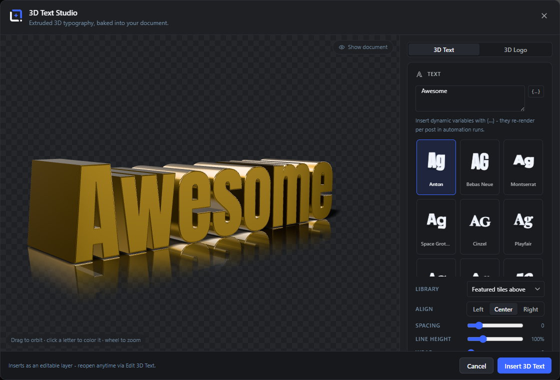
Extruded 3D typography and logos: type any text, or switch to logo mode and extrude any SVG, uploaded or taken straight from a vector layer of your document, multi-color fills preserved. Use the bundled display faces or any font from your editor library, including your own uploads, decoded locally so nothing leaves your server.
Shape it with depth, bevel and curve controls, pick premium materials such as gold, chrome, glass, neon glow or holographic, then click any single letter in the preview to give it its own color, material, size, depth, shift and rotation. Studio shadows and a ground reflection light the result.
Open it from the Extensions menu. Insert as a transparent PNG layer, bake a 360-degree spin as a sprite-sheet layer or a self-contained HTML viewer, and bind the text to post data so it re-renders per post in automation runs. Reopen anytime via Edit 3D Text.
3D Text
#Switches the studio to text mode, where it extrudes the text you type. This is the default mode when you open the studio.
3D Logo
#Switches to logo mode, which extrudes an SVG or a vector layer from your document instead of typed text. Selecting this hides the Text card and Curve control and shows the Logo card.
Tip. A vector layer selected in the editor opens the studio straight in logo mode.
Show document
#Toggles a one-time flattened render of your current design behind the transparent 3D scene, so you can judge the text over the real artwork instead of the checkerboard. When editing an existing layer, that layer is left out of the preview.
Tip. Your choice is remembered between sessions.
Preview (orbit, zoom, pick letter)
#The interactive 3D stage. Drag to orbit the camera, use the mouse wheel to zoom, and in text mode click any single letter to select it for per-letter styling.
Close
#Closes the dialog without inserting anything. The Esc key and clicking the dark backdrop do the same.
Cancel
#Closes the studio and discards your work, the same as Close.
Insert 3D Text
#Renders the current 3D text at high resolution and adds it to your document as a transparent PNG layer, centered and scaled to fit. The button reads Insert 3D Logo in logo mode, and Update 3D Text / Update 3D Logo when you are editing an existing layer (it re-fits the new artwork into the same box).
Edit 3D Text
#Reopens the studio for a layer that was created here, with every setting restored, so you can change the text, material or lighting and re-bake. This action lives on the layer itself (right-click or the layer menu), because the inserted layer remembers it came from 3D Text Studio.
Text and layout Extension 11 items #
Type the text to extrude and control its alignment, spacing, line height and wrapping.
These controls live in the Text card, which is only visible in 3D Text mode. The text you type is extruded live in the preview.
You can mix in dynamic variables so the layer re-renders per post during automation runs, for example a post title or a brand field.
Your text…
#The multi-line text box for the words you want in 3D. Type here and the preview rebuilds as you go. Press Enter for a new line.
{…} (variable button)
#Inserts a dynamic {{binding}} token at the cursor, for example {{post.title}}. During automation runs the token is replaced with the real value for each post, so one design produces many labeled outputs.
Tip. Requires a recent editor core (API 2.6+); older cores show the Dynamic dropdown instead.
Dynamic
#A fallback dropdown (shown only on older cores without the {…} button) that binds the whole text to one source. Pick a field to re-render the layer per post; the typed text stays as the design-time preview.
Custom text
#The default choice in the Dynamic dropdown. It means the layer uses exactly the text you typed and does not re-render per post.
Align
#Sets how multiple lines line up horizontally against each other. Use it when your text has more than one line.
Left
#Aligns all lines to a common left edge.
Center
#Centers each line on the middle axis. This is the default alignment.
Right
#Aligns all lines to a common right edge.
Spacing
#Widens or tightens the gap between letters (tracking). Negative values pull letters closer, positive values push them apart.
Line height
#Sets the vertical distance between lines of text, as a percentage of the normal line spacing. Lower values pack lines tighter, higher values spread them out.
Wrap
#Breaks long text into lines after roughly this many characters, so a long bound title becomes a poster-friendly block instead of one endless strip. Set to 0 to turn wrapping off.
Fonts Extension 14 items #
Choose from 12 bundled display fonts, or any font already loaded in your editor library.
The font tiles are 12 display faces that ship inside the extension, decoded locally so nothing leaves your server. Click a tile to apply it.
Below the tiles, the Library dropdown lets you pick any font family the editor page already loads (built-in families and your own uploads), with a Weight selector for that family.
Anton
#A tall, heavy condensed sans, good for bold impact headlines. This is the default font.
Bebas Neue
#A tall all-caps condensed sans with an even, poster-like rhythm.
Montserrat
#A geometric sans in its heaviest (black) weight, clean and modern.
Space Grotesk
#A contemporary techy sans with slightly quirky letterforms.
Cinzel
#A classical Roman-inscription serif in caps, elegant and formal.
Playfair
#A high-contrast display serif with a refined, editorial feel (Playfair Display).
DM Serif
#A stylish high-contrast serif with a warm display character.
Fredoka
#A rounded, friendly sans that reads soft and approachable.
Bangers
#A bold comic-book style caps face, great for loud, playful text.
Lobster
#A connected script with retro-signage flavor.
Pacifico
#A relaxed brush-style handwriting script.
Dancing Script
#A lively, casual handwriting script with bouncy letterforms.
Library
#Picks a font from the editor's own font library instead of the tiles above. Fonts are grouped into your uploads and the editor's built-in fonts; woff2 files are decoded locally in the browser.
Weight
#Chooses the weight (for example 400 or 700) of the family picked in the Library dropdown. It only appears once you select a Library family, and lists the weights that family actually provides.
Tip. Defaults to weight 400 when the family has it.
Materials Extension 12 items #
Twelve premium material presets, each setting the surface look plus its own face and side colors.
Materials are shown as tiles in the Material card. Clicking one applies its physical look (reflection, metalness, glass, glow and so on) and also loads its matching Face, Sides and Glow values, which you can then override.
Metals and glass pick up long streaky highlights from the studio environment, so they look best with some rotation.
Gold
#A warm polished gold metal. This is the default material.
Chrome
#A bright, mirror-like silver metal that reflects the studio lights sharply.
Copper
#A warm reddish-brown metal with a soft metallic sheen.
Steel
#A cooler brushed-metal grey, more muted than chrome.
Glass
#A clear refractive glass that transmits and bends what is behind it. Pairs well with a Backdrop so the refraction has something to show.
Frosted
#A translucent frosted (milk) glass with a soft, diffused surface.
Neon
#A glowing neon-tube look that emits its own light. Selecting it turns on a real bloom glow automatically.
Gloss
#A glossy painted plastic with a shiny clear-coat highlight, in a vivid red by default.
Matte
#A flat, non-reflective surface with soft even shading, for a subtle, understated look.
Candy
#A glossy, saturated pink candy-coat, bright and playful.
Hologram
#An iridescent holographic finish whose color shifts across the surface, for a futuristic look.
Gradient
#A smooth color gradient down the face of the letters. Choosing it reveals the Bottom color control so you can set the second gradient color.
Material colors and glow Extension 4 items #
Override the face, side and (for gradient) bottom colors, and dial in the emissive glow.
These controls sit under the material tiles. Picking a material preset fills them in for you, but you can change any color afterward to make the material your own.
Face
#The color of the front faces of the letters (the part pointing at the camera). Uses the editor's color picker.
Sides
#The color of the extruded sides and bevels of the letters (the depth). Set it darker than the face for a natural shaded edge.
Bottom
#The second (bottom) color of the face gradient. This control only appears when the Gradient material is selected; the Face color acts as the top color.
Glow
#Adds an emissive bloom halo around the letters, as if they give off light. The Neon material turns this up automatically, but you can add a glow to any material.
Per-letter styling Extension 10 items #
Click a single letter in the preview to give it its own color, material, size, depth, shift and rotation.
In text mode, click any letter in the preview to select it. A per-letter panel then appears where you can override just that letter; a small pop marks the selected glyph.
Every control here has a neutral value that means "follow the whole text", so you only override what you change. Spaces cannot be styled.
Letter „x“
#The panel heading shows which letter is selected. Click a different letter in the preview to switch, or click empty space to deselect.
Tip. The prompt reads "Click a letter in the preview to give it its own color." until you select one.
Color
#Sets a face color for just the selected letter, independent of the whole-text Face color.
Auto
#Clears the selected letter's custom color so it follows the main text color again.
Material (Like text)
#Gives the selected letter its own material preset, chosen from the 12 materials. Leave it on Like text to keep the letter on the same material as the rest of the text.
Size
#Scales just the selected letter up or down relative to the others, as a percentage. Useful for drop-caps or emphasis.
Depth
#Overrides the extrusion depth for the selected letter, as a percentage. Push one letter deeper (or flatter) than the rest.
Shift
#Moves the selected letter up or down from the baseline, as a percentage of its height, for a bouncing or staggered look.
Rotation
#Tilts the selected letter clockwise or counter-clockwise for a hand-set, playful arrangement.
Reset letter
#Removes all custom styling from the currently selected letter, returning it to the main text style.
Reset all letters
#Clears every per-letter override at once. This button only appears while at least one letter has custom styling.
Shape (depth, bevel, curve) Extension 3 items #
Control how thick, how rounded, and how curved the extruded text is.
The Shape card sets the 3D form of the letters themselves. The Curve control is hidden in logo mode.
Depth
#Sets how thick the extrusion is, that is how far the letters stick out toward and away from you. Higher values make chunkier 3D text.
Bevel
#Rounds the front and back edges of the letters. A little bevel catches the light for a polished edge; more bevel makes the letters look softer and rounder.
Curve
#Bends the whole line of text along an arc. Positive values curve one way, negative the other, and 0 keeps it straight. This control is only available in 3D Text mode.
View (rotate, tilt, zoom) Extension 3 items #
Aim the camera around the text with rotate and tilt sliders, plus mouse-wheel zoom.
The View card mirrors the drag-orbit of the preview: the sliders and the drag stay in sync, so you can set an exact angle or eyeball it by dragging.
Rotate
#Turns the text left or right around its vertical axis (yaw). This is the same value you set by dragging the preview horizontally.
Tilt
#Raises or lowers the camera to look down at or up toward the text (pitch). Matches vertical dragging in the preview.
Zoom (mouse wheel)
#Scrolling the mouse wheel over the preview zooms the camera in and out. There is no slider; it is a preview-only control.
Light and shadow Extension 5 items #
Set the studio brightness and shape the cast shadow on the ground.
The Light & Shadow card controls the overall exposure and the shadow the text drops on an invisible floor. Shadow, Blur, Length and Direction only matter when Shadow is above 0.
Light
#Overall brightness of the studio lighting. Higher values make faces and highlights brighter, lower values give a moodier look.
Shadow
#The strength (opacity) of the shadow cast on the ground beneath the text. Set to 0 to remove the shadow entirely.
Blur
#How soft the shadow edge is. Low values give a crisp, hard shadow; high values give a soft, diffused one.
Length
#How far the shadow stretches away from the text, by lowering or raising the light. Longer shadows read like a lower sun.
Direction
#The angle the shadow (and key light) falls from, so you can point the shadow left, right or behind the text. It stays consistent as you orbit.
Finish (reflection and backdrop) Extension 4 items #
Add a mirror-floor reflection and set the background color behind the text.
The Finish card adds a ground reflection and lets you choose the backdrop. Leaving the backdrop transparent lets you drop the text straight into any design; a solid backdrop is also what glass refracts.
Reflection
#The strength of a mirror-like reflection of the text on the ground plane, fading out with distance. Set to 0 for no reflection.
Backdrop
#The background color behind the text, chosen with the color picker. When a color is set, the inserted layer keeps that solid background; leave it transparent to insert just the text.
Transparent
#The first backdrop swatch (a checkerboard). It clears the background so the text is inserted as a transparent PNG, trimmed to its content. This is the default.
Backdrop swatches
#Quick-pick color chips next to the picker for common backgrounds: dark, white, cream, navy and blue. Click one to set the Backdrop instantly.
3D Logo mode Extension 5 items #
Extrude an SVG file or a vector layer from your document into 3D, keeping its original colors.
Switch to 3D Logo with the mode toggle to reveal this card. It extrudes vector artwork instead of text: an SVG you upload, or a shape layer, group or SVG image asset already in your document.
All the material, shape, view, light and finish controls still apply, so a logo can be gold, glass, beveled and lit exactly like text. The Curve control is not available for logos.
Source
#Chooses which vector artwork to extrude. The dropdown lists eligible layers from your document (shapes with a visible fill, groups containing such shapes, and SVG image assets), indented to show nesting, plus an entry for an uploaded SVG.
Saved logo
#When you reopen a logo layer with Edit 3D Text, the Source dropdown starts on Saved logo, meaning it reuses the SVG markup stored with the layer so you do not have to pick the source again.
Uploaded SVG
#A Source option that becomes selectable after you load an SVG file. It represents the file you uploaded rather than a layer from the document.
Load SVG file…
#Opens a file picker to load an SVG from your computer as the logo source. Only filled paths are extruded (outlines are ignored).
Original colors
#When checked, the logo keeps the fill colors from the SVG or vector layers (so multi-color logos stay multi-color) while still using the chosen material's physics. Uncheck it to paint the whole logo in the Face and Sides colors instead.
360 spin and exports Extension 5 items #
Bake a full turntable rotation as a sprite sheet layer, a drag-to-rotate HTML viewer, or single frames in a ZIP.
The 360 Spin card renders a full turn of the text or logo. Pick the number of frames and the frame size, then either insert the whole turn as one sprite-sheet layer or download it for use outside the editor.
Every frame uses identical framing so the spin looks steady, and the design stays editable through Edit 3D Text.
Frames
#How many still images make up one full 360-degree turn. More frames give a smoother spin but a larger file.
Size
#The pixel size of each square frame in the spin. Larger frames are sharper but heavier.
Insert sprite sheet
#Bakes the full turn as a single sprite-sheet layer added to your document, with identical framing on every frame. Use this when a plugin or your own code plays the sheet as an animation.
Viewer (HTML)
#Downloads a single self-contained HTML file that shows the spin and rotates as the visitor drags. Ready to embed on a page with no dependencies.
Frames (ZIP)
#Downloads the individual spin frames as separate images in a ZIP archive, which feeds 360-player plugins (for example WooCommerce product viewers).
Dynamic text sources (fallback dropdown) Extension 12 items #
On editors without the inline {…} variable picker, the Dynamic dropdown lists these bound sources, and the chosen field re-renders the text for every post in automation runs.
This dropdown only appears on older editor cores that lack the inline variable button. On current cores the field uses {{token}} variables instead.
The server can replace this built-in list with a fuller set of site fields (author, WooCommerce, ACF). When the post has no value for the chosen field, the design-time text is kept.
The Brand Kit group is always added on top of whatever list is shown.
Post
#Group heading in the Dynamic dropdown for the built-in post fields listed below.
Post title
#Binds the text to the current post's title, so each run bakes the post's own headline in 3D.
Post excerpt
#Binds the text to the post excerpt (the short summary). Best paired with Wrap so long text breaks into lines.
Author
#Binds the text to the post author's name.
Category
#Binds the text to the post's category (the first category when several apply).
Publish date
#Binds the text to the post's publish date.
Site name
#Binds the text to your WordPress site name.
Brand Kit
#Group heading for the brand-kit fields that resolve from the run's active brand kit.
Company
#Binds the text to the brand kit's company name.
Website
#Binds the text to the brand kit's website address.
Binds the text to the brand kit's email address.
City
#Binds the text to the brand kit's city.
Font Library options Extension 3 items #
Options inside the Library dropdown that let you extrude any font from your editor instead of the 12 featured tiles.
The Library dropdown appears when the editor page exposes readable font faces. It lists every family the editor itself ships plus your own uploads; woff2 files are decoded locally so nothing leaves your server.
Picking a family here reveals the Weight dropdown and clears the highlighted featured tile above.
Featured tiles above
#The default Library choice. It keeps one of the 12 bundled font tiles active and hides the Weight dropdown. Pick this to go back to the tile grid after choosing a library font.
Your uploads
#Option group listing the custom fonts you have uploaded to the editor. Only shown when you have at least one custom font.
Editor fonts
#Option group listing the font families the editor ships built in.
Logo source (extra options) Extension 2 items #
The placeholder and layer entries inside the Logo mode Source dropdown.
In Logo mode the Source dropdown is filled from your document: every visible vector shape, every group that contains a shape, and every SVG image layer becomes a pickable source.
Choose a source…
#The default first option of the Source dropdown before you pick a logo. When you re-open an existing 3D logo layer it reads Saved logo instead, meaning the stored SVG is still in use.
Document layers (list)
#Between the placeholder and Uploaded SVG, the Source dropdown lists each eligible layer by name, indented by how deeply it is nested in groups. Picking one extrudes that layer's filled paths (built-in shapes like star, heart or badge are converted to exact geometry).
Tip. Only filled paths extrude; plain outlines and zero-width strokes are ignored.
Insert / Update button (mode variants) Extension 3 items #
The primary footer button changes its label to match the mode and whether you are editing an existing layer.
The primary button bakes the scene to a transparent PNG (or a sprite sheet) and either updates the layer you opened or inserts a new centered layer. Its wording follows Text vs Logo mode and new vs edit.
Insert 3D Logo
#The primary button label in Logo mode when creating a new layer. Bakes the extruded logo and drops it in as a new image layer.
Update 3D Text
#The primary button label when you opened an existing 3D text layer via Edit 3D Text. Re-bakes and replaces that layer in place, refitting the new shape into its box.
Update 3D Logo
#The primary button label when re-editing an existing 3D logo layer. Re-bakes and replaces that logo layer in place.
Dialog behaviors & shortcuts Extension 4 items #
Ways to open, seed, close and interact with the studio window beyond the visible controls.
These affordances are not buttons but they change how the studio opens and closes.
Esc (close)
#Pressing Escape closes the studio without inserting or updating anything.
Click outside the dialog
#Clicking the dimmed area around the window (the backdrop) closes the studio, the same as Cancel.
Tip. Clicks inside the window never close it.
Auto-seed from selection
#What you had selected in the editor when you opened the studio pre-fills it. A selected text layer copies its text into the field (up to 120 characters). A selected vector shape, group or SVG image opens the studio straight in Logo mode with that layer as the source.
Tip. Editing an existing 3D layer ignores the selection and restores its saved settings instead.
Drag versus click in the preview
#In the preview a drag orbits the model, while a plain click (movement under 5 pixels) in Text mode selects the letter under the pointer for per-letter styling. Orbiting also updates the Rotate and Tilt sliders live.
Tip. Letter picking is disabled in Logo mode, where clicks only orbit.
Settings panel sections Extension 8 items #
The right-hand control panel is split into labelled cards, each grouping related controls.
Each card carries a small icon and a heading. Two of the cards swap in and out with the mode: Text shows in Text mode, Logo shows in Logo mode.
Text
#Card holding the text field and its variable picker, the dynamic binding, the font tiles and Library, plus Align, Spacing, Line height and Wrap.
Logo
#Card holding the Logo mode Source dropdown, Load SVG file…, and the Original colors toggle.
Material
#Card with the 12 material tiles, the Face, Sides and Bottom colors, the Glow slider, and the per-letter styling panel.
Shape
#Card with the Depth, Bevel and Curve sliders that control the extrusion. (Curve is hidden in Logo mode.)
View
#Card with the Rotate and Tilt sliders that set the camera angle on the model.
Light & Shadow
#Card with the Light, Shadow, Blur, Length and Direction sliders for studio lighting and the cast shadow.
Finish
#Card with the Reflection slider and the Backdrop color plus its swatches (including Transparent).
360° Spin
#Card with the turntable Frames and Size dropdowns, Insert sprite sheet, and the Viewer (HTML) and Frames (ZIP) exports.