Handwriting Fonts
Draw an alphabet, get a font this site can use everywhere.
Handwriting Fonts overview ExtensionHandwriting Fonts 5 items #
Draw an alphabet, get a font this site can use everywhere.
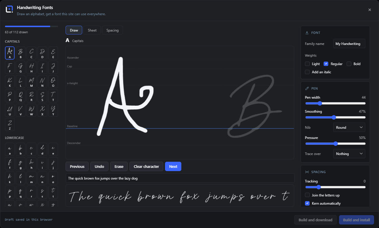
Your own handwriting, turned into a real font the whole editor can use. Draw the letters on a proper type grid with baseline, x-height and ascender guides and the neighbouring letters faint beside you, or print the ruled sheet, fill it in with your favourite pen, photograph it, and let the registration marks straighten the page and read every cell in order.
Accented characters are composed for you: draw the plain letters and the accents once, and the umlauts and accents for German, Spanish, French, Portuguese and Italian land at the right height. One alphabet yields a whole family, Light, Regular and Bold as genuine weights plus an italic by slant. Cursive mode joins the letters visibly, and spacing comes from the real ink of each glyph, with a tracking slider and per-letter nudge on top.
Open it from the Extensions menu. One click installs the finished font into the site's font library, where it appears in the font picker, brand kits, templates, curved text and every layer style. The font file doubles as the project file: reopen it later and every stroke is still editable.
Draw
#Draw the letters here on a type grid.
Sheet
#Print a ruled sheet, fill it in by hand, photograph it and let it be read.
Spacing
#The workbench for side bearings, tracking and per-letter nudges.
%1$d of %2$d drawn
#How much of the required character set exists so far.
Draw the letters marked as required before building.
#Shown when characters the font needs are still missing.
Drawing a character ExtensionHandwriting Fonts 11 items #
A proper type grid, with the neighbours faint beside the letter.
Baseline, x-height, cap height, ascender and descender are drawn while you work, and the letters either side are shown faintly, so the shapes line up from the start rather than being corrected afterwards. Pressure is picked up where the device offers it.
Pen
#A round pen whose width follows pressure where the device reports it.
Chisel
#A calligraphy nib: the stroke thickens and thins with direction rather than with pressure.
Nib angle
#The angle the chisel nib is held at.
Nib width
#How broad the nib is.
Smoothing
#Evens out a shaky hand without flattening the character of the stroke.
Erase
#Removes single strokes rather than the whole character.
Clear character
#Empties the character you are on and leaves the rest alone.
Undo
#Takes back the last stroke.
Trace over
#Shows a faint reference letter under your hand while you draw.
Heights
#Baseline, x-height, Cap height, Ascender and Descender: the guides drawn across the grid.
Next
#Moves to the next character in the set.
The printed sheet ExtensionHandwriting Fonts 9 items #
Write on paper, photograph it, let the registration marks do the rest.
The corner marks straighten the photographed page and the cells are read in order, so no letter has to be matched up by hand. One character per box.
Download as image
#Saves the ruled sheet so you can print it.
%1$d characters on %2$d sheet(s).
#How many sheets the chosen character set needs.
Choose a photo
#Takes the photograph of the filled-in sheet.
Corners found, check them and read the sheet
#The four registration marks were located. Correct them by hand if one sits wrong, then read the sheet.
Those four corners do not form a sheet
#The marks do not describe a rectangle. Usually a corner was missed or the photo is cropped.
Reading the boxes
#The cells are being read in order.
Found %d characters
#How many boxes held writing.
No writing found in the boxes
#The sheet was read but the cells were blank, or the contrast was too low.
Take these over
#Moves what was read into the alphabet, where it can still be edited stroke by stroke.
Spacing workbench ExtensionHandwriting Fonts 6 items #
Side bearings come from the real ink, then you adjust.
Each glyph is measured from its own ink rather than from its box, so the spacing starts out even. Drag a gap or a letter edge in the preview line to adjust one pair.
Drag a gap or a letter edge
#Adjusts the space between two letters, or one side bearing.
Tracking
#Opens or tightens the whole alphabet at once.
Kern automatically
#Works out the awkward pairs and adjusts them for you.
%1$d pair(s), %2$d letter(s) adjusted
#What the spacing currently carries.
Reset this
#Puts one pair or one bearing back.
Reset all spacing
#Puts every adjustment back to the measured value.
Weights, italic and joined writing ExtensionHandwriting Fonts 6 items #
One alphabet, a whole family.
Because the strokes are kept, the same letters can be re-drawn thinner or thicker rather than smeared, which is what makes Light and Bold genuine weights instead of a fake outline.
Weights
#Light, Regular and Bold, drawn from the same strokes with a narrower or broader pen.
Add an italic
#Adds a slanted cut of the family.
Join the letters up
#Cursive mode: entry and exit marks at a fixed height and the gaps closed, so the letters visibly connect.
Join here
#Where a letter is entered and left, so neighbouring letters meet at the same height.
Overlap
#How far joined letters run into each other.
Include
#Which character set to build: every character, or only the ones still missing.
Building and installing ExtensionHandwriting Fonts 11 items #
One click puts the font in the site font library.
An installed font turns up in the font picker, brand kits, templates, curved text, text on a path, WordArt and every layer style, with no reload. The font file doubles as the project file.
Family name
#What the font will be called in the picker. Defaults to My Handwriting.
Build and install
#Builds the family and installs it into this site's font library, which is a site-wide setting and needs an account that can manage options. Without that right the family can still be built and downloaded as a font file.
Build and download
#Builds the family and hands you the files instead of installing them.
Installed %s. It is in the font picker now.
#Confirmation that the family is available site-wide.
Insert a specimen
#Drops a sample of the finished font onto the canvas.
Add a text layer
#Adds a text layer already set in the new font.
Copy CSS
#Copies the font-face rule for use outside the editor.
Open an installed font
#Reopens a font from the library for further editing.
Open a font file
#Reopens a font file from disk. Every stroke is still editable.
This font has no project inside it.
#The file is a normal font, not one built here, so there are no strokes to edit.
Saved drafts
#Work in progress kept in this browser. Delete draft removes one.
A second pair of eyes ExtensionHandwriting Fonts 5 items #
The checks that run over a finished alphabet.
They point at the things that make handwriting look wrong at text size and are hard to see while drawing one letter at a time.
What was found
#The list of things worth looking at before building.
%d character(s) sit oddly next to the others.
#Their size or position differs from the rest of the alphabet.
%d character(s) moved onto the baseline
#Letters that floated above or sank below the line were put back on it.
Stand them on the baseline
#Applies that correction to the whole alphabet.
%d character(s) still needed
#Characters the chosen set requires that have not been drawn.