Calendars
Calendars builds fifteen poster-style calendars as real, editable layers, with all date and astronomy math computed locally.
Calendars (overview) Extension 7 items #
Calendars builds fifteen poster-style calendars as real, editable layers, with all date and astronomy math computed locally.
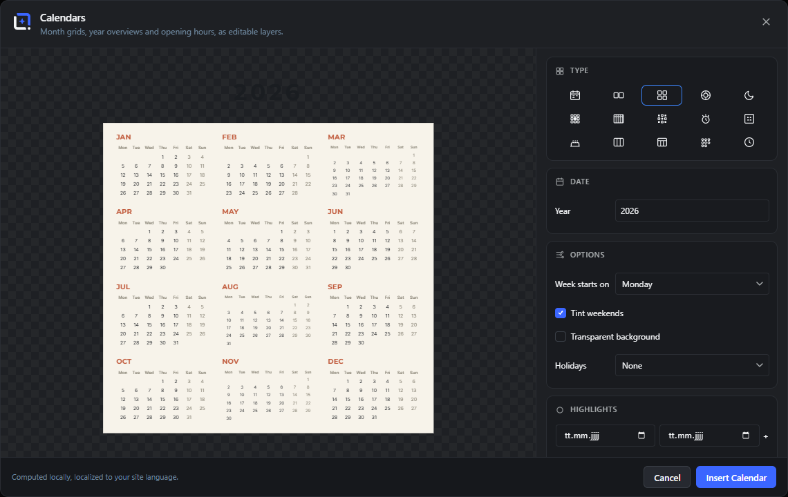
Poster-style calendars as editable layers: month grids, multi-month and year overviews, a circular year wheel, a moon phase calendar, a life calendar counting your weeks, a landscape wall planner, a year-in-pixels mood tracker, countdown and advent posters, perpetual birthday calendars, week planners, school timetables, habit trackers and opening-hours cards.
All astronomy is computed locally. Public holidays are off until you pick a country: Germany, Austria or Switzerland, and their names are given in German. Mark days by clicking straight into the preview: eight marker shapes, per-entry colors, date ranges as soft pills and an automatic legend. Month and weekday names follow your site language, week numbering follows ISO, and the week starts on Monday or Sunday, whichever you pick.
Open it from the Extensions menu. Everything lands with a transparent background as editable layers and reopens anytime via Edit Calendars.
Editable layers
#Every calendar is inserted as a grid image layer plus separate title, subtitle and legend text layers, wrapped in a group. You can move, restyle or delete each piece like any other layer.
Insert Calendar
#The primary button when creating a new calendar. It renders the grid, adds the text layers, and drops the finished group into your document.
Tip. Shown only when you are building a new calendar.
Update Calendar
#Replaces the Insert button when you reopened an existing calendar. It re-renders the same layer in place with your new settings instead of adding a second calendar.
Edit Calendars
#Reopens the studio on an existing calendar layer with all its saved settings. Because the layer stores its generator setup, you can change the year, type, markers or theme at any time.
Tip. Available from the layer's generator menu once a Calendars layer exists.
Cancel
#Closes the studio without inserting or changing anything.
Close
#The X button in the top corner. Closes the dialog and discards any unsaved changes, the same as Cancel.
Tip. Clicking the dark area outside the dialog also closes it.
Computed locally, localized to your site language
#A footer note reminding you that all calendar math (week numbers, moon phases, weekday names) runs in your browser and follows your WordPress site language. No calendar data is sent anywhere.
Calendar types Extension 15 items #
Fifteen calendar layouts, chosen from a grid of icon tiles at the top of the settings column; the tile you pick changes which options appear.
The Type grid holds fifteen tiles. Click one to switch layout. The selected tile is highlighted, the preview updates instantly, and the settings below rearrange to show only the controls that apply to that type.
Choosing a type also pre-fills a sensible title (for example the month name and year) until you type your own.
Month
#A single-month grid, the classic calendar page. Supports week numbers, weekend tint, today marker, neighbor mini-months, moon phases and clickable day highlights.
Tip. The most option-rich type; click days in the preview to mark them.
Several months
#A multi-month view that tiles two, three, four or six consecutive months, rolling over the year end. Good for a quarter or half-year on one poster.
Year
#A full twelve-month year overview, all months as small grids on one page. Day highlights and labeled legend entries carry across every month.
Year wheel
#A circular year calendar with the twelve months arranged around a ring and the year in the center. Can add a moon-phase band and equinox/solstice season rays.
Moon calendar
#A year of principal moon phases (new, first quarter, full, last quarter), computed locally from astronomy. A wide landscape band per month.
Life calendar
#Your whole life as a grid of small cells, one per week or per year, with lived time filled in. A reflective poster driven by your birth date and a life expectancy.
Wall planner
#A landscape year wall planner: all twelve months as horizontal day strips, the format you pin above a desk. Supports weekend tint, holidays and highlights.
Year in pixels
#A mood-tracker grid with one small square per day of the year. You color days in the preview, and each distinct labeled color becomes a legend entry.
Tip. Give each color a name in the Highlights list to build the legend.
Countdown
#A countdown poster showing the number of days left until a target date, with an optional progress bar from January 1 of the target year. Great for a launch or a big day.
Advent calendar
#A festive advent layout with 24 numbered doors. A fixed December design that needs no date input.
Birthday calendar
#A perpetual birthday calendar grouped by month, ignoring the year. Add each person as a highlight with a name, and they appear under their month.
Tip. Only the day and month of each highlight are used, so it never goes out of date.
Week planner
#A weekly planner with the seven days as columns and writing lines under each, for a printable to-do or agenda page. Built around any date inside the week you want.
Timetable
#A school or class timetable: weekday columns against period rows, with period start times generated automatically from a start time and length.
Habit tracker
#A monthly habit tracker: one row per habit against a check cell for every day of the chosen month. Type your habits and pick the month.
Opening hours
#An opening-hours card listing each weekday with its hours, and closed days shown as such. For a shop or office. No date is needed.
Date (moment controls) Extension 10 items #
The Date panel sets which moment the calendar shows; the exact fields shown depend on the calendar type.
Depending on the type, this panel shows a month picker, a year, a month count, a week date, a birth date and life settings, or a countdown target. Fields that do not apply to the current type are hidden.
The whole Date panel is hidden entirely for Opening hours, Birthday, Advent and Timetable, which do not need a specific moment.
Month
#A dropdown of the twelve month names in your site language. Sets which month the Month, Habit tracker and (as start month) Several months views show.
Tip. For Several months this field is relabeled Start month.
Start month
#The same month dropdown, relabeled when the type is Several months. It sets the first tile; following months roll forward from here, wrapping into the next year if needed.
Year
#A number field for the calendar year. Used by month, multi-month, year, moon, wheel, habit, wall and pixel calendars.
Months
#How many months the Several months view tiles. Two and three sit in one or two rows; four uses two columns; six uses three.
Week
#A date picker for the Week planner. Any day inside the week you want works; the planner shows the seven days of that week, aligned to your week start.
Birth date
#Your date of birth for the Life calendar. It sets how many cells (weeks or years) are filled in as already lived.
Life expectancy
#A slider for the total number of years the Life calendar covers. It sets the overall size of the grid.
Type (In weeks / In years)
#Chooses whether the Life calendar counts in weeks (a 52-column grid) or in years (a 10-column grid). Weeks give the dense classic look; years are calmer.
Target date
#The date the Countdown counts down to. The poster shows the number of days from today until this date.
Label (optional)
#Free text shown under the countdown number. Leave it empty and the calendar fills in a default like until the target 24 December 2026.
Options Extension 15 items #
Display toggles and layout settings; each option appears only for the calendar types it affects.
The Options panel gathers the small switches and dropdowns that fine-tune a calendar: week start, week numbers, weekend shading, the today marker, moon extras, transparent background, plus the writing lines, holidays and timetable settings.
Only the options relevant to the current type are shown, so this panel looks different for a month grid than for a timetable.
Week starts on
#Whether weeks begin on Monday or Sunday. It rotates the weekday column headers and the day grid to match.
Week numbers
#Shows ISO week numbers down the left side of the month grid. Useful for planning and for European business calendars.
Tip. Week numbers follow the ISO 8601 standard.
Tint weekends
#Softly shades Saturday and Sunday so weekends stand out from work days.
Mark today
#Highlights the current day in the grid, but only when the shown month and year are the current ones.
Neighbor months
#Adds small previous-month and next-month grids in a strip above the main month, wrapping the year at December and January.
Tip. Handy for seeing what falls just before or after the current page.
Moon phases
#Draws small moon-phase icons on the days they occur inside the month grid, computed locally.
Moon ring
#Adds a band of moon phases around the Year wheel, showing the lunar cycle across the year.
Season markers
#Adds equinox and solstice rays and labels (Spring, Summer, Autumn, Winter) to the Year wheel, marking the start of each season.
Transparent background
#Drops the solid background so the calendar sits on whatever is behind it in your document. Only the grid, text and markers are drawn.
Tip. Useful for placing a calendar over your own photo or texture.
Writing lines
#How many writing lines appear under each day column of the Week planner, for notes and tasks.
Holidays
#Adds public holidays for a country as red dot markers, and (for a single month) into the legend. Choose None to turn it off.
Tip. Holiday markers use a fixed red so they read as official days.
Days
#How many weekday columns the Timetable shows: five (Mon to Fri), six (adds Saturday) or seven (full week).
Periods
#How many period rows the Timetable has. Each row gets an automatic start time based on the start time and length.
Start time
#The clock time the first Timetable period begins. Later period times are calculated from here.
Minutes each
#How many minutes each Timetable period lasts. This spacing sets the start time printed on every following row.
Markers and highlights Extension 13 items #
Mark birthdays, events and date ranges either by adding dates in this panel or by clicking days right in the preview.
The Highlights panel manages every marked day. Add a single date, or a start and end date for a range, using the two date fields and the plus button. You can also click days directly in the month, multi-month or year preview to toggle a marker on or off.
Each highlight in the list has a shape button, a color swatch, its date, an optional name, and a remove button. Named highlights can flow into an automatic legend under the grid, and ranges appear as soft pills across the days they cover.
This panel is shown for Month, Several months, Year, Year wheel, Birthday, Wall planner and Year in pixels. For Year in pixels it is used to color days and label each color.
Add date
#The first date field in the add row. Sets the day you want to mark. Fill it in, then press the plus button to add it to the list.
Until (optional)
#The second date field. Set it to turn a single day into a date range, which is drawn as a soft pill spanning those days. Leave it empty for a single-day marker.
Tip. If the end date is before the start, the studio swaps them automatically.
Add (+)
#The plus button that commits the date (or date range) from the fields into the highlights list. Duplicate dates are ignored.
Click days in the preview
#On month, multi-month and year previews you can click a day to add a marker and click it again to remove it. The list and preview stay in sync.
Tip. The cursor turns to a pointer over clickable days.
Marker shape
#The small symbol button on each highlight row. Click it to cycle through the eight marker shapes for that single date. Hidden for date ranges, which are drawn as pills.
Marker color
#The color swatch on each highlight row. Sets the accent color for that marker. Left unset, it uses the theme accent color.
Tip. For Year in pixels, this color is what fills the day square.
Name (optional)
#A text field on each highlight for a label like a person or event name. Named highlights appear in the automatic legend, and drive the entries and colors of the Birthday and Year-in-pixels calendars.
Remove
#The X button on a highlight row deletes that marker from the list and the preview.
Legend below the grid
#When on, named highlights (and holidays, for a single month) are listed as a text line under the calendar, wrapped across lines as needed.
Import ICS / CSV
#Reads an .ics or .csv file and merges its dates into the highlights list, skipping duplicates. A quick way to pull in events from another calendar app.
Tip. After a successful import the studio shows how many new dates were added.
Date-range pills
#A highlight with an Until date is drawn as a soft rounded pill across the covered days instead of a per-day symbol, so multi-day events (holidays, trips) read as one band.
Automatic legend
#The named highlights and holidays of the visible scope are gathered into legend text lines automatically, joined with dot separators and wrapped near 58 characters per line.
Color days to build the legend
#For the Year in pixels type, the highlights panel note changes: give each single day a color and a name, and every distinct labeled color becomes a legend swatch under the pixel grid.
Marker shapes Extension 8 items #
The eight symbols a single-day marker can take, cycled with the shape button on each highlight row.
Every single-day highlight uses one of eight shapes. Click the shape button on a highlight row to step through them. Date ranges do not use a shape; they draw as pills instead.
Circle
#A filled accent circle around or on the day. The default marker, good for a clear positive highlight like a birthday.
Ring
#An open ring outline around the day, a lighter touch than the filled circle.
Square
#A square marker on the day, a boxy alternative to the circle.
Star
#A star marker, for days you want to feel special or celebratory.
Heart
#A heart marker, for anniversaries and personal favorites.
Dot
#A small dot on the day, the most subtle marker. Public holidays also use a dot.
Underline
#A line under the day number, marking it without covering the number.
Strike
#A line through the day, useful for crossing off or marking a day as blocked or past.
Opening hours Extension 2 items #
Fills in the weekly hours for the Opening hours card, one text field per weekday.
Shown only for the Opening hours type. Type the hours for each day (for example 9:00 to 18:00). Leave a day empty and it shows as closed.
Weekday hours field
#One free-text field per weekday (Monday through Sunday, in your site language) where you type that day's opening hours. Whatever you type is shown as-is on the card.
Closed
#Any weekday field left empty is rendered as Closed on the card. This is the placeholder text shown in the empty field.
Tip. Leave a day empty to show it as closed.
Habits Extension 1 item #
Lists the habits tracked, one per line, for the Habit tracker calendar.
Shown only for the Habit tracker type. Each non-empty line becomes one row in the tracker against the days of the chosen month.
Habits list
#A multi-line text box, one habit per line. Each line becomes a tracker row with a check cell for every day of the selected month. Blank lines are ignored.
Tip. The taller your list, the taller the tracker grid grows.
Theme Extension 8 items #
Eight ready-made color themes, chosen from a grid of swatch tiles; picking one resets any manual color overrides.
Each theme sets a background, text, muted and accent color at once. Click a tile to apply it. Choosing a theme clears any custom colors you set in the Colors panel, so you start fresh from the theme.
Midnight
#A deep navy dark theme with a bright sky-blue accent. Calm and modern.
Black
#A near-black theme with a warm golden accent. High contrast and premium.
Violet
#A dark purple theme with a soft violet accent. Playful and rich.
Forest
#A dark green theme with a light mint accent. Natural and grounded.
Ocean
#A dark teal theme with a muted cyan accent. Cool and quiet.
Golden
#A black theme where both text and accent are warm gold, for an elegant monochrome-gold look.
Paper
#A light warm-cream theme with near-black text and a terracotta accent. The default; a printable, editorial look.
Blush
#A light pink theme with a deep-rose text and a pink accent. Soft and warm.
Colors Extension 4 items #
Override the theme's background, text and accent colors individually, with an Auto reset per color.
The Colors panel lets you fine-tune the three main colors on top of the chosen theme. Each color starts from the theme and can be overridden. Press Auto next to a color to drop your override and go back to the theme's value.
Picking a new theme clears all three overrides.
Background
#The color behind the whole calendar. Overrides the theme background. Has no visible effect when Transparent background is on.
Text
#The main ink color for day numbers, titles and labels. Overrides the theme text color.
Accent
#The highlight color used for markers, the today marker and accents. Overrides the theme accent. It is also the default color for new markers.
Auto
#The small reset button beside each color. Removes your custom color for that slot and returns it to the theme's value.
Text block Extension 3 items #
An optional title, subtitle and text-size control that are inserted as real editable text layers above the grid.
Shown only when creating a new calendar (not when editing an existing one). The title and subtitle are pre-filled to match your type and moment until you type your own, and both are inserted as separate text layers so you can restyle them afterward.
When editing an existing calendar the text block is hidden, because the title and subtitle already exist as their own layers you can edit directly.
Title
#The large heading above the calendar, rendered in uppercase Montserrat. Pre-filled from the type and date (for example the month and year) until you type your own.
Tip. Some types leave the title empty on purpose, like the wheel (year is in the center) and countdown.
Subtitle
#A smaller line under the title, in uppercase Inter. For the Life calendar it is pre-filled with a lived-versus-total stat; otherwise it starts empty.
Text size
#A slider that scales the title, subtitle and legend text together, as a percentage of their default size.
Studio panels (section headings) Extension 10 items #
The labeled section headings that split the Calendars side panel into groups.
The right-hand side of the Calendars dialog is divided into labeled sections. Each heading marks one group of controls. Sections show or hide themselves depending on the calendar type you pick, so you only ever see the controls that apply.
Type
#Heading over the grid of 15 calendar-type tiles. Click a tile to switch the whole calendar to that type.
Tip. The chosen tile is highlighted; the rest of the panel updates to match.
Date
#Heading over the moment controls (month, year, month count, week date, birth date, life expectancy, target date and label). Only the rows that apply to the current type are shown.
Options
#Heading over the toggles and dropdowns that fine-tune the grid, such as week start, week numbers, holidays and timetable layout.
Tip. Which options appear depends on the selected calendar type.
Highlights
#Heading over the tools that mark special days: the add-date row, the ICS/CSV import, the legend toggle and the list of marked dates.
Hours
#Heading over the seven weekday text fields used by the Opening hours card. Shown only when the type is Opening hours.
Habits
#Heading over the multi-line habit list for the Habit tracker. Shown only when the type is Habit tracker.
Theme
#Heading over the grid of color-theme swatches. Pick a theme to set the background, text and accent colors at once.
Colors
#Heading over the three per-color overrides (Background, Text, Accent) that let you tweak the chosen theme. A brand-kit picker sits here too: choose one of the site's brand kits and the accent comes from its palette.
Typography
#Heading over the font controls. It sets the family used for the calendar grid and for the poster texts; leaving it on the default follows the editor.
Text block
#Heading over the poster title, subtitle and text-size controls. This section appears only when you are inserting a new calendar, not when editing an existing one.
Week start and holiday options Extension 6 items #
The individual choices inside the Week starts on and Holidays dropdowns.
These are the option values you can pick from the two main dropdown menus. The week-start choice rotates every grid; the holiday choice adds official public holidays as small dots and legend lines.
Monday
#Sets the first column of every week to Monday (ISO style). This is the default.
Sunday
#Sets the first column of every week to Sunday, the common layout in the US and some other regions.
None
#Adds no public holidays. This is the default; the calendar shows only the days you mark yourself.
Germany
#Adds German public holidays automatically, computed locally, shown as dots on the grid and listed in the legend.
Austria
#Adds Austrian public holidays automatically, shown as dots and added to the legend.
Switzerland
#Adds Swiss public holidays automatically, shown as dots and added to the legend.
Year wheel season labels Extension 4 items #
The four season names printed on the circular Year wheel when Season markers is on.
When the Season markers toggle is enabled for the Year wheel type, the ring gets equinox and solstice rays labeled with the four seasons. The words are translated to your site language.
Inline hints and notes Extension 7 items #
The small helper lines printed under controls and next to the dialog title.
Calendars prints short guidance strings in several places: under the dialog title, under the Highlights add-row, and under the Hours and Habits fields. They tell you what a section expects.
Adjust the calendar, the layer updates in place.
#Subtitle shown under the dialog title when you reopen an existing calendar with Edit Calendars. It reminds you that saving updates the same layer rather than adding a new one.
Month grids, year overviews and opening hours, as editable layers.
#Subtitle shown under the dialog title when you open Calendars to insert a new calendar. It summarizes what the studio can produce.
Birthdays, events - marked with an accent circle.
#Note under the Highlights add-row for grid types. It explains that added dates are drawn with an accent-colored marker.
Click days directly in the preview to toggle them.
#Second half of the Highlights note. It tells you that you can click a day in the live preview to mark it, and click again to remove it, without typing a date.
Tip. Works on the Month, Year and Several months previews.
Color days in the preview to build the legend.
#Note that replaces the normal Highlights hint when the type is Year in pixels. It explains that colored days feed the automatic mood legend.
Leave a day empty to show it as closed.
#Note under the Hours section. Any weekday field left blank is rendered as Closed on the opening-hours card.
One habit per line.
#Note under the Habits text area. Each line of text becomes one row in the habit tracker grid.
Status and error messages Extension 5 items #
The transient status and error strings shown while rendering, importing or inserting.
These messages appear in the small status line under the preview, or as a toast, while Calendars works or when something goes wrong.
Rendering the calendar
#Status shown after you press Insert Calendar or Update Calendar while the high-resolution image is being baked.
Could not insert the calendar.
#Error shown if the insert or update step fails for a reason without its own message.
Could not read the file.
#Error shown when an imported ICS or CSV file cannot be parsed or read from disk.
No dates found in the file.
#Error shown when an imported file was read but contained no usable dates to add as highlights.
Calendars needs WunderPaint 1.144 or newer.
#Error shown if the host editor is too old to provide the document bridge the extension relies on. Update the plugin to use Calendars.
Defaults and automatic text Extension 7 items #
Prefilled values, auto-generated titles, and the names of the layers Calendars creates.
Several Calendars fields start with sensible defaults, and the title and subtitle fill themselves in from the current setup until you type your own. When you insert, the result is a named group of editable layers.
Sport, Reading, Drink water
#The three habits the Habit tracker starts with. Edit or replace them in the Habits text area, one habit per line.
Automatic title suggestion
#The Title field fills itself from the current type and date until you type your own text. For example a Month becomes July 2026, a Year becomes 2026, a Moon calendar becomes Moon calendar 2026, a Life calendar becomes My life, a Birthday calendar becomes Birthdays, and a Week planner becomes Week 29 · 2026.
Tip. Year wheel and Countdown leave the title blank on purpose, since the number sits inside the art.
Automatic subtitle (life stat)
#For the Life calendar, the Subtitle fills itself with your lived total, for example 1,742 / 4,680 Weeks or a years count, using the words Weeks or Years. It stops updating once you type your own subtitle.
Back to the theme color
#Tooltip on the Auto reset button next to each color override. Pressing it drops your custom color and returns that slot to the theme's value.
until the target
#The default caption printed under the big countdown number when you leave the Label field empty. It is joined with the formatted target date, for example until the target 24 December 2026.
Calendar
#The name given to the baked grid image layer, and the prefix of the group that holds the calendar plus its text, for example Calendar: July 2026. This is how you find the calendar in the Layers panel.
Legend
#The layer name given to each automatic legend line inserted under the grid when Legend below the grid is on.